Claro de Luna - wine label design
Claro de Luna - A new wine launch for the Argentine market directed to a younger more refined consumer.
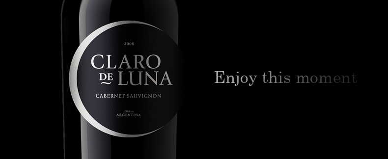
In response we created a wine that is understated, elegant but retains great presence.
In response we created a wine that is understated, elegant but retains great presence.
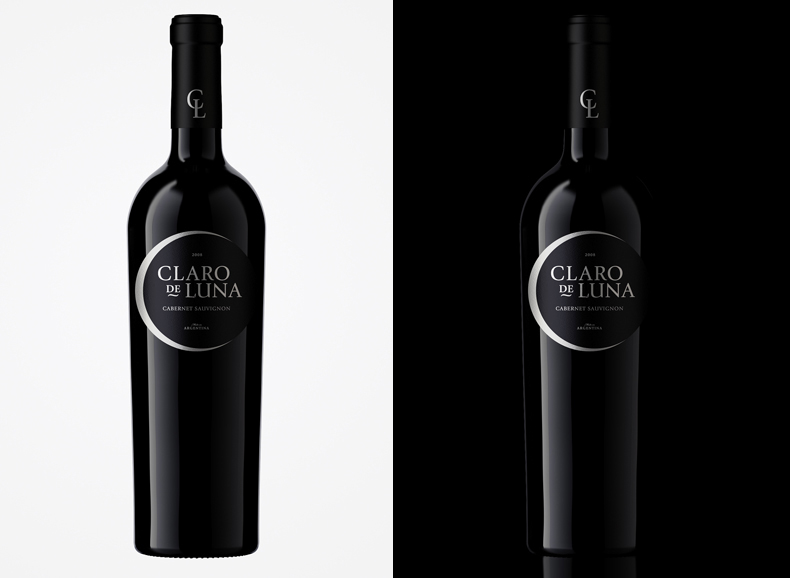
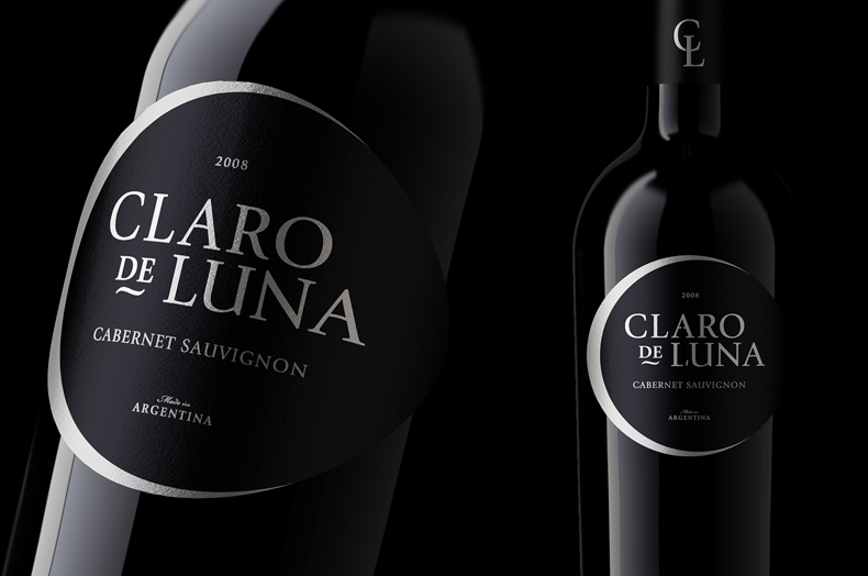
We liked the idea of representing the moon peeking over the darkness of the night. Thus we abandon the traditional square labels and started thinking about an eclipse happening on that bottle.
As the moon is the only protagonist, the label was printed on matte paper, stamping with silver accents that highly contrast with the dark bottle in a subtle way.
As the moon is the only protagonist, the label was printed on matte paper, stamping with silver accents that highly contrast with the dark bottle in a subtle way.