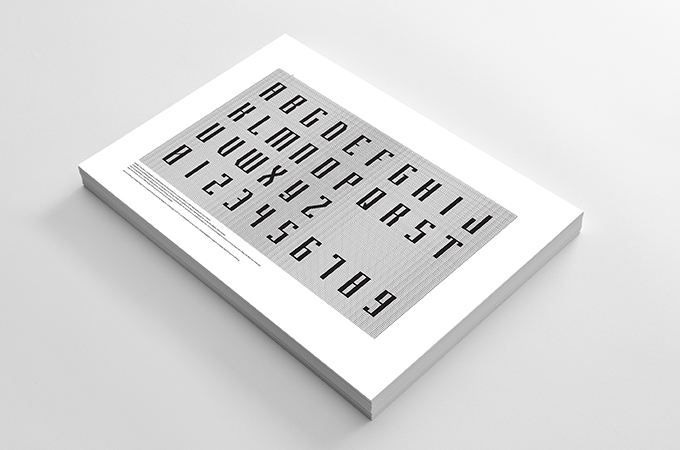
BrosU font & Logo
BrosU means “step brother” and it’s shorten of “Brothers United”.
So we’ve decided the concept as “brother”
BrosU font is started with the image of “piling up bricks” and it’s like [brother share pain > pain is work for us > work is bricks].
We’ve proceeded this piling one by one frame in the guide of 9 by 20 frame in total.
So finally, it is born as a “brotherhood” by putting 5 letters in one hexagon. It’s intended perspective drawing of bricks piled up.
Two of font type “Gothic” and “Roman” are adopted and it’s illustration file.