From 1990 to 1998 designer Patti Britton of Britton Design worked with Sam Sebastiani of Viansa Winery in Sonoma, California creating wine and food packaging. She also designed print collateral--catalogs and brochures, a wine club logo, monthly wine club newsletters, stationery, a cookbook and signage.
The unifying theme of a collection of 25 wine and food products developed for Viansa Winery is largely derived from classical sources. Renaissance-style frescoes painted on the winery walls inspired the richly colorful yet clean and contemporary look. Designer Patti Britton wanted visitors to Viansa's tasting room and marketplace to be able to take home the essence of the winery with every purchase.
Britton Design won 86 national and international design awards alone for Viansa Winery.
www.brittondesign.com
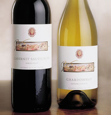
VIANSA MAIN VARIETALS
At that time, the brand was only sold in the Viansa tasting room
and through their wine club so the brand didn't have to scream "big time store".
The Carneros fresco logo of the ram was incorporated into the design
along with the frescoes from the walls for a clean look.
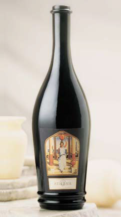
VIANSA ATHENA
Athena is the goddess of wisdom, courage, inspiration
civilization, law and justice. A custom illustration was
created showing the goddess.
A Dolcetto wine, this package design was voted by the London
International Advertising Awards in 1997 as the best wine package
design of the world, probably in part because of the amazing stylized bottle.
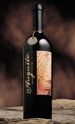
VIANSA AUGUSTO
A Barbera wine, this package design was a tribute to Sam Sebastiani's
father--August Sebastiani. A large, heavy Italian bottle was chosen along
with a medal keepsake with "Augusto" engraved on one side
and "Barbera" engraved on the other side.
This package design won several awards including a trophy from
the Package Design Council International in New York.
the Package Design Council International in New York.
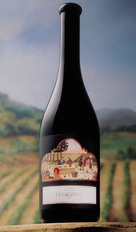
VIANSA PRINDELO
Prindelo was a red wine blend of Primitivo, Zinfandel and Charbono.
The three arches represented the blend of three varietals with
another fresco used from the wineries walls.
The Prindelo won several design awards including
a bronze trophy from the Western Art Directors Club.
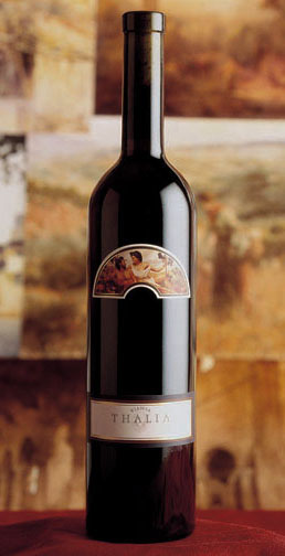
VIANSA THALIA
Thalia Sangiovese was the first wine package Patti Britton designed
for Viansa Winery. Seeing all the beautiful frescoes painted on
the walls in the tasting room and marketplace she decided to incorporate
the frescoes for all of Viansa's package designs.
The wine was named after Thalia, the Greek goddess of flowering.
happiness, abundance and bountiful banquets.
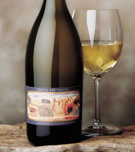
VIANSA CENTO PER CENTO
"Cento Per Cento" means "100%"--Cento Per Cento was a 100% malolactic
fermentation, buttery Chardonnay. A custom swirly "V" was created that
was foil stamped over another chosen fresco. The "V" was
also implemented for various Viansa print collateral.
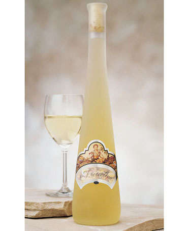
VIANSA FRESCOLINA
This tall, frosted bottle held the Tocai Friulano wine named
Frescolina or "little sweet one". A custom illustration was created with Frescolina
and her bounty of fruit. This package design won a gold trophy for the
Brand Design Association in New York in 1998
among various other awards.
VIANSA ITALIA
The Viansa Italia label design was created to look more European
since the wine was being sourced from European wineries.
The custom illustration is a replica of the monastery where
Sam Sebastiani's grandfather--Samuele Sebastiani learned winemaking
in the Tuscan town of Farneta, Italy.
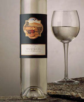
VIANSA MUSECCO
A sweet wine, this Muscat Canelli had a tall skinny bottle with another
Italian fresco.The same dark blue/purple background appears like
all the other Viansa Cal-Ital wines. This design won a bronze trophy
from the Western Art Directors Club along with other awards.
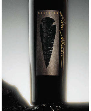
VIANSA OBSIDIAN
This Meritage blend package was originally named "Obsidian" and later
re-named "Ossidiana". Sam Sebastiani and his father August Sebastiani
collected arrowheads throughout the years. One of their 200 year-old
arrowheads was released to the label printer who produced
embossing and black foil stamp dies for the black printed
textured label. This package design won numerous design awards.

VIANSA PICCOLO TOSCANO
At one time Viansa had two Sangioveses--Thalia and this Piccolo Toscano,
meaning "Little Tuscan". Patti Britton researched a lot of the frame design
from the Vatican Museum and Italian architecture.
Later this became the design for the Viansa Merlot.
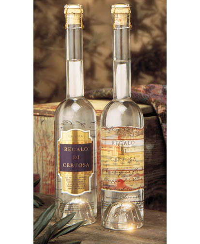
VIANSA REGALO DI CERTOSA
Regalo Di Certosa means "Gift of Certosa"--a Grappa wine which
Patti Britton decided needed a little more bells and whistles
since it was in another category than wine.
A two-sided printed wine label was applied to the bottle along
with the descriptive silkscreened on the other side of the bottle.
This package design won several awards including a trophy from
the Package Design Council International in New York.
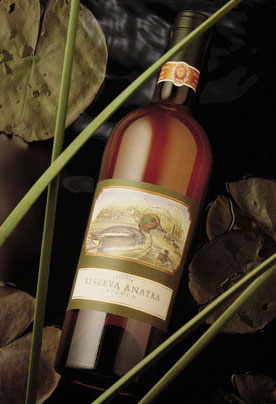
VIANSA RISERVA ANATRA
In honor of Viansa's wetlands, every year Patti Britton created a
new label design for a new duck label. This line of wines was called
Riserva Anatra, meaning "Duck Reserve". The neck band was
only used for a couple of years because it was hand applied.
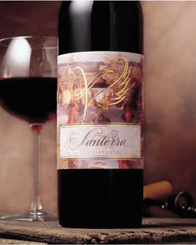
VIANSA SANTERRA
Santerra, meaning "Saint of the earth", was created for their library
wines. Patti Britton created a collage of Viansa and ethereal
images to reflect the name. Also art directed hand lettering for "Santerra",
and a foil stamped bird-like "V" with wings.
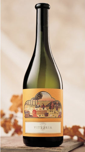
VIANSA VITTORIA
Vittoria, meaning "Victory" used the same bottle and label design
as the Prindelo. Since this wine was for the Pinot Grigio,
Patti Britton chose an orange background color
to compliment the wine.


