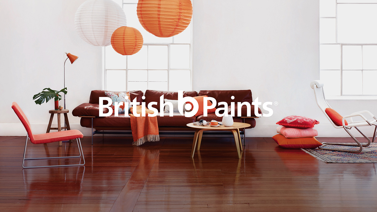
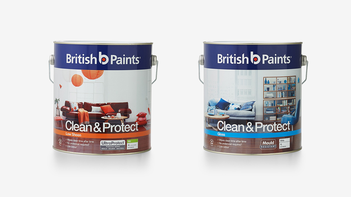

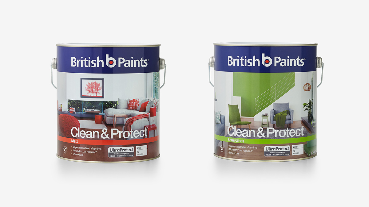
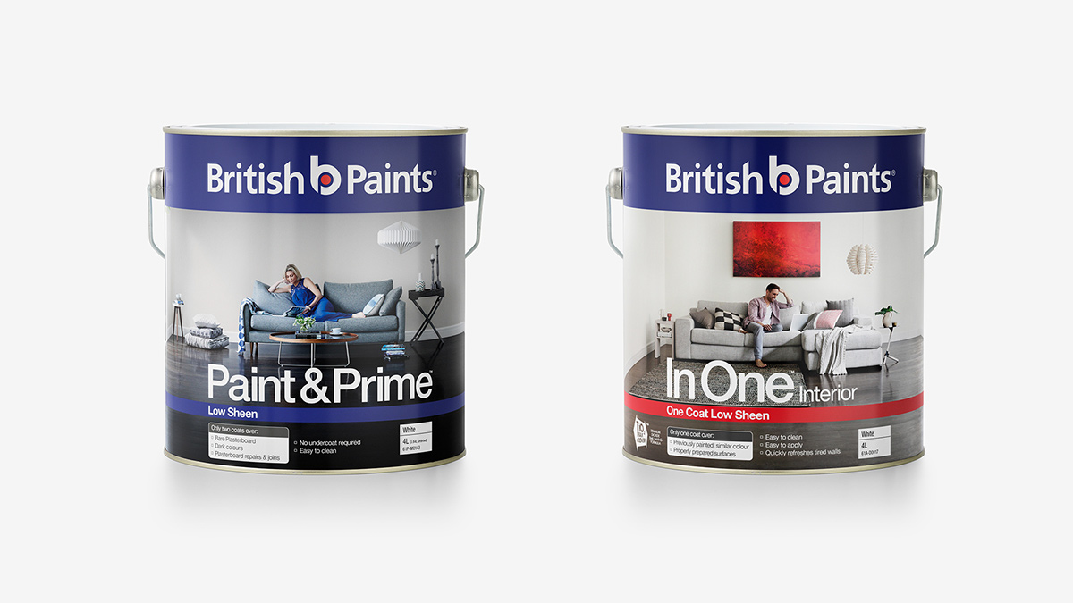
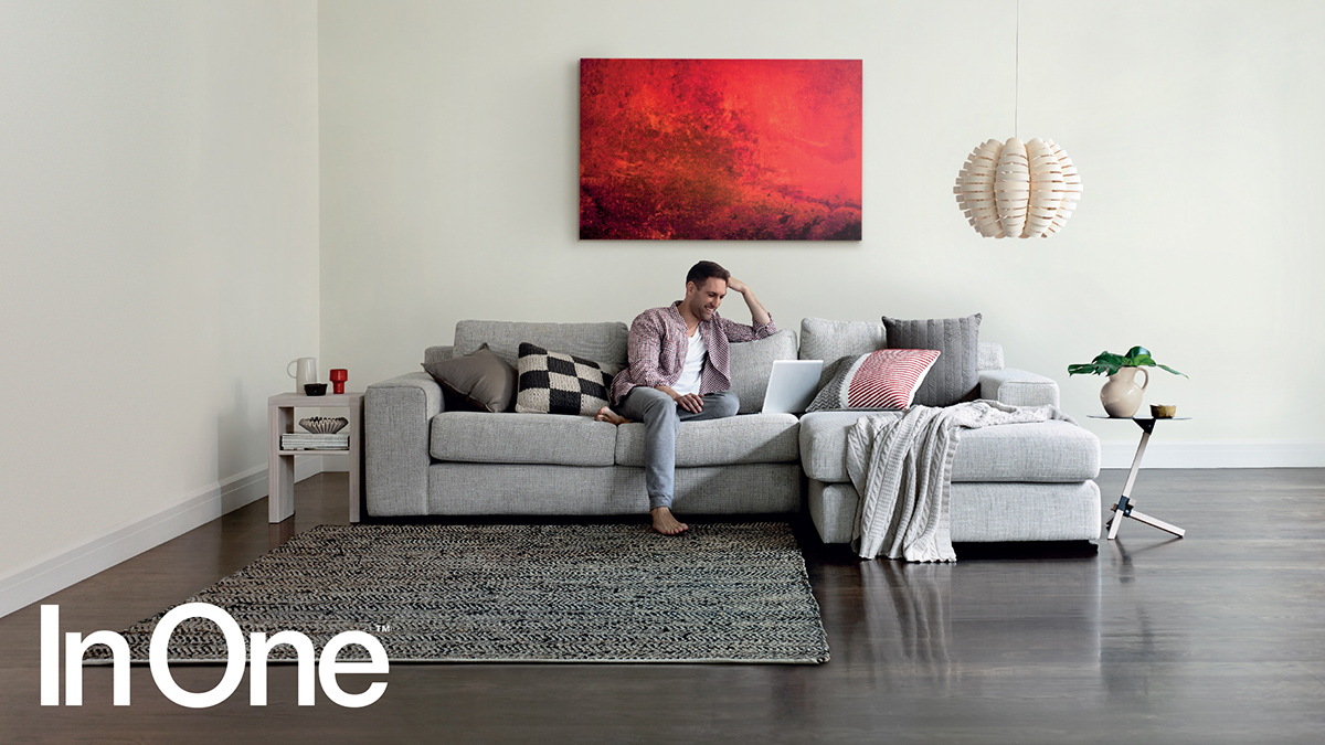
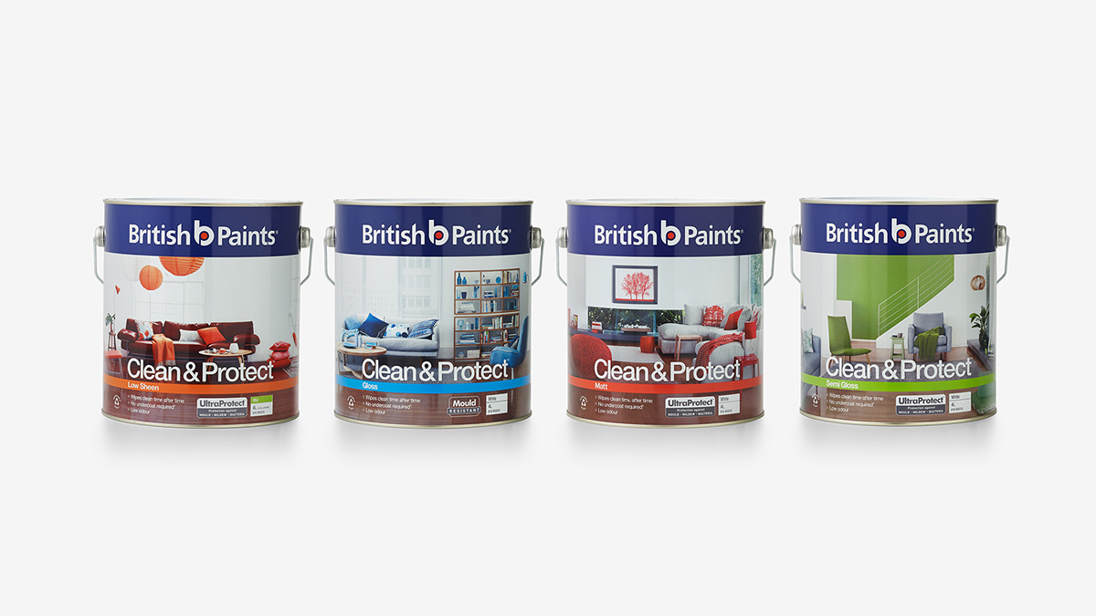
British Paints were launching a new paint range, Clean & Guard, and needed a fresh premium look to help them stand apart in their competitive market. The tin range was designed using full bleed photography of contemporary lived-in homes to mirror the target audience and the way they live. These were shot on location and colour was purposely used in the setting and logo to help differentiate each type of paint finish – gloss, matt, etc. The use of clear white space, clean vertical type and new logo placement help deliver a new premium feel to the brand.

