
Bionativa it’s a cosmetics startup company. Their products are excellent quality products at affordable prices, for everyday use.
In their body care product line, each product has it fuction with 7 versions, each one with a specific fruit aroma.
In their body care product line, each product has it fuction with 7 versions, each one with a specific fruit aroma.
This project envolved creating new label design (the company logo already existed). Although I didn’t have any influence in package design or selection, it was crucial to take advantage of it.
I wanted to create an image that was young, contemporary, and that could be easily distinguished from competition, especially at the point of sale.
Because this is a physical product, that customers hold in their hands and bring home, in my professional opinion, this would be the opportunity to create something special and establish a brand identity for the future.
Because this is a physical product, that customers hold in their hands and bring home, in my professional opinion, this would be the opportunity to create something special and establish a brand identity for the future.
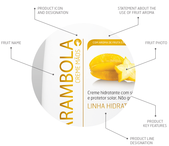
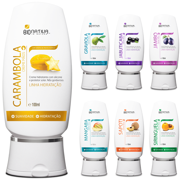
Hand Care Moisturizing Cream - 100ml


Hand Cream - 500ml and 100ml
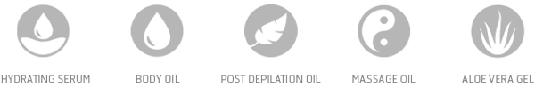
ICON SYSTEM
Almost all product lines have the 7 aromas, based on tropical fruits from Brazil, so I’ve created an icon for each fruit and each product line.
Icons for Hand and Foot Cream product lines and 7 aroma versions.

Icons for other product lines.
FINAL DESIGN
FINAL DESIGN
Since the first version was considered to much minimalistic and audacious, it was imperative to find a solution that would fit the brand requirements, so it was necessary to find a compromise around a conservative look, but I did not want to stick to much to any existing brand.
The printing technology it's very important when designing packaging or product label, in this specific project we were using vinyl as a substrate, and the main color (in the image below it's golden yellow) had to be strong and glitter, to result in an enhanced 'shelf appeal.'
The client already had a reference from metallic hot stamp, that gives very strong metallic reflexes, but for a detailed and small scale project, wouldn't work, very small lines and text would be 'eaten'.
The solution could be using METALFX or other emerging technologies, but since it was only one color per laber, we chosed Pantone Metallic colors. It's not lustrous as hot stamping, but it's a good choice after analysing the pros and cons.
This graphic line was adopted and extended to all Skin Care products.
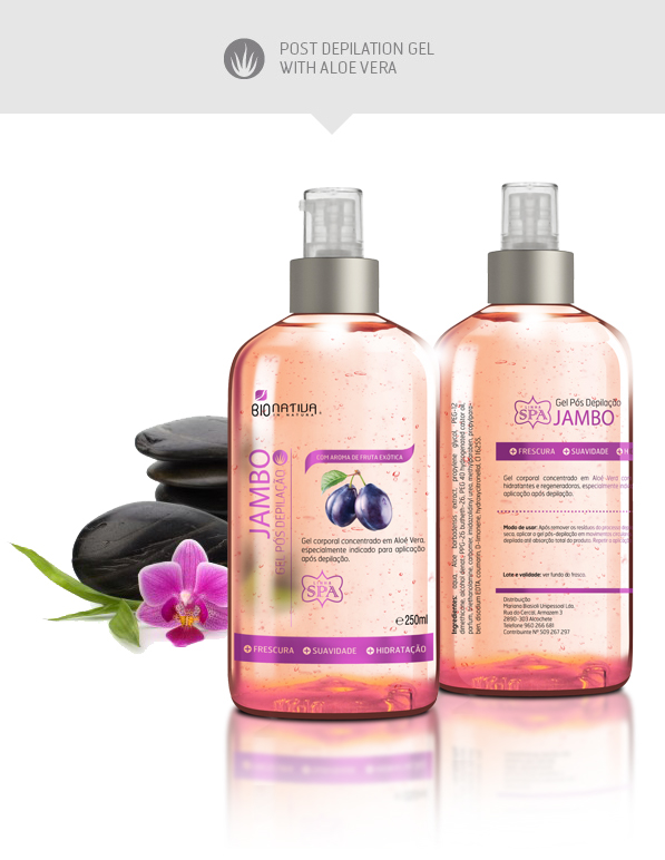
Following the same graphic direction, there is the SPA Line, composed of 3 products, each one have the same 7 fruit aroma versions.

The Hair Care product line had some differences from the other product lines. Like the previous designs, it was mandatory to use photography to communicate the product function and characteristics. Apart of that, I felt that the use of iconography to complement the title would enhance its readability or perception.

I believe this project was an example of how to balance between the briefing you have in your hands, your interpretation of it, and then the result after the client input. Sometimes these three vectors don't seem to point to same direction, when that happens there is some extra effort to make them join to result efficiently. The most important thing it's that, in the end, both parts will be very satisfied, the product will be a sales sucess.
Thanks for your support.


