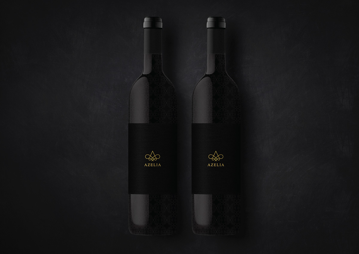
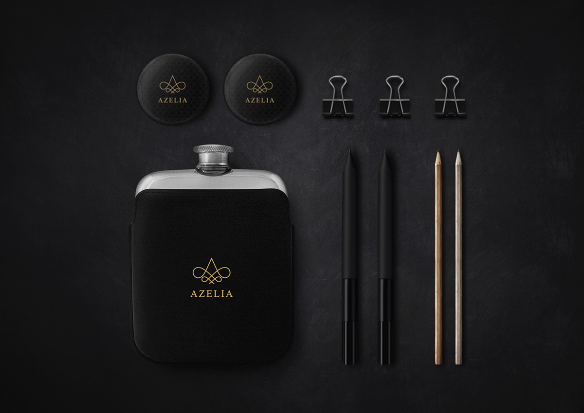
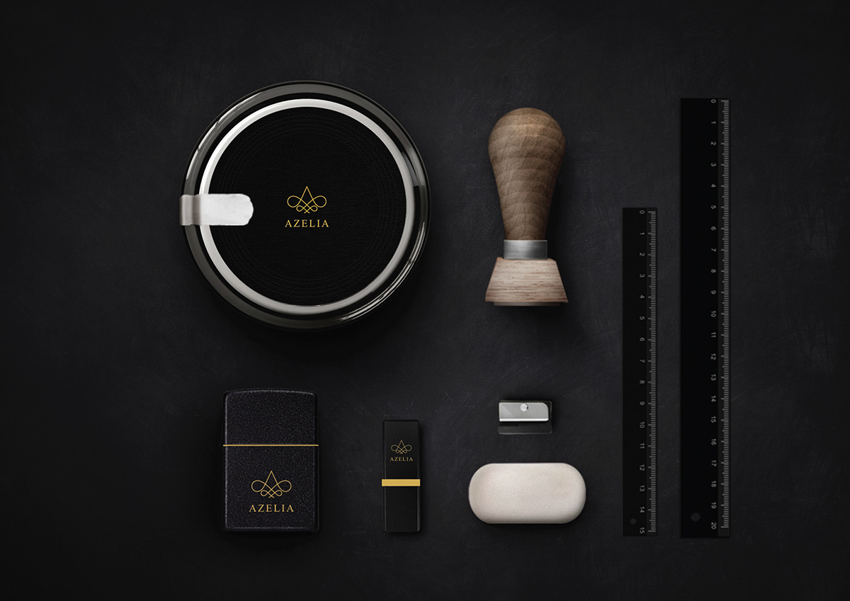
Client - AZELIA
Agency - Banana Brandworks
Graphic Designer - Sudharsan Veera
Copywriter - Suraj Sethu
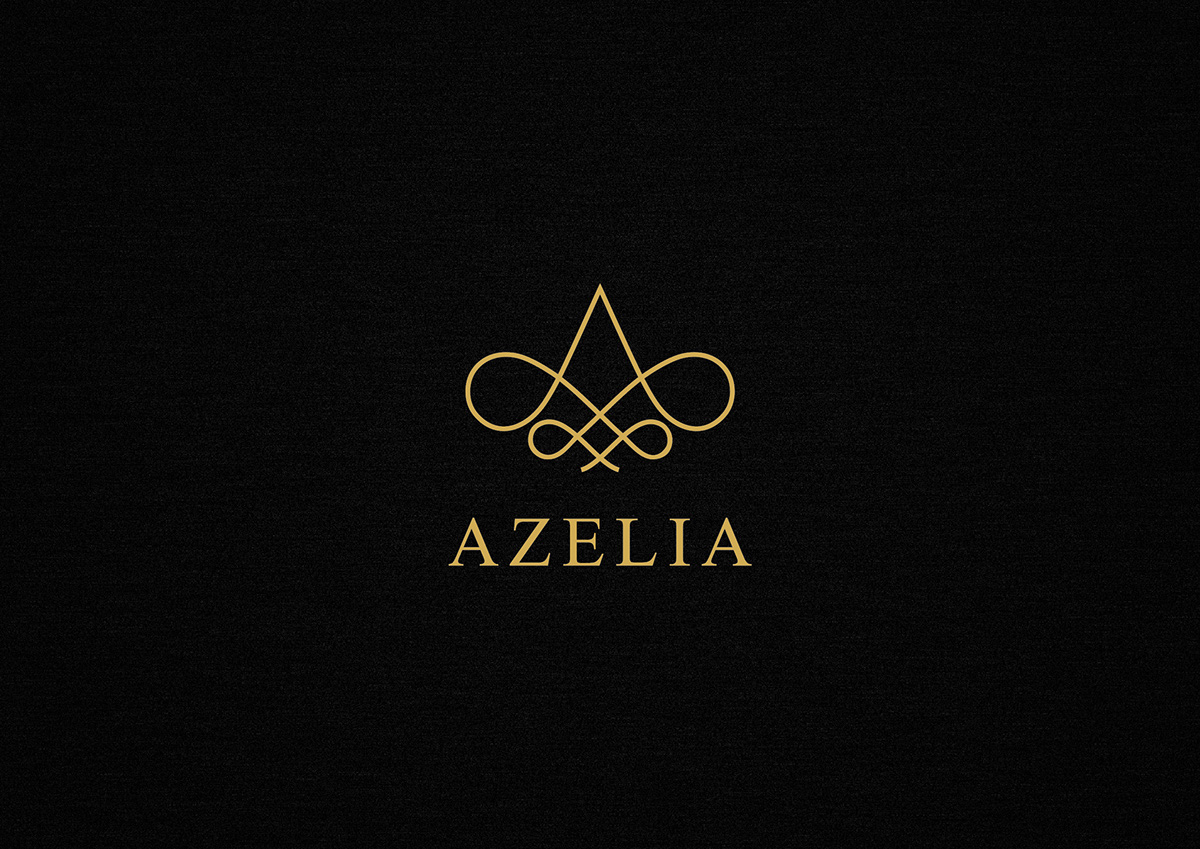
Azelia is a three star business hotel.
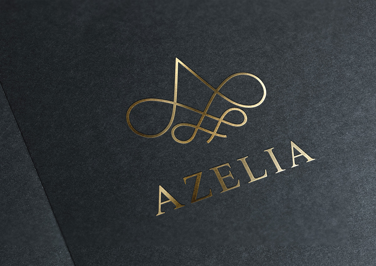
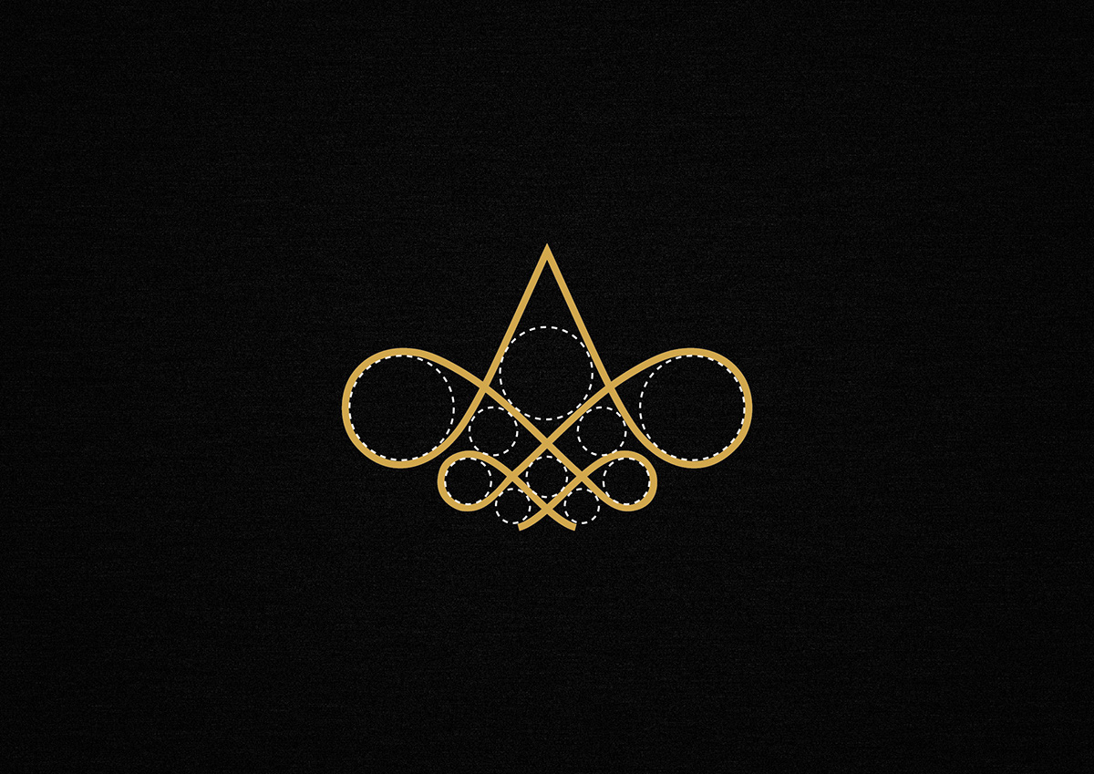
Logo Description : The logo emulates certain structural properties of the flower, such as the reappearance of certain patterns, in the arrangement of the petals in concentric inner/outer circles. The logo shows this progression with circular elements on both sides. The apex of the logo represents the pollen stalks. The logo also maintains the structure of alphabet ‘A’, which is the beginning of Azelia. The curves give the identity elegance and style.

Inspiration
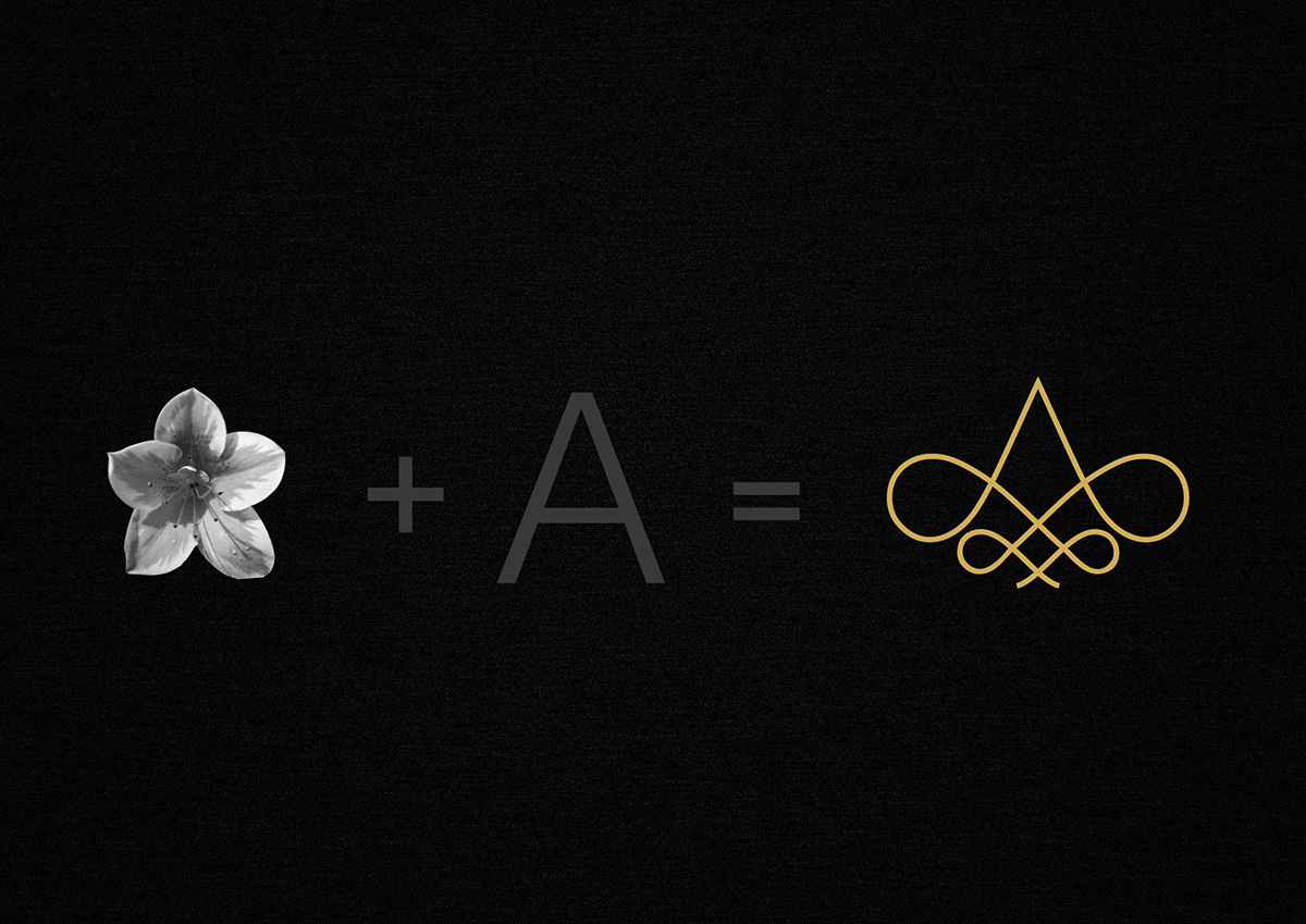
Logo Formation
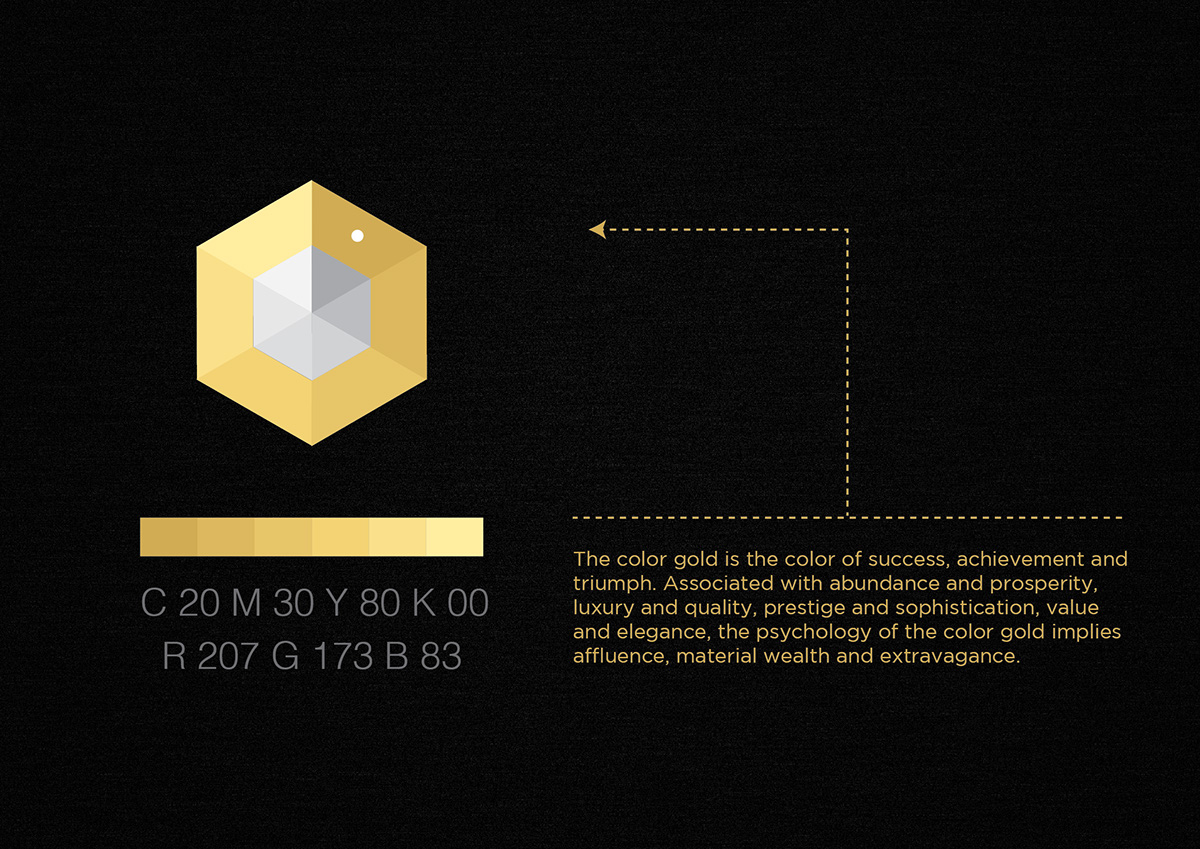
Color
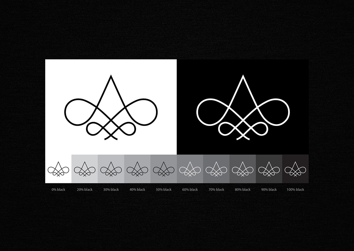
Reverse
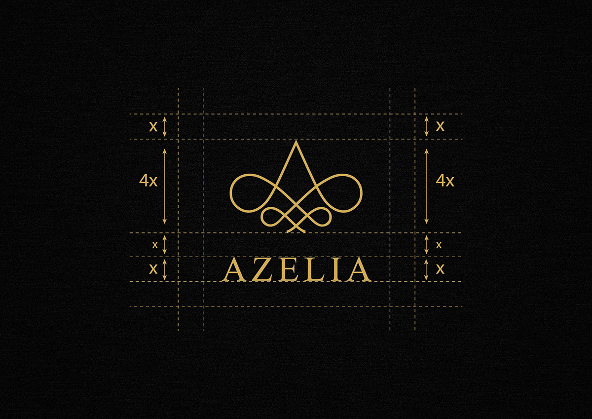
Exclusiion Zones
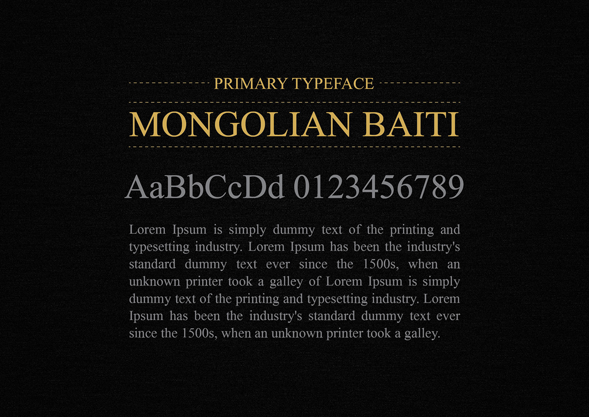
Primary Typeface
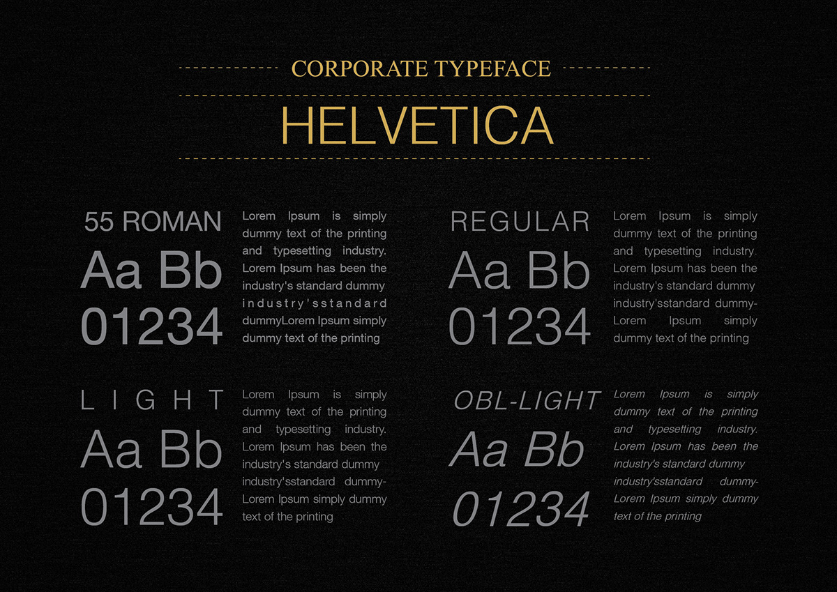
Secondary Typeface

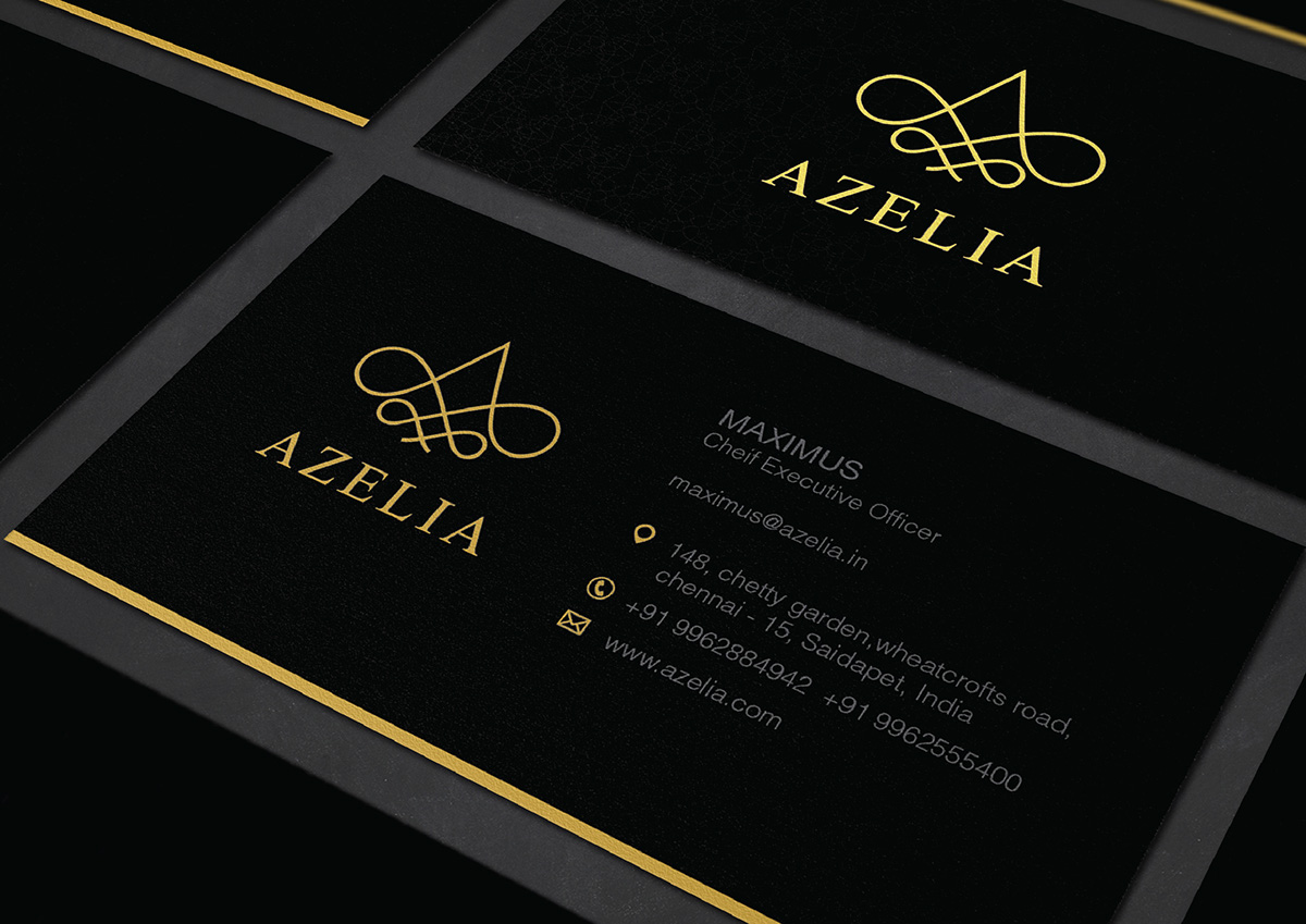
Business Card
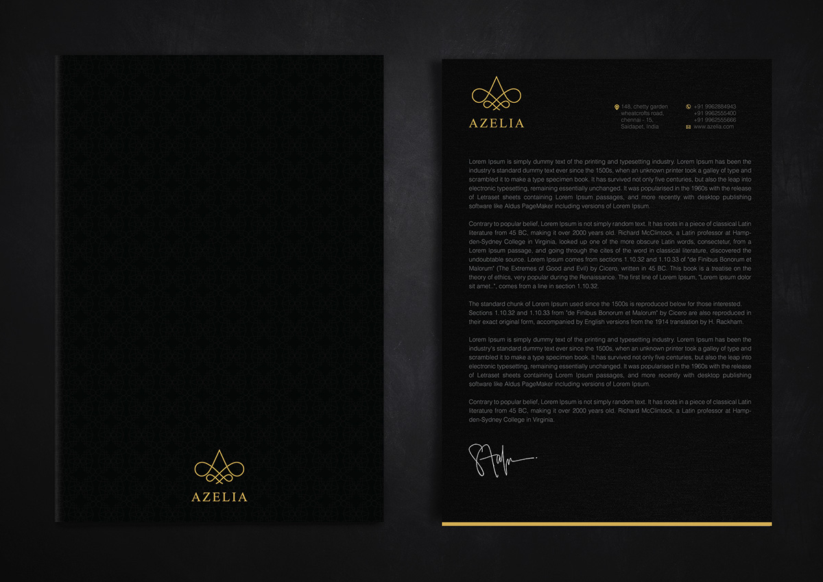
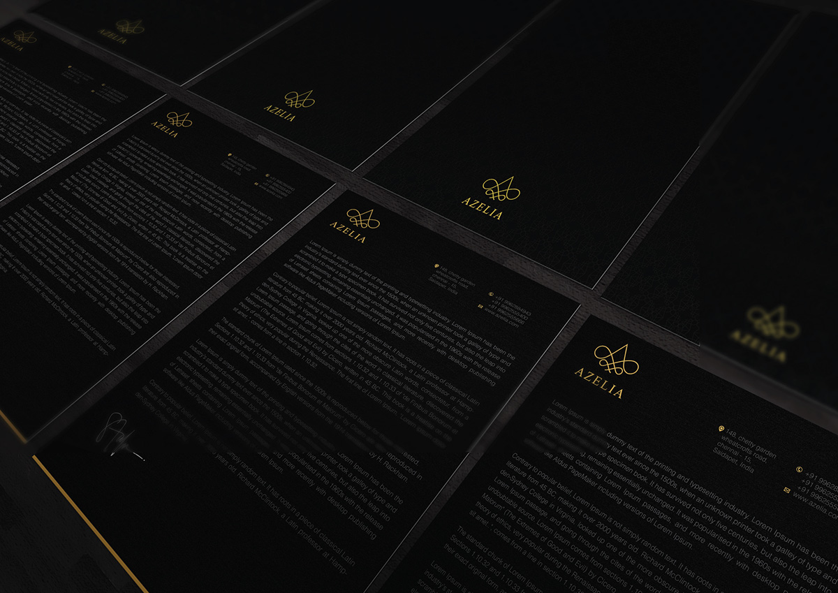
Letter Head
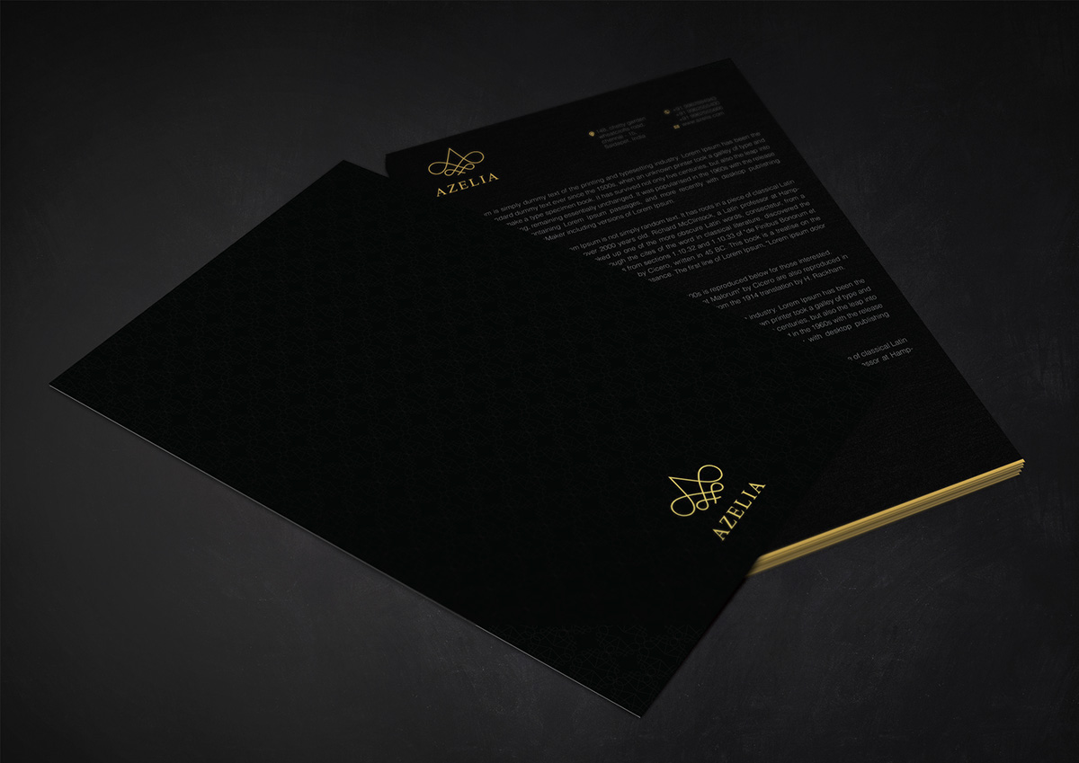

Envelope