


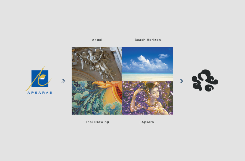
The logo development has to based on some elements from the previous one. Client wants to keep the angel with a little touch of Thai. The final result of the angel symbol was developed by Wiroon Panyalikhit. She combined the idea of instead of showing angel into create a negative space silhouette of angel by three clouds. The posture of an angel is a mixture of the western angel and a Thai dancing. Three clouds each represent different factors of the beach. The one on top is the sky, the bottom left is the water, and the bottom right is the sand.

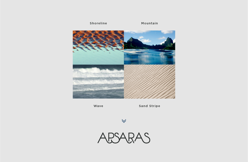
The idea of creating logotype is wavy lines of the sea. The shoreline, mountain, wave, and sand stripe. All of these lines connected together and create seascape that is where my inspiration for the logotype came from.


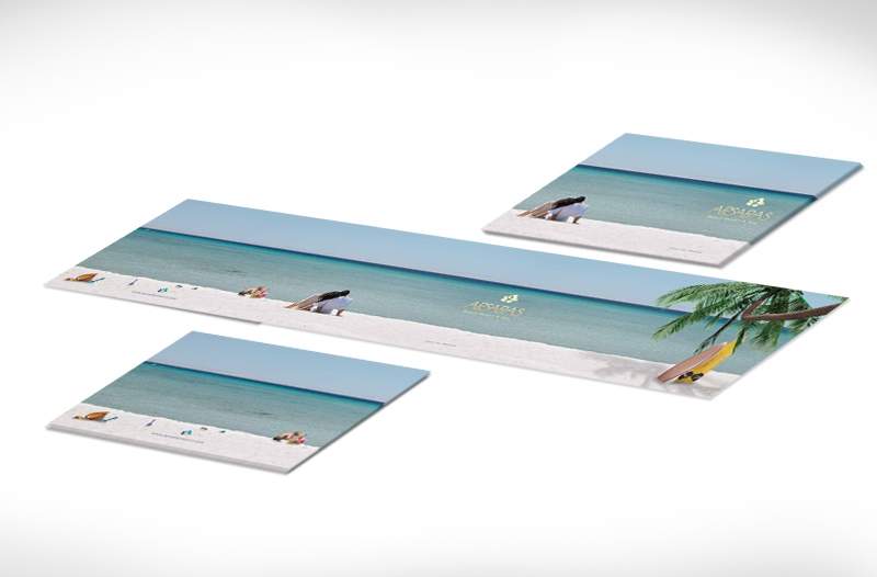
The idea for the Apsaras' brochure is to show the breathtaking panoramic view of the beachfront. So I put the view on the cover and make it one panoramic images and connects from the back cover to the front and the wing. The water colour style of painting has been also used inside to create a human touch and playful feelings.


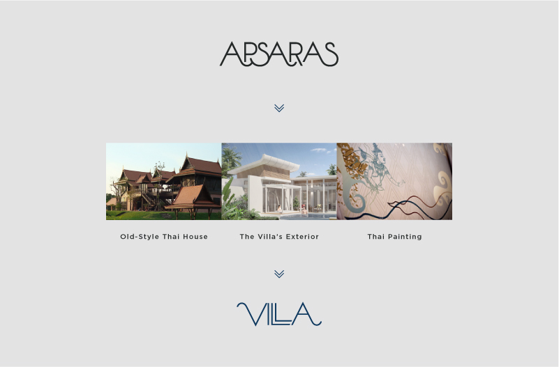
The Villa Apsaras logo was develop alongside with the Apsaras logo. The idea is to make it links to the Apsaras' logotype with some elements to link it with the Villa's identity itself. So I did combined inspirations from old-style thai house, the villa's roof, and Thai painting style into it.

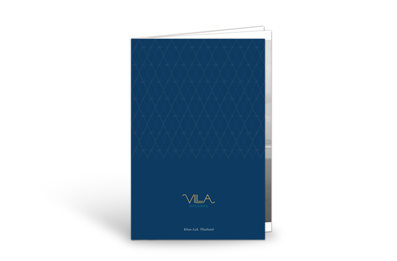


For Villa Apsaras, the idea for the brochure is to make a brochure that handy to carry but also has a little more function than being just a brochure since this is an upscale area of the resort. So I think the photo should looks more artistic than the ones in Apsaras. The right wing of the brochure could also be tear off as a postcard.


