Amsterdam 2016 | Branding
[Fictional Olympic Games Student Project]
Basic Keywords: Unity, Tradition, Simplicity, Clarity
The Netherlands is a small country with some 15 million inhabitants. It is flat, and has no geographical particularities. It is situated on the western border of Germany, the north of France and Belgium, and the east of England across the North Sea. As a comparatively small country, the Dutch people have always felt the influence of surrounding countries. If they attempted to be a part of international styles, they risked dissolving the national characteristics of the small nation. On the other hand, if they tried to stay untouched by foreign influence and keep to themselves, they could easily fall into provincialism. However, they have succeeded in creating one of the most remarkable and outstanding cultures.
While most of Europe accepted “Art Nouveau” as the “last international-spread art movement” that influenced architecture, craft, and fine arts, the Dutch rejected Art Nouveau as frivolous. Dutch artists considered themselves pragmatic and realistic. Thus, they rather turned themselves towards conventional realism that later evolved into abstraction.
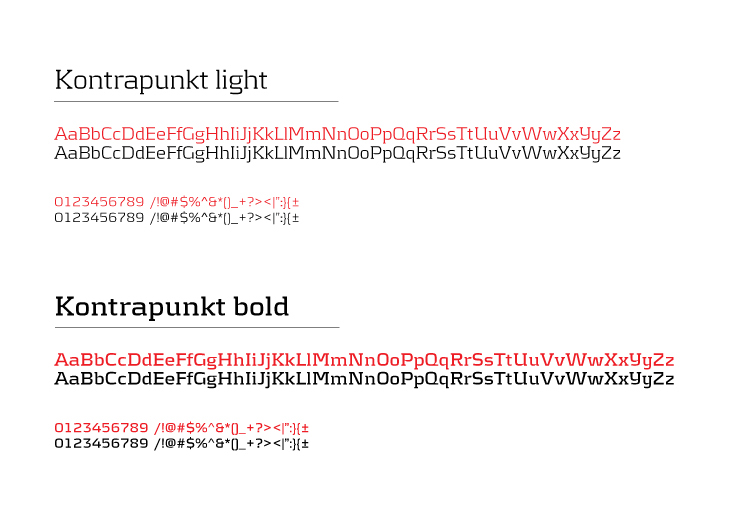
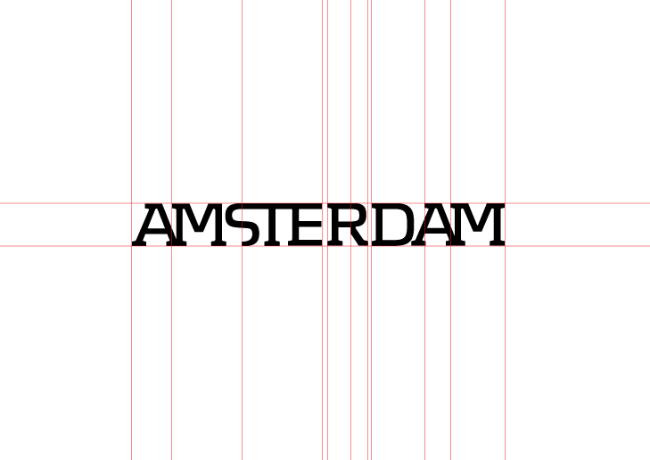
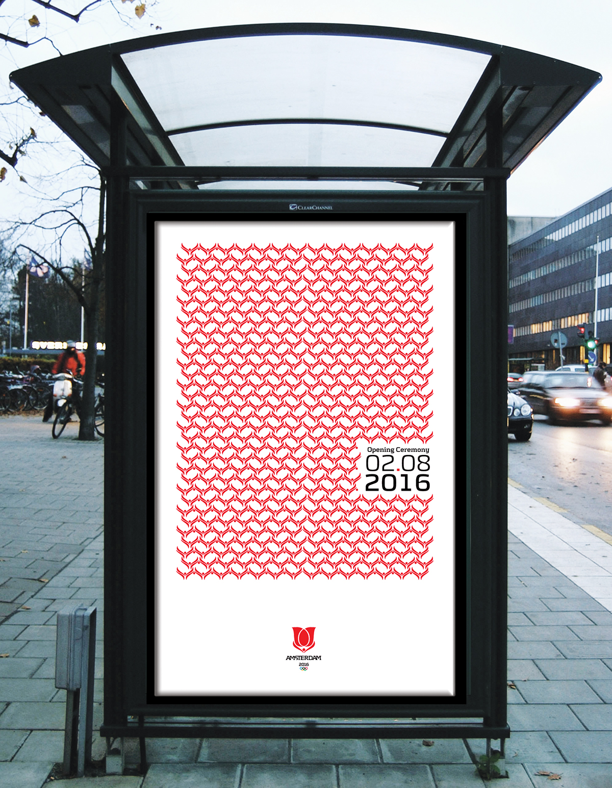
All Dutch designs have a vertical oval as one of their basic shapes.The structure is always clearly visible in the work of Dutch designers. The Dutch are more concerned with the structure, the basic shape.
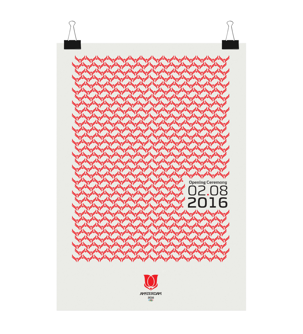
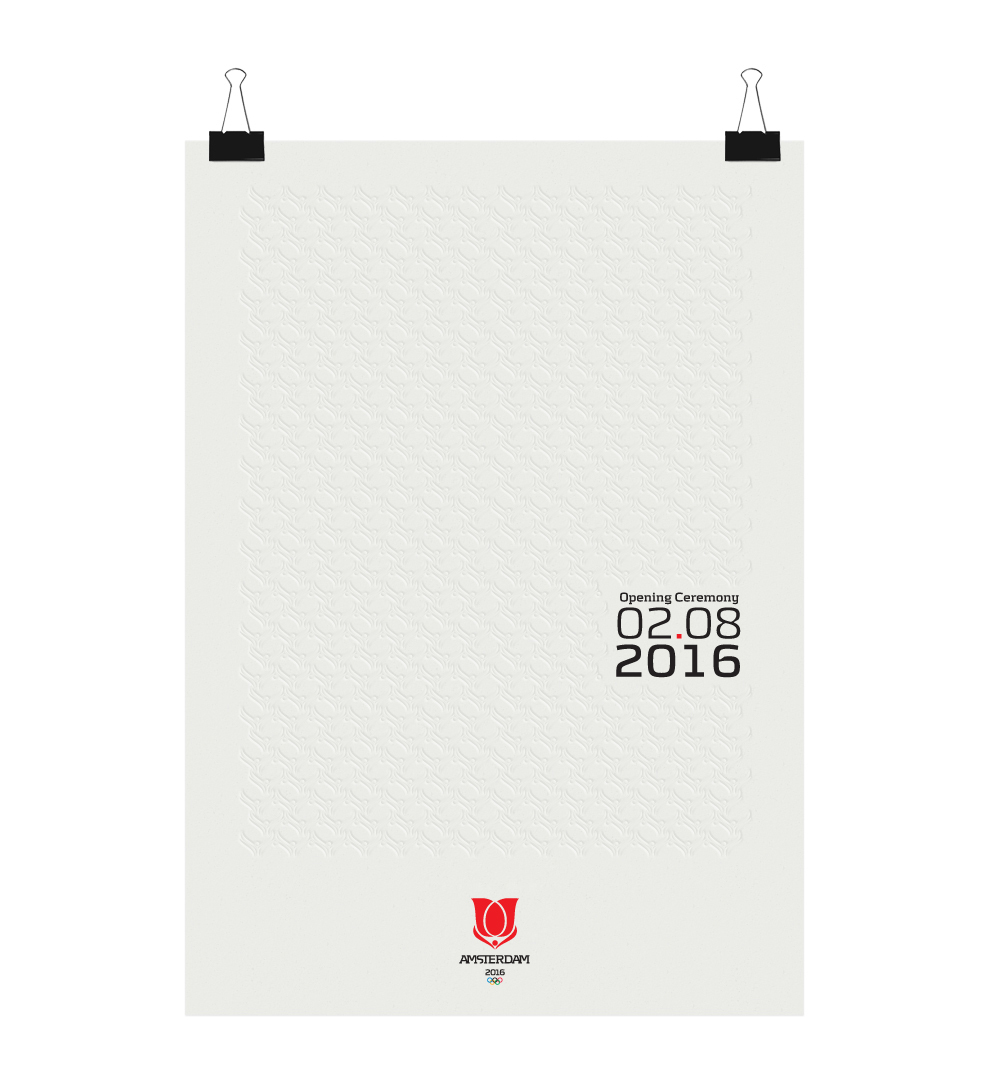
Why Red?
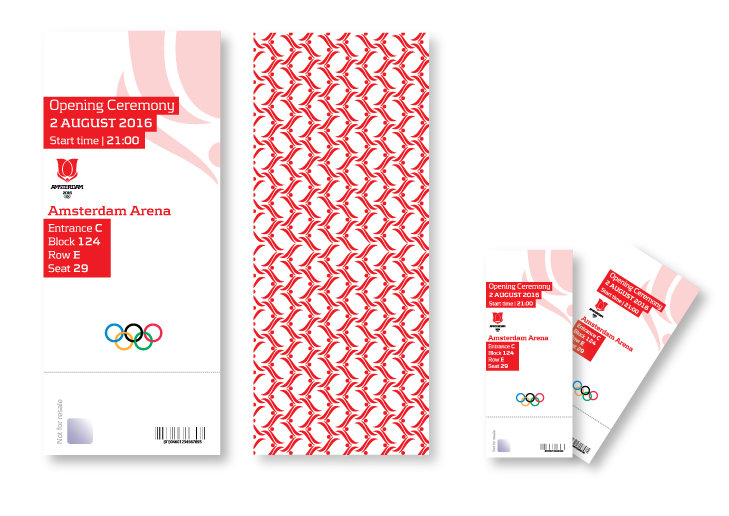
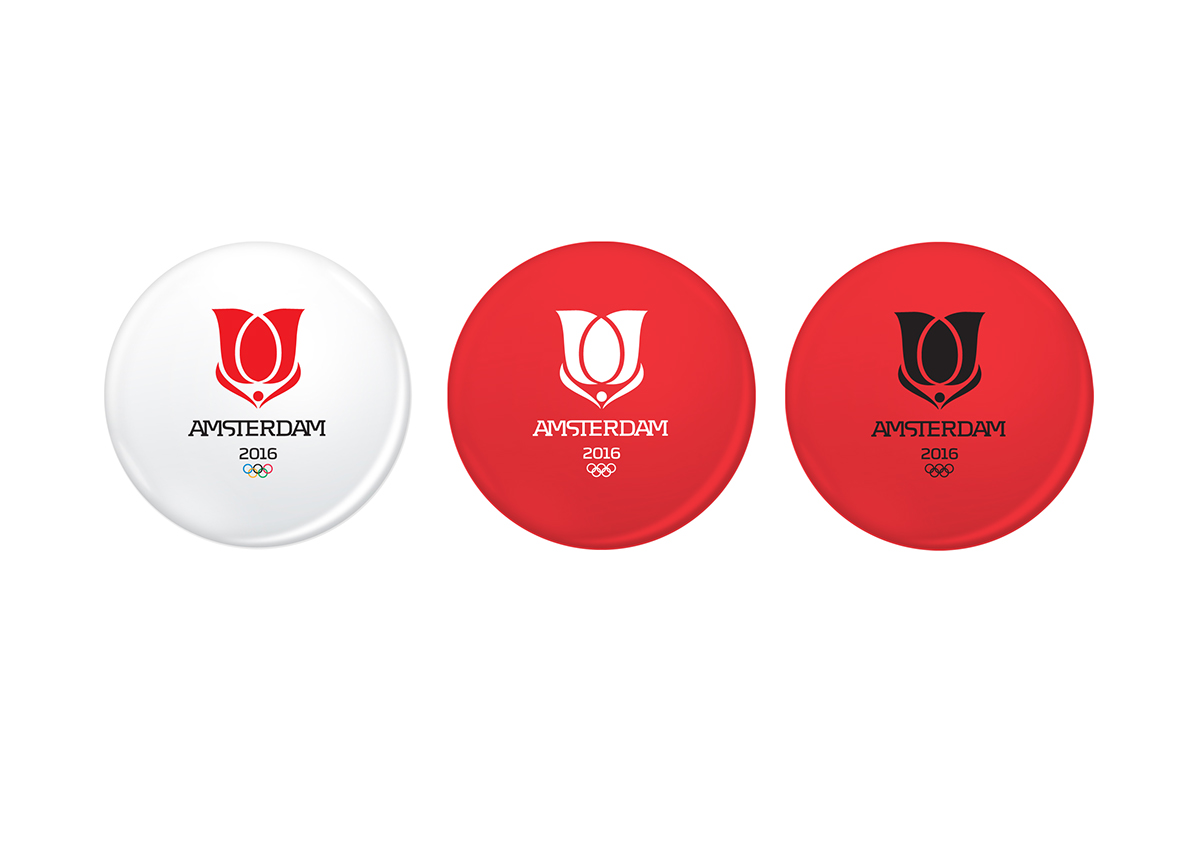
In particular the color red has been found to influence sports performance. During the 2004 Summer Olympics the competitors in boxing, taekwondo, freestyle wrestling, and Greco-Roman wrestling were randomly given blue or red uniforms. A later study found that those wearing red won 55% of all the bouts which was a statistically significant increase over the expected 50%. The colors affected bouts where the competitors were closely matched in ability, where those wearing red won 60% of the bouts, but not bouts between more unevenly matched competitors. In England, since WWII, teams wearing red uniforms have averaged higher league positions and have had more league winners than teams using other colors. In cities with more than one team, the teams wearing red outperformed the teams wearing other colors. A study of the UEFA Euro 2004 found similar results.Videos of taekwondo bouts were manipulated in one study so that the red and blue colors of the protective gears were reversed. Both the original and the manipulated videos were shown to referees. The competitors wearing red were given higher scores despite the videos otherwise being identical. A study on experienced players of first-person shooters found that those assigned to wear red instead of blue won 55% of the matches. For me everyone is a winner at Olympic Games, so I chose red color for my logo.


Subject class / Visual Communication
Bachelor of Arts Degree
Bachelor of Arts Degree
Tutor: Charis Tsevis