

Création de l’identité graphique et du packaging.
Abbas Roch est un projet personnel pour une marque de vins, plus particulièrement une cave coopérative basée dans le sud de la France. Sa production, bien que de haute qualité, souffre à la fois de la crise économique, de la baisse de la consommation de vin et de la concurrence des vins étrangers.
La marque veut se doter d’une identité complète, cohérente, dynamique et innovante, offrant une forte identification parmi les autres produits du marché. Elle cherche à se doter d’une communication plus agressive et moderne. Elle cible les consommateurs plus jeunes et actifs, héritiers de la tradition viticole française, mais néanmoins sensible à un renouvellement, à une modernisation de l’image qu’elle véhicule.
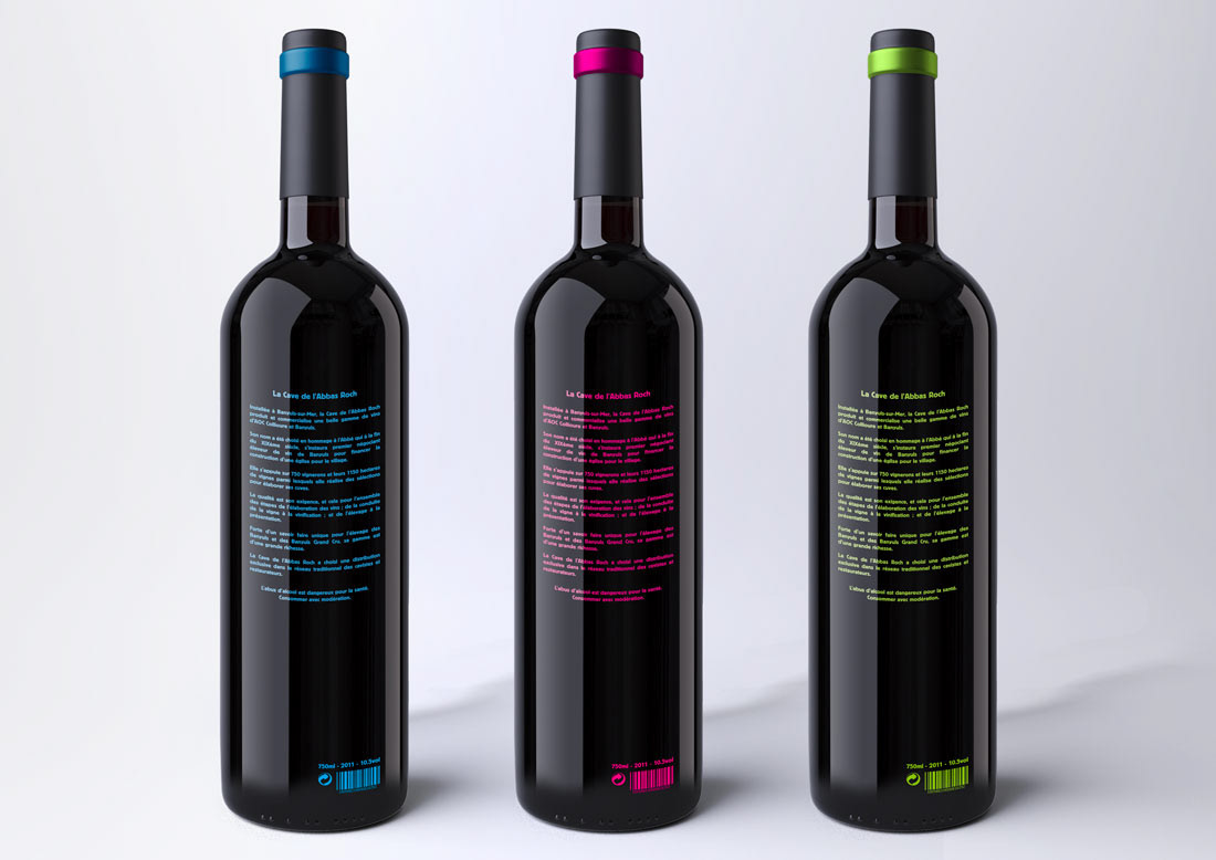
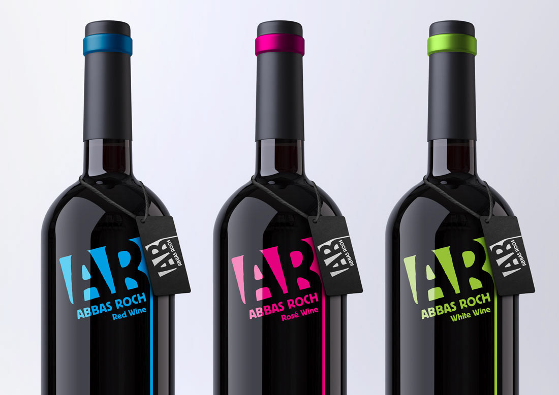
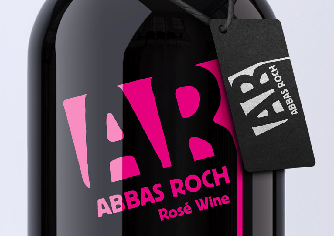
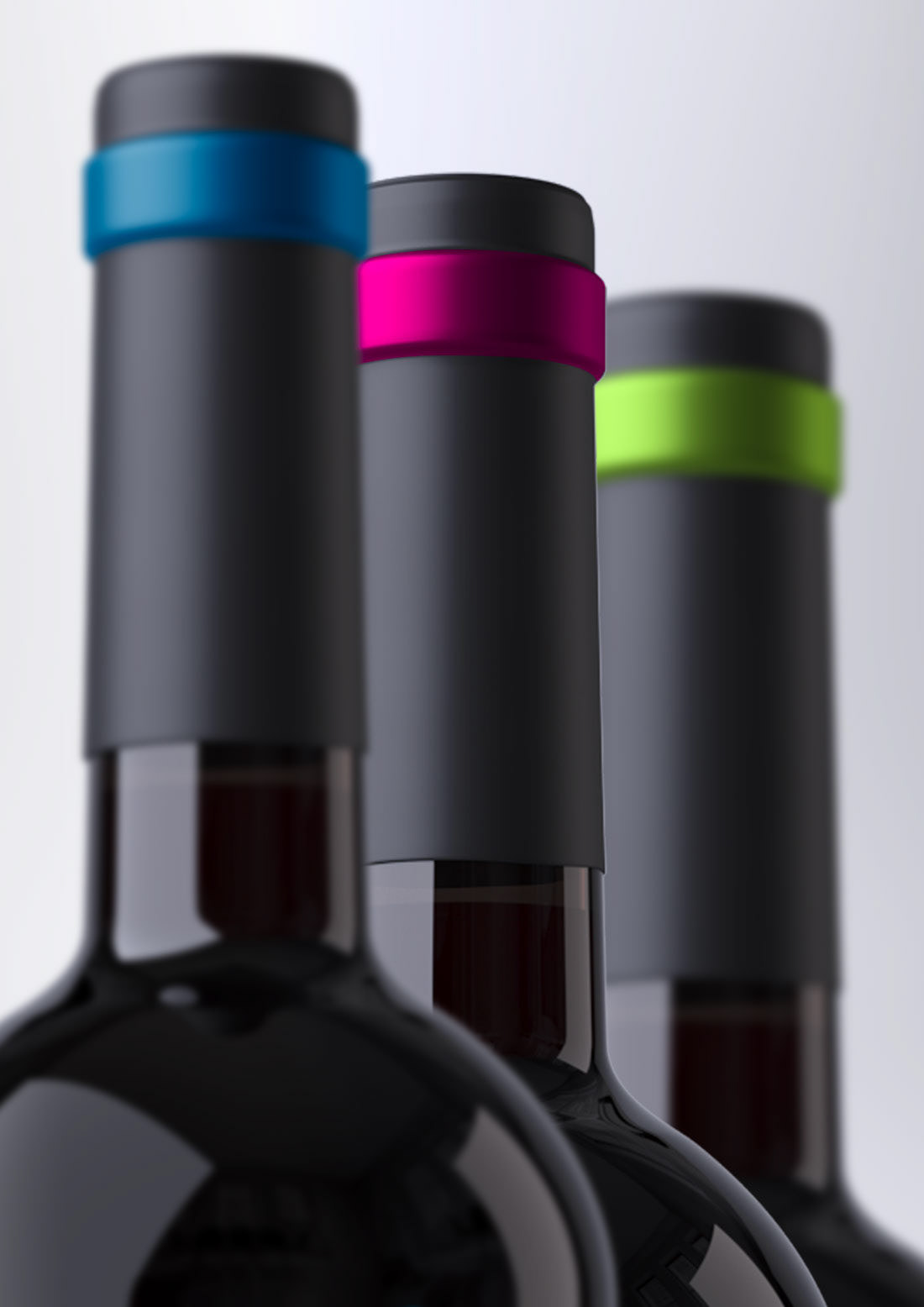
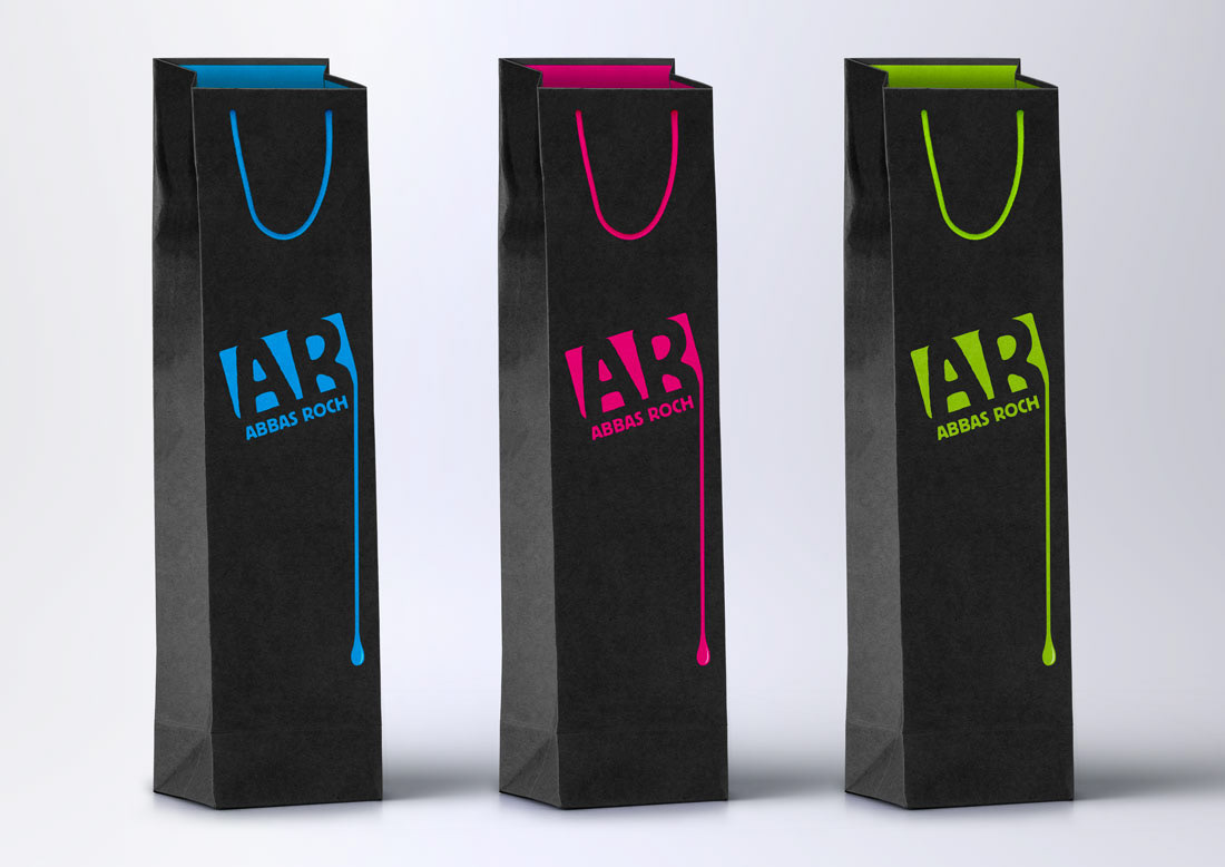
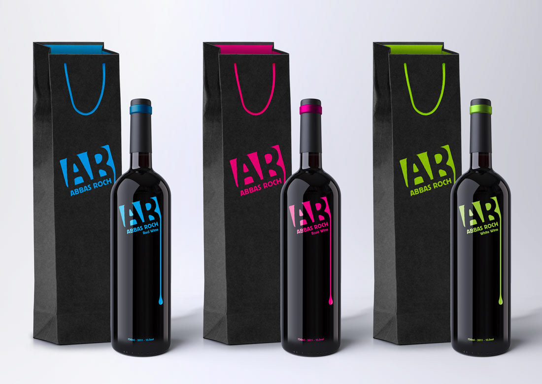
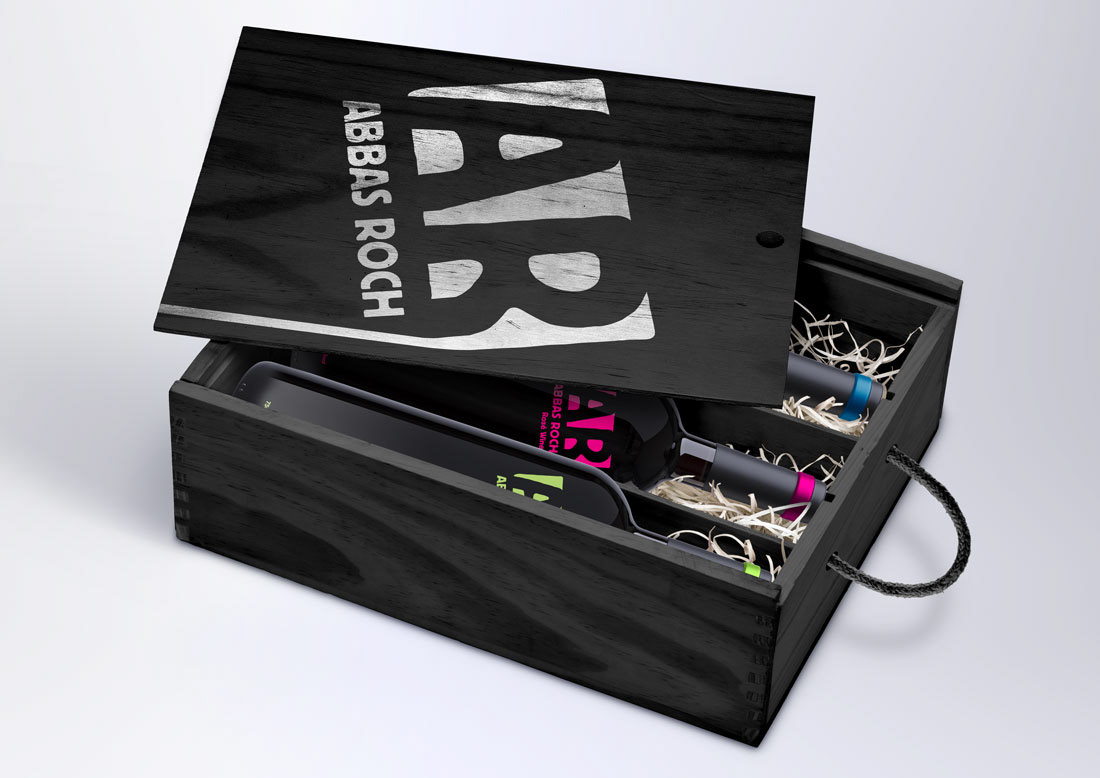
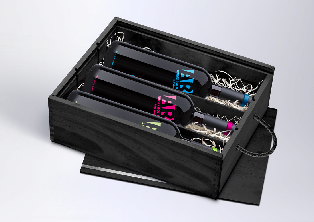
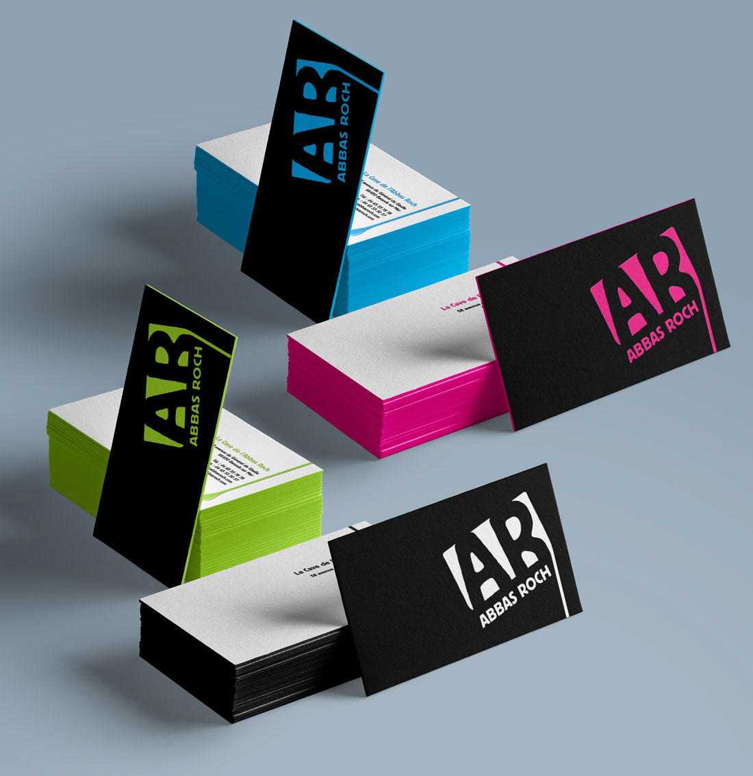
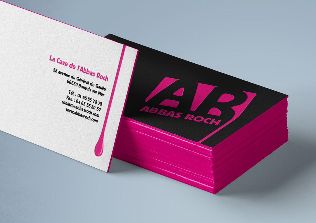
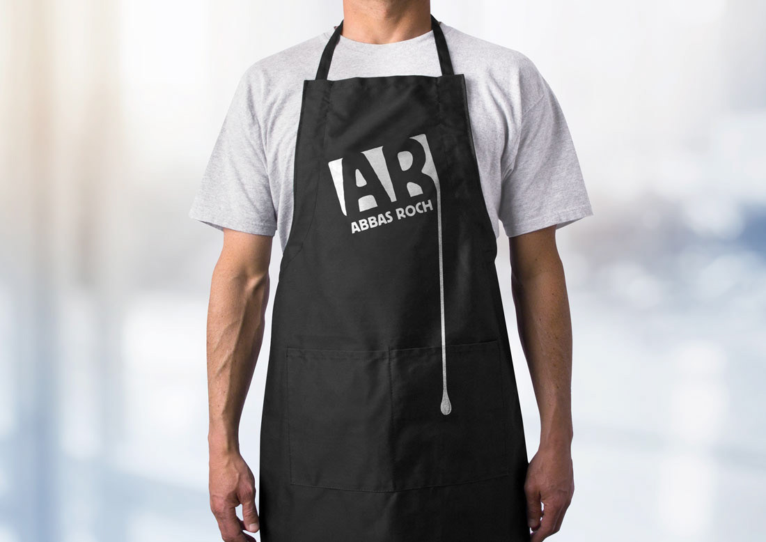
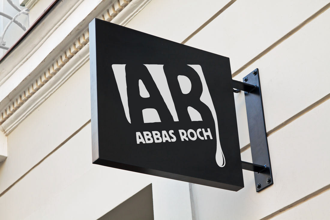
L’identité a été conçue pour séduire ce type de consommateurs et pour être visible au premier coup d’oeil dans les rayons des supermarchés. Les bouteilles se distinguent des bouteilles de vin traditionnelles qui mettent souvent en avant leur prestige par leur site de production et les noms des châteaux. Par conséquent, la marque montre un certain dynamisme par ses couleurs vives sur un fond noir. Ici, le logo suit une stratégie internationale et nous pouvons le lire plus comme une image ou un signe qui peut être reconnu sans avoir à lire le nom.
La marque veut se doter d’une identité complète, cohérente, dynamique et innovante, offrant une forte identification parmi les autres produits du marché. Elle cherche à se doter d’une communication plus agressive et moderne. Elle cible les consommateurs plus jeunes et actifs, héritiers de la tradition viticole française, mais néanmoins sensible à un renouvellement, à une modernisation de l’image qu’elle véhicule.
L’identité a été conçue pour séduire ce type de consommateurs et pour être visible au premier coup d’oeil dans les rayons des supermarchés. Les bouteilles se distinguent des bouteilles de vin traditionnelles qui mettent souvent en avant leur prestige par leur site de production et les noms des châteaux. Par conséquent, la marque montre un certain dynamisme par ses couleurs vives sur un fond noir. Ici, le logo suit une stratégie internationale et nous pouvons le lire plus comme une image ou un signe qui peut être reconnu sans avoir à lire le nom.
__________________________________________________________________________________
Creation of the graphic identity and packaging.
Abbas Roch is a personal project of a wine brand, specifically a wine cooperative in the south of France. Its production, although high quality, suffers at once from the economic crisis, the decline in wine consumption and competition from foreign wines.
The brand wants to create a total identity, coherent, dynamic and innovative, offering a strong identification among other products onthe market. It wants to be part of a more aggressive communication and up to date. It targets younger and active customers, heirs of the French wine tradition, but nevertheless sensitive to a renewal, to a modernization of the image it conveys.
The identity was designed to seduce this type of customers and to be visible at first glance in the supermarket shelves. The bottles stand out from the traditional wine bottles that often put forward their point of production and a kind of prestige with the name of the castles. Therefore, the brand shows a certain dynamism by its lively colors on a black background. Here, the logo follows an international strategy and we can read it more like an image or a sign that can berecognized without having to read the name.


Gaëlle Vila


