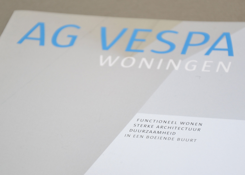
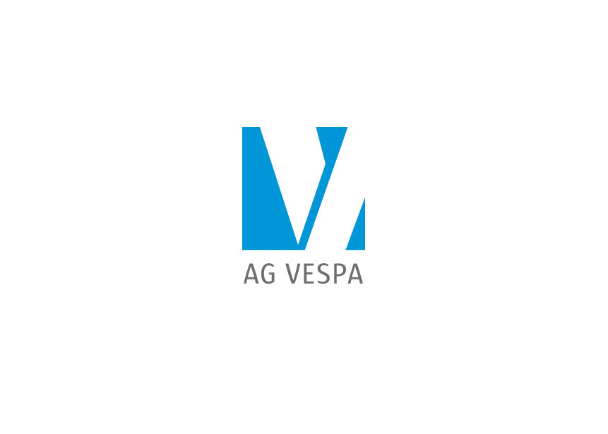
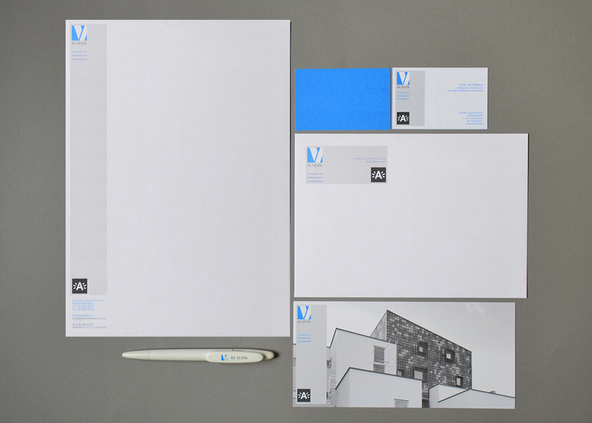
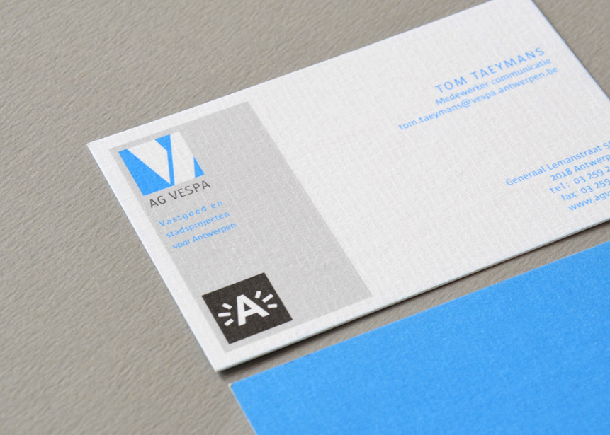
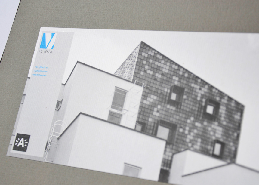
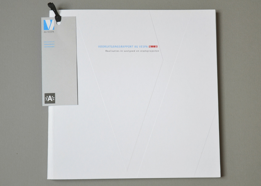
AG VESPA // Corporate Identity
AG VESPA is the real estate company of the city of Antwerp, Belgium. It operates autonomously but at the same time loyal to the urban policy of the city.
This has a big impact on the development of its identity as a company, since it has to work according to the guidelines of the city, and using the city's logo, yet it wants to retain its autonomy.
The solution lay in a simple but strong logo and a canvas where the 2 logos could coexist. By using only the colors blue and black, and inspired by the quote of Le Corbusier “Space and light and order. Those are the things that men need just as much as they need bread or a place to sleep”, I got the expected result.
CORPORATE IDENTITY
ANNUAL REPORT

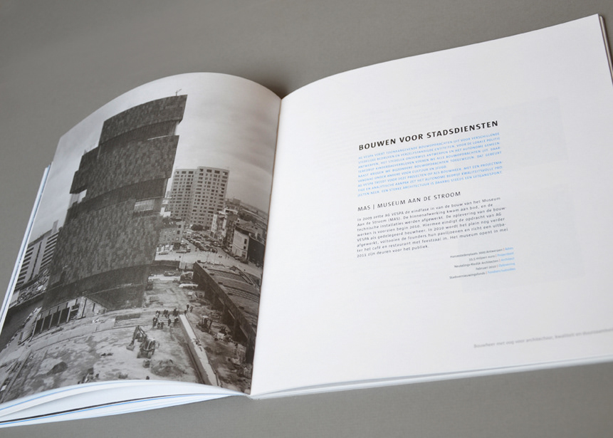
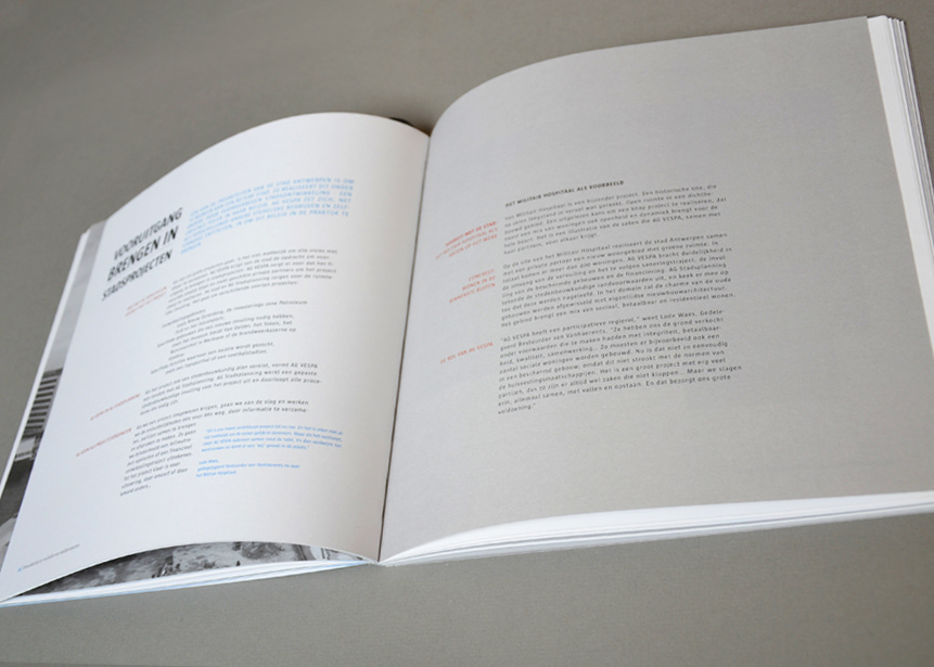
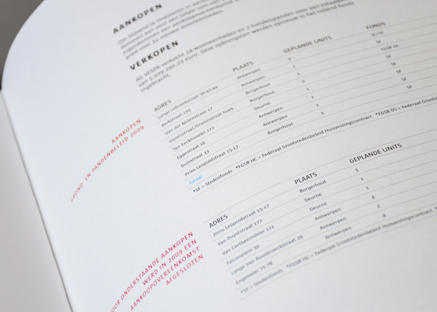

BOOKLET