


Square One District
Client
Oxford Properties
Oxford Properties
Discipline
Master Planned Community
Master Planned Community
Location
Mississauga, Ontario
Mississauga, Ontario
Architect
Hariri Pontarini Architects
Hariri Pontarini Architects

Oxford Properties came to Vanderbrand with a project that would set a record for the most significant mixed-use development in Canadian history, spanning 130 acres. Square One District will repurpose and transform downtown Mississauga with 37 new towers comprising over 18,000 new residences and class A office buildings, anchored by Square One Shopping Centre. The future Hurontario LRT stop at Mississauga City Centre will provide connections to thousands of commuters travelling back and forth from downtown Toronto.
As a response to a project of this scale, Vanderbrand designed a place brand and launch campaign for Square One District that would communicate Oxford’s vision and commitment to stimulate economic development in downtown Mississauga. Square One District is made possible by redeveloping the under-utilized parking lots, as well as low-density developments, which surround Square One Shopping Centre, resulting in a modern, metropolitan area.

The place brand created by Vanderbrand needed to establish a profile for the new development, while being sensitive towards the local community and its rich history. The next step for Canada’s sixth-largest city was to turn downtown Mississauga into a vibrant, walkable area where people could achieve a work, life balance. Square One Shopping Centre has been Canada’s premier destination for retail, lifestyle, and entertainment for over 47 years, and as a result, the new precinct was named Square One District.


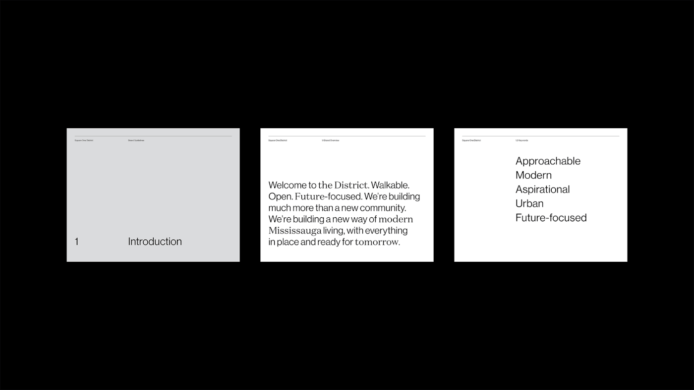
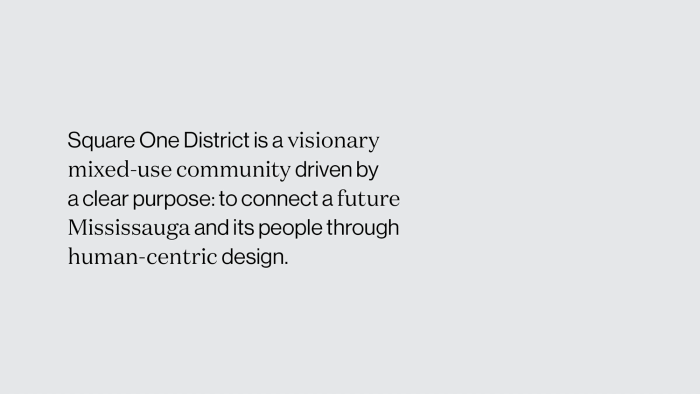
Square One District is a multi-phase, multi-decade project. With the future Hurontario LRT steadily approaching, the master plan community creates a foundation of an enlivened streetscape and encourages an urban lifestyle. The vision for the mixed-use development demanded a strong, concise, thematic framework. Vanderbrand’s campaign for the precinct connects a future Mississauga and its people through human-centric design and messaging. The narrative concept is underlined with notions of aspiration, innovation, and above all, connection – between people, and between places.
The new identity and graphic program are an important part of the strategy for Square One District. It allows for flexibility across spatial and digital communications, while still feeling inclusive to all arms of the mixed-use development spanning offices, condominiums, retail, and public spaces.


The brand mark for Square One District is set in a clean and modern typeface. This typeface was selected not only for longevity, but for the cohesion it brings to a brand designed for the future. The versatility of the primary typeface complements the atypical typographic system where serif and sans serif typefaces are used in combination to bring vibrancy and optimism to the messaging used for promotional communications.
As part of the graphic language for the Square One District launch campaign, the use of electric purple activates the brand strategy and embodies Oxford’s bold promise for change in downtown Mississauga. As Square One District moves into the different phases of development, the colour story can evolve and reinvigorate the community with renewed energy with diverse, vibrant hues.


The brand program developed for Square One District anticipates the major transformation this community is about to undergo. Vanderbrand crafted a system that can expand and evolve, while amplifying a confident, yet approachable voice that serves as an expression of Oxford’s ongoing commitment to revolutionize downtown Mississauga.