


A premium investment company
Brand identity

Esterad’s rebrand process started with the understanding of the brand’s rich legacy in Bahrain as a profitable and high dividend-paying investment company. It has a long and proven track-record of secure investments regionally and internationally in a variety of assets classes including real estate, public markets and private equity.


Challenges we faced in developing a brand strategy and identity
The main challenge for Esterad’s rebrand was the lack of strategyto build upon.
Before we could show the world a ‘new Esterad’, we had to bring a brand centric approach to the project, starting with a new vision, values and proposition
for the future. That new strategy would serve as a compass on Esterad’s journey
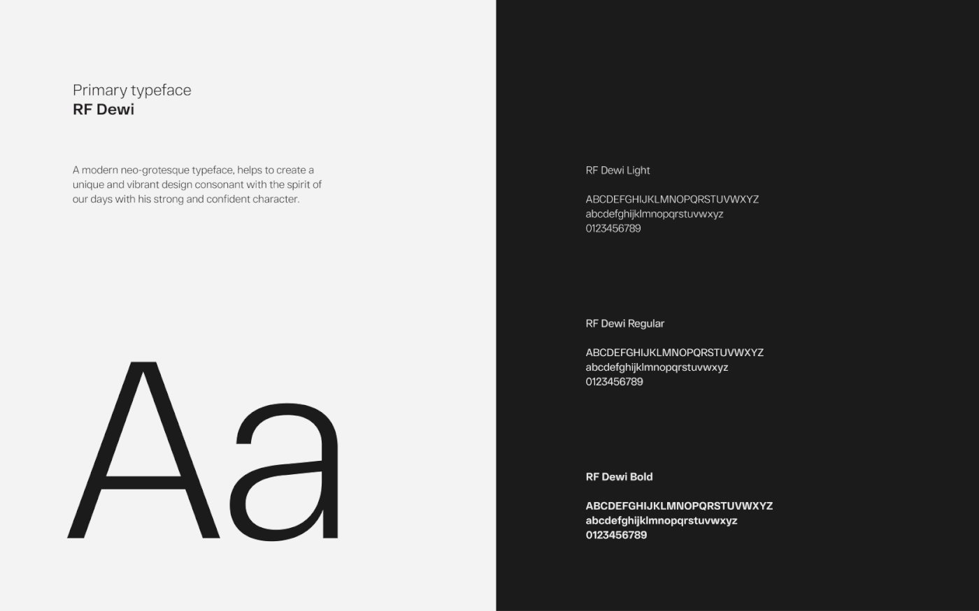
as a brand, including their identity – the colours and typeface used until then
lacked stand-out and the ‘dot-com era’ brand mark was no longer fit for a bold,
dominant, 21st century investment company.


Our strategy to bring this investment company brand back to life
We started the process with our interactive Why™ workshop –an engaging
and collaborative session, where key stakeholders participated in exercises that helped unearth the brand’s true personality. A brand strategy was
developed based on the workshop findings, which was later translated
visually into a bold, modern brand identity.
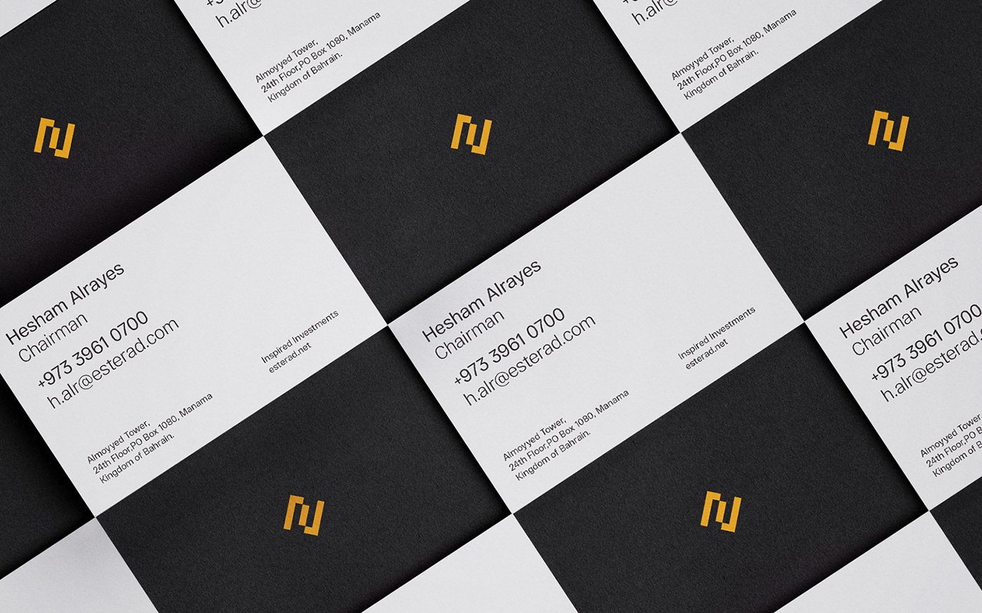
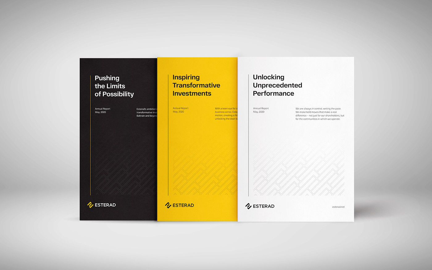
Esterad uses a dark grey and pure white colour palette, reflectingthe
Esterad uses a dark grey and pure white colour palette, reflectingthe
brand’s modern professionalism, clarity and stability; astriking yellow
accent colour represents Esterad’s confidence and high–energy
they bring to the region’s investment industry.

Results
A brand-new Esterad was unveiled to the public earlier this year as part of a multistage rollout process. We are thrilled to see this new investment company brand on its journey to seize its opportunities and take the investment market by storm once again.


