


SUZIE Architektur specialises in the execution of holistic construction projects. Bridging the gap between customers, service providers and regulators, the Viennese architecture firm delivers with enthusiasm and dedication. Reflecting on their projects and values, we collaborated with the team from SUZIE Architektur to lay the
foundation of the brand strategy.
Our objective was to align brand values to best communicate the uniqueness of the architectural office – so that they can meet the ever changing needs and demands of their creative customers.


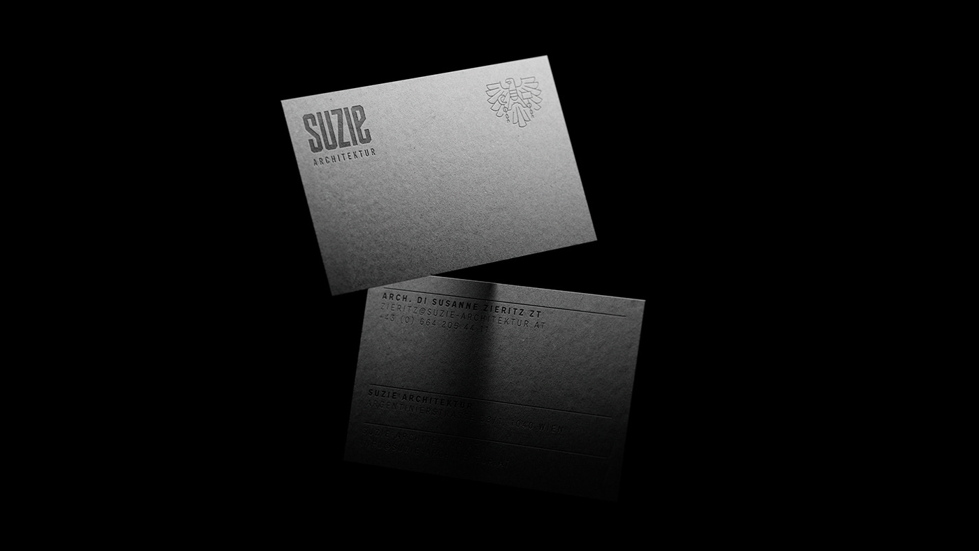
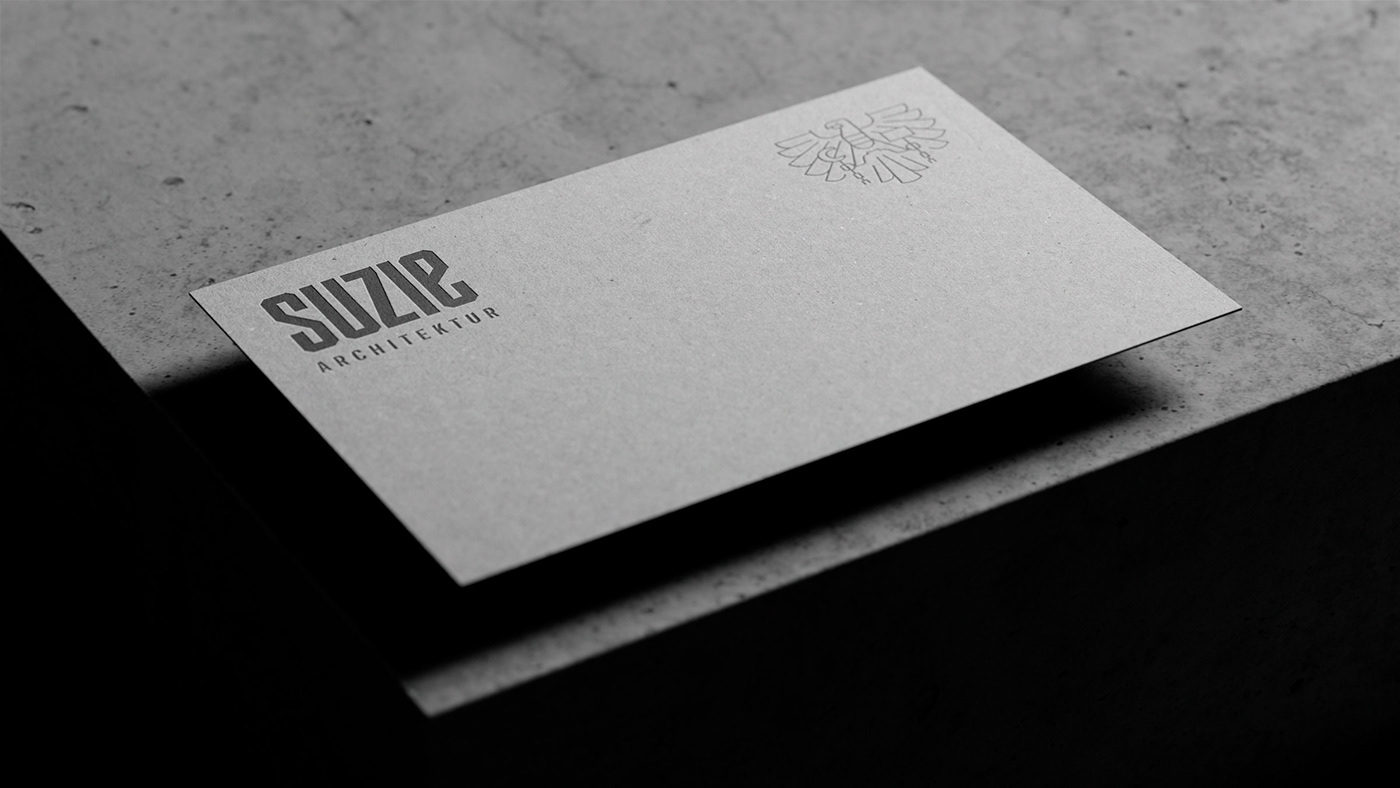
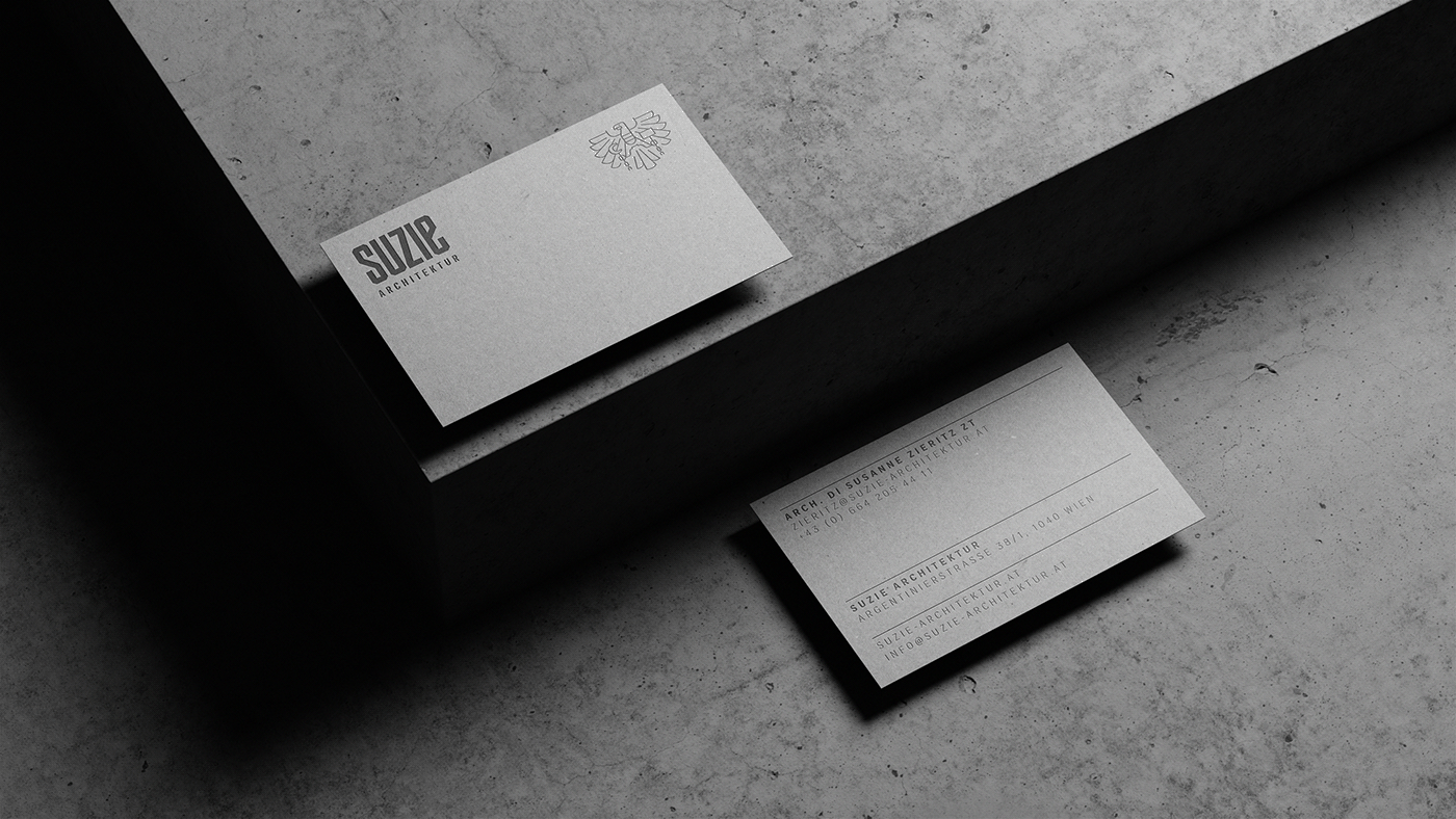
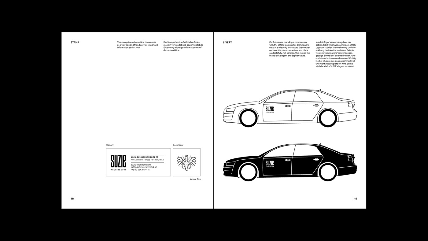
The long-established civil engineer eagle, characterises SUZIE's architectural identity – a symbol of official trade and is considered a quality standard seal. It has been redesigned for a clean, simple, contemporary look and feel to align with the rest of the visual identity.


SUZIE architecture can be experienced as a bridge between customers, service providers and regulators: a philosophy of presence from project design all the way through to final implementation on the construction site.
The flexible nature of the process and dialogue enhanced the visual description of the office. This corporate culture forms the foundation of a concept that not only remains theory, but is physically tangible.
Below: Befitting the ideals of the brand – getting hands on. We handcrafted the concrete logo personally. Creating the forms, mixing, pouring and setting the concrete. Bringing the bespoke logotype to life.
Below: Befitting the ideals of the brand – getting hands on. We handcrafted the concrete logo personally. Creating the forms, mixing, pouring and setting the concrete. Bringing the bespoke logotype to life.


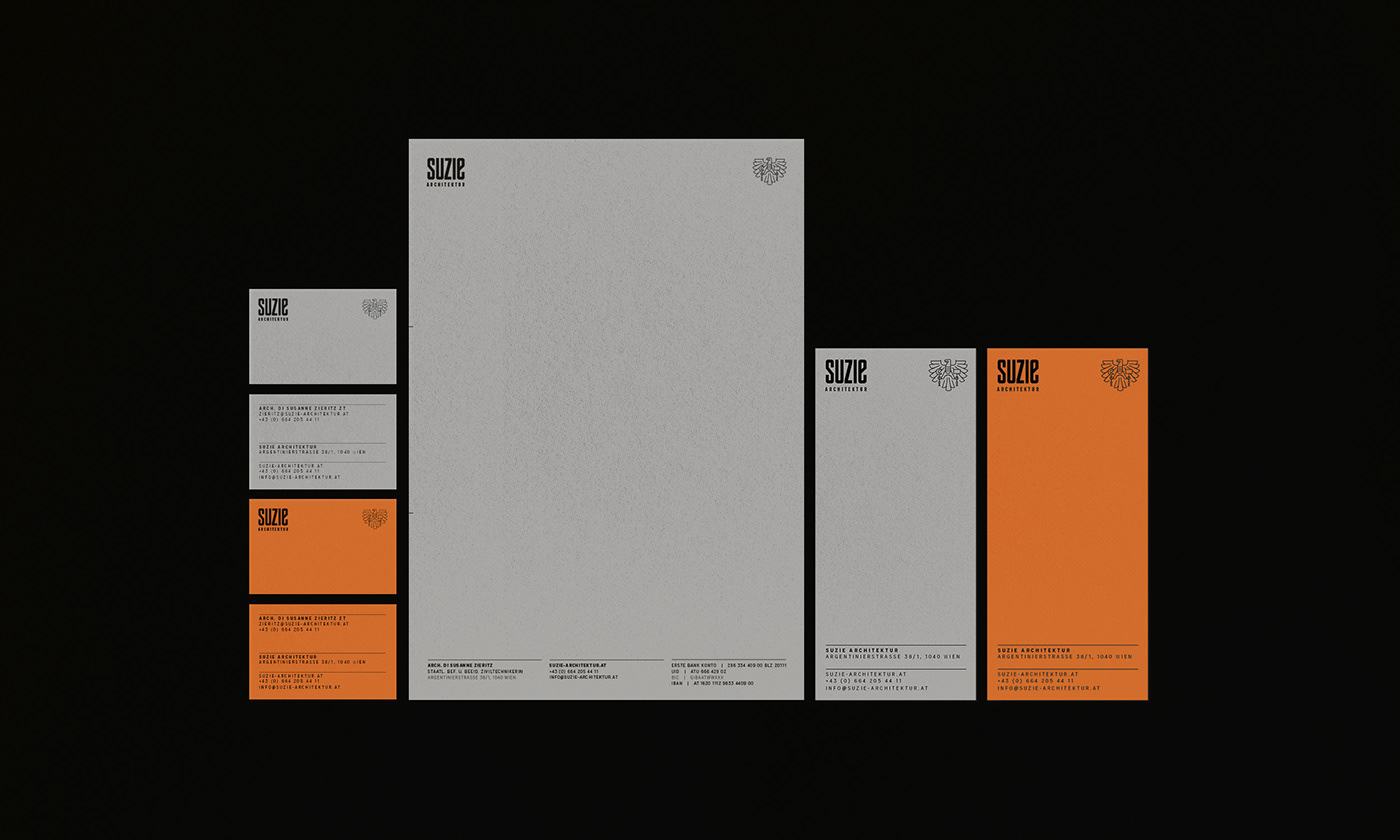
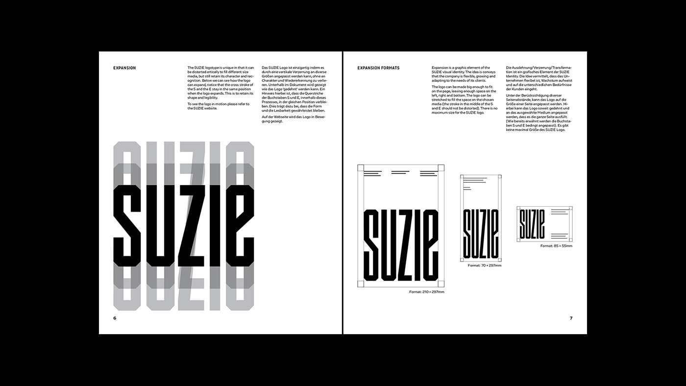
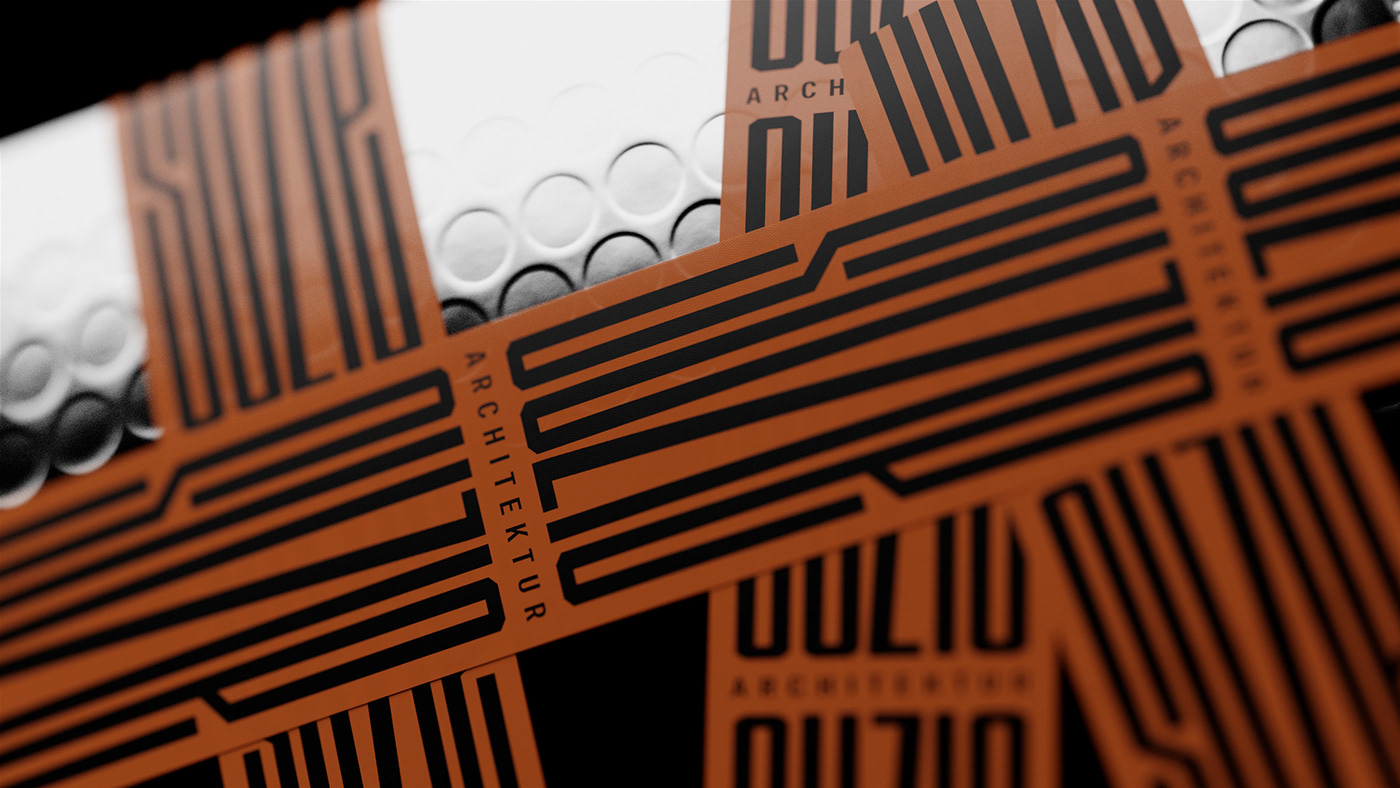
The brand system takes its cues from the bespoke logotype. It has been designed in such a way that it is variable, meaning it can stretch and grow without losing its legibility, this stretching and expanding adds to the visual character and helps to separate the SUZIE brand with its own distinct, unique voice.


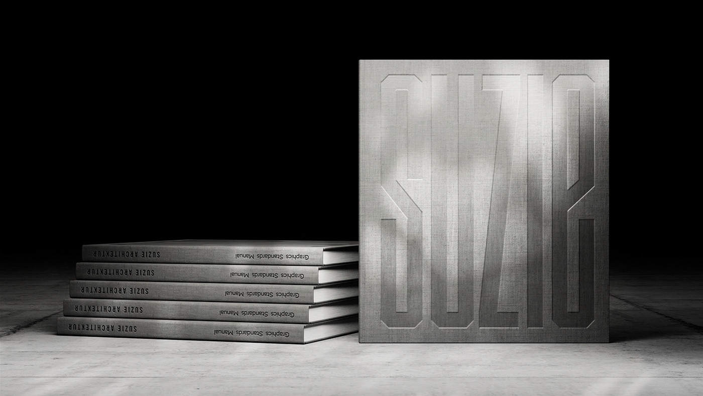
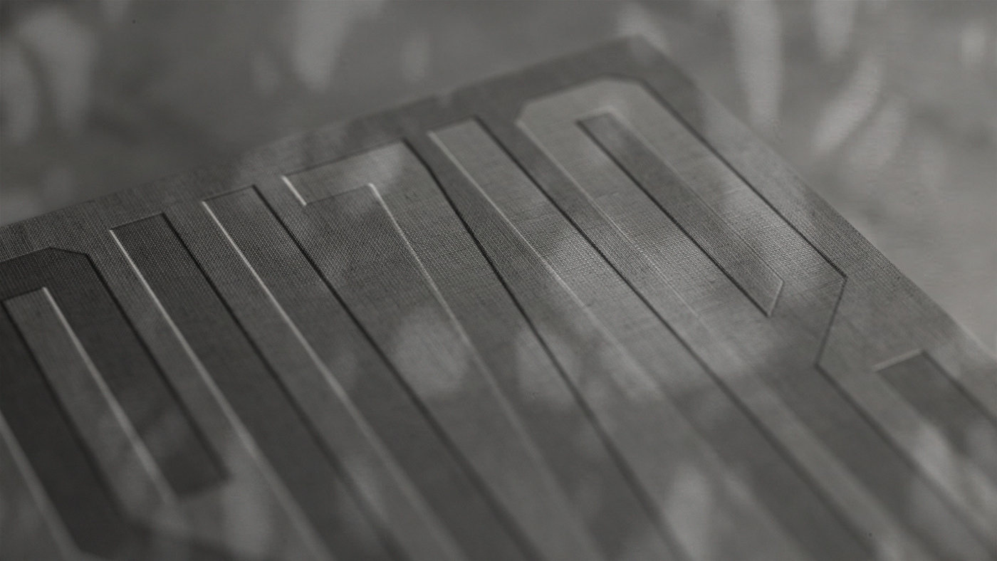
The mission of SUZIE Architektur is to deliver high-quality design and coordination throughout the process with special care going into all materials and textures. This was translated into the branding, which resulted in a careful selection of paper and printing techniques. The brand book is encased in a linen fabric stamped with a bold, blind emboss.


Creating a brand world – With its bold, graphic identity system SUZIE Architektur is positioned as a well-founded and flexible architectural firm in the Austrian capital.


Project Title: SUZIE Architektur
Description: Brand and Strategy
Year: 2017
Project team:
Project team:
Aaron Canning – Voice of concept and design
Theresa Feth – Voice of production
Laura Feth – Voice of words
Theresa Feth – Voice of production
Laura Feth – Voice of words
Kevin van Kleef – Voice of 3D visualisation
Behind the project – Aaron Matthew Canning (IRL) and Theresa Magdalena Feth (DE) currently located in Salzburg (AT). For years we have been collaborating with small companies, organisations and big businesses located nationally and internationally. We walk with our clients throughout the whole process. This close collaboration takes us right to the core of the brand strategy and narrative leading into the creation process. The process of creating exclusive brand worlds that live and breathe the unique voice of your brand – to tell the story that sets you apart.
We stay true to our belief that there is one unique way of telling your story, one that empowers and moves, where beauty and purpose are equal.


