Lettering
Given the fact that the name of the company is long, hard to pronounce and has an acronym at the end, I opted for a typeface that didn't cause any visual entropy and provided an optimal reading. It also had to be friendly, yet credible and institutional. The brandline "intellectual property knowledge" clarifies the core business.
Dado o facto de o nome da empresa ser longo, de difícil dicção e conter uma sigla, optei por um tipo de letra que não causasse entropias visuais e oferecesse uma boa leitura.
É amigável, embora credível e institucional. O brandline clarifica o core business da empresa.
É amigável, embora credível e institucional. O brandline clarifica o core business da empresa.
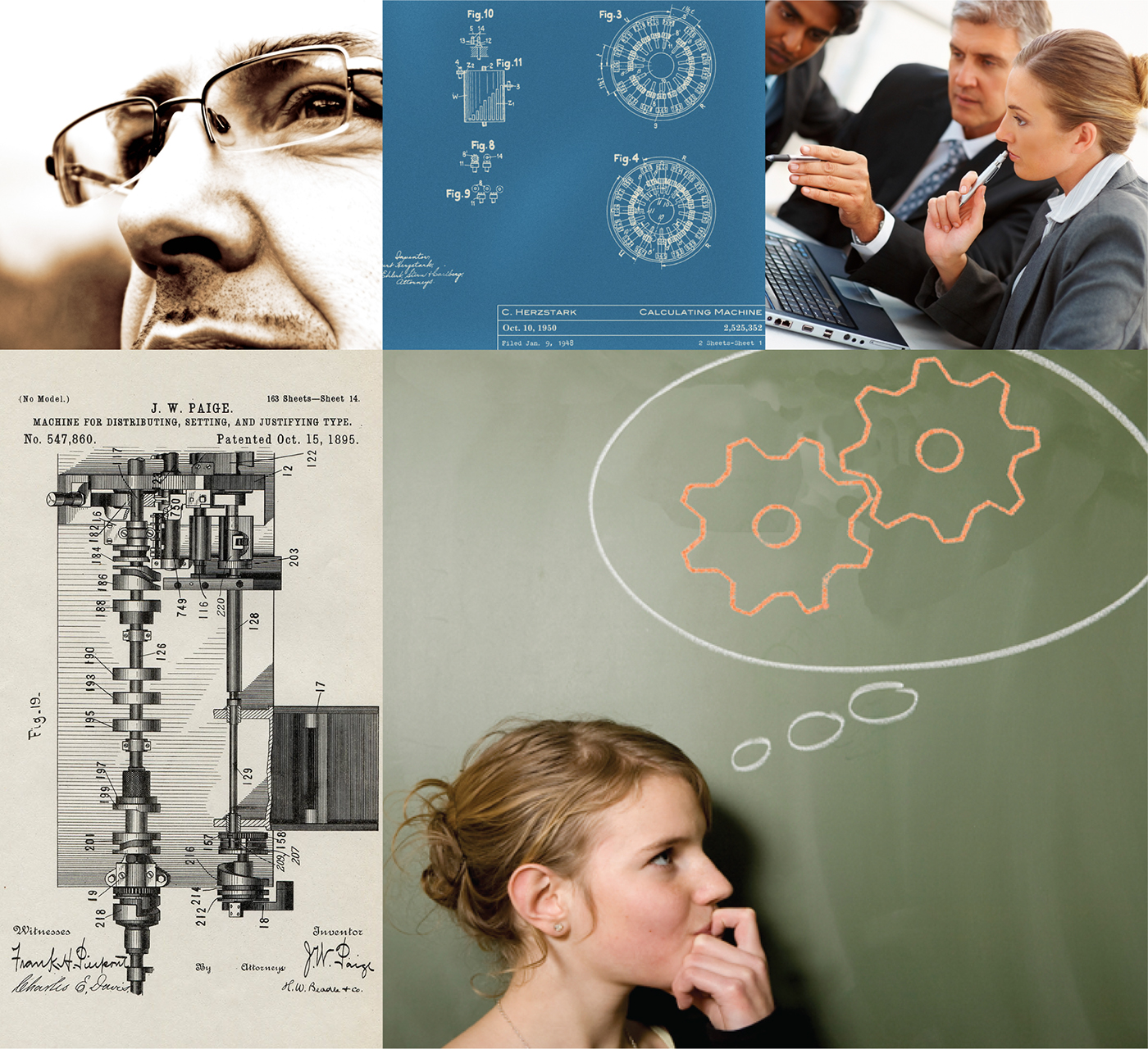
Visual inspiration // Inspiração visual

The brand // A marca
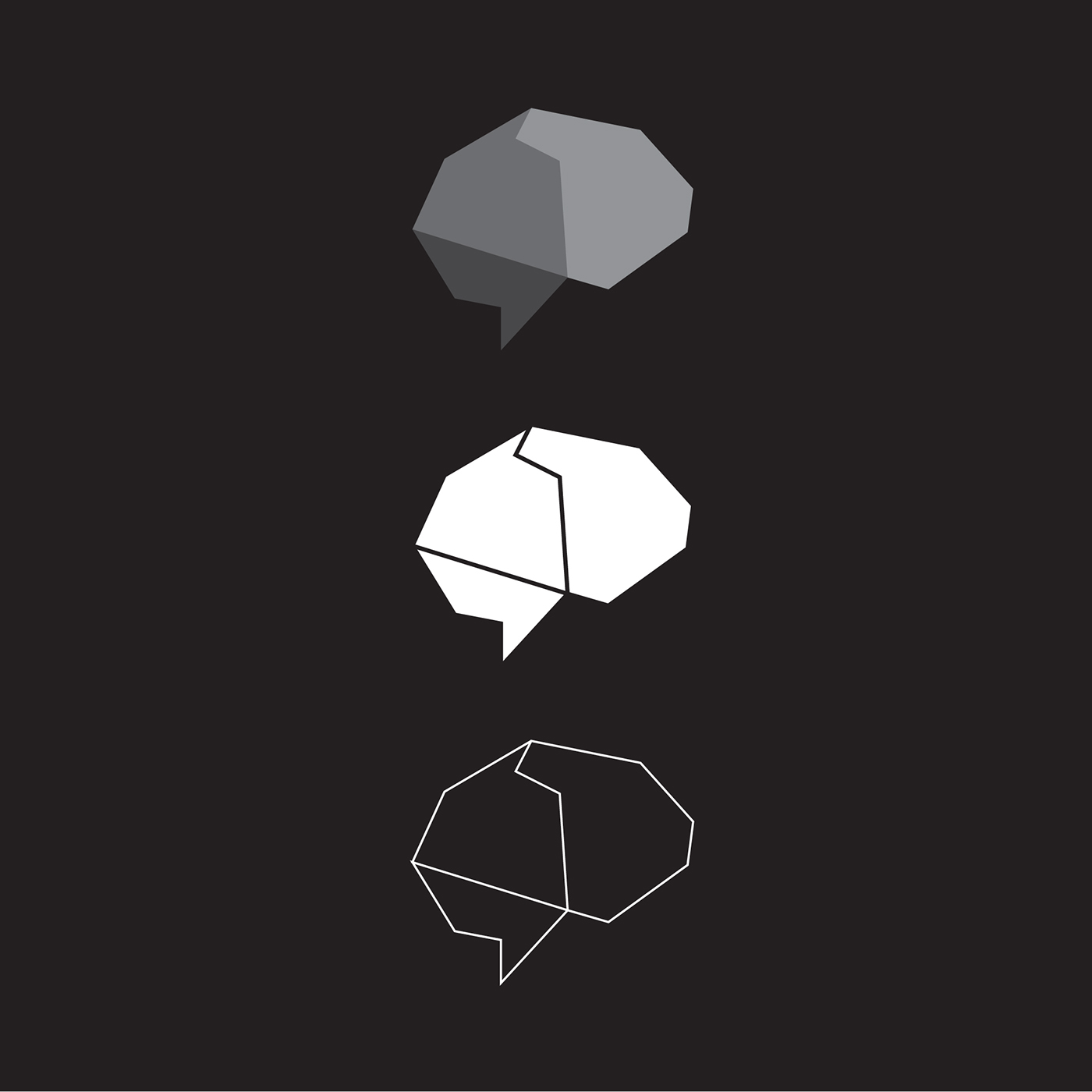
The symbol adds uniqueness to the brand. It's angulous and sharp, in contrast with the more smooth lettering. It´s abstract in essence although one can envisage a polished solid, a gem, maybe a brain or a speech bubble, among others.
The symbol adds uniqueness to the brand. It's angulous and sharp, in contrast with the more smooth lettering. It´s abstract in essence although one can envisage a polished solid, a gem, maybe a brain or a speech bubble, among others.
O símbolo vem acrescentar um carácter próprio à marca. É anguloso e geométrico em contraste com o lettering mais suave. É essencialmente abstracto embora possa aludir a um sólido polido, uma gema, ou até mesmo a um cérebro ou balão de fala entre outros.

Graphic communication // Comunicação gráfica
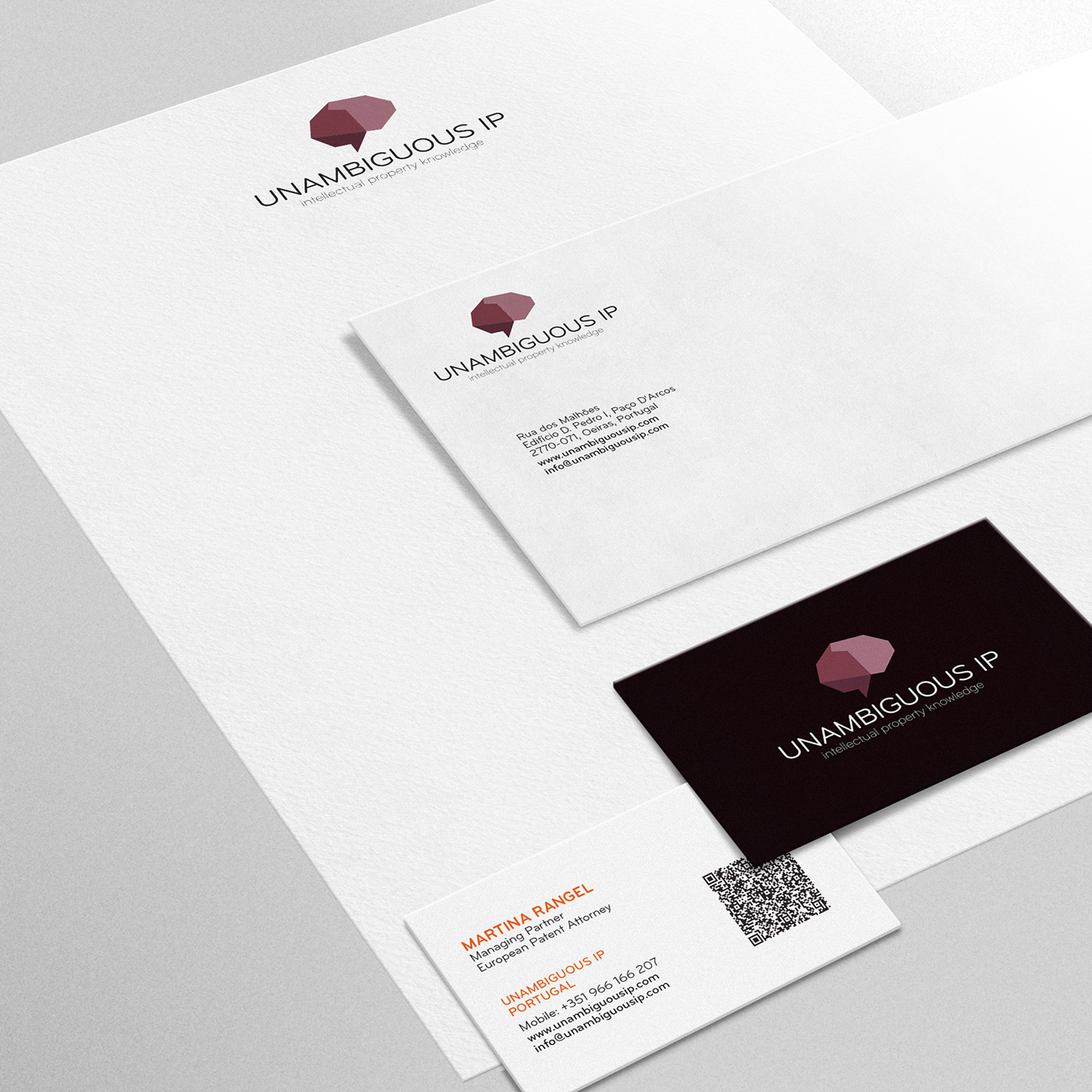
The symbol provides the basis for the graphic communication. This ensures an immediate visual recognition. It can contain text and imagery, making it a versatile graphic tool.
O símbolo serve de base para a comunicação gráfica, garantindo um reconhecimento visual imediato. Pode conter texto e imagens tornando-se numa ferramenta comunicacional versátil.
The colours // As cores
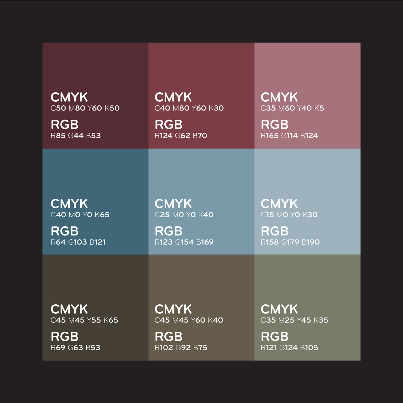
The chosen colour palette is institutional and adult yet contemporary.
A paleta de cores escolhida é institucional, adulta e contemporânea.