


OpenMed Rebranding
—
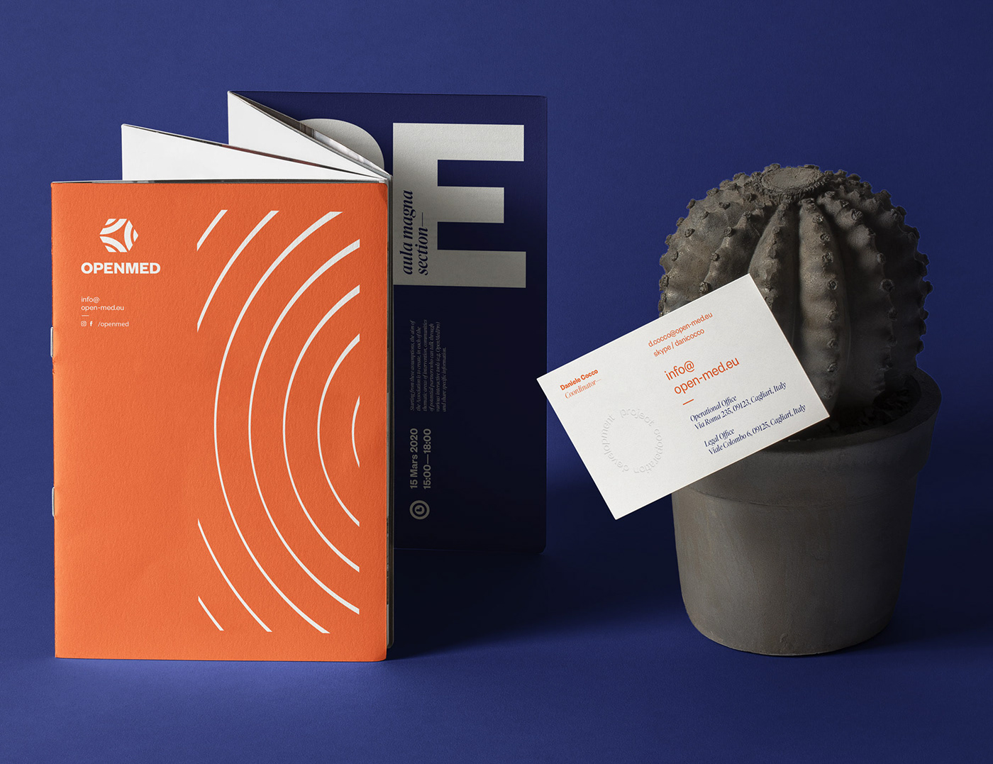
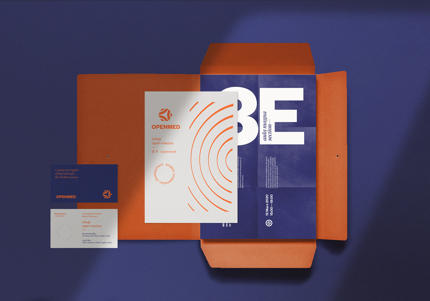
OpenMed is an association that promotes integration and exchange occasions through the implementation of a vast range of cooperation projects and initiatives in particular among Mediterranean countries.
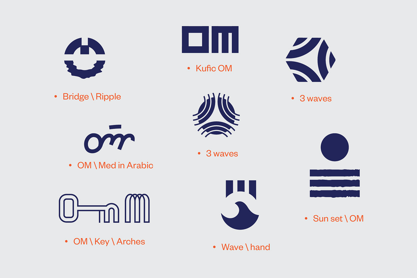
The Association asked us to modernise its visual identity and make it cleaner. We proposed a concept based on the idea of Mediterranean connectivity of its three shores—South Europe and the MENA shores. The letter O was duplicated three times to represent the waves of these shores, which meet in an open space in the middle, to communicate and interact.


If you liked this project, please
like, comment and follow
—
Thanks


