The objective of this project was to redesign any wine bottle available in the market.
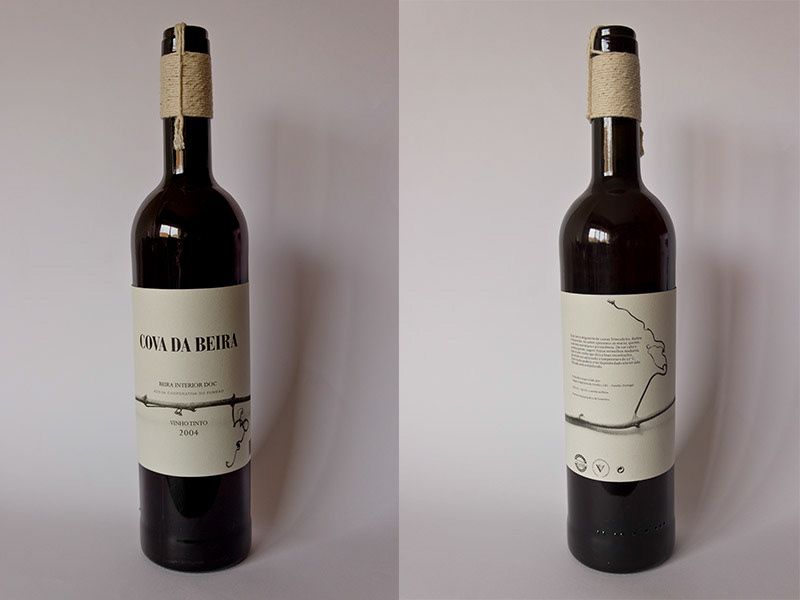
I chose Cova da Beira for its poor design and because I already had it at home.
I knew I wanted the bottle to have a simple design but which worked well and was different from what is most commonly seen in the market.
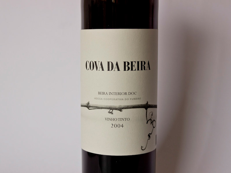
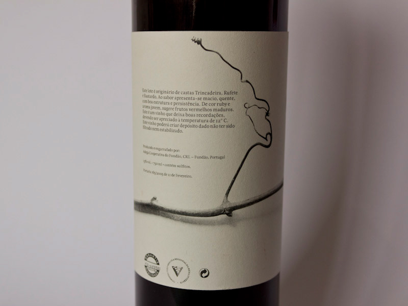
Firstly I chose a bottle with more elegant proportions. Then I chose to photograph a vine in grayscale and tie the information around it. Having the vine wrap around the bottle I was able to arrange the usual front and back information in the same sheet.
Though the typographic layout is simple, when combined with the photograph it gains another dimension.
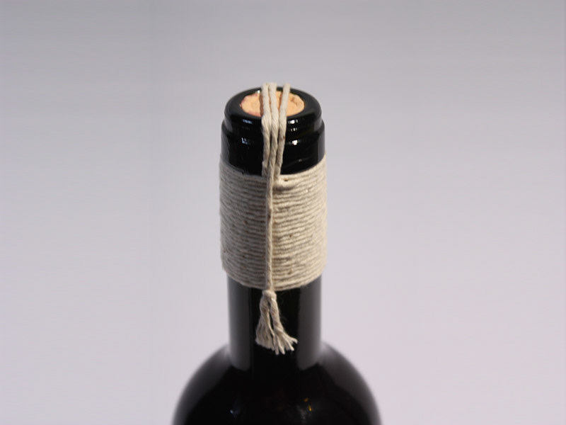
For the capsule I carried the nature inspiration and used string to seal the bottle. This wouldn’t however, be able to be made industrially.
For the capsule I carried the nature inspiration and used string to seal the bottle. This wouldn’t however, be able to be made industrially.
January 2012
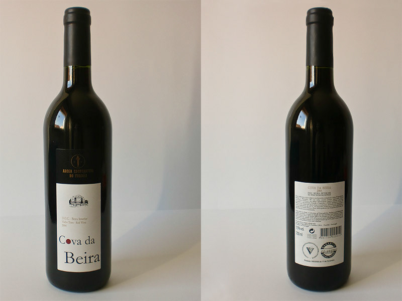
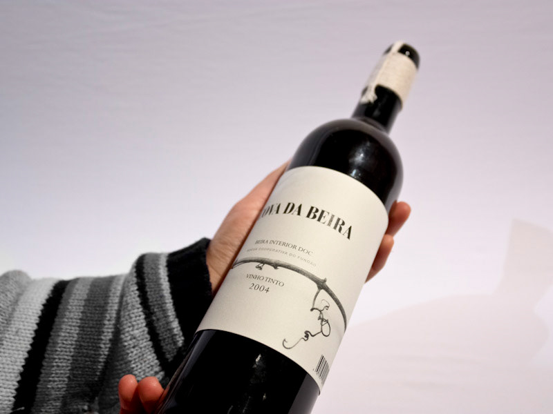
Original labeling.