“618 FANS GO” Visual Design
小红书618放肆购主视觉设计
TIME:2020.06
01 Background | 项目背景
In 2020, RED’s mid-year promotion is named “618 Fans Go”. Combining with diversified community of RED,we use RED CLUB members as leading roles to represent users and create fresh and joyful shopping atmosphere with C4D design.
小红书2020年中大促主题是:“618 放肆购”,尝试以RED CLUB成员代表用户,结合小红书的多元化社区生态,打造新鲜、丰富的生活场景及购物心智,为此,我们共设计了3个不同阶段6个主题场景的KV去逐步增加促销氛围。
02 Elements | 元素设计及优化
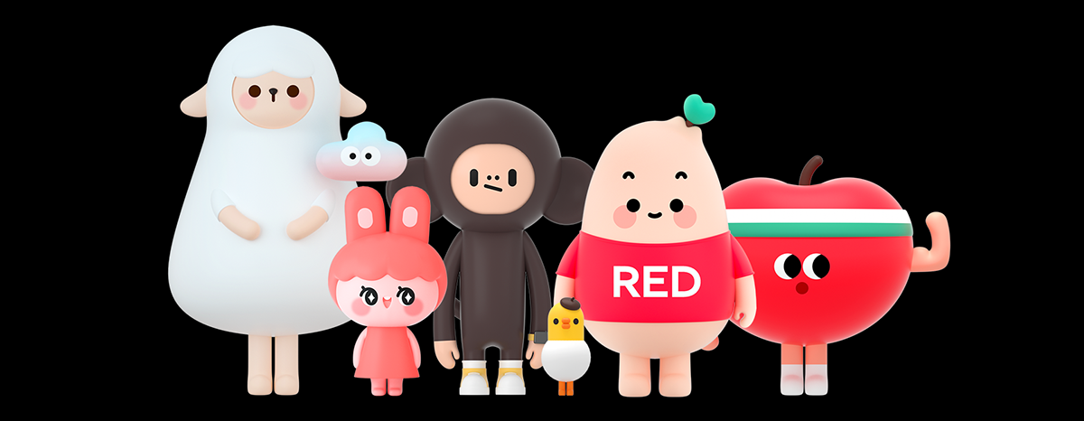
RED CLUB is a popular club in RED CITY, and all hot newcomers prefer gathering here. As the manager of RED CLUB, Captain warmly invited his friends who lived together in the RED community to join in :
Mina 🐰 + Little Black 🐵 + Vincent 🐤 + Newton 🍎 + Claude 🐑.
RED Club是RED CITY里最夯的一间俱乐部,薯队长作为RED Club的店长,热情爆表的他邀请了同住在RED社区的盆友们一起加入:
美娜 🐰 + 小黑 🐵 + 文森特 🐤 + 牛顿 🍎 + 克劳德 🐑 。
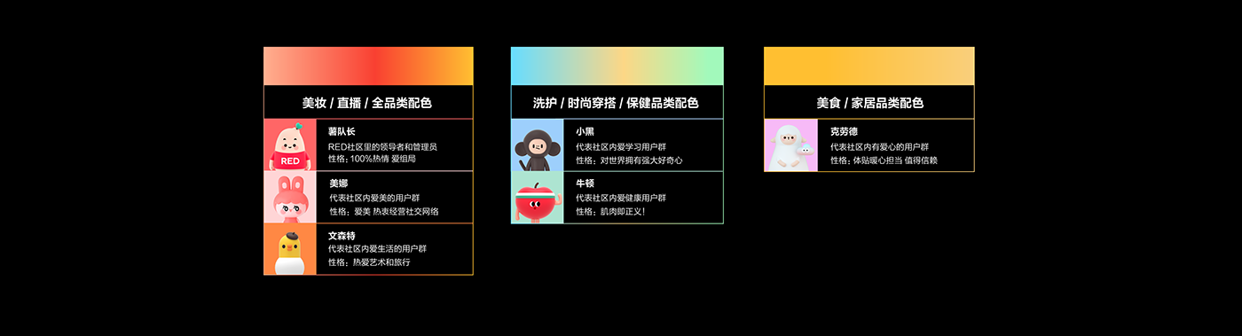
At the very beginning of the project, we setup a norm for the promotion scene and selected color schemes for each REDClub members based on their personality.
项目开始前我们先根据每个成员的性格规拟定了他们所代表的场景属性和配色。
a. C4D Scene Design
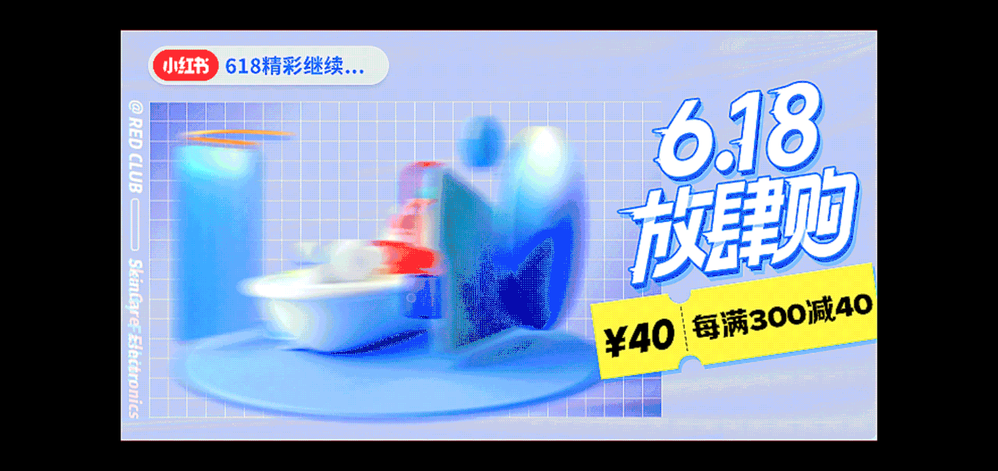
About scene design, in order to highlight the attributes of e-commerce, we added many different merchandise elements into the scene, and hoping users could immerse the vivid shopping atmosphere.
a. C4D场景设计
为了突出电商的属性,我们在场景中融入了商品元素,让用户在逛的时候更有代入感。


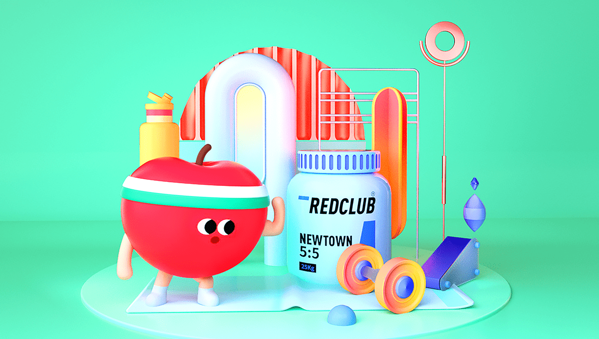


△ 左图为个护场景 右图为时尚/3C场景
b. Logo Design
In order to highlight the theme logo of "618 Fans Go", firstly we selected an inclined and powerful typeface with jagged edges. Then, we added the glitch dynamic effect on the logo to strengthen its visual impact and let the concept stand out.
c. Graphic Design
By creating a lively shopping atmosphere, we adopted plastic texture for the background and combining gradient grid with C4D design. We also use price tag as a symbolic element to point out the importance of sale in this promotion. In general, we attempt to establish a sense of difference between 2D and 3D elements.
b. 字体设计:
为突出“放肆购”的主题logo,首先选用了硬朗有力量的字形风格,通过倾斜和锯齿边缘的细节处理,增加其视觉动势,加上后期故障风的动效,更加凸显了主题“放肆购”的概念,也增强了视觉冲击力。
c. 平面设计:
c. 平面设计:
为了营造购物场景感,利用塑封膜为背景肌理,尝试用渐变网格与C4D场景相结合,以及价格贴标为活动利益点的载体,让整体视觉有种二维三维图形相结合的差异感,不仅契合小红书用户热爱时尚潮流的文化基因,同时也提高了活动的记忆度和趣味性。


△ 618放肆购3个阶段6个场景设计
d. Motion Design
The 360-degree rotating stage played a significant role in this design. We hope to stimulate the shopping desires by showing different promotion scenes with different RED CLUB members. Meanwhile, this promotion has unique motion design to differentiate itself from others. We hope it could give users a vivid and delighted impression.
d. 动效设计
360度旋转舞台是这次设计中的亮点,希望通过不同生活场景的切换,用主色调、RED CLUB角色和单品的集合,刺激用户的购买欲望,同时和日常促销惯用的商品堆砌LAYOUT形成差异化,避免视觉疲劳。
△ 图为预售期第一期动效场景及最终上线稿
△ 图为预售期第二期动效场景及最终上线稿
△ 图为正式期动效场景及最终上线稿
Art Director 美术指导:Gigi
Graphic Design 视觉设计:IVY赵获君 / 顾丹
Motion Graphic 动效设计:小黑 / 顾丹
Check out more of our work on 关注我们 :

