


Designer notes:
The option presented is in my opinion the choice to go with.
The logo itself is very much distinctive, and speaks the idea comfortably while still adding visual communication to its character.
there is plenty of room for the logo to breath & it looks great on black and white surfaces, in contrast with the first idea (01) which in smaller scales loses its definitions and is too crowded.
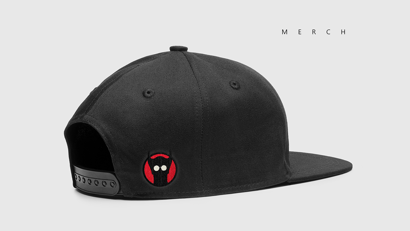
Applications on merch, and other social platforms are easy, since this version is flexible and recognisable even if only part of it is shown.
The logo itself is very much distinctive, and speaks the idea comfortably while still adding visual communication to its character.
there is plenty of room for the logo to breath & it looks great on black and white surfaces, in contrast with the first idea (01) which in smaller scales loses its definitions and is too crowded.
Applications on merch, and other social platforms are easy, since this version is flexible and recognisable even if only part of it is shown.
The main characteristics of the “blind bat” are clearly visible and there is no need for text to be added to “explain” the illustration. Although typography can be added in later stages to enhance its ability to communicate efficiently in various other formats, there is no pressure to consider this presentation a final stage in the brand's development.
I understand that you are still trying to wrap your heads around the idea of the brand, and are eager to have visual representations of it. But if I may, I believe that part of a successful designer’s work, is firstly the clients good understanding of the concept and communication of these ideas.
I understand that you are still trying to wrap your heads around the idea of the brand, and are eager to have visual representations of it. But if I may, I believe that part of a successful designer’s work, is firstly the clients good understanding of the concept and communication of these ideas.
To sum up, What is needed for the future?
in order to consider this job done. we need to discuss your vision more. I would also suggest for advertising purposes on social media, to do a couple of photoshoots, so we can have material for the YT channel for example.
in order to consider this job done. we need to discuss your vision more. I would also suggest for advertising purposes on social media, to do a couple of photoshoots, so we can have material for the YT channel for example.
My sense is that for the time being you have a logo that you can use to build around, in which by the way I have great confidence will not let you down. I stand by this idea, and hope my concept can intrigue your imagination to move forward with passion in doing what you love.


