


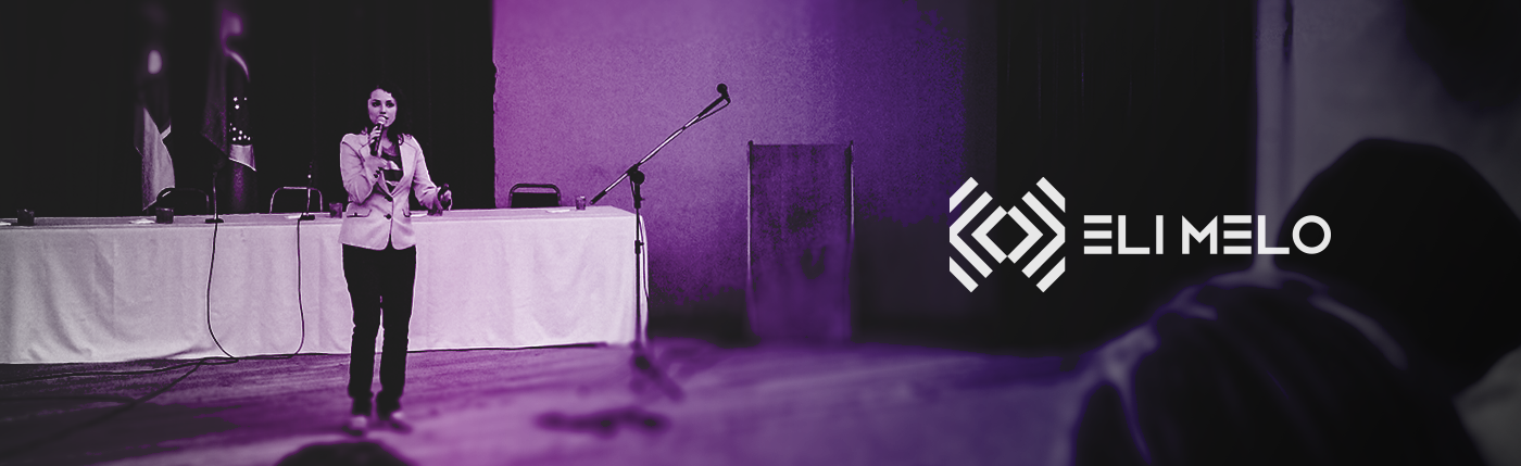
Eli Melo works by developing team skills, aiming at continuous improvement in companies. She is passionate about art, learning and developing people, and has a project where she shares creative and interactive content, based on her experience.


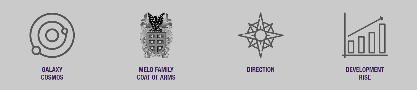
There was a need to create a symbol that adds the references extracted from the semantic connection in addition to the initials of the brand.
Galaxy - Cosmos - MELO - Direction - Development - Rise

The grid reinforces the junction of E and M, together with the shield of the Melo coat of arms, ascending towards space. Reflecting the symbol, first vertically and then horizontally, we find a relationship with the galaxy, revealing a multiple orientation, but with a focus in the center.

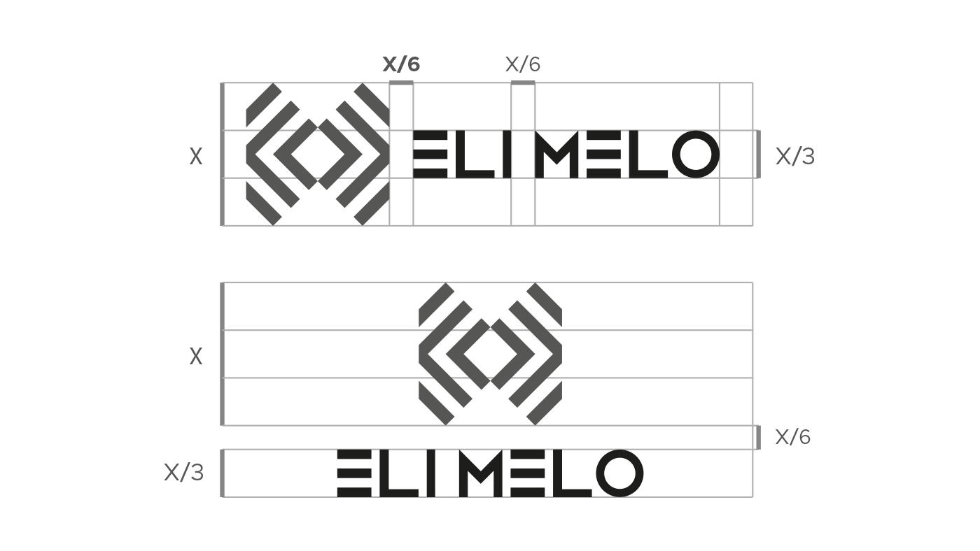
The typography needed to be modern and diverse to relate well with the brand, so the Helvetica Neue LT family was chosen as a source of support.


Purple as the main color, which is a mysterious and sophisticated color, is related to the meaning of the brand, as it represents elegance and wisdom, as well as being reliable, safe, responsible, optimistic, cheerful and idealistic. A shade of dark blue was used as a secondary color, in addition to shades of purple as support colors, being useful for diversifying the brand, either to create textures or gradients.


Brand Visual Identity


Eli Melo is a creative and modern brand, and his new visual identity is harmoniously related to his concept, revealing his passion for the professional who is dedicated to developing people.


