


About ECIU
ECIU stands for the European Consortium of Innovative Universities. It's a leading international network of research-intensive universities, emphasizing on innovation, creativity, social and environmental impact, having extensive experience in administrative practices and structures.
One of the main components of the consortium is ECIU University – an alliance of 12 member universities. With the goal to connect and empower people to impact business, society and environment, ECIU University focuses on giving students real competences and skills.
We've been brought in to create unifying visual identity for ECIU consortium, ECIU University and future initiatives.


Situation
Since ECIU University has members in 12 different countries, we've identified a broad scope of target audiences. In order to meet the expectations of all stakeholders and to create a visual identity for ECIU, we took a different approach to a design process.
Participatory design
To achieve the best results, we’ve decided to involve stakeholders to the creative process. As a result, 24 people from 12 institutions were invited to discuss and understand everyone’s outlook and to agree on design direction.
We've started with personal questionnaires about knowledge and experience about ECIU as a brand, where all participants shared their personal visions for ECIU. Then we've facilitated branding workshops, analyzing competitors, target audience and archetype. A round of logotype and visual identity design proposals followed, where participants had a chance to vote for their favorite proposal and after that we came to a joint decision for the visual identity direction.
Participatory design method was a great solution to ensure that every party was involved in the decision making. What is more, it gave a sense of ownership of the project to the people behind these institutions, making all participators the real brand ambassadors in the future.


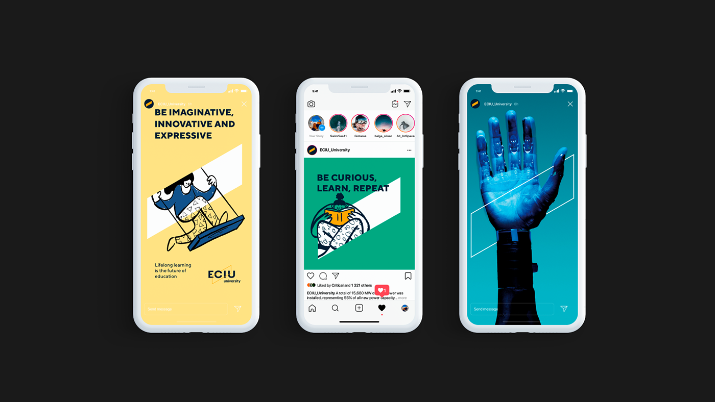
Visual identity
The core element of the whole visual identity is a diagonal symbol - parallelogram. It's a metaphor for ECIU alliance's mission - to connect and empower people to grow their knowledge and skills.
The logotype has the main symbol that frames the typography, and this composition creates a sense of “out of the box” thinking. Throughout the visual identity the symbol is very flexible and can be utilized in many different situations.
There are not many guidelines besides graphic element placement, designated colors and typography. A simple structure allows graphic element to be adapted to any situation. Since the visual identity and its elements are going to be used in different contexts at the alliance – simplicity is the key as it ensures the integrity of the brand. As a result, the whole brand book of ECIU is easy to understand and adapt.
Outcome
The participatory design process led to a visual identity system that is co-created by the ECIU community and is the best representation of this brand. As one of the partcipants, Director of International Relations Department at KTU, G. Šadeikaitė notes – "the process of the ECIU University logotype and visual identity creation has reflected who we are as the ECIU University community and how the values of cooperation beyond any borders, transformative innovation and connectedness lead the way we work".


Client: European Consortium of Innovative Universities (ECIU)
Participatory design moderation and design strategy: Jonas Liugaila
Design: Benjaminas Alimas, Simas Petrauskas
Project manager: Živilė Bugenytė
Illustrations: by various illustrators at Ouch! (used for presentation only)
Year: 2020


