Человек и Пароход / ЧиП (English: Chip Coffee) is
a coffee roaster and cafes in Moscow and St Petersburg. The name in Russian (English version is just transliterated 'ЧиП') literally means Person and Steamship. Firstly, it is about the structure of a coffeeshop, where two things are most important: a person (barista) and a steamship (coffee machine). Secondly, it refers to the tradition of naming ships after the most honorable persons. The logo itself resembles the shape of a water wheel, a part of paddle steamers.


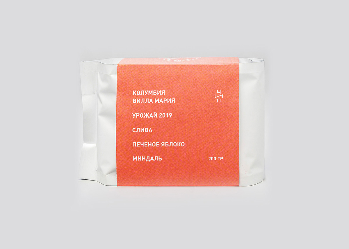
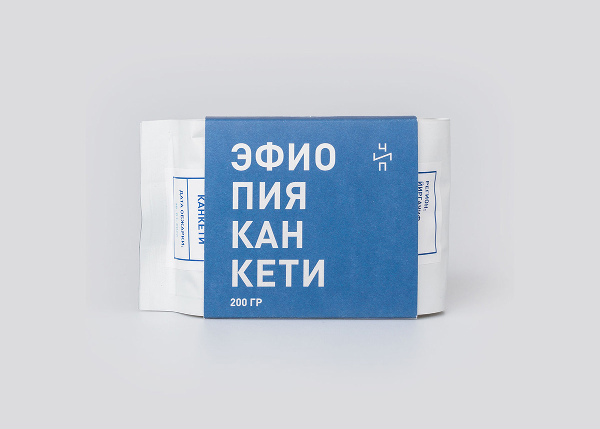
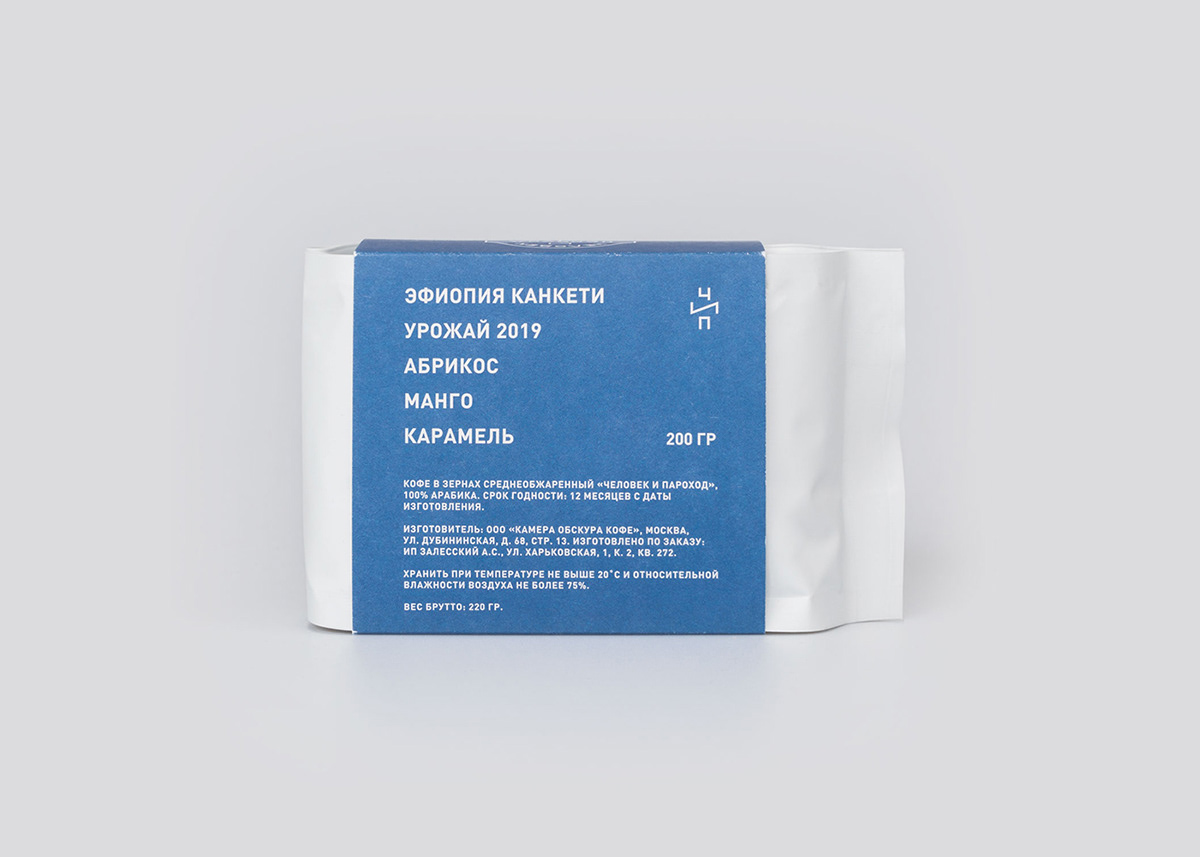
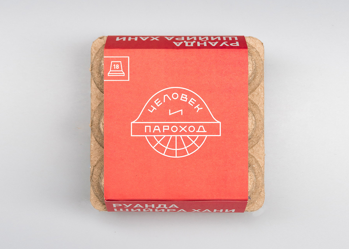
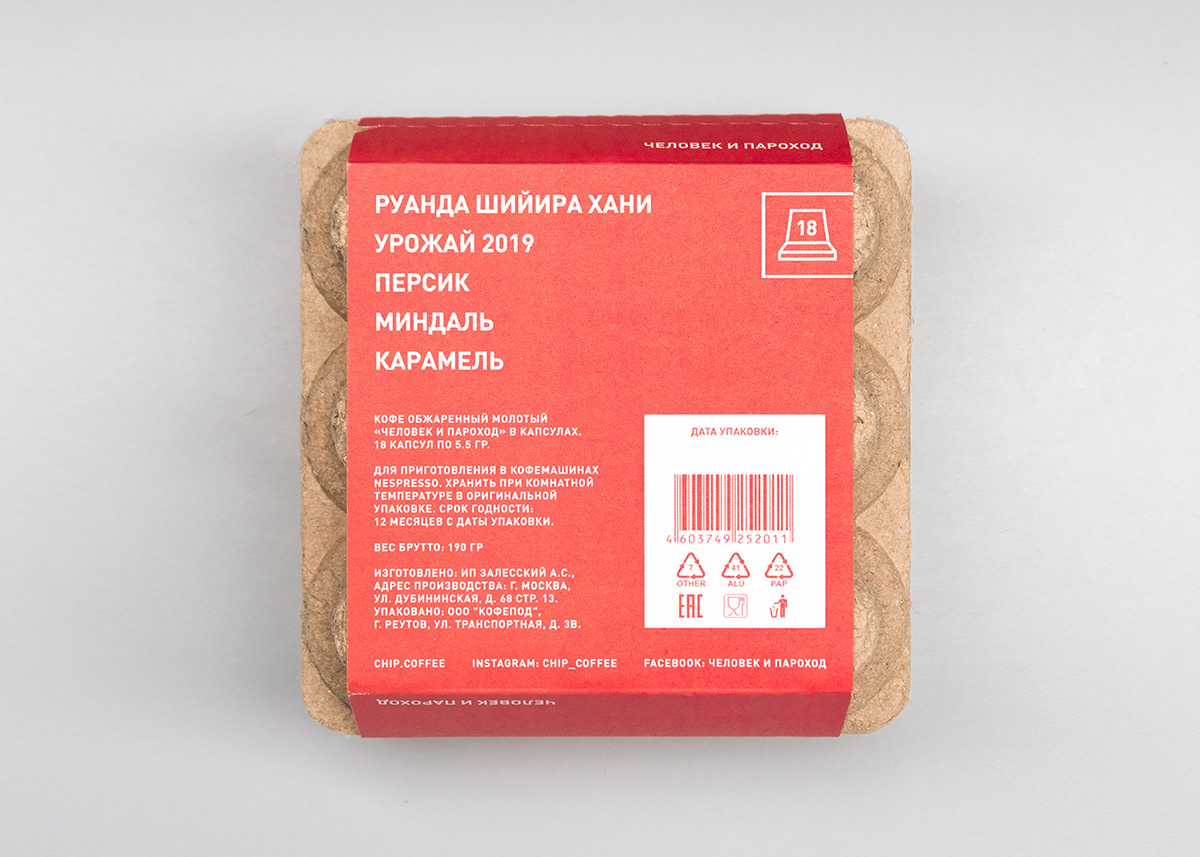


The whole visual identity is built upon two colours: red and blue.
There are always only two coffees in each category available, they change from time to time. The second feature is bold, eye-catching but clean typography.


The pattern was firstly intended for customisation of the coffee machine, to emphasise its central place in the coffee shop. Since everything is obviously connected to marine theme, the pattern should also follow this principle.
The pattern is basically dazzled camouflage pattern based on original colours and logo shapes.


Designed in cooperation with Nicholas Chistyakov. Photos by Chip Coffee


