
Student Project
Role: UX/UI Designer
Duration: 3 months
Software: Sketch, Figma
Purpose
As part of my UX bootcamp course, I was given a choice of three projects to do. I chose the education app project. I wanted to expand on my skill working with projects that would require large databases of information, so it seemed like the right fit.
The purpose for this app would center on finding a solution for students to improve their academic experience. Students have been struggling through difficult courses since the beginning of education. CollabiQ (pronounced Collab-I-Q) is a space that would help students to collaborate on classwork.
Design Thinking
The steps served as a guide to ensure that CollabiQ remained user-centric and solving the original problems. In the real world, constraints such as time or budget may limit the UX designer from following all steps thoroughly, and this happened here too. My focus on CollabiQ was primarily on usability and UI, leaving formal user research out.
My informal research would take the form of having my mentor be the sounding board and tester for my ideas with the direction of the app. These interactive sessions with someone who had several years of experience did help me to improve several aspects of the app.


Defining The User
User Stories
The project brief provided user stories, which gave me a clearer picture of what the user wants to accomplish in the app. They were:
● As a new user, I want to create a profile, so that other students can find me.
● As a new user, I want to find and connect with students studying my subject
(or a related subject), so that we may collaborate.
● As a frequent user, I want to be able to message other students, so that we
can problem-solve together.
● As a frequent user, I want to be able to view and share articles, videos,
images, andother files, and write posts for other students to read, so that
we can share knowledge.
● As a frequent user, I want to get peer feedback on my assignments, so
that I can improve my classwork before submitting it to the instructor.
● As a frequent user, I want to know if someone messages me or shares
something that I would be interested in reading or reviewing, so that I don’t
miss anything.
User Flows
I translated those user stories into six user flows. These each became 6 user tasks: Create Profile, Search, Message, View Feed, Post Feedback, View Notifications. From my previous sessions with a Senior UX Design mentor, I knew that the user flows clarified the app’s functions and the specific actions needed to achieve them, which would then inform me on what to include in my screens.

Iterative Design Rounds
Sketches and Wireframes
The process for making screens began. I sketched my thoughts out on paper first, basing screens on the user flows.
Create Profile Screen Flow Sketches
Here are the initial sketches for the ‘Create Profile’ Task Flow.


Low Fidelity
Iteration 1
In this iteration, I took the sketches to Figma and made them digital. The skeleton was starting to take place.

Mid Fidelity
Iteration 2
I focused on improving the UI in this iteration. I wanted to create a look and feel that was fresh, modern, and engaging. Dribbble came in handy here.
Mid Fidelity
Mockups
I went through iterative rounds to refine the screens until I had high fidelity, full color screens ready to mockup.
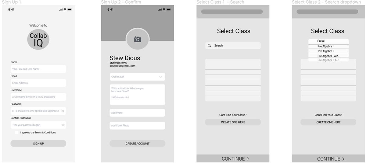
On the first screen of the sign up flow, I decided to add a background image to the screen. Another change you can see is my decision to include illustrations. I made this decision to take up some empty white space and liven up the screen, keeping the user’s attention engaged. It is one of the major industry design trends I picked up on during my musings through the latest design work on the internet.

High Fidelity
Creating an Identity
Visual Branding
Before ending up with the high fidelity screens above, I scoured the internet for inspiration on the app’s look and gathered my favorite ideas into a moodboard. I wanted the look and feel to be clean, efficient, and reliable to reflect CollabIQ’s place in the educational sector.
Initial Moodboard
Initially I chose a blue color palette with a pop of green. After mocking up a few screens, I decided to add a pop of bright red for variety and visual interest.

Style Guide
To ensure consistent design standards, I created a style guide. The red added excitement and interest to the calming blues and bright greens.

View the complete style guide.
Creating an App

Prototype
Using the finished screens, I created a prototype on Figma. Interact with the prototype here.
Mockups
The finished screens were then mocked up onto a mobile device using Angle from Sketch.
I also mocked up different breakpoints of two screens to reflect how the site will be responsive, which can be seen later.
I also mocked up different breakpoints of two screens to reflect how the site will be responsive, which can be seen later.


Final Thoughts
The Gridding Process
Some screens have three elements, some four, so creating a grid to accommodate both type of screens was difficult at first.
After researching grids and consulting with my mentor, I eventually decided on a twelve column grid. Twelve columns are flexible and can be made responsive.
Learning New Software
I decided to invest some time in the beginning of the project to learn a new software. Two, actually: Figma and Sketch. Before I had been using Adobe and Axure.
This greatly improved my work flow by introducing me to more efficient techniques like setting up components.
Design Trends
In this project, I learned how to incorporate design trends into my work. This had to be done in a strategic way, using designs that would add to the overall effect of my work, and not just to try to be trendy. It was a good exercise to see if I could implement these trends. Such trends were: use off illustrations, and the curved nav bar.
Creating User Flows
This is the first app that I was able to use my new knowledge of user flows to establish the screen flow and it flushed out the app quickly by covering all needed functions.
That’s it! Feel free to reach out for more information or check out another project of mine. Thank you.


