Creative Fields
Logo & Identity, Packaging, Photo Editing
Project Background
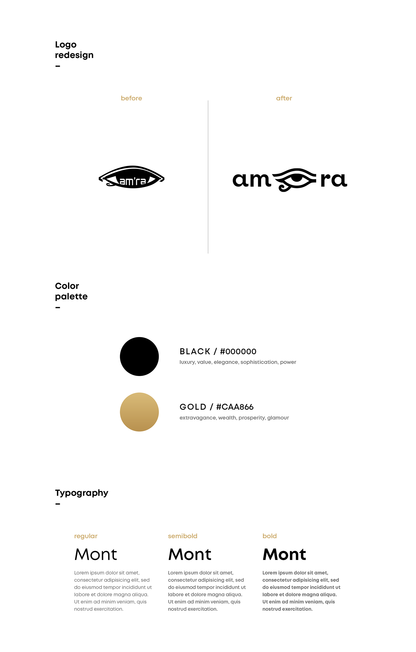
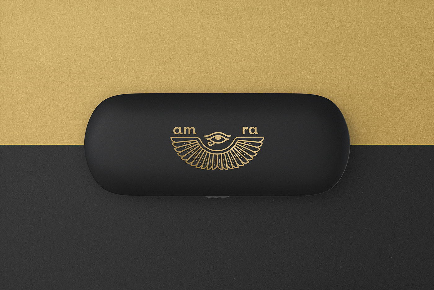
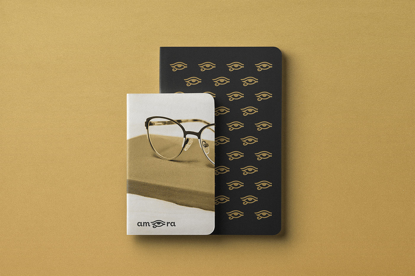
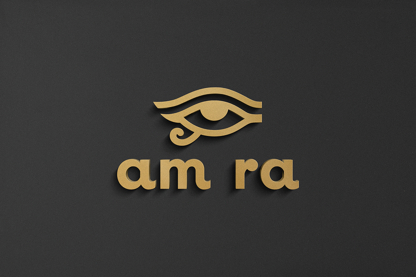
The project is my concept in a contest on the Freelancer.com. The brand reflects art and culture of the ancient Egypt, hence the name AmRa as the abbreviation of the Egyptian god of the sun — Amun-Ra who was the chief of the Egyptian gods. The main symbol of the above mentioned mythology is the eye (referring to the Eye of Ra) that functions as a violent force that subdues the Ra's enemies.
Challenge & Mission
The client designed an initial logo, but was not very satisfied with it and wanted an improvement. The main reason the logo was wrong is due to the lack of design principles. The text inside the icon and a thin space between the lines made the logo illegible — improperly visible in smaller sizes and unequally presented on black and white. The tech Orbitron typeface was not suitable neither for the company nor for the style of the eye icon. Overall, the logo was outdated and dense. Desired colors of the client were black and gold.
Solution & Result
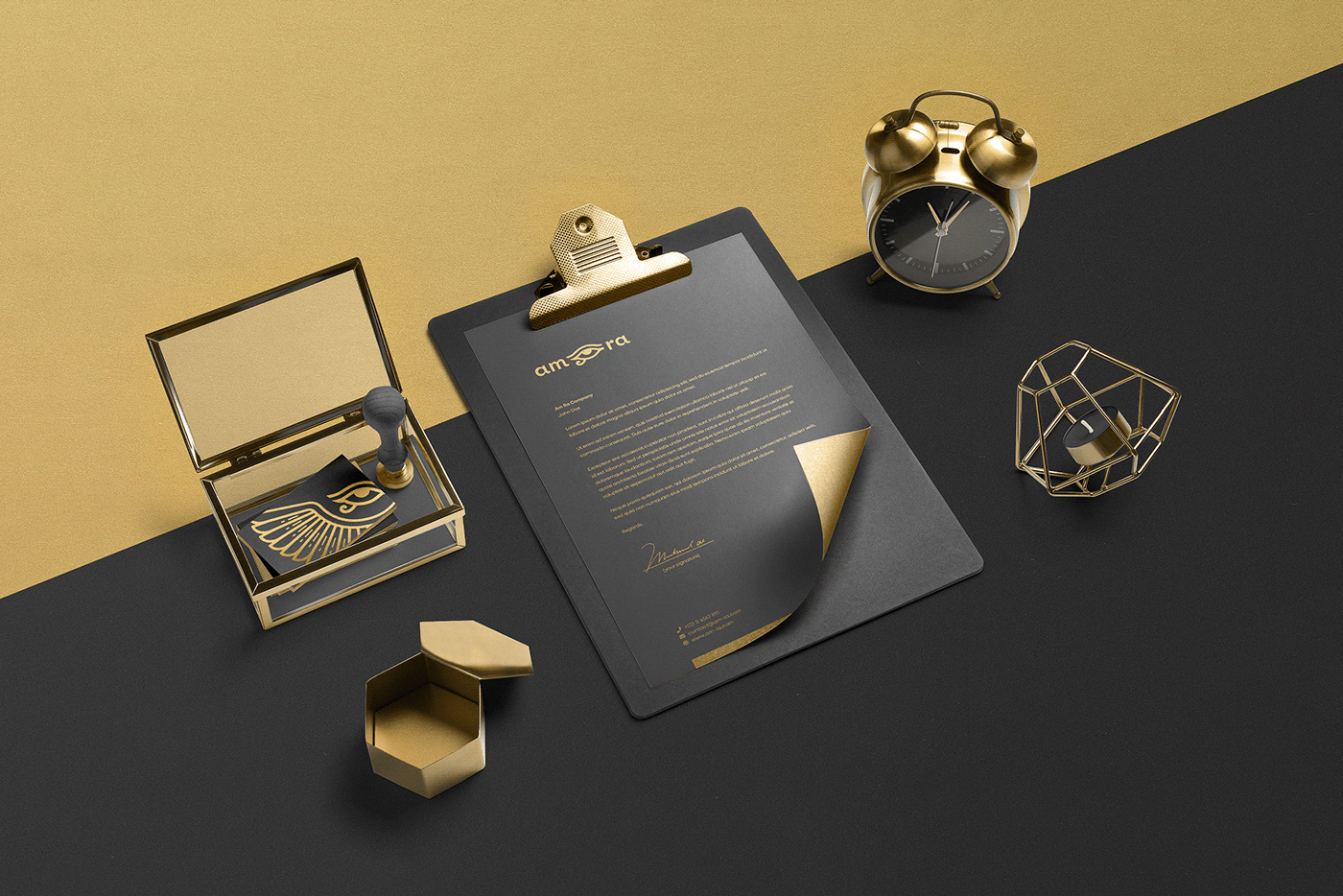
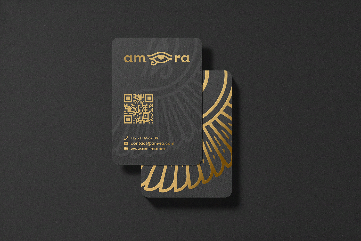
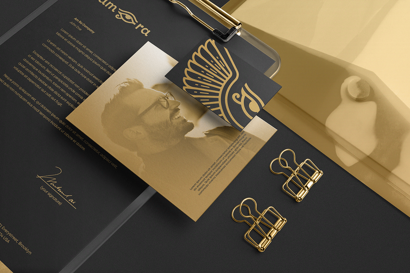
The main target for this project is an elegant, strong and memorable solution that brings professionality and aesthetics to the brand. By interpreting the client's previous design and idea, the new logo was designed which solves and fixes all the problems and mistakes the old one had. The golden textures harmonize with the brand's main colors, assisting the visual identity and evoking the elegance and richness.
Year
2020