
Road Trip Icons & Branding // Travel Nevada (Nevada State Department of Tourism) // 2019


Journey Before Destination.
Nevada is the seventh largest state in the union, with over 80% public land. As such, one of the best (and often, only) ways to travel the state is by road.
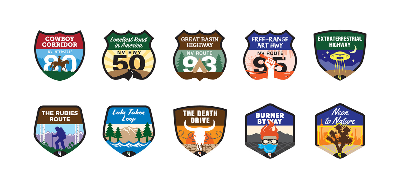
The Goal: Because Nevada is often seen a merely a vast desert, travelers often miss the hidden gems just off the highways. Small towns filled with history and eccentricity abound along Nevada's roads. By naming and branding each main road, the aim is to show travelers that the journey comes before the destination. The ten road trips are the arteries that connect Nevada, and help bring visitors to places beyond Las Vegas and Reno, into the heart of the state.
The Strategy: The visual strategy was based in the vintage National Park posters of the 1930s and 40s, combined with the simplicity of road signage. Ten main roads throughout Nevada were chosen and named according to the main attractions that can be seen and experienced along that stretch of highway.
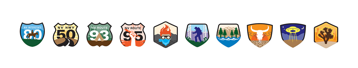
Colors and shapes are simple and graphical. Typography has a vintage feel. Each icon is reduced to the major theme of each road trip, helping to let visitors know what they can expect to experience on their road trip.
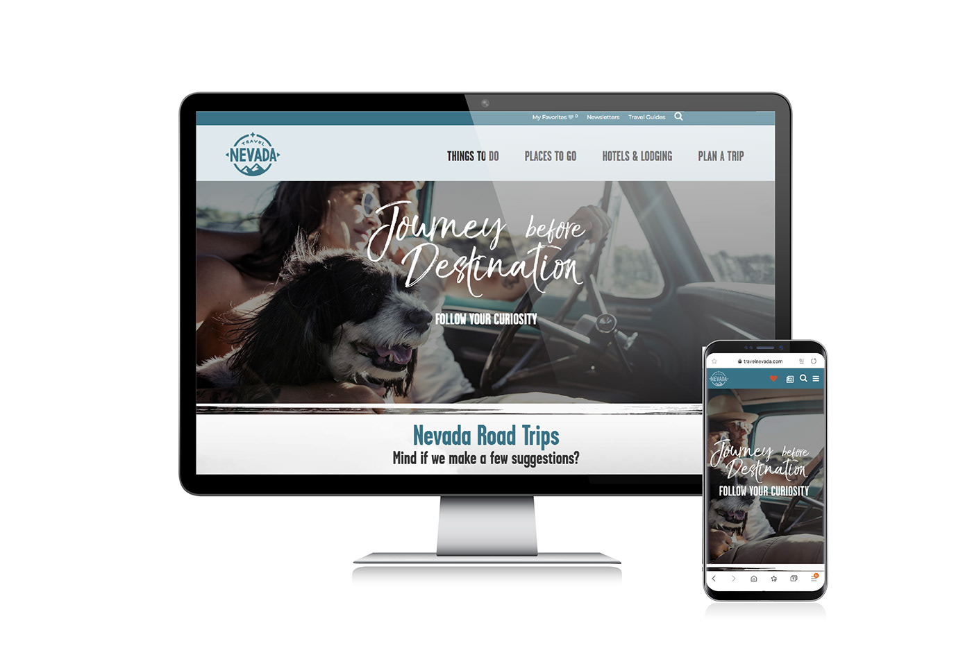
The icons are used in everything from the official state Visitor's Guide and State Map, to website landing pages, to collectable swag, passport stamp books and more. This program was instituted as an evergreen marketing program and continues to evolve.


Road Trip Icons


Road Trip Branding in Action


Role(s):
Icons & Branding – Art Director, Designer
Website – Travel Nevada Art Director // Agency: Noble Design Studio


