OPPOSITES ATTRACT
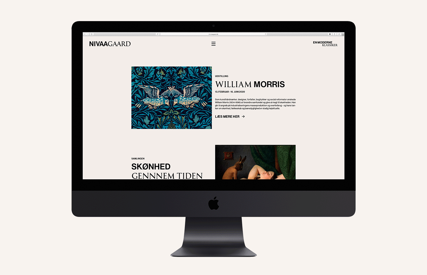
Working under the idea of opposites attract the new museum identity for The Nivaagaard Collection embraces the idea of combining the modern with the classic.
The design challenge was to combine the museum's classic permanent collection with their popular modern exhibitions while creating a strong brand identity, which could appeal to a younger audience.
Combining the contrasting grotesque and serif fonts is a key element in the new identity and is applied on everything from merchandise to wayfinding and exhibition design. It is a versatile logosystem with a strong and recognizable brand signature.
Not only does the new visual identity promise to show both sides of the arts but also to unite past with present. You get the best from both worlds in one museum experience –presented in an inclusive and accessible tone of voice focusing on showing opposites within the museum, and guiding the guests through both the arts and life from the perspective of opposites.
Fonts in use: Neue Haas Grotesk by Christian Schwartz and Reforma 1918 by PampaType.