Waterways House
Environmental Graphics - 2019
Project developed as part of the Open Design and Digital team
Graphic pieces development for the interior design of the Waterways House in Dublin. As the company is present in different cities, the initial concept to create the manifestations was to transfer the essence of each of them on the offices walls through their most iconic buildings. All of this in a minimalist but original style that includes line illustration, typographic and geometrical graphics that could be linked with their environment and atmosphere. Along this tour around different continents, a stop was done in the Hispanic lands to bring some “sabor” to the canteen introducing typical sayings in a lettering style.
.
.

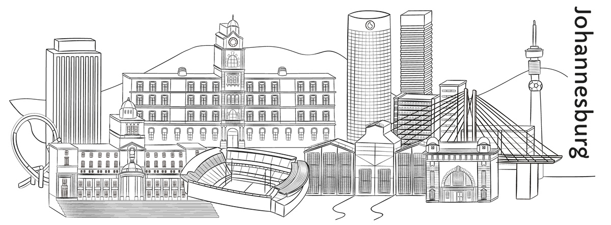
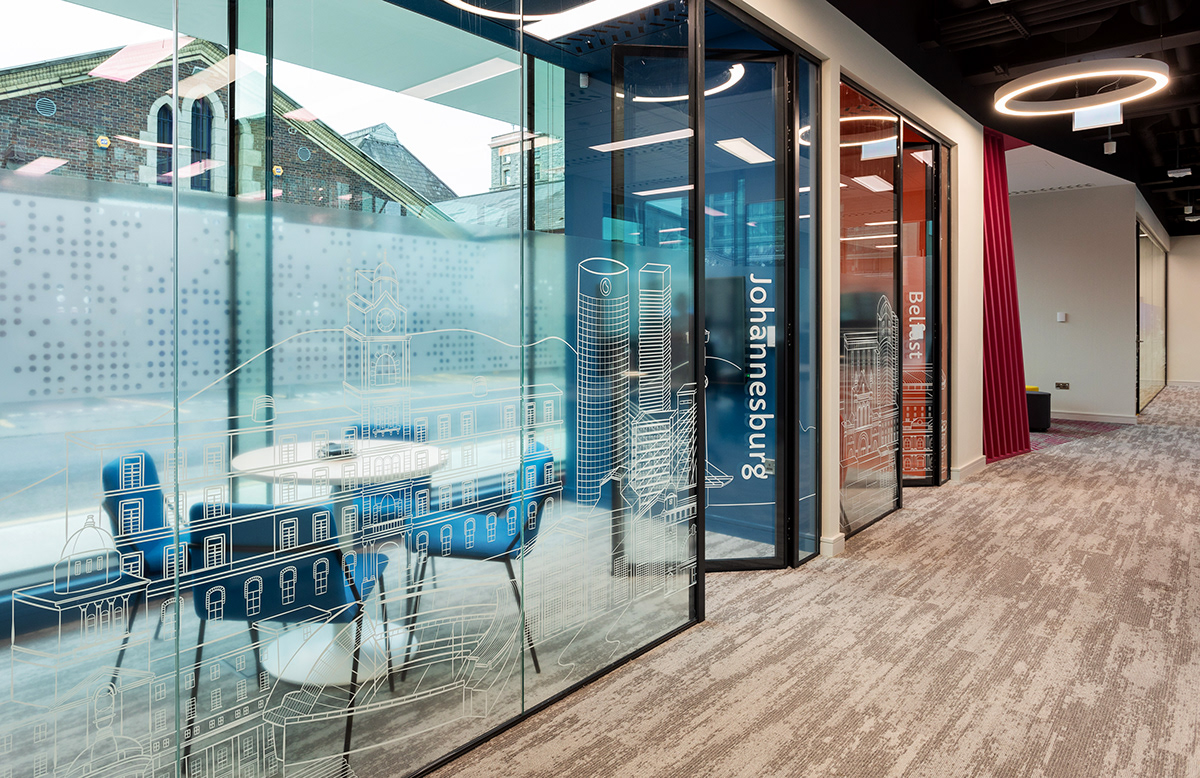
CITYSCAPES ILLUSTRATIONS
A hand-drawn style was proposed for the creation of the illustrations. As Saongroup is a company that have branches in different countries, we decided to illustrated cityscapes for the meeting rooms available in the building. After selecting a group of cities where the company is located, research of iconic buildings was done to create illustrations that represent cities properly. Finally, seven illustrations were done for each meeting room in measures ranging from 3 to 7 meters wide and 1.5 meters of high.

Photo taken by Sonica / www.sonica-fitout.com


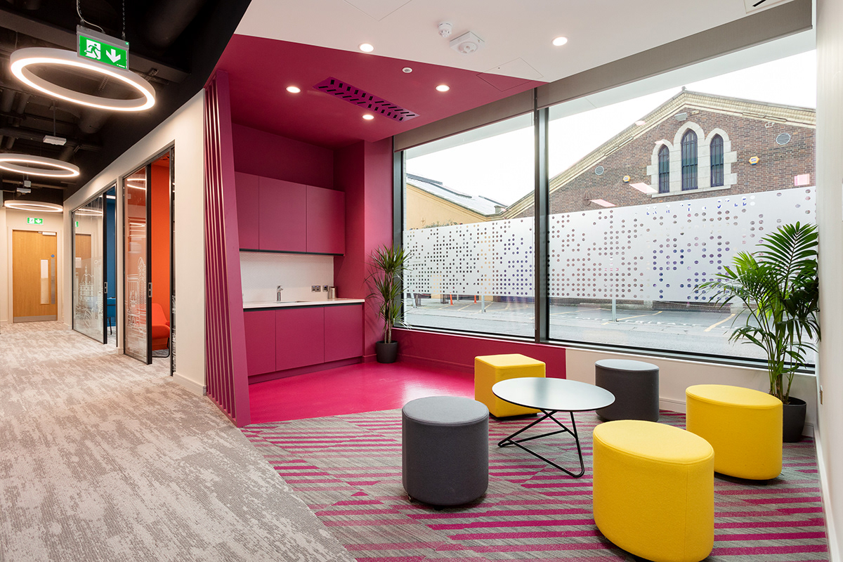
GRAPHICS
For the offices, we created a composition using all the job titles listed by the company. The idea was to provide privacy to the offices without block the vision of the people that work inside.
The lockers design was based on a minimalist style considering the carpet, walls and furniture design in order to avoid overload the environment. Geometrical patterns that included triangles and dots were taken of the common areas and applied on the lockers using grey tones and small touches of colours coming from the established colour palette. The same concept was applied for the creation of the lift wall graphic based on a rectangles pattern that follows the lines of the floor. Also, the outside walls just took a triangle figure on the corner and a composition of words that represents the worker’s values making a mix between geometrical shapes and typographic compositions applied to the offices.

Photo taken by Sonica / www.sonica-fitout.com


Photo taken by Sonica / www.sonica-fitout.com
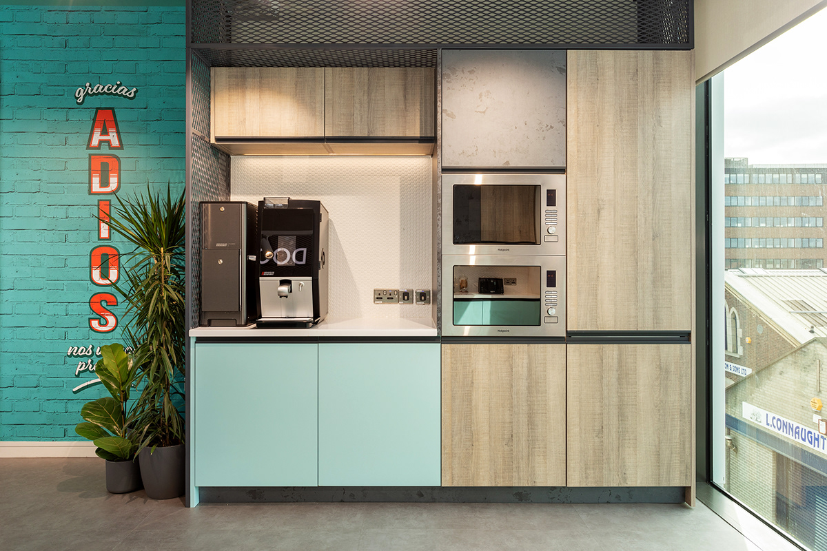
CANTEEN GRAPHICS
For the canteen wall, hand-drawn aesthetic with something bolder and playful was proposed. We want to create a friendly and relaxing atmosphere so typical sayings were posted in some walls of the canteen and the tea station in lettering. Although the idea was based on the popular Latin lettering, the colours used try to conserve some sobriety but keeping the lettering style.
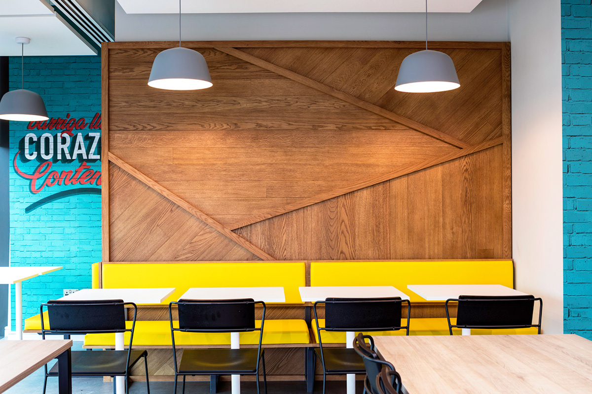
Photo taken by Sonica / www.sonica-fitout.com