
Creating a gallery of modern art pluses
Client: Attacat
Year: 2020
Attacat has commissioned multiple artists to make artistic pluses for their visual identity. Attacat is a digital marketing agency and is currently undergoing a visual rebrand. They want their virtual and physical spaces to have the look and feel of a modern art gallery dedicated to optimistic and vibrant pluses—a showcase of artists' interpretation of their tagline ”grow together" in the form of plus signs.
Why art?
Attacat is seeking original work for its own intrinsic value and as an expression of the individual artists. They want the artists' pluses to inspire them and bring joy to all those who work with Attacat. With time they hope their site and workspace could become a showcase for up and coming artists.
Why multiple artists?
Primarily because variety will provide interest and reason to come back. Attacat hopes each plus will represent subtly different aspects of who they are.

THE PLUS SIGN
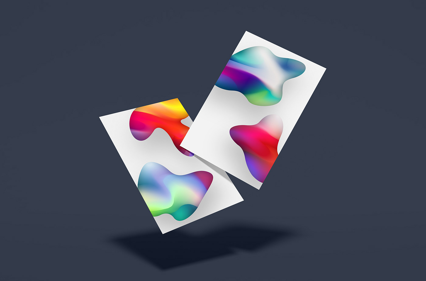
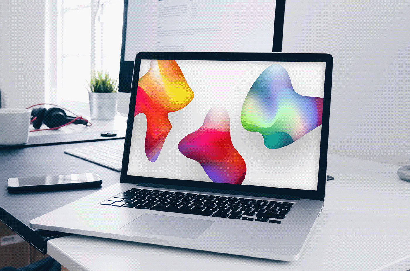
The plus signs created for Attacat have organic, softened curves and are not strictly symmetric, to give a friendly and pleasant feel. Instead of just looking like a mathematical sign the symbol now looks a bit more like human arms stretched out to give a warm hug or a welcoming greeting. This supports the positive feel Attacat wants to achieve by using a plus sign. The smudged colors resembling abstract painting are applied to give the plus an artistic expression. The soft shadow under the sign supports the light and uplifting atmosphere and gives a sense of space and depth.
As a viewer you're not just looking at a flat art piece although it's purely 2D. Virtually you're in a room, a space with the elements and get a feeling of tactility. The elements seem to have an appearance that's three-dimensional, you can imagine how soft and pleasant they would feel if you could hold them in your hand. Further more they appear to have a glow and to be partly semi-transparent, even somewhat luminescent that gives the indistinct veils of colors a resemblance to colorful nebulae.
As a viewer you're not just looking at a flat art piece although it's purely 2D. Virtually you're in a room, a space with the elements and get a feeling of tactility. The elements seem to have an appearance that's three-dimensional, you can imagine how soft and pleasant they would feel if you could hold them in your hand. Further more they appear to have a glow and to be partly semi-transparent, even somewhat luminescent that gives the indistinct veils of colors a resemblance to colorful nebulae.


THE SHAPES
Attacat wanted additional shapes in the same style as the plus sign(s). The shapes related to the plus signs are sharing the same characteristics: soft curved lines, a diffuse paint texture, and bright, glowing colors. Although the shapes are entirely abstract, they bear resemblance both to elements from nature, stones soften by the ocean waves, and some of the oldest artefacts found, manmade tools more than 3 million years old. This quality both looking like something from an ancient time and something from a distant future, make them intriguing or puzzling. A startling balance between something primitive and something sophisticated.

WHY PLUS SIGNS?
For growth, getting bigger
For marketing that adds to lives
For positivity and optimism
For more than average
For togetherness and being greater than than sum of the parts
For maths' association with digital (1s anf 0s)
For not being negative (success at the cost of others is not an option)
To be represent "grow together!

THE TECHNIQUE
The soft, smudged hues are made using a Gradient Mesh in Illustrator. The mesh is manipulated with the Warp Tool to give the abstract ink/paint effect. A drawing technique similar to analog finger painting.
The shapes are made by making a Clipping Mask. New color variations can be made simply by rotating, scaling and replacing the Gradient Mesh. Finally Inner Glow (Multiply mode) and Drop Shadow are added to the Clip Group. This way the elements remain vector throughout the whole process.
The shapes are made by making a Clipping Mask. New color variations can be made simply by rotating, scaling and replacing the Gradient Mesh. Finally Inner Glow (Multiply mode) and Drop Shadow are added to the Clip Group. This way the elements remain vector throughout the whole process.


