

Gigi Quérette is an interior designer who designs spaces appropriately for the needs of its users, creating comfortable, harmonious and functional environments.
.
.

The visual identity results in a visual projection that transcends the guiding concepts of the projects created by Gigi Quérette, combining simplicity, functionality and adaptability.
A minimalist visual identity was created, using only the relevant elements to convey the message to the user, eliminating any superfluous component and with a purely decorative function. This allowed to create a functional communication, capable of transmitting its content in a clear and objective way, without excesses.
A minimalist visual identity was created, using only the relevant elements to convey the message to the user, eliminating any superfluous component and with a purely decorative function. This allowed to create a functional communication, capable of transmitting its content in a clear and objective way, without excesses.
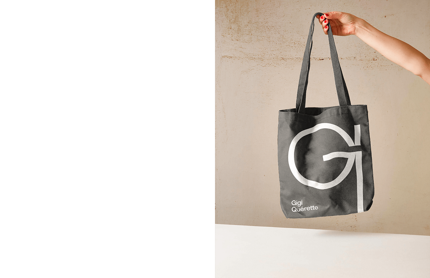
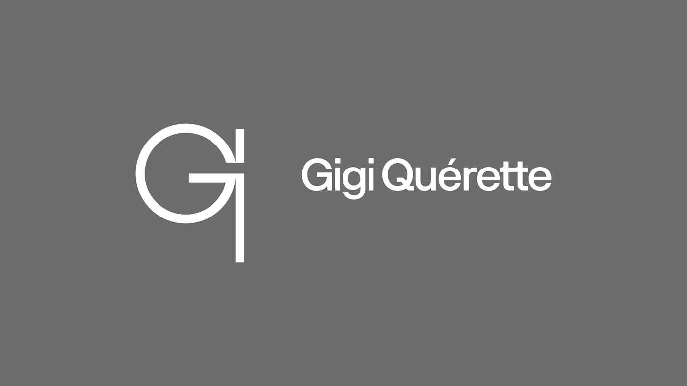
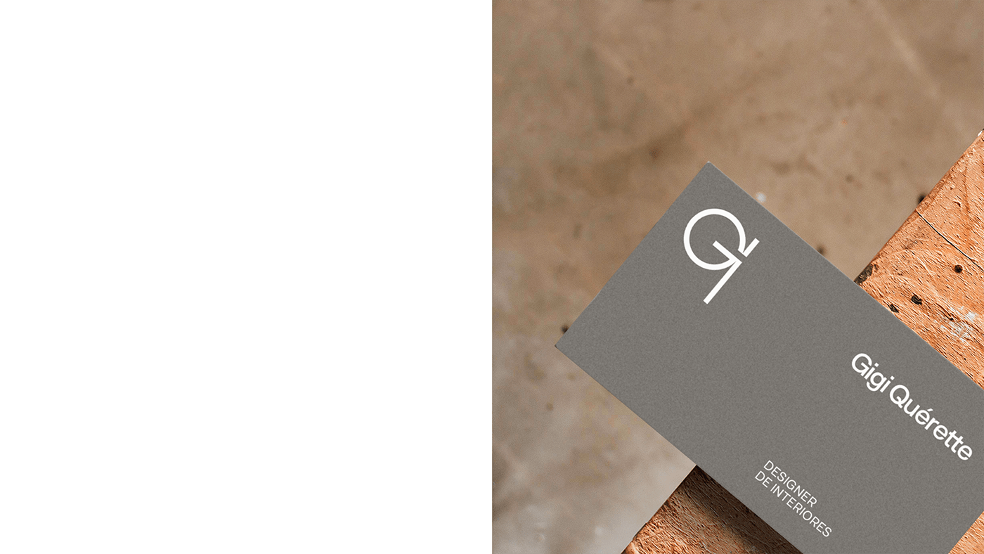
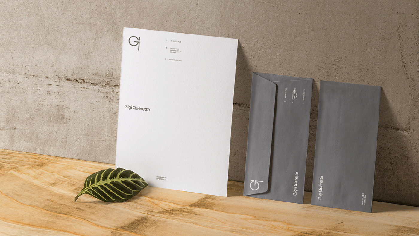
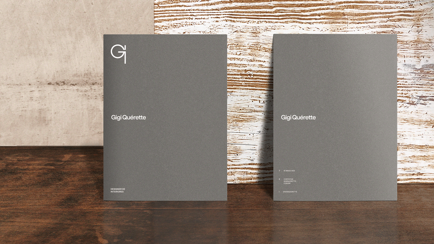
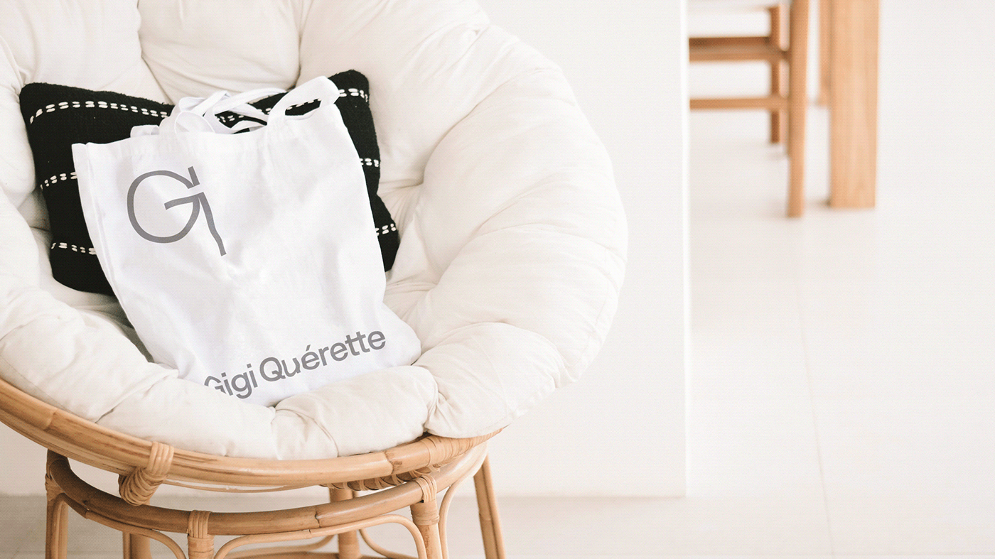
The symbol is a pictogram representing the initials G and Q, built from basic geometric shapes, making it easy to be memorized, reproduced and understood. The lettering follows the symbol's minimalist ideal, composed of a neutral and clear typography.

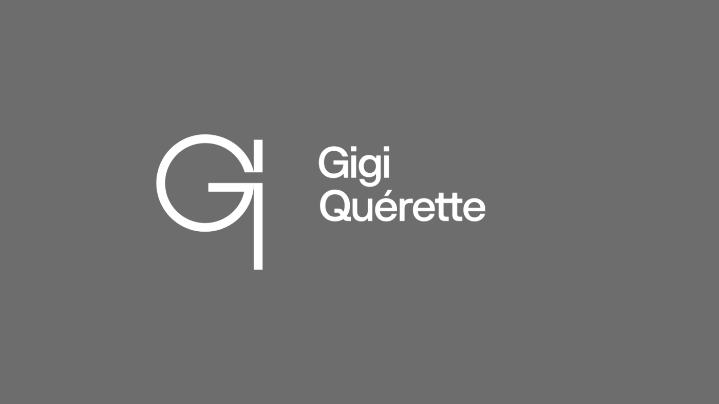
We bet on the classic contrast between gray and white, through a minimalist, neutral and functional approach, perfectly to the project.


.
.

.
..
.
.

.
.


