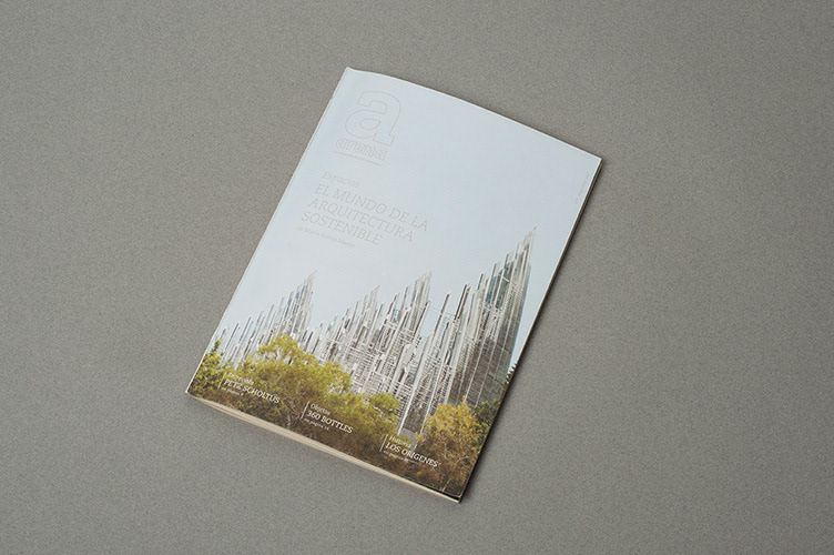
Arena
I defined the identity of a magazine of sustainable design: the name, the palette of colors,
the typography, the structure, the image treatment, and so on. Its name's Arena, which in spanish means sand. Every element is connected to the concept of sand, evoking his meaning of nearness
to our planet, stressing the environmentalist point of view that leads the spirit of the magazine.
For example the outline titles allow a partial saving of ink, the paper is recycled, the area of some photos is often reduced.
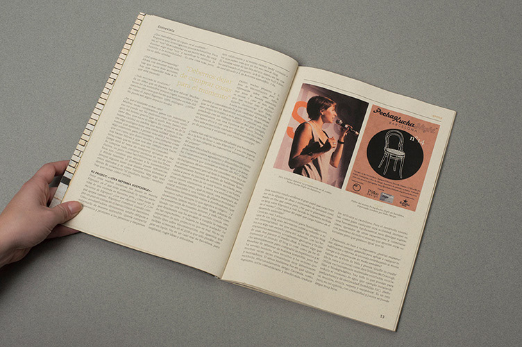
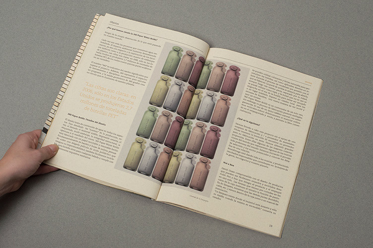
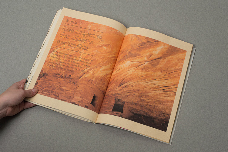
There are 4 sections in which the magazine is divided:
Entrevista (Interview), Objetos (Objects), Espacios (Spaces) and Historia (History).

In the picture below, a double page from Entrevista.
A double page from Objetos.
An example from the inside of Espacios.

In this picture you can see the double page intruducing a new section (in this case Historia).
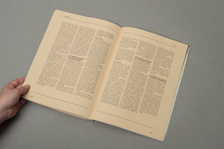
An article from the inside of the last part, Historia.
The colophon.
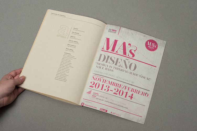
All the ads are coherent with the spirit of the magazine.

A detail showing the paper.
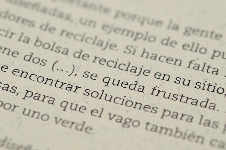
A detail showing the typography.
Another detail.


