Company “Inforum” provides high-speed access to the Internet via fiber-optic channel since 2011. Due to the professional growth they need a new logo design and corporate identity printed products.
TASK:
- To develop a new logo design. Catchy and colorful style, as well as reflect the core activities of the company;
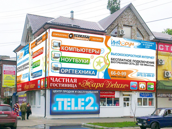
- To develop a style of print advertising. Design should be bright and eye, as well as combined in style with logo.
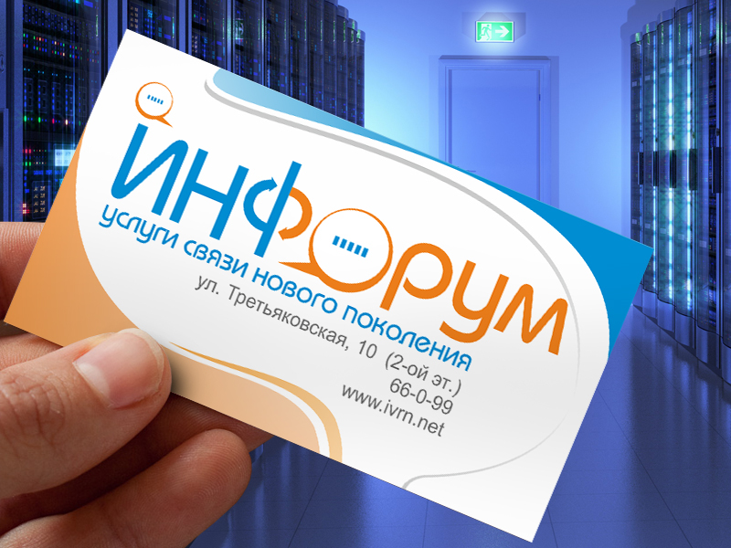
I decided to divide the logo into two halves:
“Инфо (Info)” – information, communication, exchange of information;
“Форум (Forum)” – communication, independent of the distance.
And to link those two halves using the letter “Ф”, arrows depicting the exchange of information.
The letter “О” has become a very good dialog cloud and another cloud of orange I posted above the letter “И” for the balance of colors. Thus, dialog clouds represent transmission of information over long distances.
“Wherever you are, how far are, you will hear from Inforum!”
Style printed products was performed using the same colors. Make the edges of blue and orange waves background inspired me the phone cord lying on the table. This is the best suited for my customer.