


One of the versions I liked but was later tweaked to fit the client's needs.

Given I loved how the lettering turned out I decided to have it animated and thought it would be an interesting idea than just a static image. I intend to do more along these lines in the future but with more swashes and ornamentation.

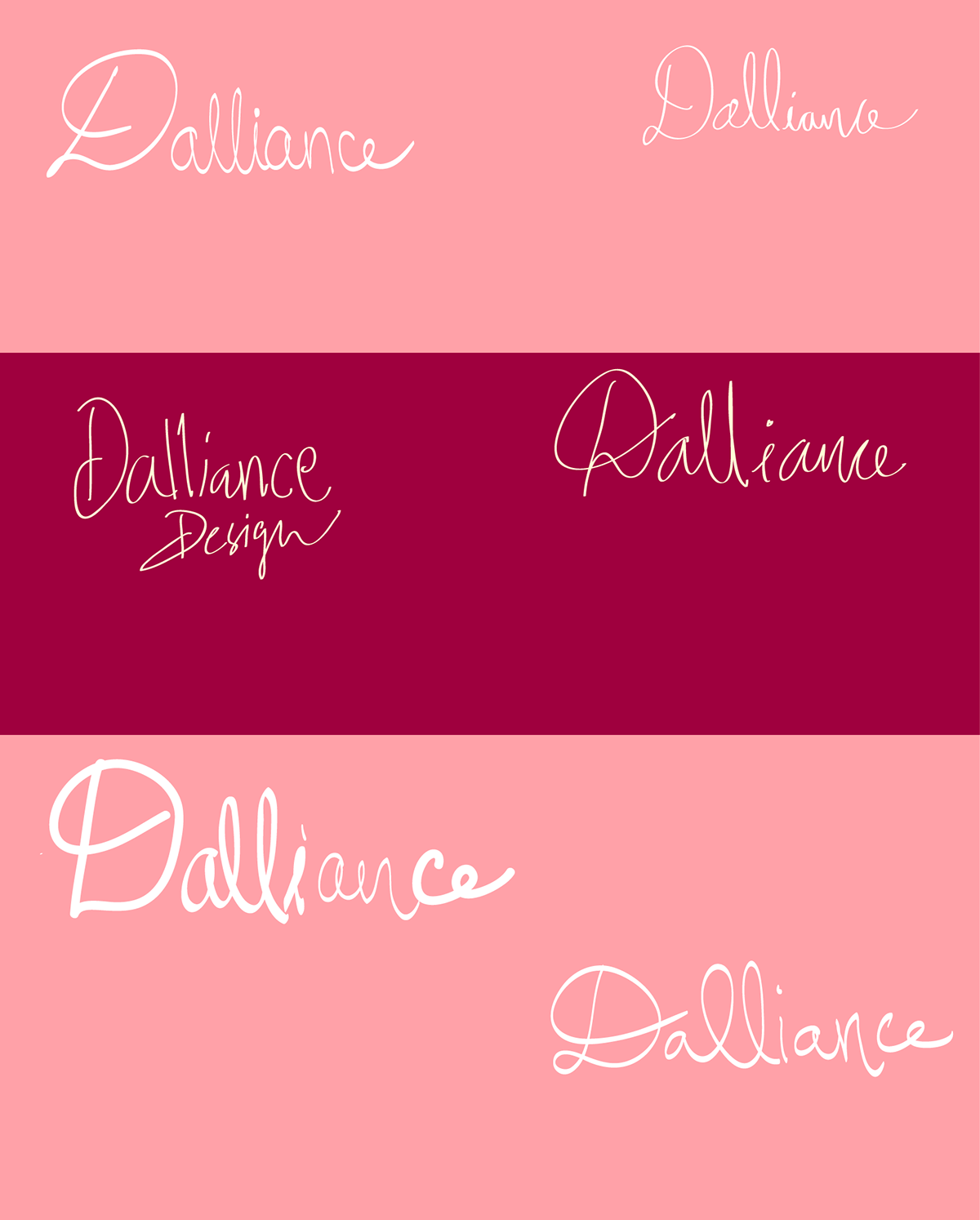
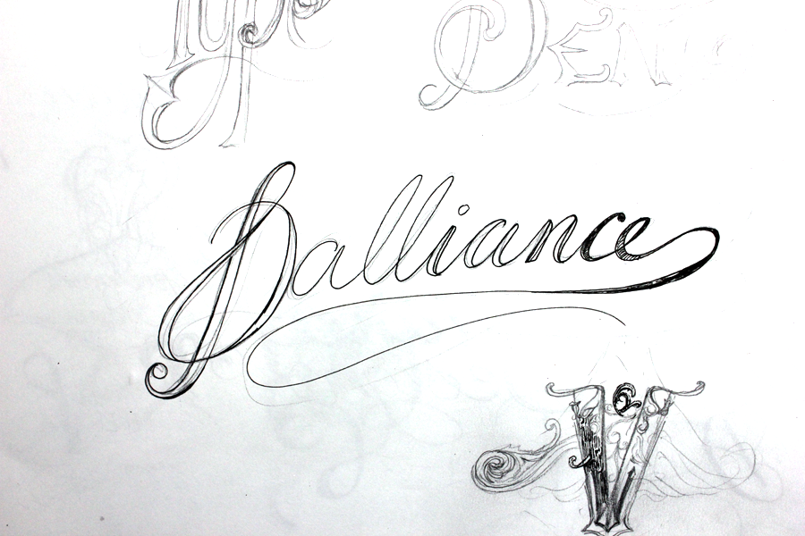
Conceptualising and cleaning up in the initial stages. Seeing what works and what doesn't. The stylised "a" was a challenge and there's still mixed emotions about the "a" from the feedback I received and therefore I decided to an alternative version of the "a" in a slightly different form.


Alternative "a"
This piece was one of the alternatives using a different "a" and it has little to no ornamentation. You could say the client had likes for a plain version as well since it had little distractions.

Finalised Artwork with some things cleaned up for more legibility and the ornamentation removed. The ball terminals were given a different highlight, etc.

Monogram

Series of attempts in trying to capture femininity in the lettering. I had some fun working on this non-uniform style since I hadn't tried lettering like this before this project.

Initial Mockup Sketches (Pen n Ink)


Arrow
Series of attempts in trying to incorporate the arrow into the D in the most legible manner without completely disturbing the D's elegance. Dalliance and the arrow have similar connotations, Cupid perhaps?