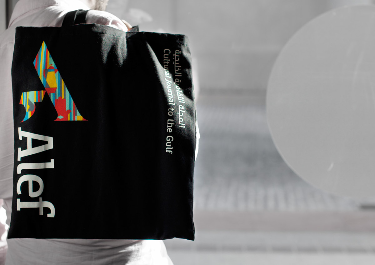
Alef Magazine Brand identity
and Editorial Design
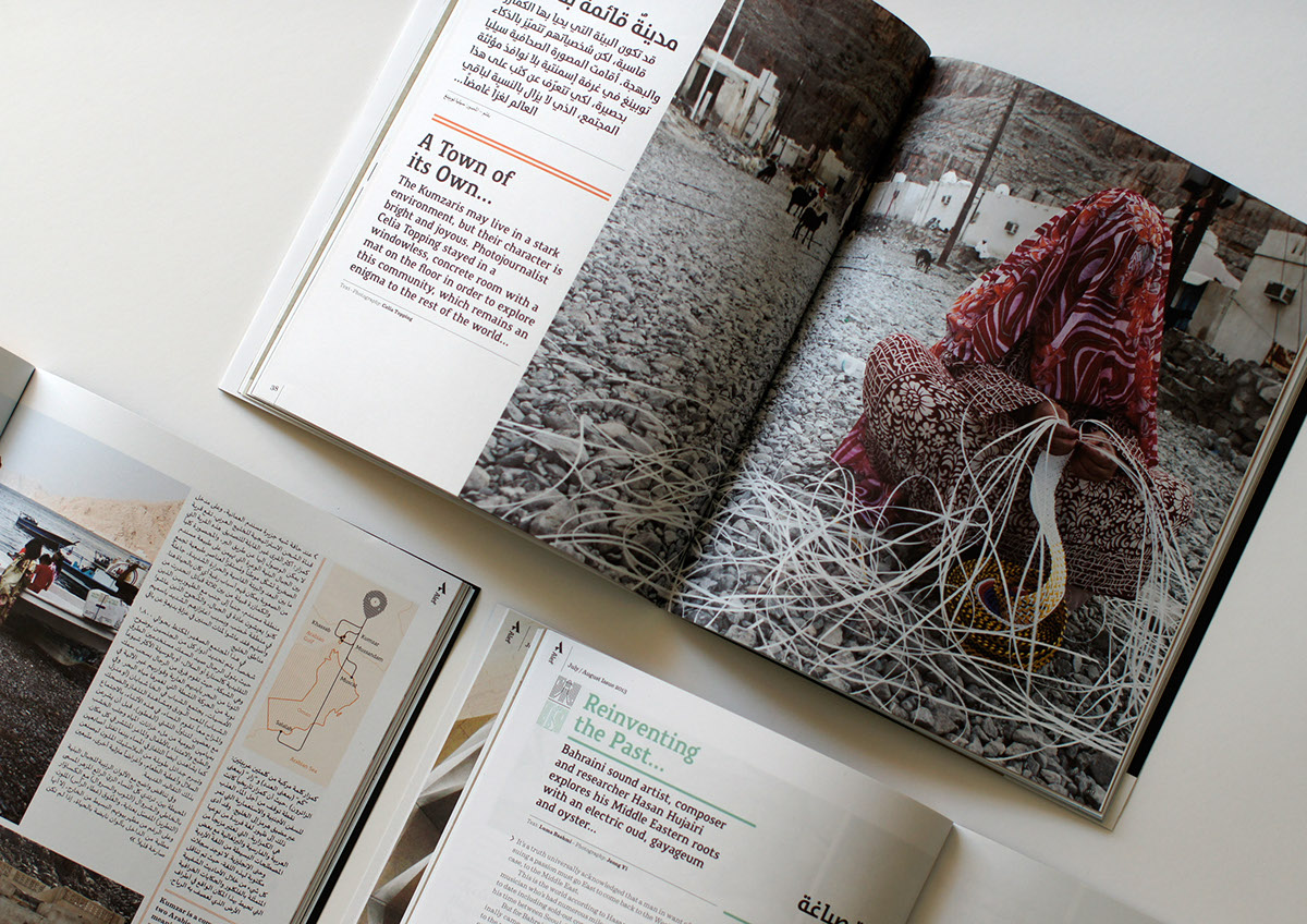
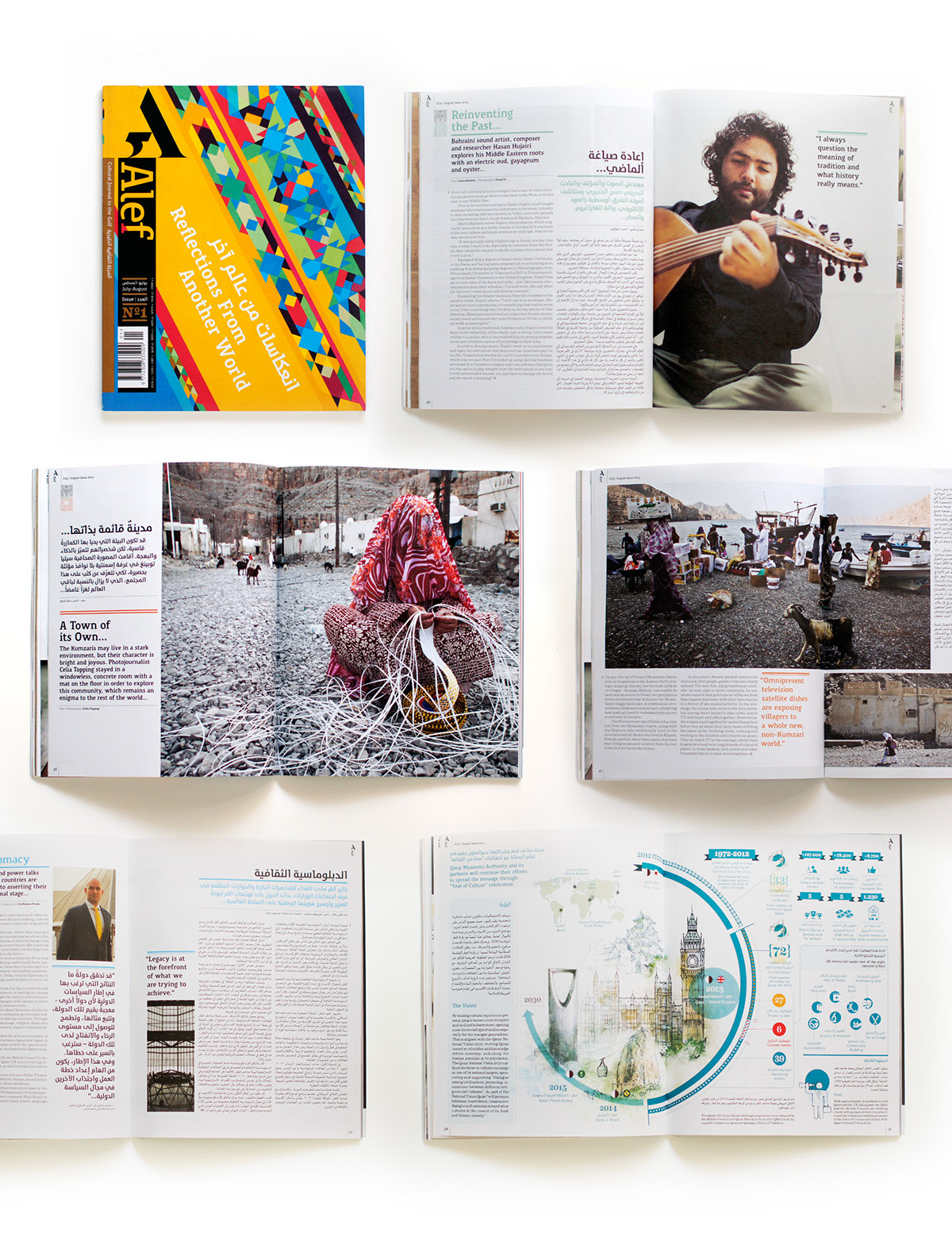
An independent magazine published out of Doha, Qatar. It was launched last July 6, at the Serpentine Gallery on the last day of the Mayor of London’s Shubbak Festival, a 3-week-long Arab contemporary art fair. Printed bi-monthly, it is one of the first Arabic and English bilingual formats to come out of the Middle East focusing on cultural topics that are indigenous to the Gulf region. It is distributed worldwide.
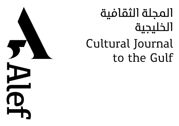
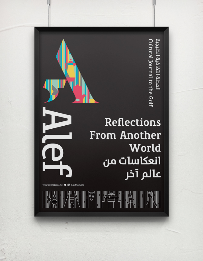
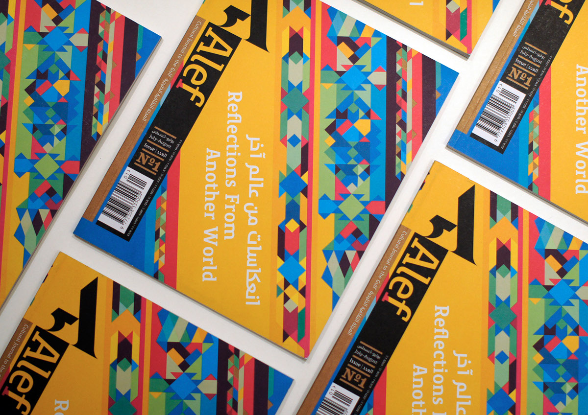
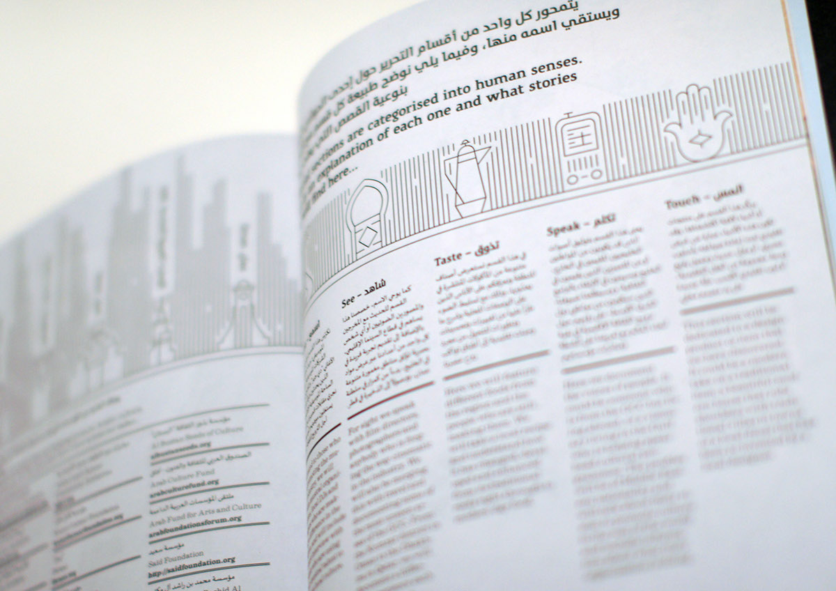
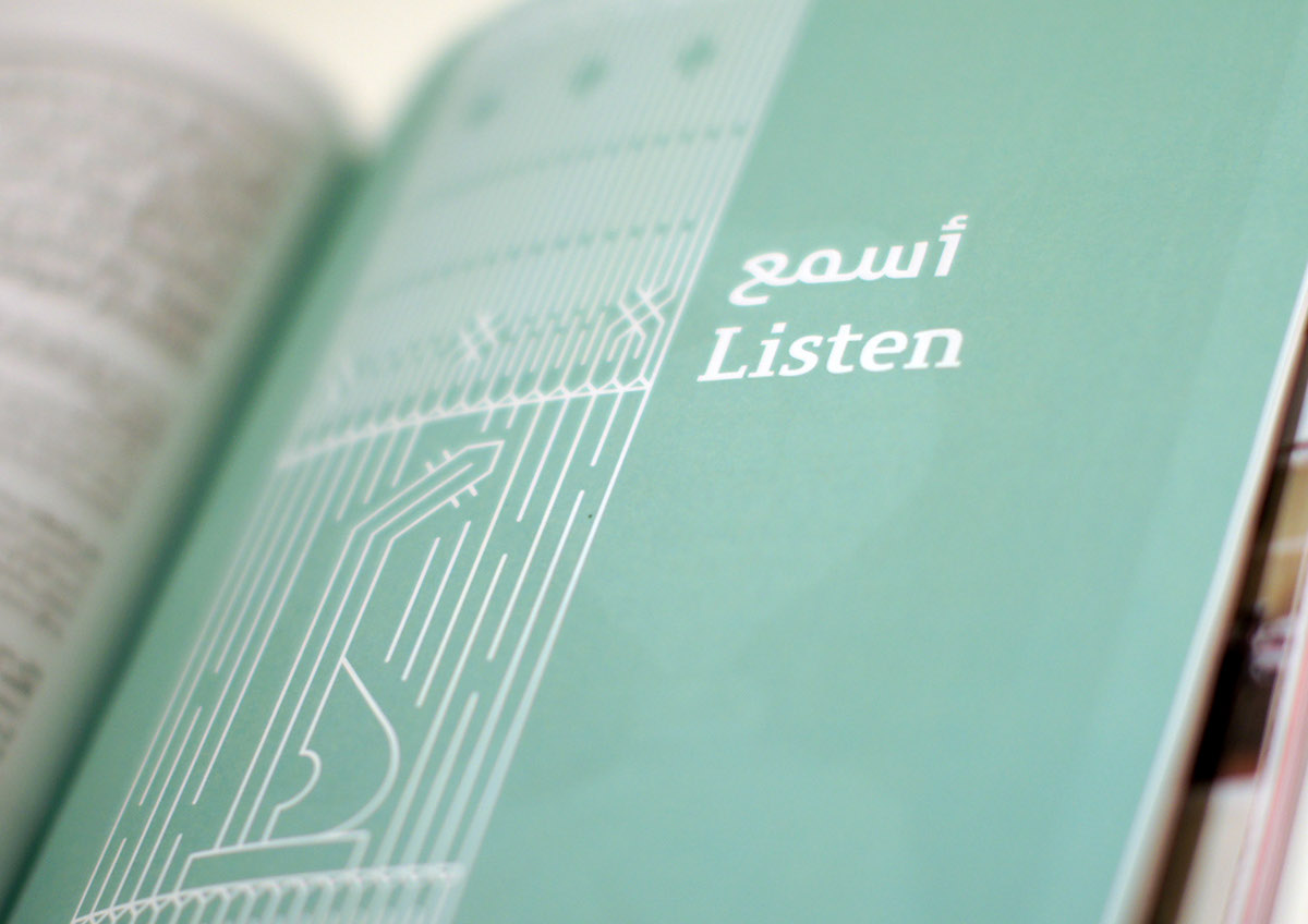
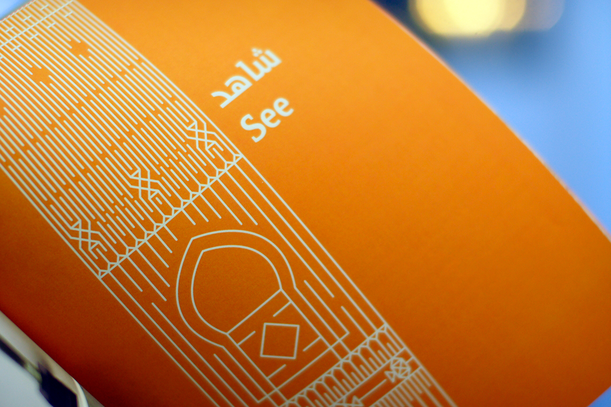
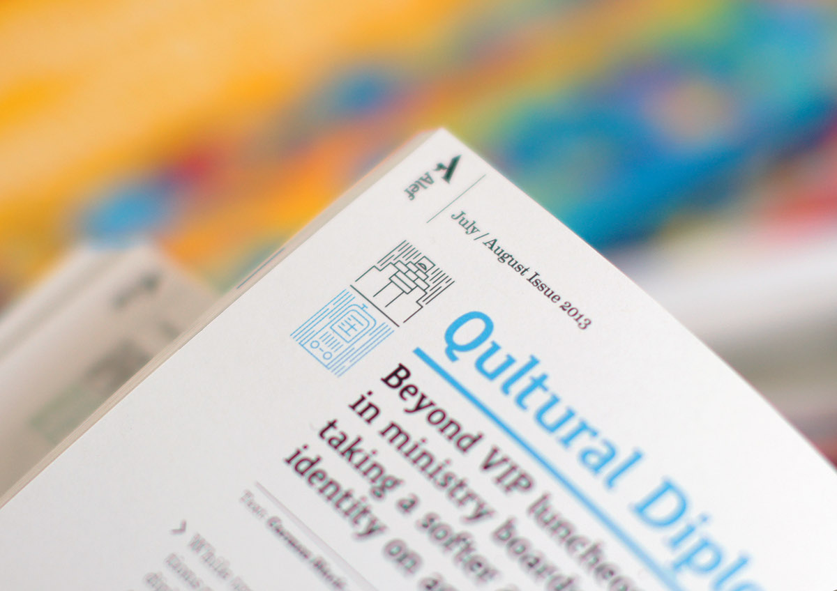
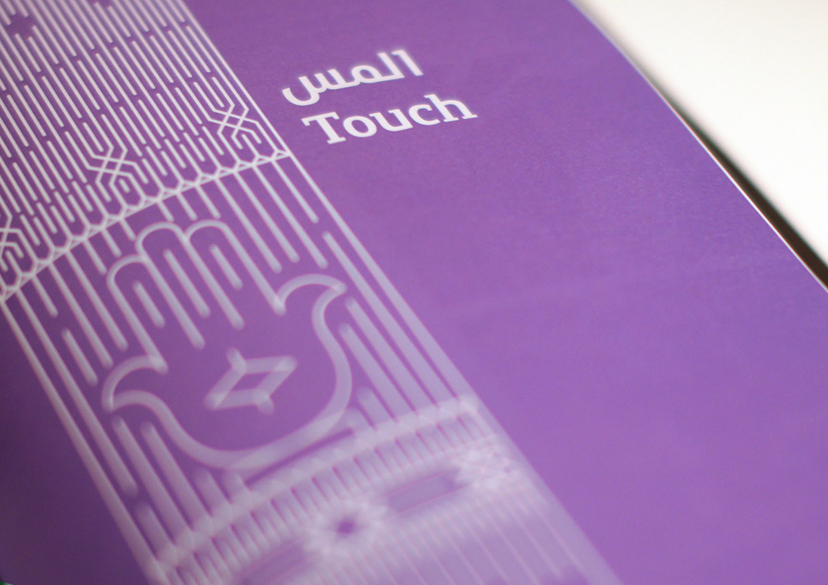
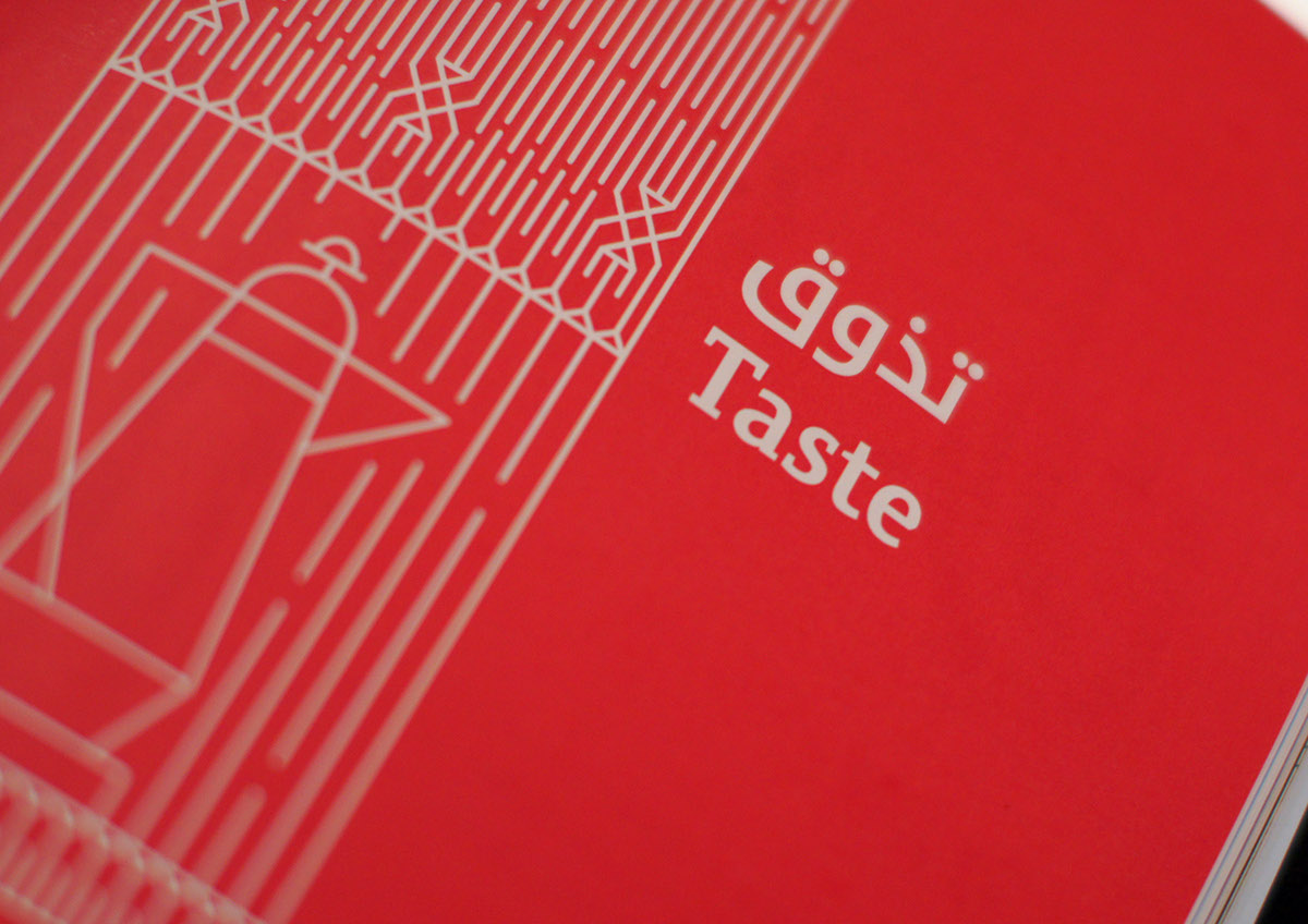
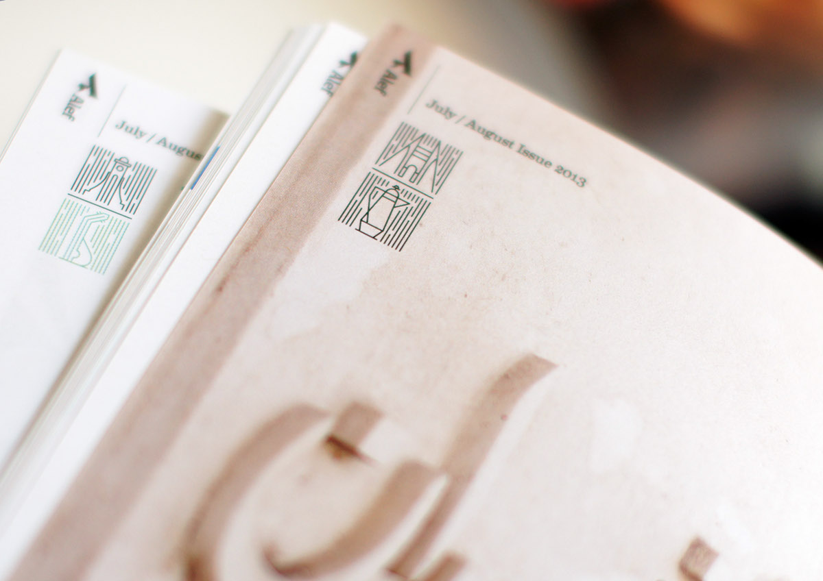
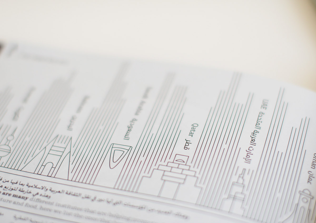
The symbol is a representation of the first alphabet of both languages and by using the the vertical form of the Arabic alphabet to further enforce the idea of a dual language brand mark and cover masthead, this core idea of integrating too completely different languages follows through out the magazine, and using a flexible grid system that allows both languages to coexist on the same spread without duplicating image content and articles can be written in either languages first. Usually dual Arabic/English language publications coming out of the Middle East are mirrored and always seemed that the second language is done as an after thought rather than as part of the design solution. 28 designed Alef magazine in a way that gives the opportunity for readers and writers to have a richer and engaging content by using a simplified way to navigate the magazine and dividing it into five senses illustrated by pictograms relevant to the region and inspired by the local textile (Sadou) patterns.
The symbol is a representation of the first alphabet of both languages and by using the the vertical form of the Arabic alphabet to further enforce the idea of a dual language brand mark and cover masthead, this core idea of integrating too completely different languages follows through out the magazine, and using a flexible grid system that allows both languages to coexist on the same spread without duplicating image content and articles can be written in either languages first. Usually dual Arabic/English language publications coming out of the Middle East are mirrored and always seemed that the second language is done as an after thought rather than as part of the design solution. 28 designed Alef magazine in a way that gives the opportunity for readers and writers to have a richer and engaging content by using a simplified way to navigate the magazine and dividing it into five senses illustrated by pictograms relevant to the region and inspired by the local textile (Sadou) patterns.