The Cyber center’s corporate identity (this is real case).
The main task of this project is the promotion of cyber-sport in Russia. Due to setting up new cyberspace people will get an opportunity to develop and perfect their computer skills. Besides, regional cyber-tournaments and competitions will take place here.
I worked out the following solution: I identified the core colors of the project: neon blue, neon green, and a gradient of these colors + black. The chosen colors cause appropriate associations because they can be often seen on a phone, laptop, or keyboard backlight.
The outline of a logo is a rectangular parallelepiped through which I demonstrate an astonishing versatility of the center’s space, where every player dives into during a game. Located in the middle a Download-bar has a shape of «C» letter. The binary system simulation as well as basic programming language symbols became one of the main elements of the Cyber center’s style.
The Cyber Center is a place of interaction between members of the international community. Therefore, I created a personal font based on ROBOTO (Cyrillic) and diacritics from different languages around the world.
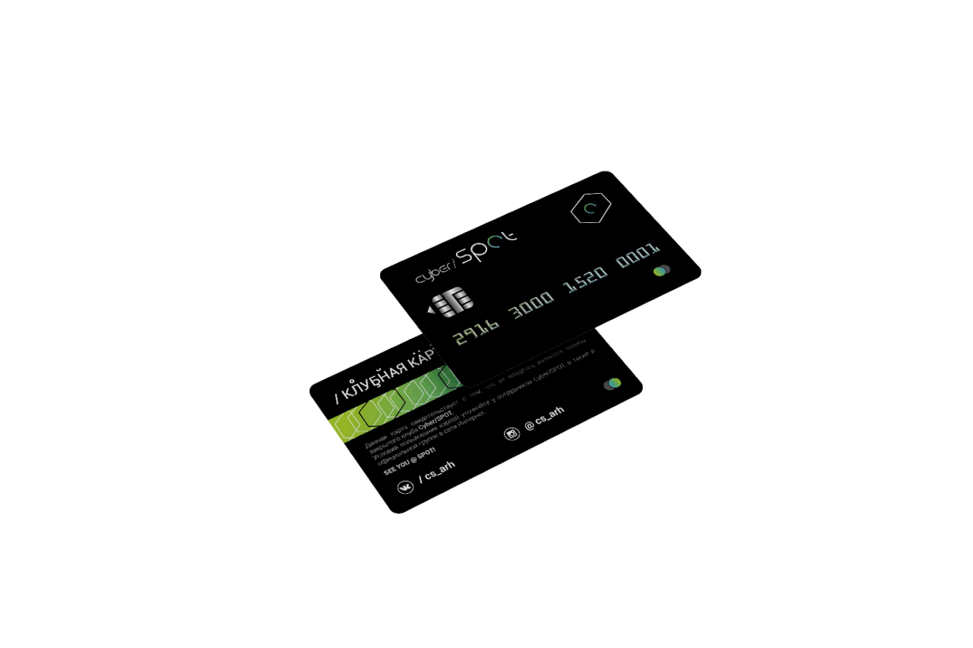
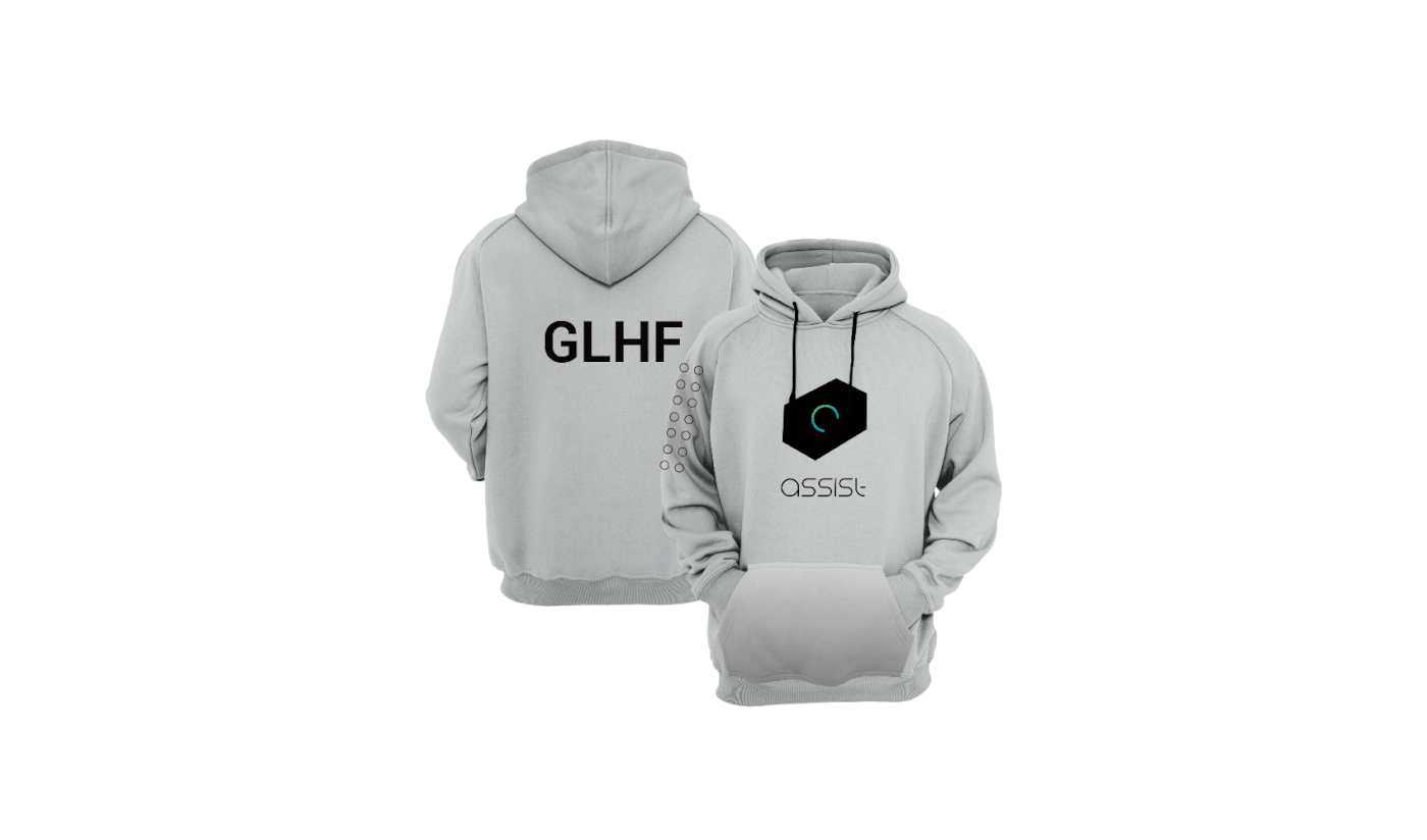
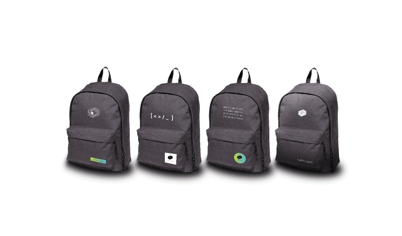
The case includes a lot of style units for the greater involvement of young people.
+ I used gaming slang in fashion design.