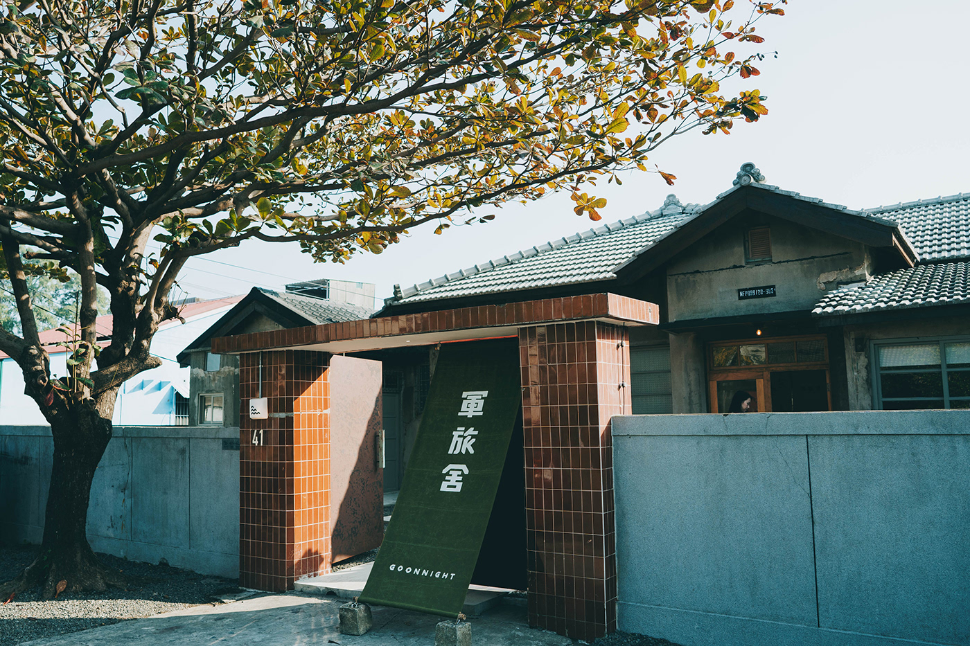
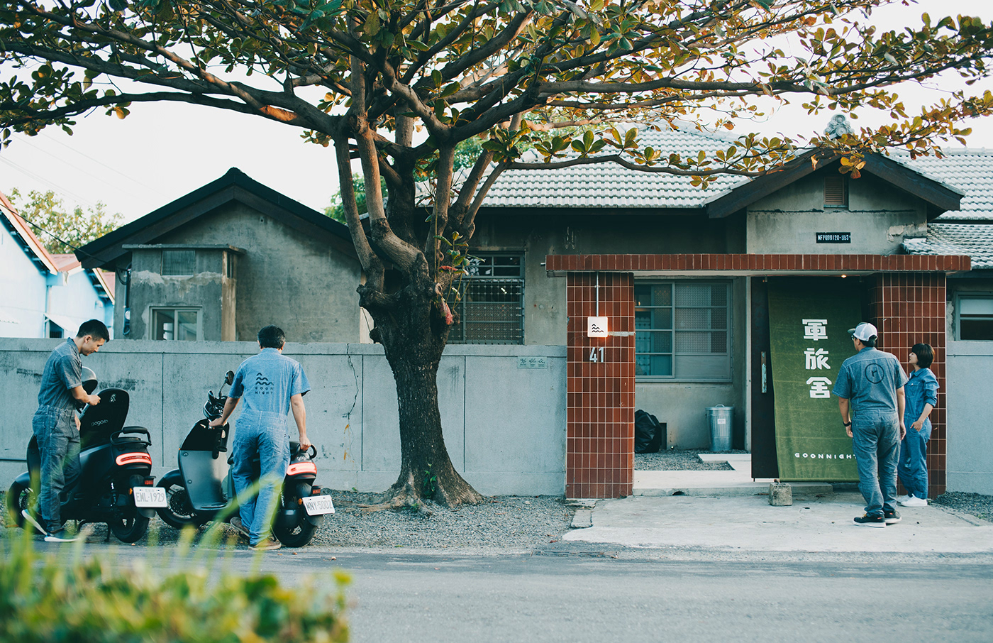
軍旅舍正門口 攝影|林祐任
Goonnight Hostel in Military dependents' village B&B Identification System
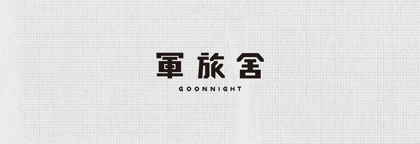
軍旅舍 座落在有著 70 多年歷史的左營眷村,
老屋透過空間的重新翻修與詮釋,
使歷史的文化與新世代共存,
使歷史的文化與新世代共存,
並成了現在的旅店 - 軍旅舍 Goonnight
Located in the military dependents’ village with 70 years history in Zuoying, Kaohsiung City, Taiwan,
two old houses are renovated into a new hostel - Goonnight.
“Goon” means military or soldier in Taiwanese.
The owners use the homophone of “Goodnight”,
representing the combination of military history and this modern, cozy hostel.
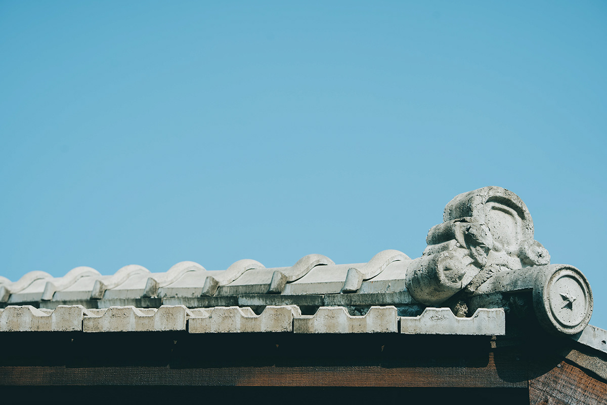
軍旅舍屋簷 攝影|林祐任
依據軍旅舍的特色,
發想視覺的初期便訂下了主要的關鍵字,
分別是:日式 Japanese style、海軍 Navy、兩戶相通 Two households connected
As the ideation started, three keywords came up according to the feature of Goonnight Hostel: Japanese style, Navy and Two households connected


兩戶相通|建材單位形
標準字 風格演進
A \\
包含 海洋 Ocean、結合書籍 Library、軍帽 Campaign Hat 的概念,
想表達軍旅舍不只是一間旅店,
也可以變成你想像中的家、書店或是任何形式的空間。
Combining concepts like Ocean, Library and Campaign hat, we try to show that Goonnight is more than a hostel.
It is also a dream home, bookstore or places of any possible kind.
B \\
視覺進行到了中期後有了一個相較成熟的版本。
標準字的部分,
筆畫上前窄後寬、勾勒的筆勢,
象徵『軍』的風格意象。
As we developing the ideas, the visual evolve to a better version.
In logotype we use neat and sharp strokes showing the characteristic of the soldiers.
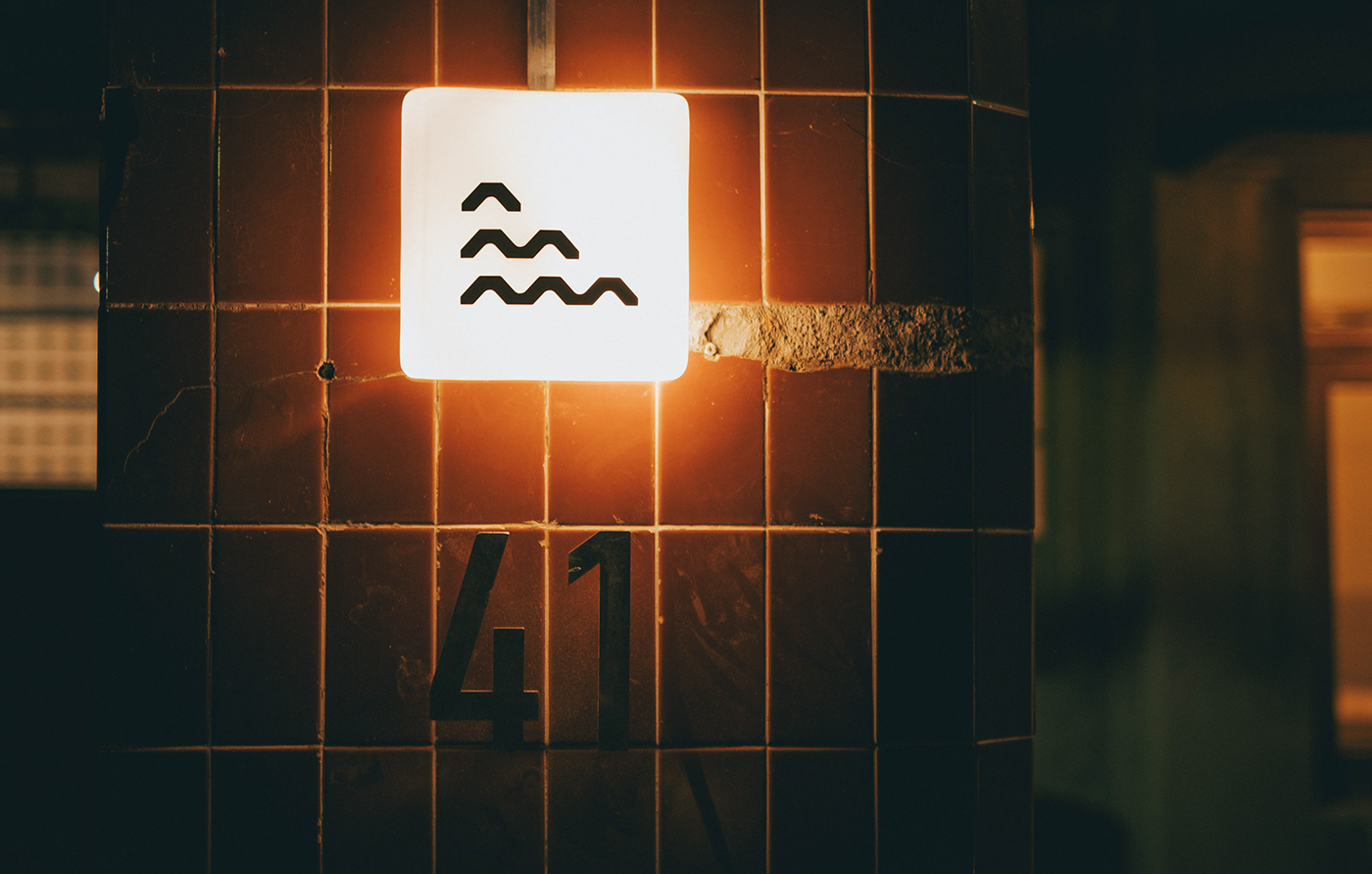
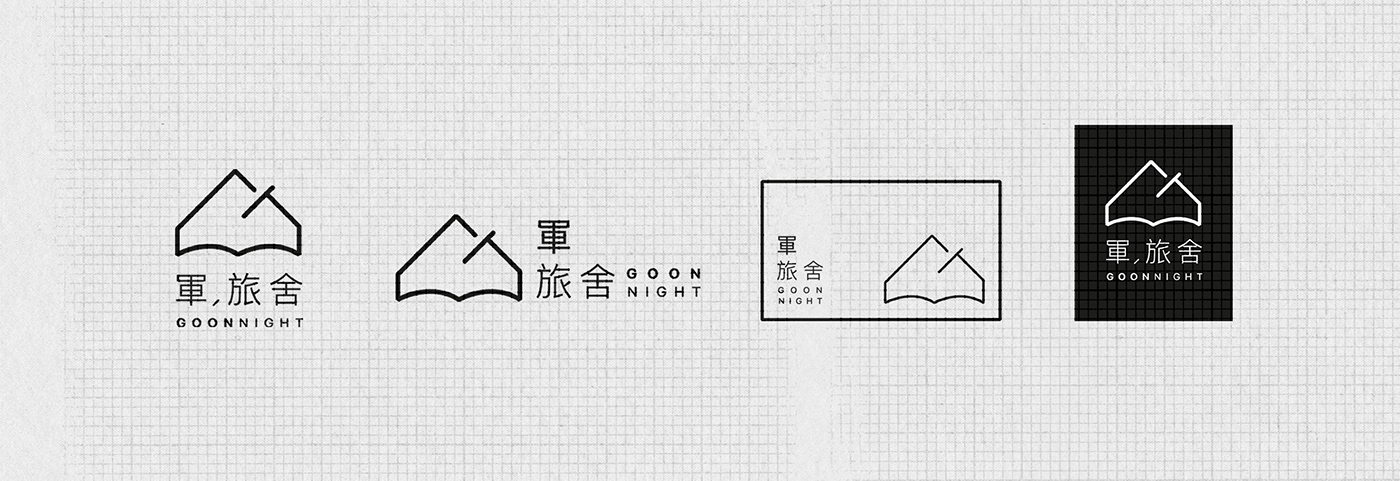
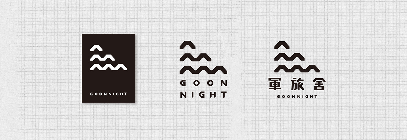
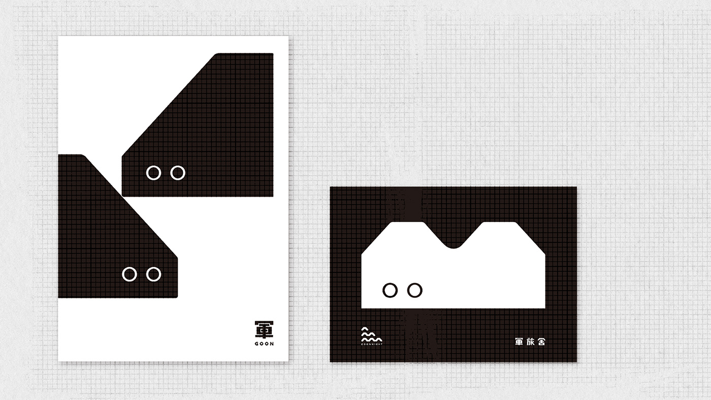
Logo 則是以大屋頂為最上層,
象徵 旅店 Hostel、家 Home 的感覺,
第二層是 兩戶相通 Two households connected 的建築特色,
第三層則是象徵 海洋 Sea。
On the upper part of the logo was the big roof of the hostel,
in the middle was the feature of two households connected and the bottom was the symbol of the ocean.


經過各方討論後,
最終希望整體的風格可以再精簡、平易近人些,
於是以類似的概念再去嘗試新的版本。
After further discussion, we found that it would be better to simplify the whole style.
Such concept led us to the final version of the visual.
__________________________________
FIN \\
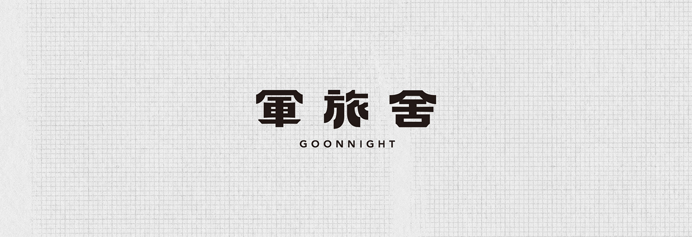
最後的標準字定案,
是以軍旅舍建材之一的磚頭樣貌作為單位型。
The final version uses the shape of the bricks in the building as unit form.
將磚塊這樣的單位形應用在標準字上,
筆畫相對單純,
營造復古樸實並帶一點可愛感,
呼應軍旅舍是一個適合親子出遊的好居所。
Applying this unit form to the logotype makes the strokes look simpler and brings in some cuteness. This also relates Goonnight hostel with a nice place to stay for family trips.
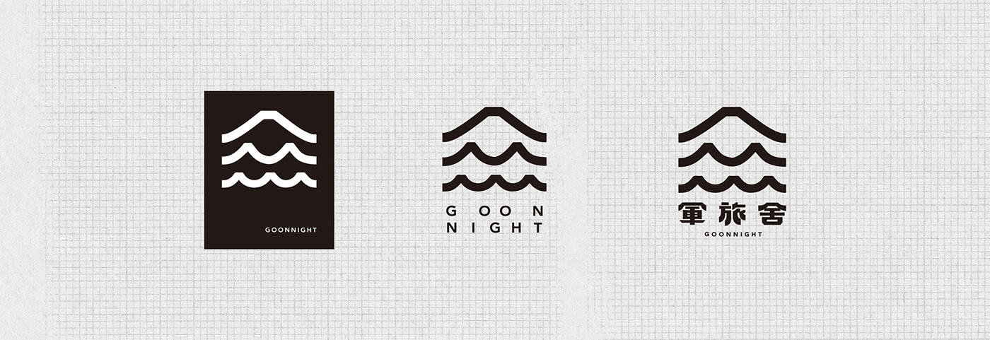
Logo 則是將單位型的磚頭放在最上層,
由上而下排列,
象徵一點一滴的堆砌,
第二層為兩戶相通的建築特色,
第三層可以有較多想像,
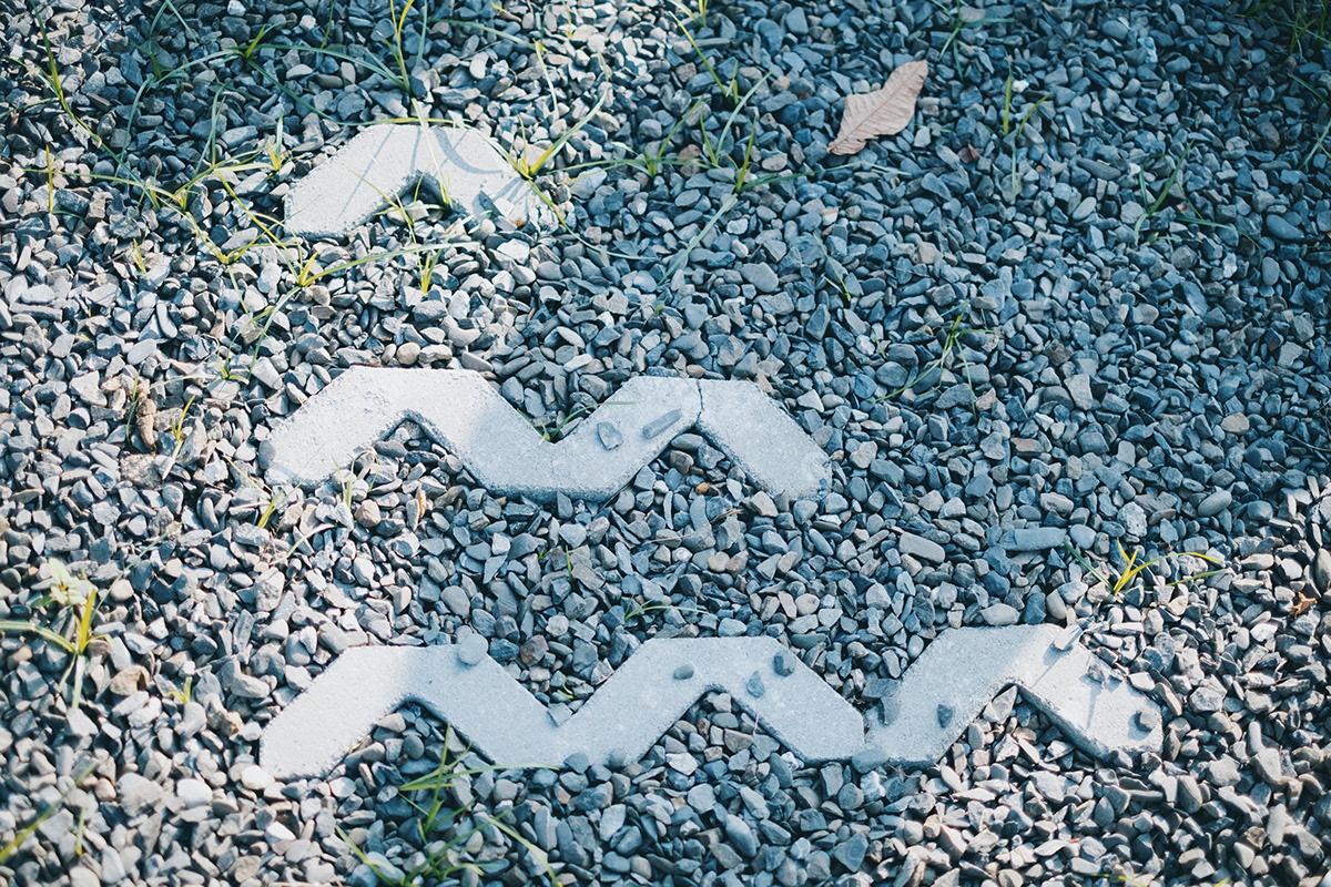
可以是門口的屋簷、有歷史文化的海浪,
同時也有眷村的意象。
Meanwhile, for logo we stacked the unit forms, giving the meaning that the hostel is built by one after another bricks, just like history itself.
The logo can be divided into three layers from top to bottom.
The first layer is the unit form, while the second layer connects two unit forms, representing the feature of “two households connected”.
Last but not least, we give the third layer more space for imagination.
It could be the eaves of the houses, ocean waves of history and culture and the imagery of military dependents’ village.
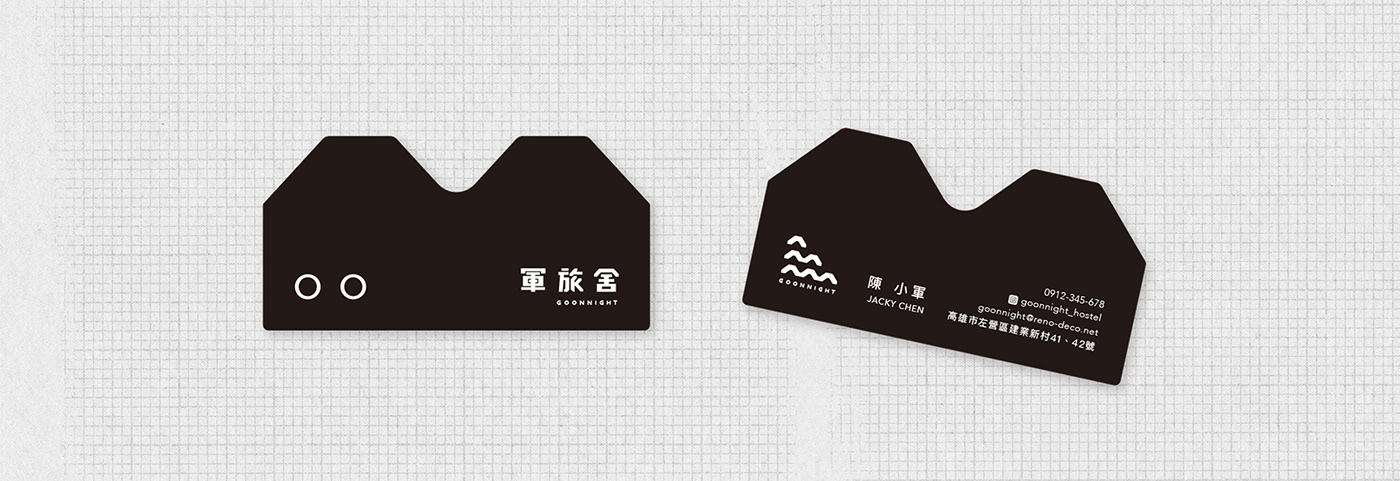
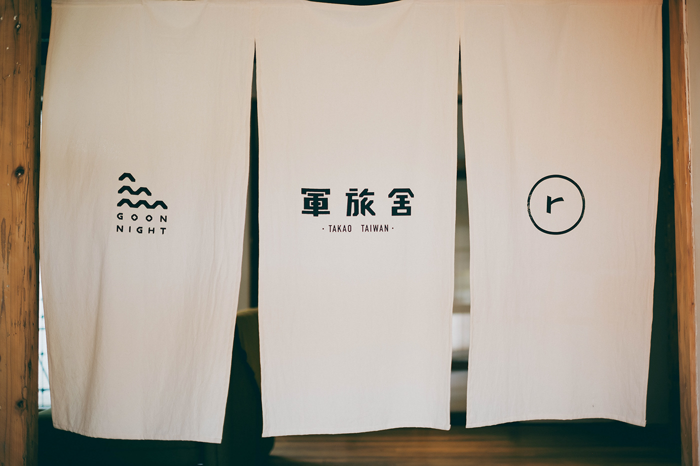
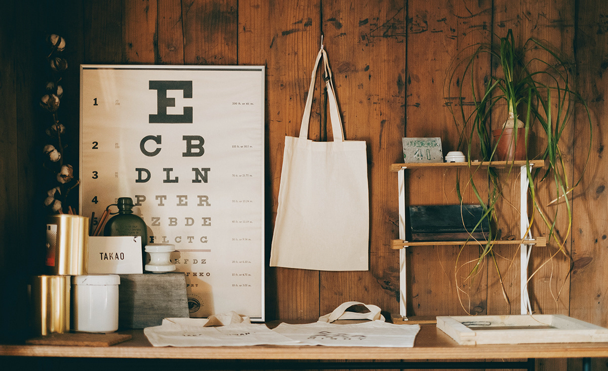
名片 NAMECARD \\
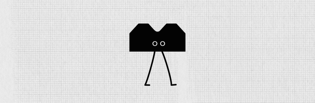
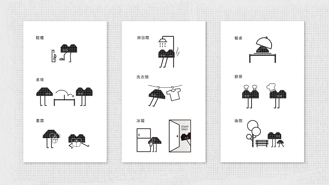
吉祥物 MASCOT \\

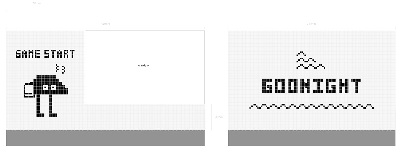
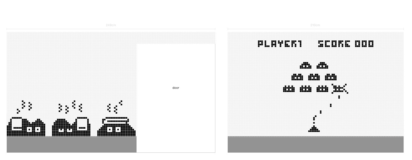
指標系統 SIGNAGE SYSTEM \\
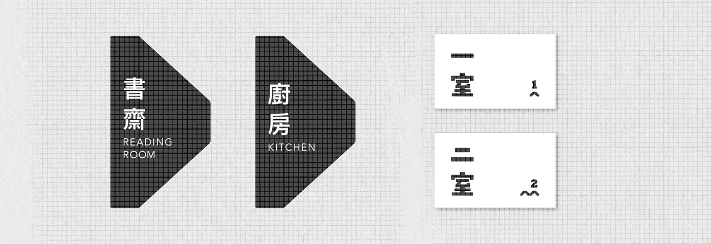
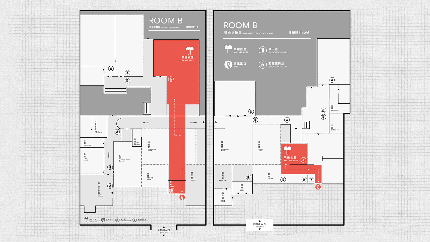
逃生動線 EVACUATION PLAN \\
貼紙 STICKERS \\
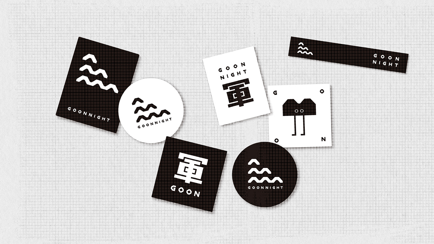
明信片 POSTCARD \\


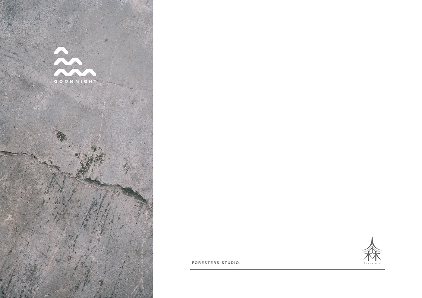
Goonnight
Goon [ 軍 ] , 台語發音
Goodnight , 晚安


攝影|林祐任
澡堂磁磚壁面設計 Bathroom Design \\
從一顆一顆小小的浴磚聯想到兒時玩的 8-bit 街機遊戲,
透過浴磚組合成有趣的圖案,
讓一家人在進入澡堂時能會心一笑。
The mosaic-like bathroom tiles recall the pixels in 8-bit arcade games.
For bathroom design we try to put the customer in a good mood by assembling the tiles into cute images.


攝影|林祐任
rnd inc. 空間設計事務所
室內空間設計規劃
老屋翻新改造
老屋翻新改造
人森設計工作室 Forests Studio
視覺識別系統規劃
平面設計師
林怡蓁 DADA LIN
平面攝影師
林祐任 YOYO LIN

軍旅舍 臉書粉絲專頁
rnd inc. 空間設計事務所
Goonnight!
來去眷村住一晚,和你身邊的人說聲晚安。
攝影|林祐任