


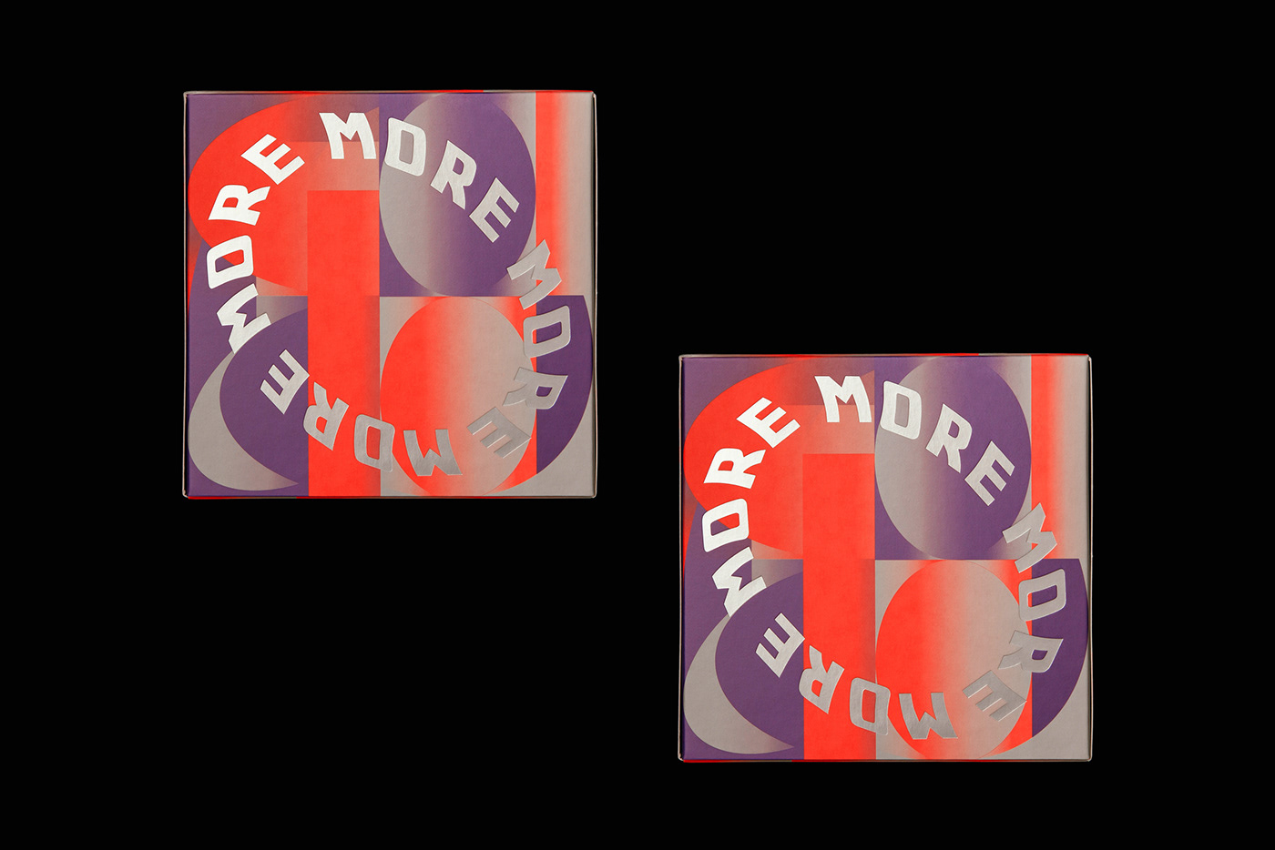
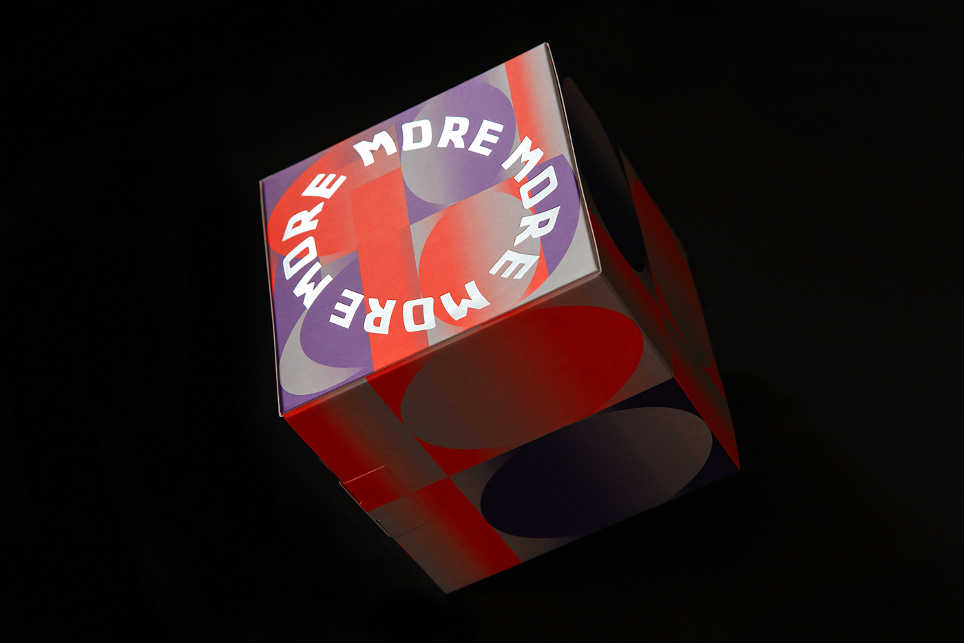
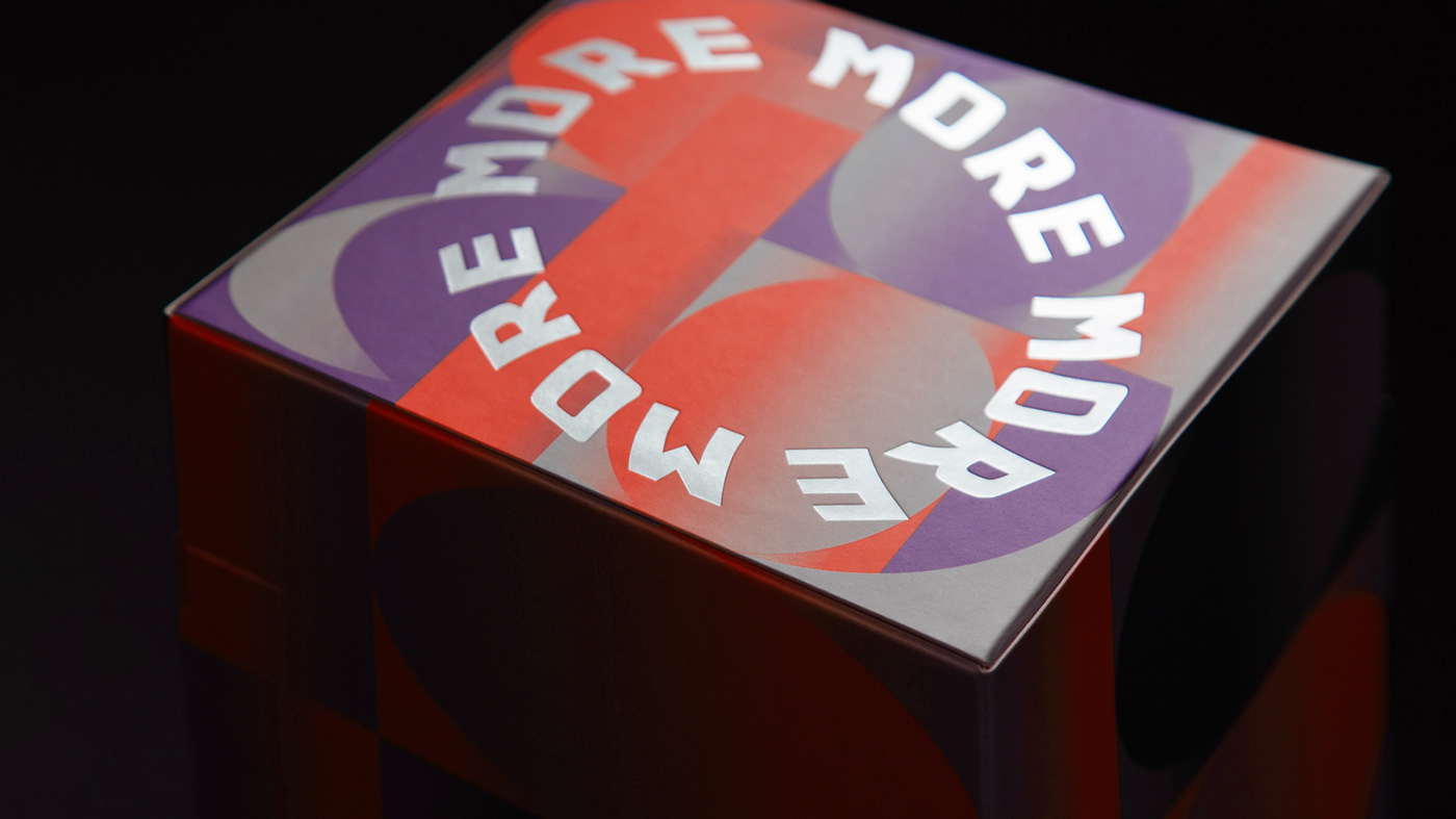
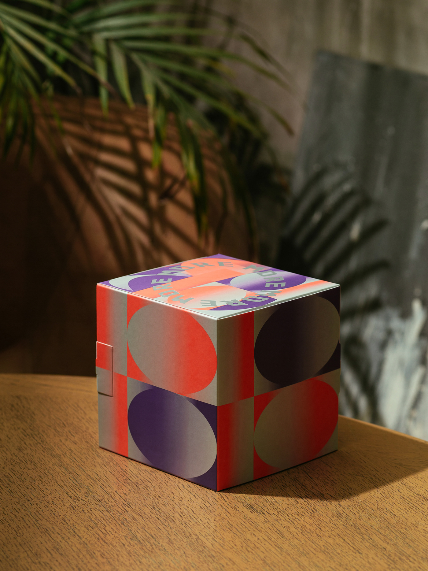
more more cake packaging
抹 more 是一間位於台北的咖啡廳,以一顆顆別具特色的手工蛋糕為名,甜點外層會包覆著一層濃郁的鮮奶油,在外盒的設計上,呼應了店名與鮮奶油抹開的關係,在 more 與 more 之間,創造綿延滑順的視覺感受。配色上則參照了店內的空間色系,以橘紫兩色, 讓蛋糕外盒化為店面的延伸空間。
‘抹 more’ is a cafe located in Taipei City, and it is well-known for its homemade cakes. The Chinese pronouncing of ‘more’ could indicate the buttercream frosting that spreads over cakes. This inspired the concept of package design, "More" sounds like "wipe" in Chinese. Swipe the butter on the cake is the most important process when you make cake more complete. I try design via gradient and color lump to present the connection between the cake and the side after you sliced the cake.
‘抹 more’ is a cafe located in Taipei City, and it is well-known for its homemade cakes. The Chinese pronouncing of ‘more’ could indicate the buttercream frosting that spreads over cakes. This inspired the concept of package design, "More" sounds like "wipe" in Chinese. Swipe the butter on the cake is the most important process when you make cake more complete. I try design via gradient and color lump to present the connection between the cake and the side after you sliced the cake.

Piece of cake


Piece of cake


Client:抹 more
Graphic Design : Yang Chun
Copywriting : Moma Liu
Graphic Design : Yang Chun
Copywriting : Moma Liu
Photo : Steven Chuan-Shun Huang (58kg)
Copyright © Y_Y_A_N_Graphic. All rights reserved.
THANKS !
THANKS !


