


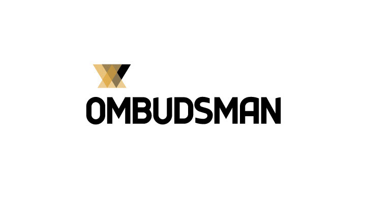
The Ombudsman logo has a bold typeface, the latter giving a sense of strength to the word itself. This boldness is complemented by a light icon, which with its overlapping structures represents interaction, discussion between people or entities. The darker structure representing the Authority backing up this interaction.
The logo at once strong and approachable may be signed off with a slogan to reinforce the action of the specialized areas of the authority. Therefore the general logo bearing the slogan: focusing on your rights is to be replaced by the logo bearing the name of the prospective departments such as Education, Environment & Planning, Health and so on.

Using a main colour for the corporate logo and colour coding the different departments will enable the clients to identify the required entity quicker. This will strengthen the image of the corporate as a unity and also of each department individually. This coding will be used for all the digital and printing material.
The typefaces
EXPLORA TYPEFACE - used for the logo typography
The Explora typeface created in 2004 by French graphic designer Benoît Sjöholm is a bold contemporary type.
The Explora typeface created in 2004 by French graphic designer Benoît Sjöholm is a bold contemporary type.
DIN PRO TYPEFACE - used for slogan and the various authority sections
The DIN typeface is very legible and easy to reproduce. Both a medium and a narrow version are defined today. The typeface has gained popularity due to its wide exposure and has been also used by non-governmental organizations and businesses. The origins of this typeface go back to the type sheet defined by the Prussian rail network in 1906 for use on its trains. It is a widely used standard typeface for traffic, administration and business applications.
The DIN typeface is very legible and easy to reproduce. Both a medium and a narrow version are defined today. The typeface has gained popularity due to its wide exposure and has been also used by non-governmental organizations and businesses. The origins of this typeface go back to the type sheet defined by the Prussian rail network in 1906 for use on its trains. It is a widely used standard typeface for traffic, administration and business applications.
Advertising Agency: Mokapink.
Graphic Designer: Alessandro Caselli.
Client: Ombudsman Malta.
Brand: Ombudsman Malta.
Media: Print, outdoor.
Country: Malta.
Graphic Designer: Alessandro Caselli.
Client: Ombudsman Malta.
Brand: Ombudsman Malta.
Media: Print, outdoor.
Country: Malta.


