In 2019 the Teatro de la Maestranza in Seville convened several studios to redesign its identity and create a graphic system that responded to new communication needs.
Throughout thirty years of activity, its graphic identity has not evolved. However, its audience has been aging and has not been renewed.
The aim of the new direction of the theater was to connect with the new music audiences, through a program that, without neglecting its traditional subscriber base, would appeal to a younger sector. The identity should be a reflection of this programming: risky, contemporary and with an eye on the most avant-garde theaters in Europe.
To face this challenge, we formed a team together with two other Andalusian studios: Grupo Habermas, which would be in charge of redesigning the brand and its applications and Fernando de la Vega, who would take care of the digital ecosystem.
Our mission consisted in the design of the graphic system and its declines in all kinds of pieces, from the posters of the different cycles to the communication campaign of the new season.
The project that we show here, turned out to be a finalist, passing the cut, only two points out of a hundred from the first.


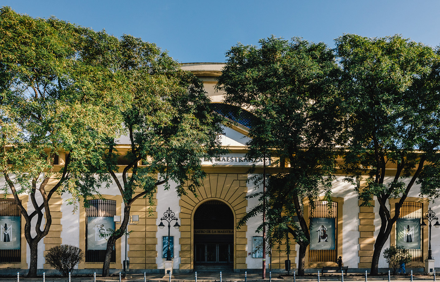
Thus, after analyzing the appearance of the theater, we find a space with a very particular characteristic: its double façade.
The Maestranza is the theater of the Seville Opera. It is built on the site of the Artillery Master's headquarters, from which its exterior façade is preserved. The existence of a classical façade, which was superimposed on a contemporary façade, suggested a metaphor for the relationship between the Theater and the city of Seville.

With that idea, we designed a graphic system based on that double façade, superimposing layers of information and geometric elements that could recall those theater facades.
Thus the seasonal graphic of the theater took shape, which would serve to create the promotional and communication material. This campaign would serve as an introduction to the new graphic style of the Theater.


To create the visual system of the different cycles of the theater, we delved into the idea of the double façade. We note that in those two facades of the theater there are many holes that allow you to contemplate its interior. The richness of shapes of these holes help define the architectural personality of the space.


We created a set of geometric shapes based on those architectural details that pierce the double façade. Each of these holes will serve to configure the layers with which each graphic piece will be built.

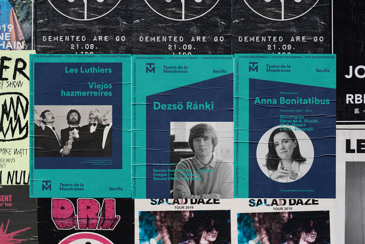
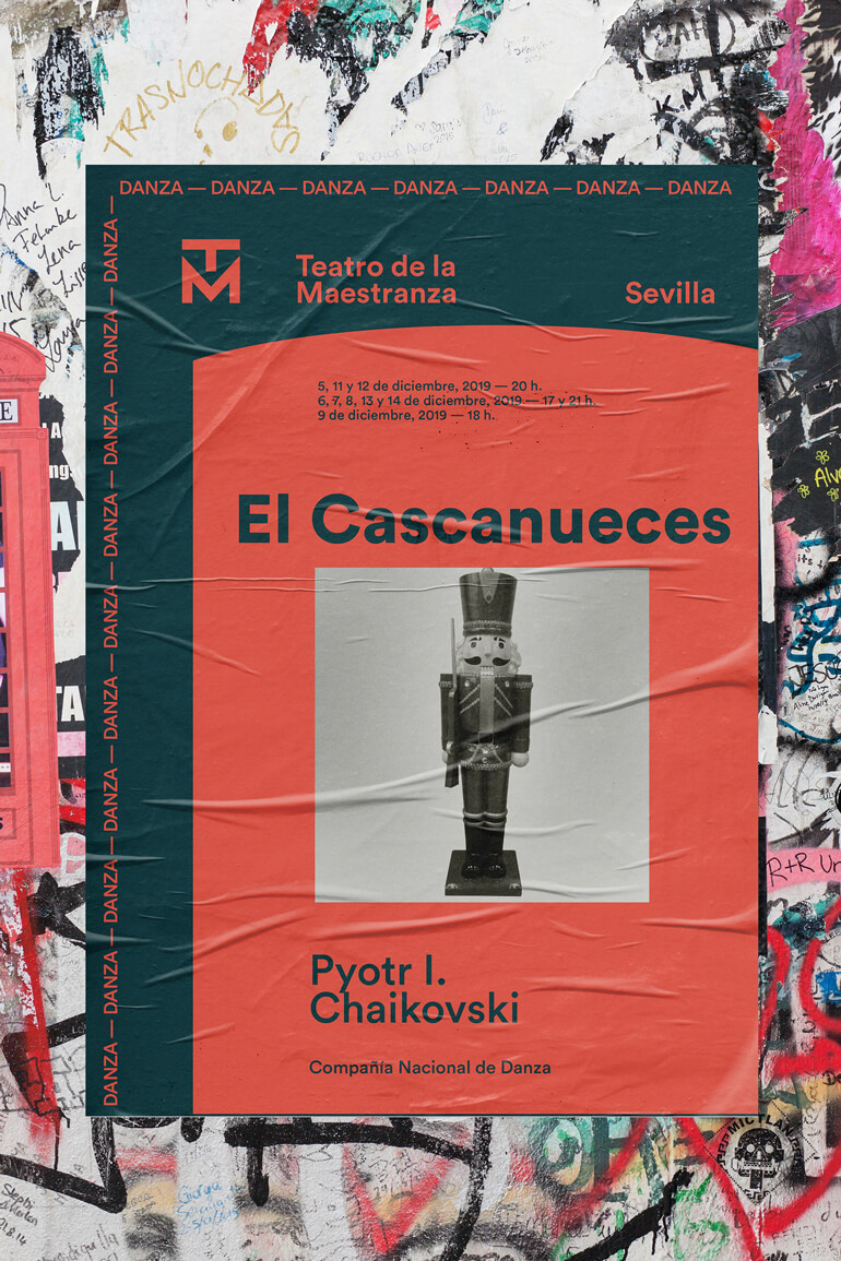
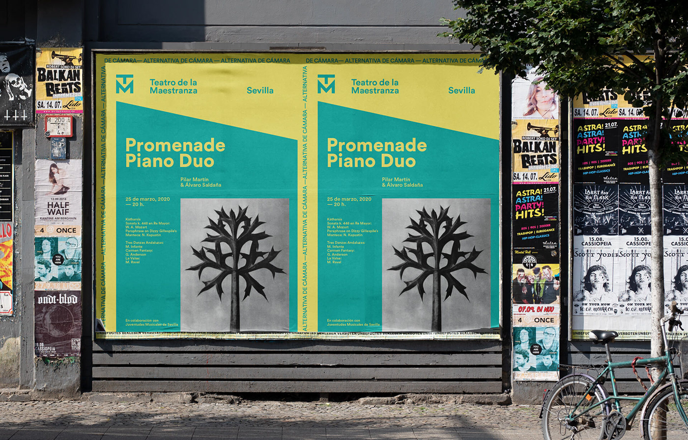
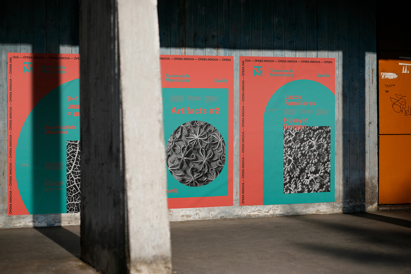
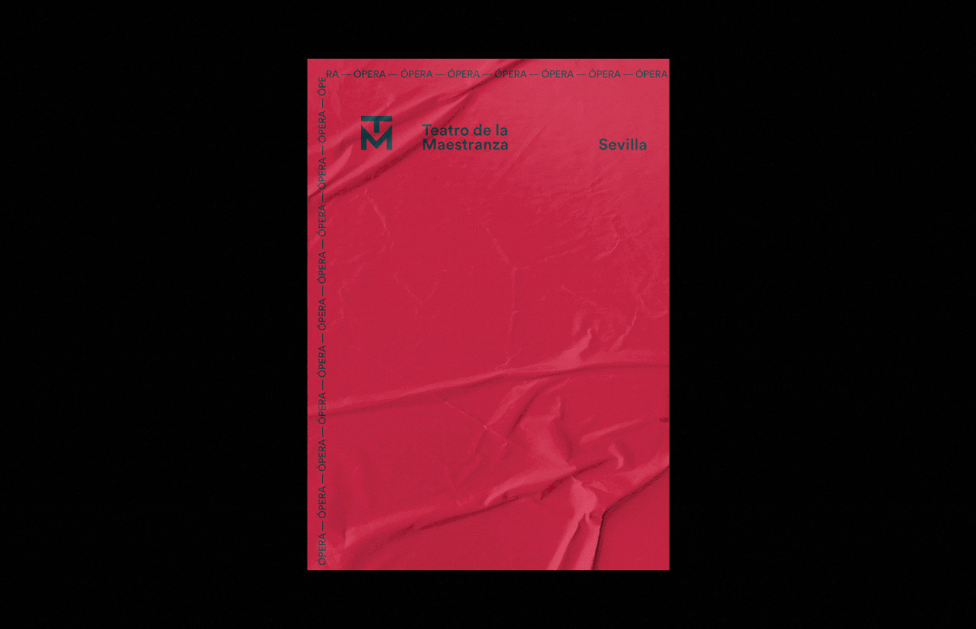
In this way, the visual system that encompasses all the cycles and works of the Teatro de la Maestranza is based on a layered composition —alluding to the two facades and the interior of the Theater—.
The first contains the new brand of the Theater and the information related to the cycle.
The second, which configures a kind of “poster within a poster”, would have the information related to the work, the author, the dates of the show as well as interpreters or other specific data.
The third layer would contain an image alluding to the specific work or the author.
The layer-based visual system allows multiple uses and makes it possible to adapt it to printed supports using different overlapping page formats.
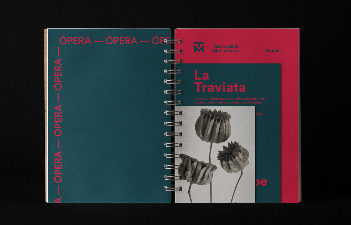
The geometric shapes of the holes would help to provide variability within each cycle. Thus, each work would have a different combination of geometric shapes, which would articulate its composition.

Completing the system, the different cycles would be identified with the help of a color code.

We create combinations of two colors, with a more or less vibrant appearance depending on the character of the cycle.