Clarica
Clear insurance solutions
Create a brand identity for a non-existent company
About Clarica
Clarica is the largest provider of home, auto and business insurance in Canada. Our products are distributed through a nation-wide network of insurance brokers or sold directly to consumers through call centres and the Internet. We understand that insurance isn’t just about protecting the things you care about, it’s about making the right decision. We want to make insurance as simple as possible for our customers. Helping you choose the right coverage is extremely important so that when an unforeseen event occurs, we’ll be there when you need us the most, and we promise to get you back on track in a fair, respectful and easy manner.
Brand Attributes
TRUSTWORTHY
SECURE
FRIENDLY
RELIABLE
PROFESSIONAL
CLEAR
HONEST
MODERN
SIMPLE
LIGHT
SECURE
FRIENDLY
RELIABLE
PROFESSIONAL
CLEAR
HONEST
MODERN
SIMPLE
LIGHT
Design Rationale
Clarica is an insurance company that offers the clearest and simplest plans for their customers. In order to portray that in their logo, I based it off the shape of a circle. The circle represents security and unity, and also the idea of infinity or a never-ending cycle. I also wanted to capture the idea of a step-by-step process that ensures customers will have the most understanding of what they are paying for. The logo is meant to modernize the company and make them more friendly and dynamic so that they may appeal to a younger audience. I wanted to create something that was easily applicable and versatile
Concepts

Logo Mark Development


Colour Palette

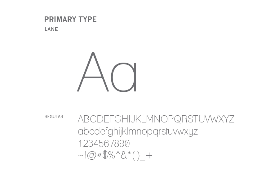
Typography

Application


Logo Animation


