About
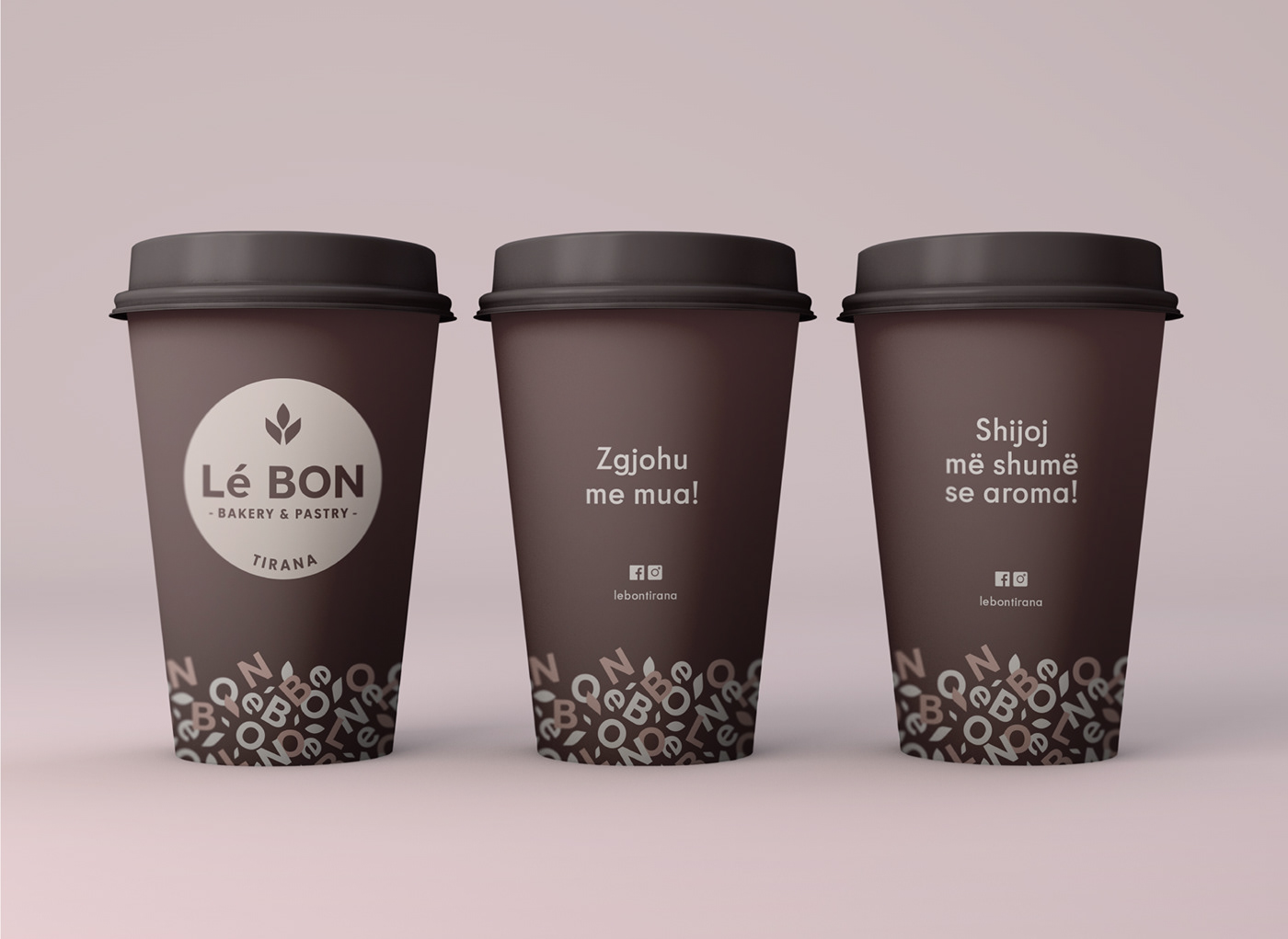
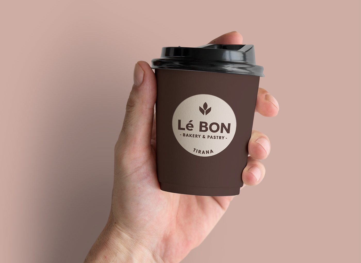
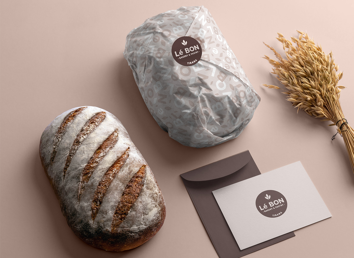
Le Bon is one of the best bakery and pastries in Tirana. This name sounds tasty for everybody that has been there. A family business directed by three nice brothers that are bringing our daily recipes in quality. It's a real tasty station located in a very strategic business place, for everybody who works or passing by. Under Recipe in quality we suggest organic colors, more near to the food, (trying to avoid black and gold color- old logo). Here is the rebranding of Le BON Tirana.
The Brief
To refresh their brand, we were asked to recreate the Le Bon logo based on the current logo structure, but to give a sweeter feel, to identify better their products and business profile and to be more minimal. Also it has to be associated with other graphic elements that later will be applied in different packages.

The Process
In order to create a sweeter feeling and a minimal visual language, we have refined the old logo starting by reshaping and simplifying all the elements on it, preserving the circular structure by filling it with brown color to establish an authentic appearance for the brand a minimal and sweater mood to meet their target audience.