Pure Beer LTD is a new Aberdeenshire brewing company. They set a competition online asking designers to create a new, minimal and modern logo. These were my final outcomes.
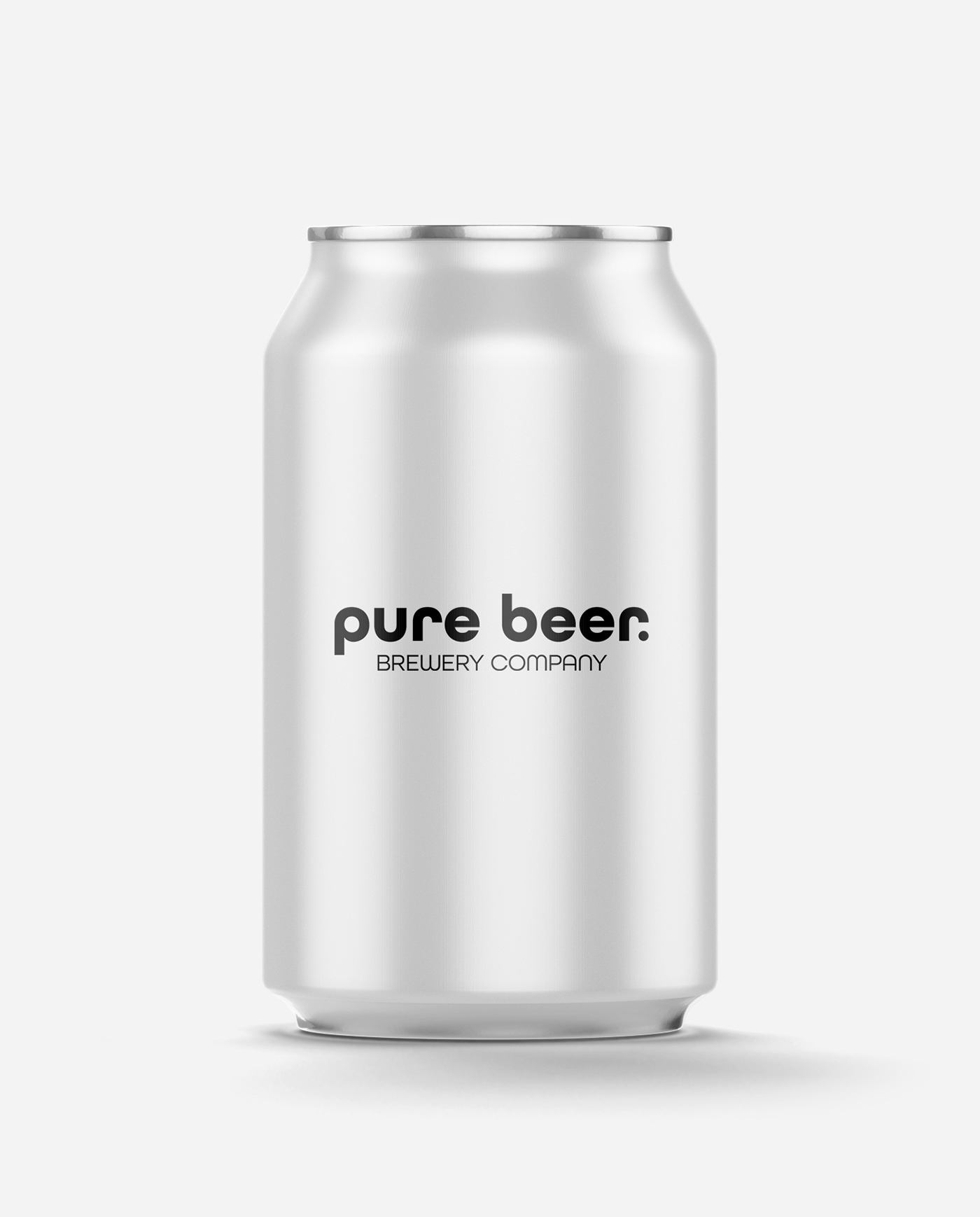
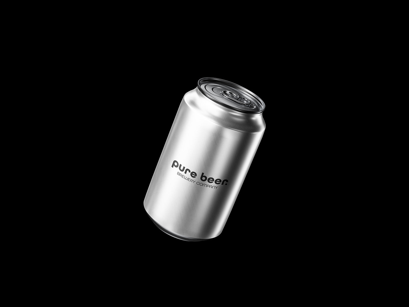
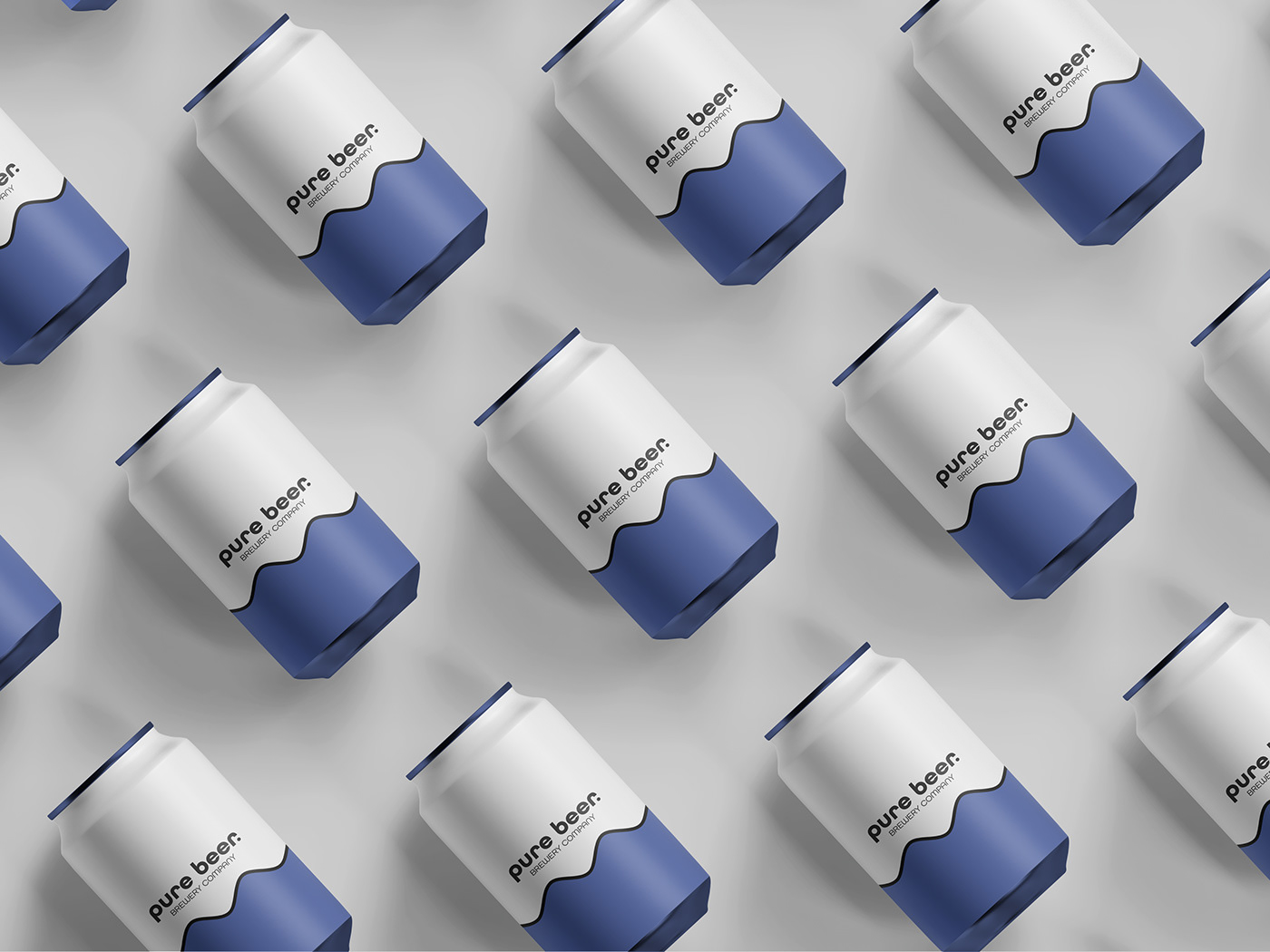
I created a word mark logo that used a combination of upper and lower case letters. Within the design, I added a full stop which also illustrates as a beer tap. I did this as Pure Beer stated that this was one of their influences and inspirations within the brief.
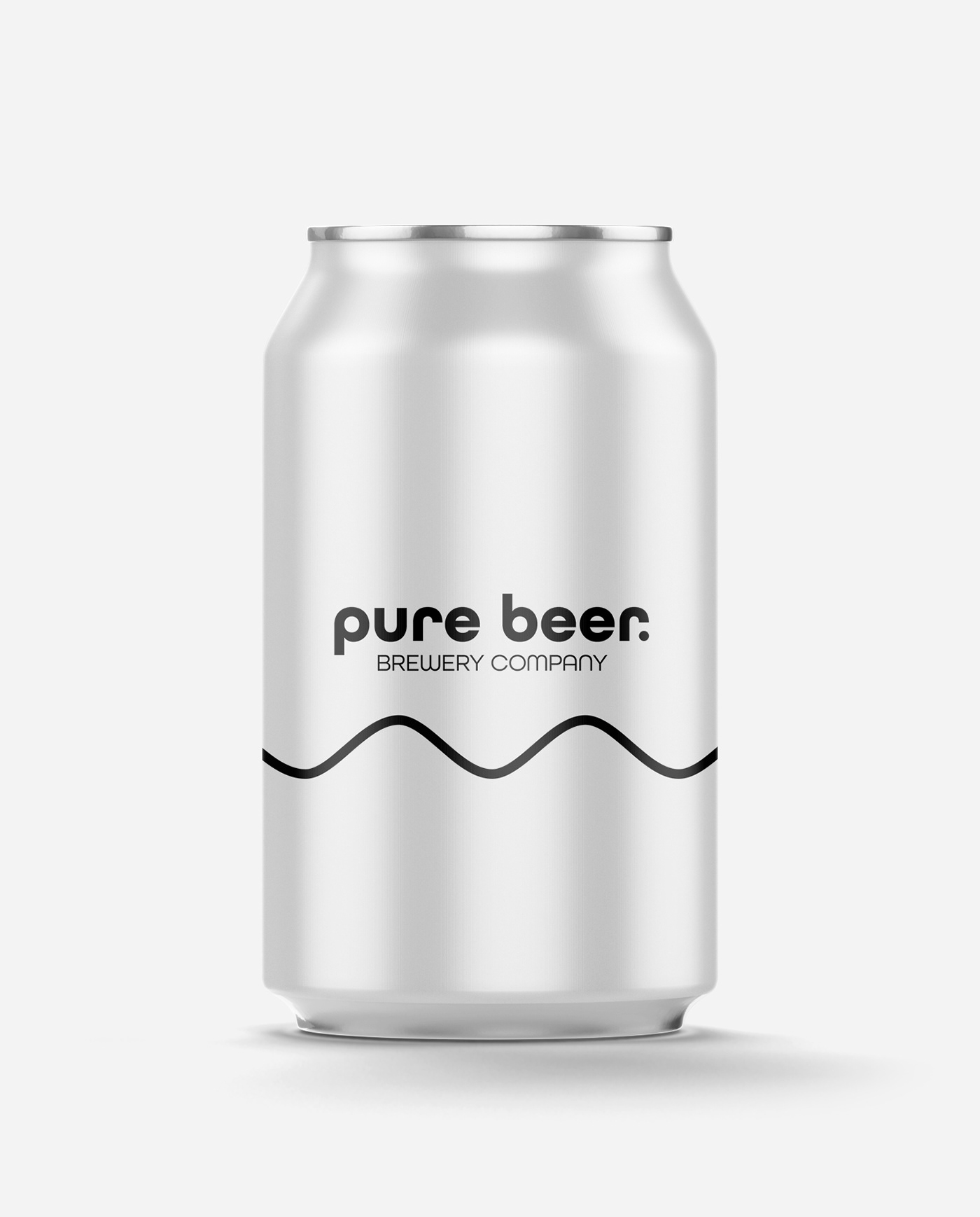
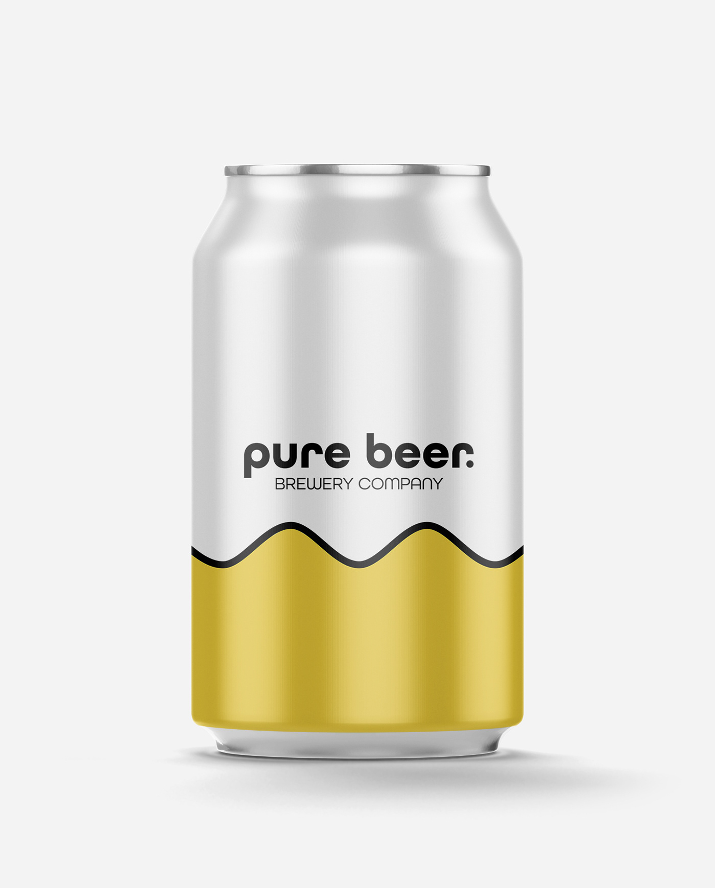
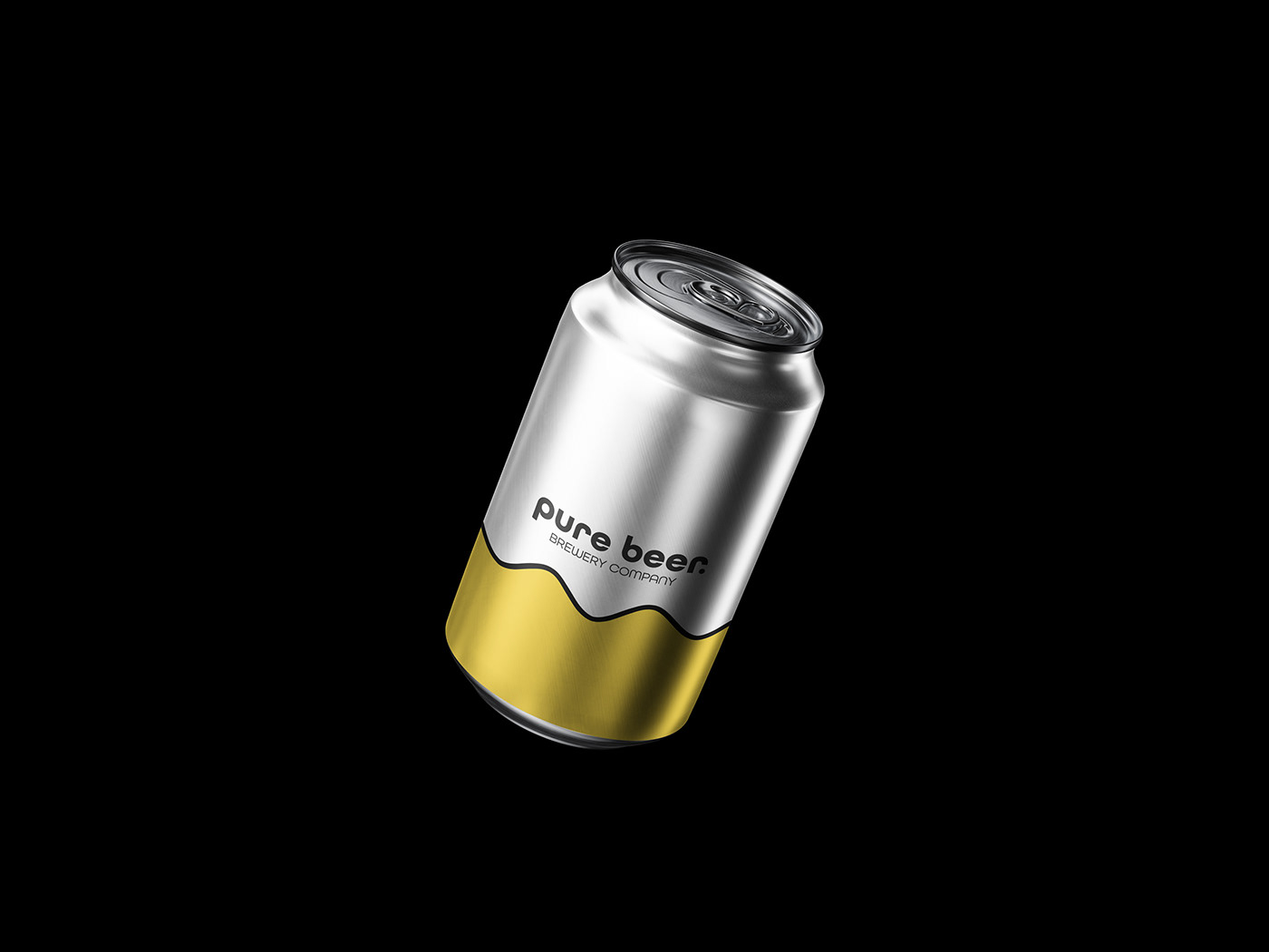
As well as the word mark, I added a wavy line and a pop of colour to illustrate beer/lager, but also variations within the design. This was mostly for packaging purposes, but I think that it works with the logo too.
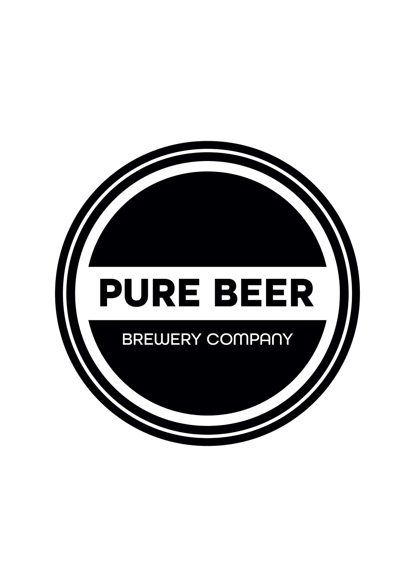
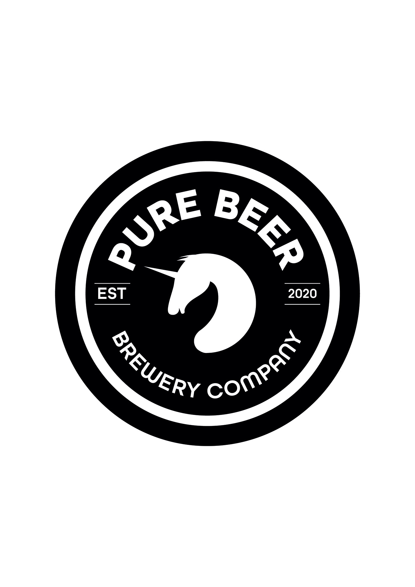
Upon entering the competition, there was no limit to how many design you were allowed to upload, so I uploaded three of my designs. These were my three preferred logo designs. The other two designs are at the bottom of the page.
*UPDATE*
As of 11:40am, my third design (with the unicorn in the middle) has made it to the last review of the contest. I have been asked to make some adjustments to the logo, so I will be carrying these out before Sunday 7th June.