Intoducing a very interesting, yet very simple case study on print collateral, and why it is vitally important to trust your brand to someone that can actually dig in and find the best means of conveying your message. This is exactly the situation in which business owners find themsleves as they get bombarded with ads for "free business cards!" The moral of the story is that you get out what you put in. Enjoy.
The original card. This is your typical 'free' business card offered by large online printers as loss-leaders to attract new customers.
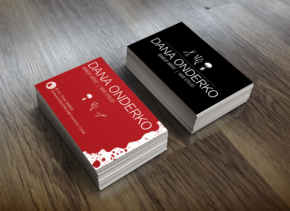
I interviewed Dana and found that she had an eye for the edgy, clean, and minimal, but without coming off cliche. Her target demographic is both men and women, but her primary focus is women. Dana's business and talent attracts all ages, but she wants her brand to appeal to women ages 18-29 primarily. I set to work.

I knew I wanted to use clean, sans-serif type throughout the card. I also didn't want to mix font families in order to maintain the same style throughout the copy, since there was so little on both the front and rear.
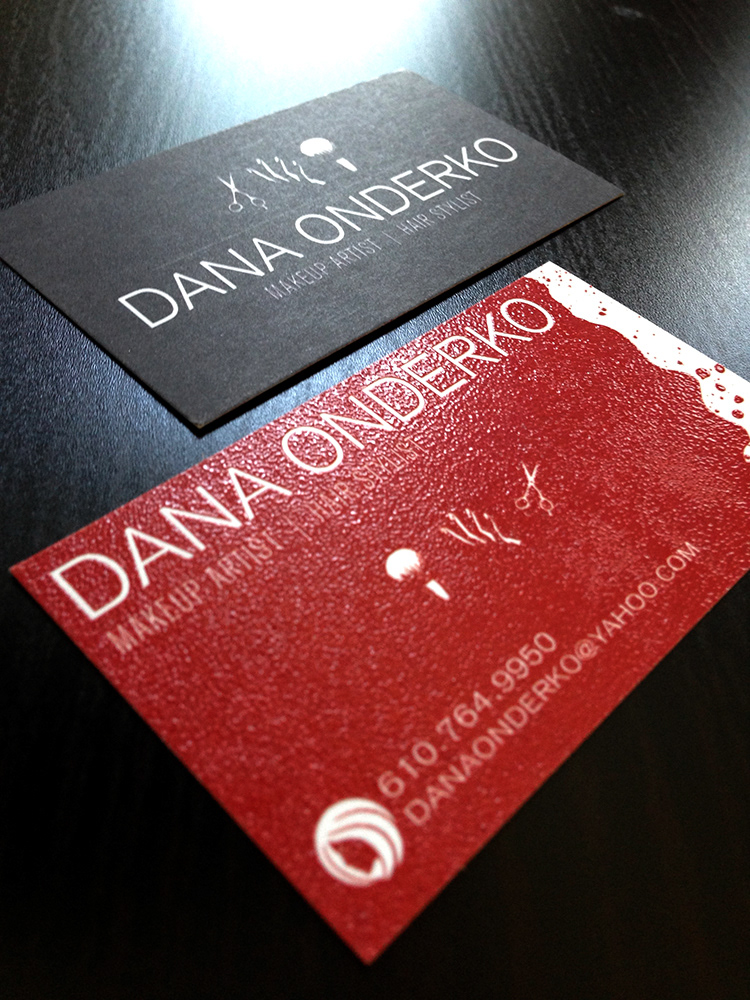
I had to find a means of conveying what services were offered, but didn't want to clutter the card with type, since a minimal approach was being used. Bear in mind; I pitched the idea of using raised thermography, so I knew that I wanted to really make whatever elements I used stand out and away from the texture of the card. I decided to apply a little UX theory to the card, and used symbols instead of type. They stood out, were concise, and maintained the minimal approach for which we strove.
The rear of the card uses the same symbols to convey the services performed, as well as the other typographic elements from the front of the card.
The symbol used next to the contact information is being used as a brand icon; this is a small testing phase for it to be used as a logo later and on other marketing materials.
I feel the card was a success, and the final product was met with great acclaim! I hope you enjoyed the process as much as I did.