Week 10
The Zine
Task 1
Zine Research


Zine 1 | Chicago
Created by Sofia Clausse, the spreads use images of buildings from Chicago accompanied with warped typography. The zine explores distorted typography and imagery inspired by the warped reflections of the buildings and surrounding environment on the surface of the Cloud Gate sculpture.
Although her zine is images oriented which isn't allowed according to the task, there are still elements of the design which can be applied to a typographic zine. Using a simple san serif typeface, the zine utilises minimal text which which has been warped to match the style of the images to create a cohesive design. The greyscale colour scheme helps to create strong contrast, with the use of white on black and black on white text creating variation and visual interest within the zine.


Zine 2 | Musezine
Musezine is a zine created by Ryan Len which reflects the thoughts and insights on design that he gathered throughout his career.
Utilising a single column layout, the Musezine has a more conventional layout and design compared to the previous example, with a focus on being bold and simple. The use of a black and white colour scheme keeps things consistent throughout the zine and has strong contrast to make the typography stand out. A simple san serif typeface is with varying scales and line weights to create hierarchy within the pages, with defined headers and body text. The use of a single black page with large white text helps to make the message stand out from the rest of the pages and helps to create visual interest.
Overall, the use of a consistent grid and typeface with contrasting colours helps to create a zine that is clean and easy to understand. With a typography forward design, Ryan Len's Musezine will provide important insights into the design of my typographic zine.


Zine 3 | Stories of Stories
Stories of Stories is a project by Lina Forsgren that focuses on telling socially important stories alongside visually expressive interpretations.
The colour scheme for the zine is red and blue, with large blocks of colour to create contrast and visual appeal. Throughout the zine and specifically within each spread, the consistent use of these colours helps to create a cohesive design. The lack of a consistent typeface works with the design as each spread tells an individual story, thus helping to separate each spread to make the overall zine more legible. Within the zine, a clear hierarchy is present through the use scale and upper case letters. The images used are consistent in style throughout the zine and work well with the accompanying text in each spread.
Overall, the zine is well designed and visually appealing, with the variation in the amount of text in each spread creating a more visually interesting design. Utilising a consistent colour scheme and style throughout the spreads, the final result is cohesive and effective in achieving its desired purpose.
Task 2
Zine Concept
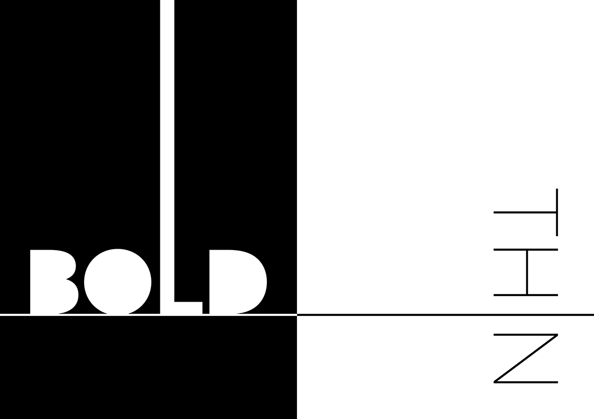
For the design of my zine, I decided to do the typographic concept of stroke weight. Throughout the semester, varying line weights was a major elements within all of my work, so I thought it would be fitting to end the semester making it the focus of my zine.
Within the spread, I wanted to both show and tell how line weight can be effectively used in many different contexts. Although it can only use typography, I wanted to have variation in the amount of information on each page to make the zine more interesting. Using stroke width to highlight the differences in the characters forms and their potential application, I wanted to produce a zine which was visually appealing while also being educational.
I wanted my zine to be clean and minimal in its design so I was most inspired by zine 2, utilising a single san serif typeface with a black and white colour scheme to produce a final result which was bold and effective.


Week 11
The Zine
Task 3
Zine Content
The first decision to make for the zine was choosing a typeface which fit the criteria of simple sans serif with a large font family. I ended up picking a typeface called Azo Sans, which fit fulfilled the desired aesthetic and functional criteria. For the overall layout of the zine, I wanted to push hard into the black and white colour scheme so I thought it would be interesting to alternate between black pages with white text and and white pages with black text. From there I wrote body text explaining what stroke weight and showed how to use it. To accompany the text, aesthetic elements were used to increase interest and to represent and enhance the message in the text.
Text
Weight refers to the relative thickness of a fonts stroke.
A typeface can come in many different weights, with these variations making up the font family. A standard typeface contains four to six different stroke weights including: Thin, Light, Regular, Medium, Bold, Black
Why Use Stroke Weight?
By utlising contrasting stroke weights, the designer is able to create a hierarchy of information.
Weight can be used to draw focus to specific elements to show their importance.
Stroke weight can also be used to organise information
Stress - Although less prominent in sans serif typefaces, stress refers to the stroke width variation of a single character.
Keywords - Dramatic, Eye-catching, Important & Minimal, Clean, Modern
Images
To produce the "images" the typeface was edited using adobe Illustrator to give more control, then the images were moved back into InDesign.


Task 4
Zine: First Draft


Week 12
The Zine
Task 5
Zine: Final

<a href="https://www.freepik.com/free-photos-vectors/business-card">Business card psd created by yeven_popov - www.freepik.com</a>