
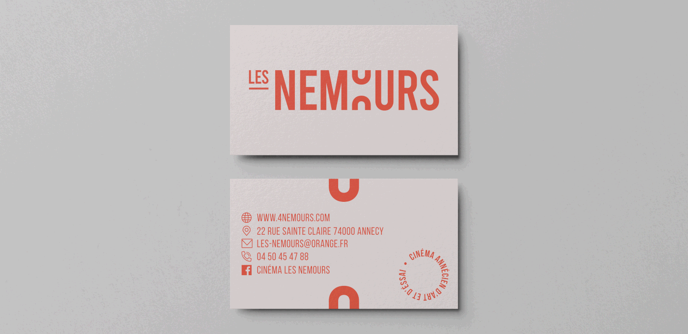
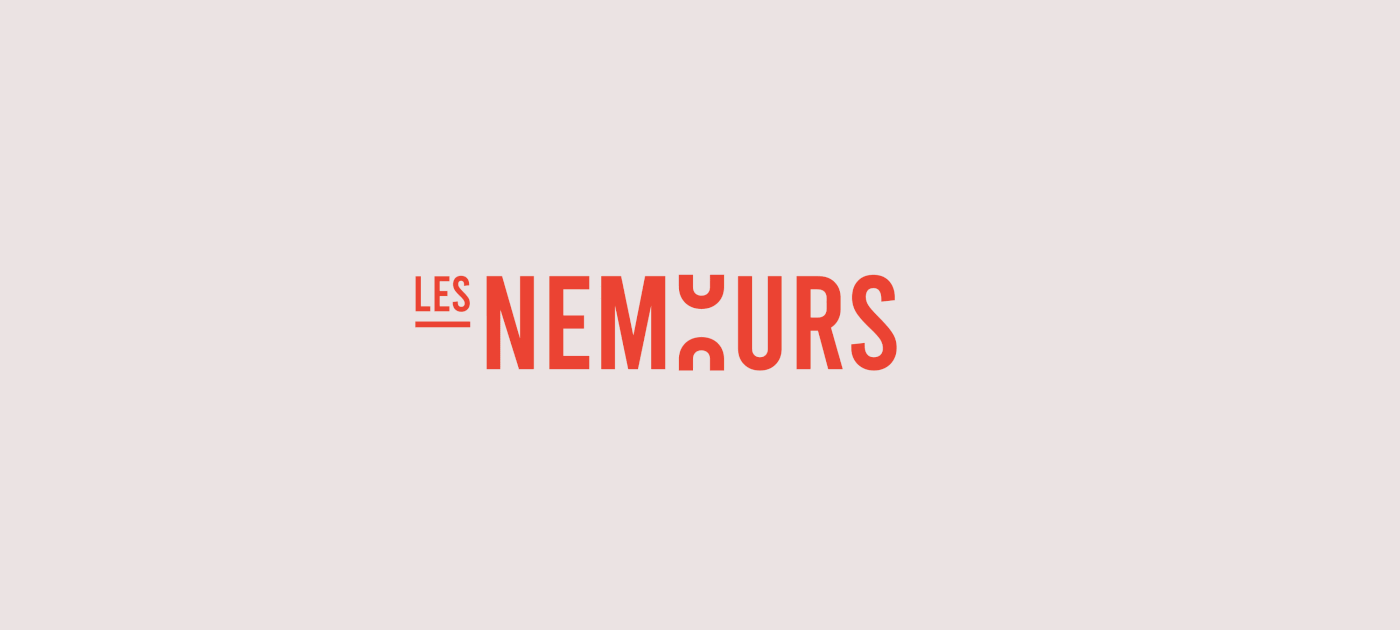
What if the cinema «les Nemours» changed its visual identity?
"When people ask me if I went to film school I tell them, no, I went to films."
Quentin Tarantino.
Quentin Tarantino.
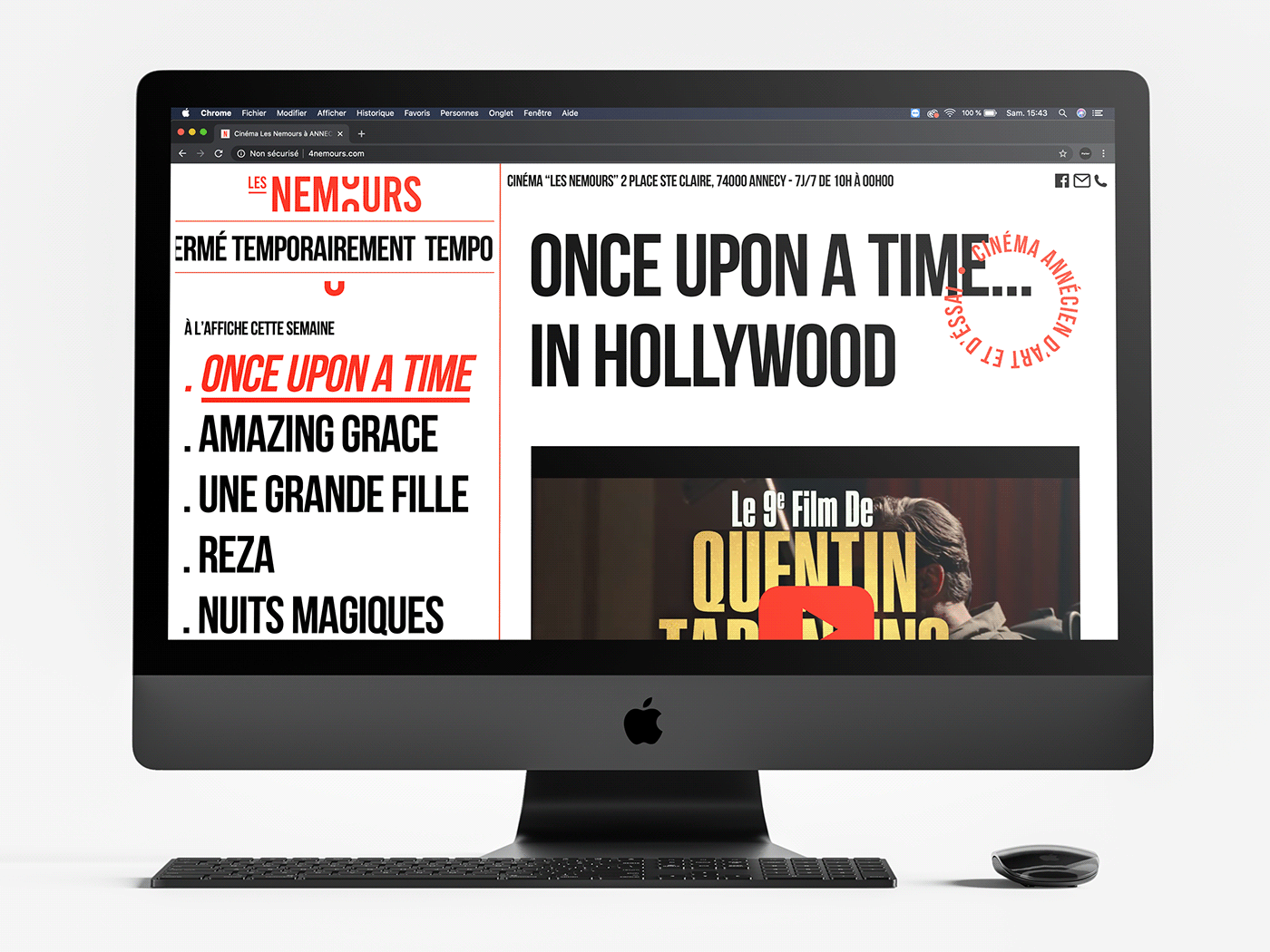
«Les Nemours» is an art-house cinema located in Annecy, France, which I spent much of my adolescence.
Economically victim of the COVID-19 crisis, it was with great sensitivity that I wanted to support this iconic cinema of the little Venice of the Alps.
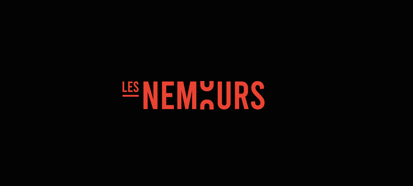
The cinema will celebrate its 15th anniversary this year, which is why Polär has taken on the challenge of remaking its entire visual identity by reproducing its logo so that it is more graphic and original so that it can stand out more from the big competitors.
On this work, my goal was to create a unique and authentic visual by bringing a special touch to the history of cinema, represented here by the roll-out of a film reel.
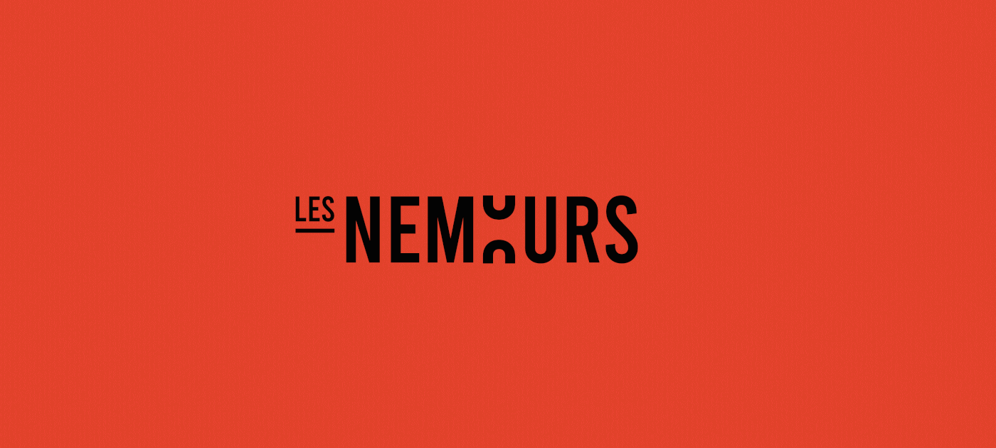
Favoring a design with minimalist but dynamic shapes, the result exudes freshness and lightness.
Economically victim of the COVID-19 crisis, it was with great sensitivity that I wanted to support this iconic cinema of the little Venice of the Alps.
The cinema will celebrate its 15th anniversary this year, which is why Polär has taken on the challenge of remaking its entire visual identity by reproducing its logo so that it is more graphic and original so that it can stand out more from the big competitors.
On this work, my goal was to create a unique and authentic visual by bringing a special touch to the history of cinema, represented here by the roll-out of a film reel.
Favoring a design with minimalist but dynamic shapes, the result exudes freshness and lightness.
-
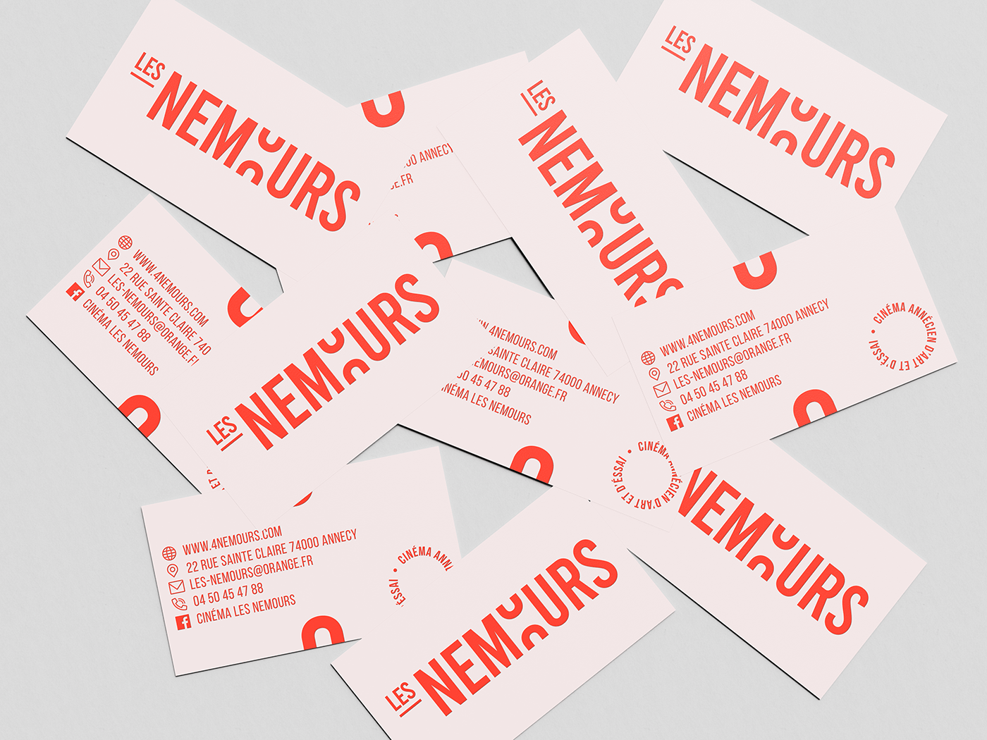
Client: Cinema Les Nemours (Facebook)
Design : Thibault Savoyen (Pölar) Instagram
Et si le cinéma « les Nemours » changeait son identité visuelle?
« Quand les gens me demandent si je suis allé à l'école de cinéma, je leur dis: non, je suis allé au cinéma. » Quentin Tarantino.
« Les Nemours » est un cinéma classé d’Art et d’essai situé en Haute Savoie à Annecy, dans lequel j’ai passé
une grande partie de mon adolescence.
une grande partie de mon adolescence.
Aujourd’hui victime de cette crise économique face au COVID-19, ce fut avec une grande sensibilité que j’ai voulue soutenir ce cinéma iconique de la petite Venise des Alpes.
À l’approche des 15 ans de ce cinéma, Polär s’est lancé le défi de refaire l’intégralité de son identité visuelle en reprenant son logo de façon à ce qu’il soit plus graphique et original pour pouvoir se démarquer davantage des grands concurrents.
Sur ce travail, mon objectif était de créer un visuel unique et authentique en apportant une touche propre à l’histoire du cinéma, représentée ici par le dérouler d’une bobine de film.
Privilégiant un design aux formes minimalistes mais dynamiques, le résultat respire la fraîcheur et la légèreté.
-
Client : Cinéma Les Nemours (Facebook)
Design : Thibault Savoyen (Pölar) Instagram
EN
Inspired by the traditional film reel, Pölar wanted to take this historic and iconic film emblem back into the identity of the logo. Formerly used for the diffusion of a film, it is by unrolling the central letter «O», that "the Nemours" takes on a more cinematic look, also allowing it to distinguish itself from the classic.


FR
Inspiré de la traditionnelle bobine de film, Pölar a voulu reprendre cet emblème historique et iconique du cinéma dans l’identité du logo. Autrefois utilisée pour la diffusion d’un film, c’est en faisant dérouler la lettre centrale « O », que "les Nemours" prend une allure tout de suite plus cinématographique, lui permettant également de se distinguer du classique.


Follow us on instagram @polar_std
Our website is open here : polargraphisme.com