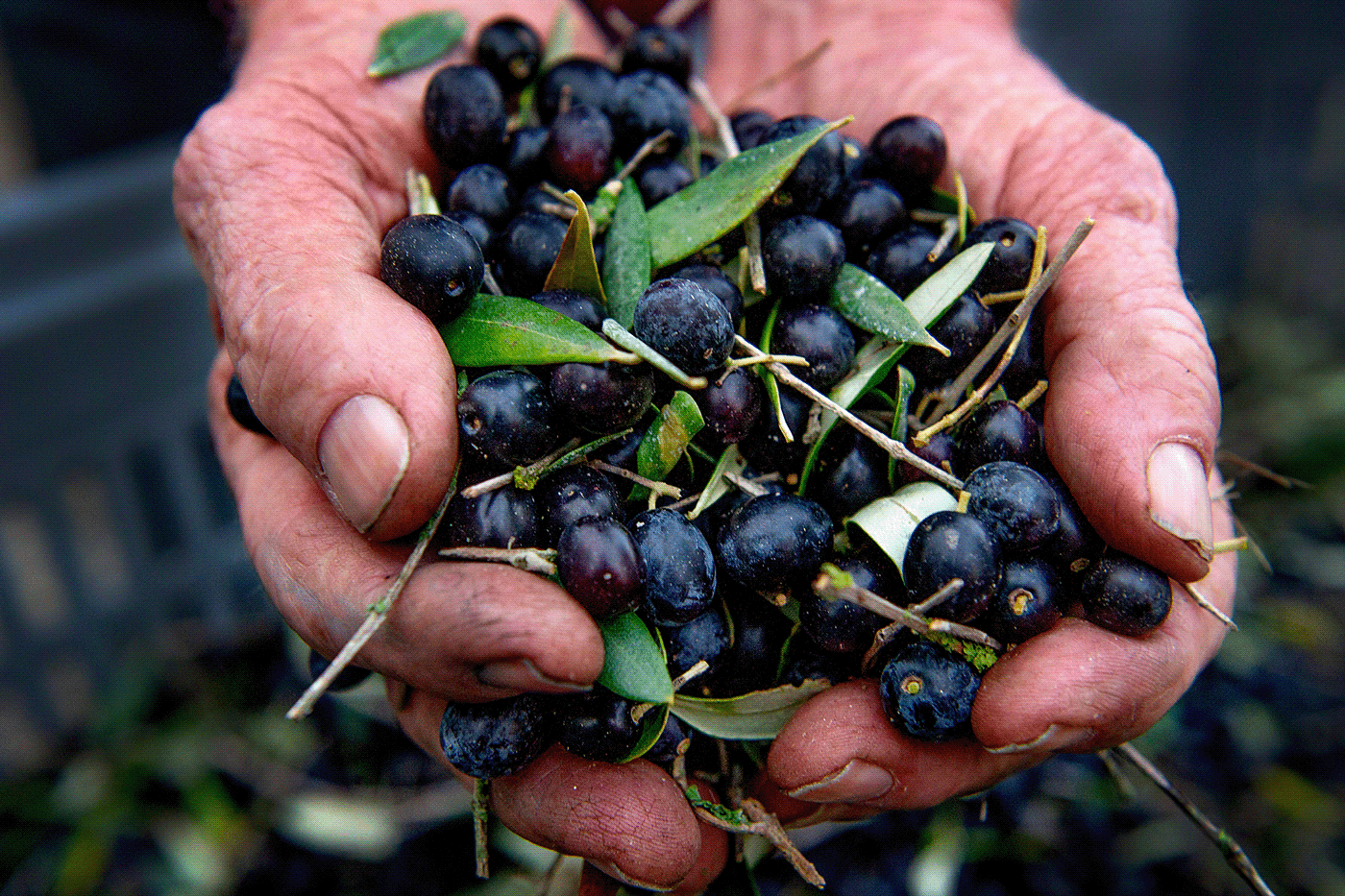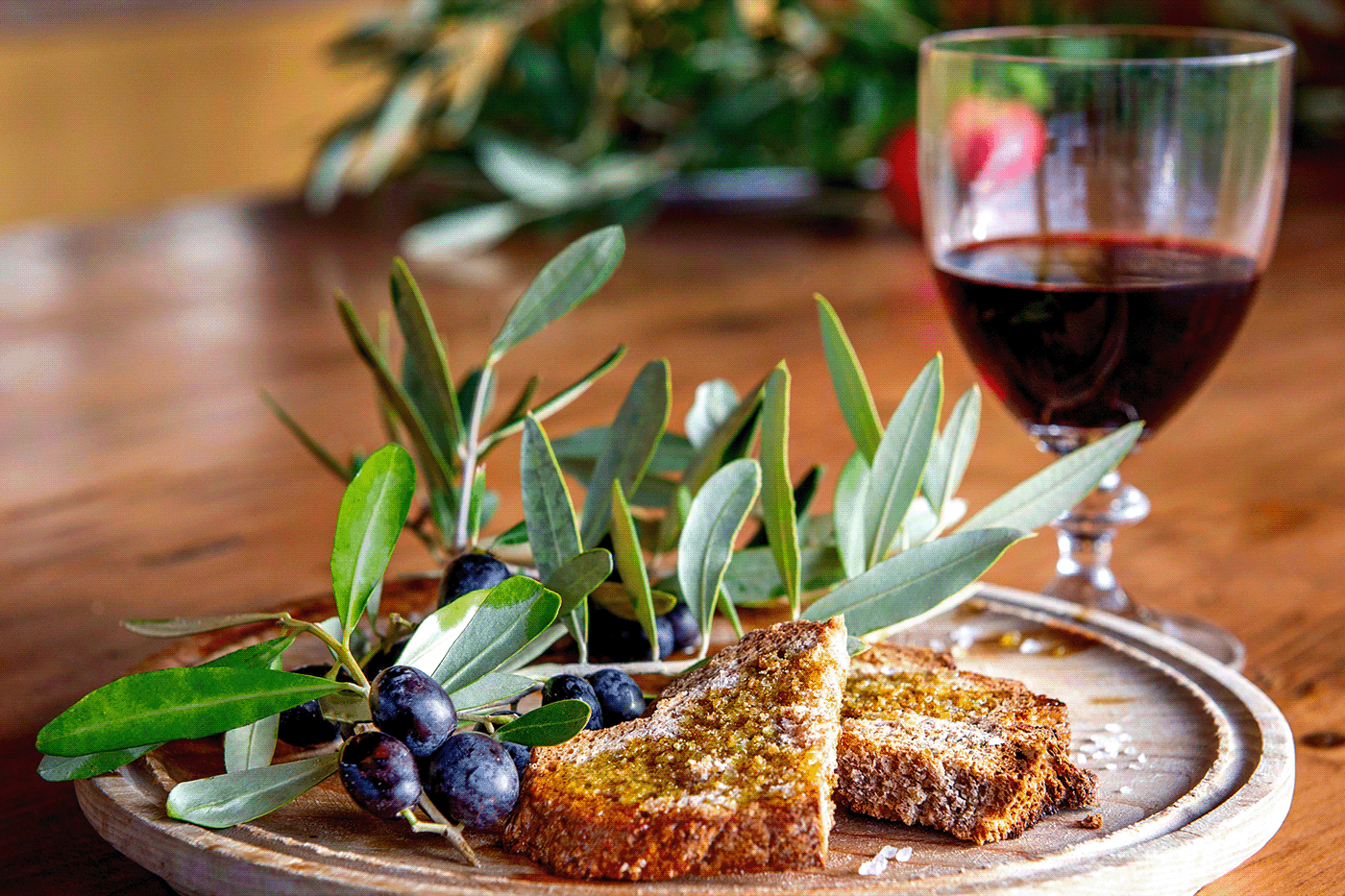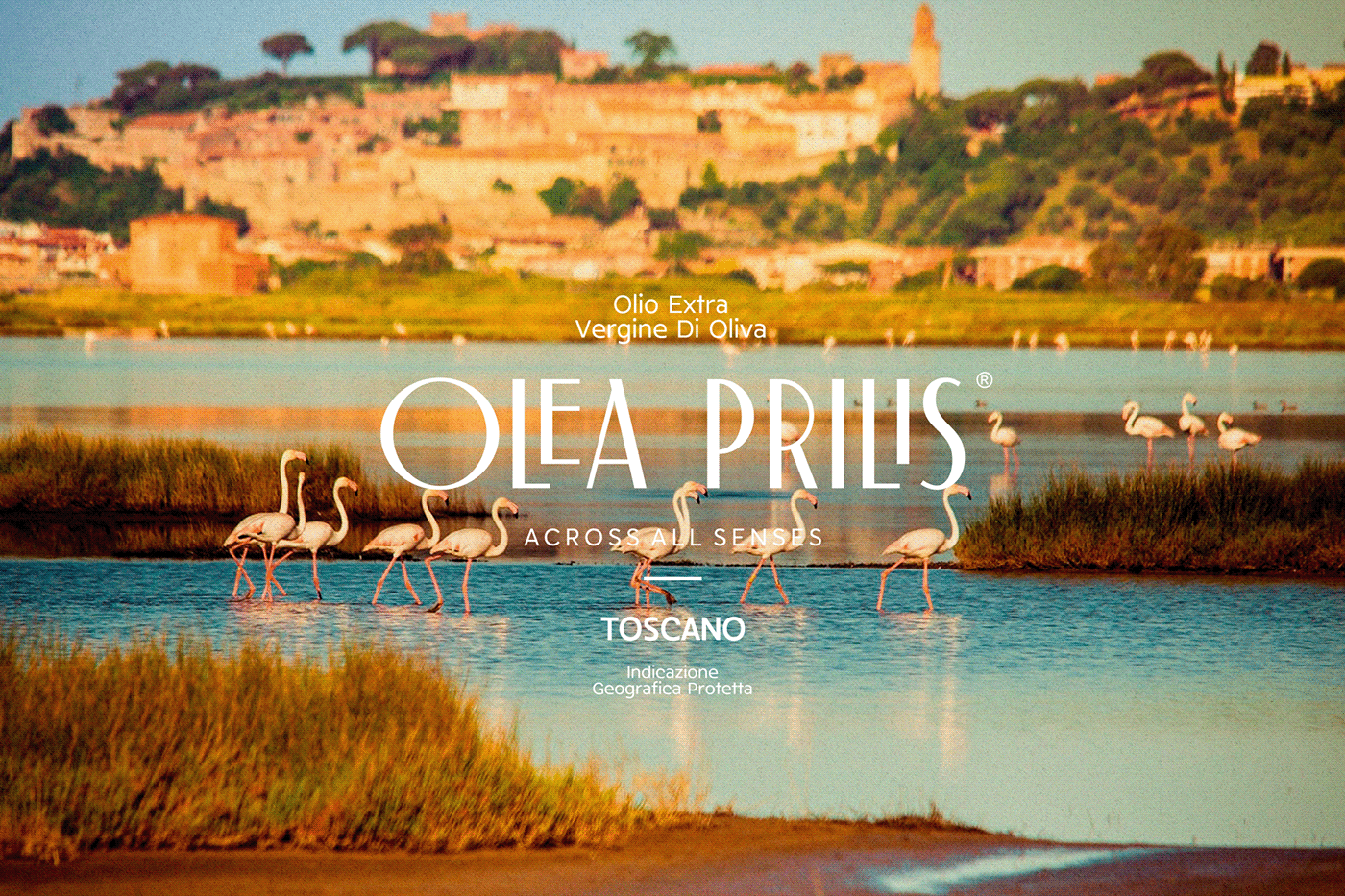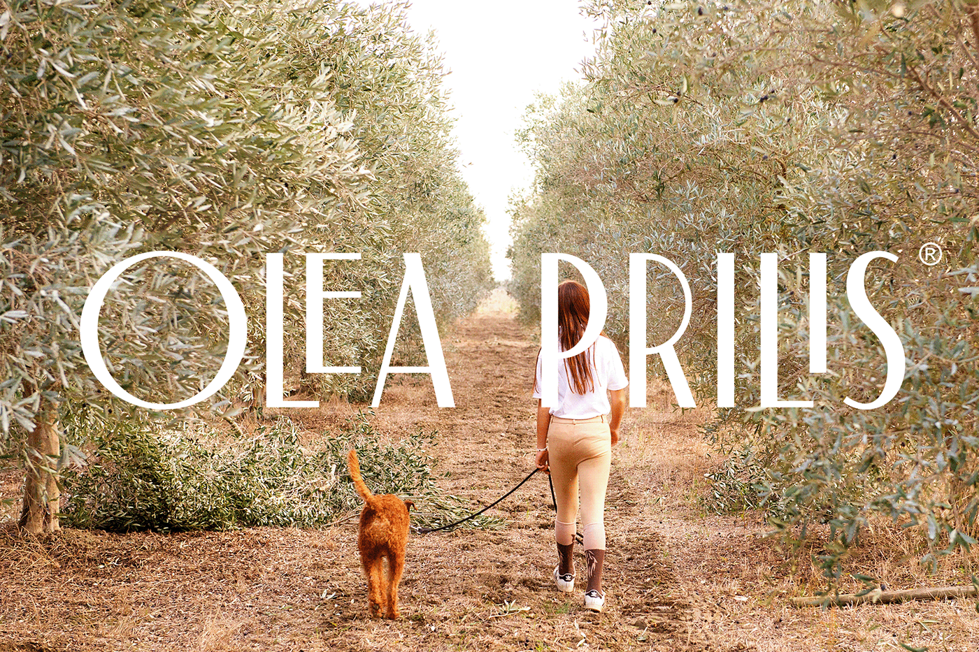
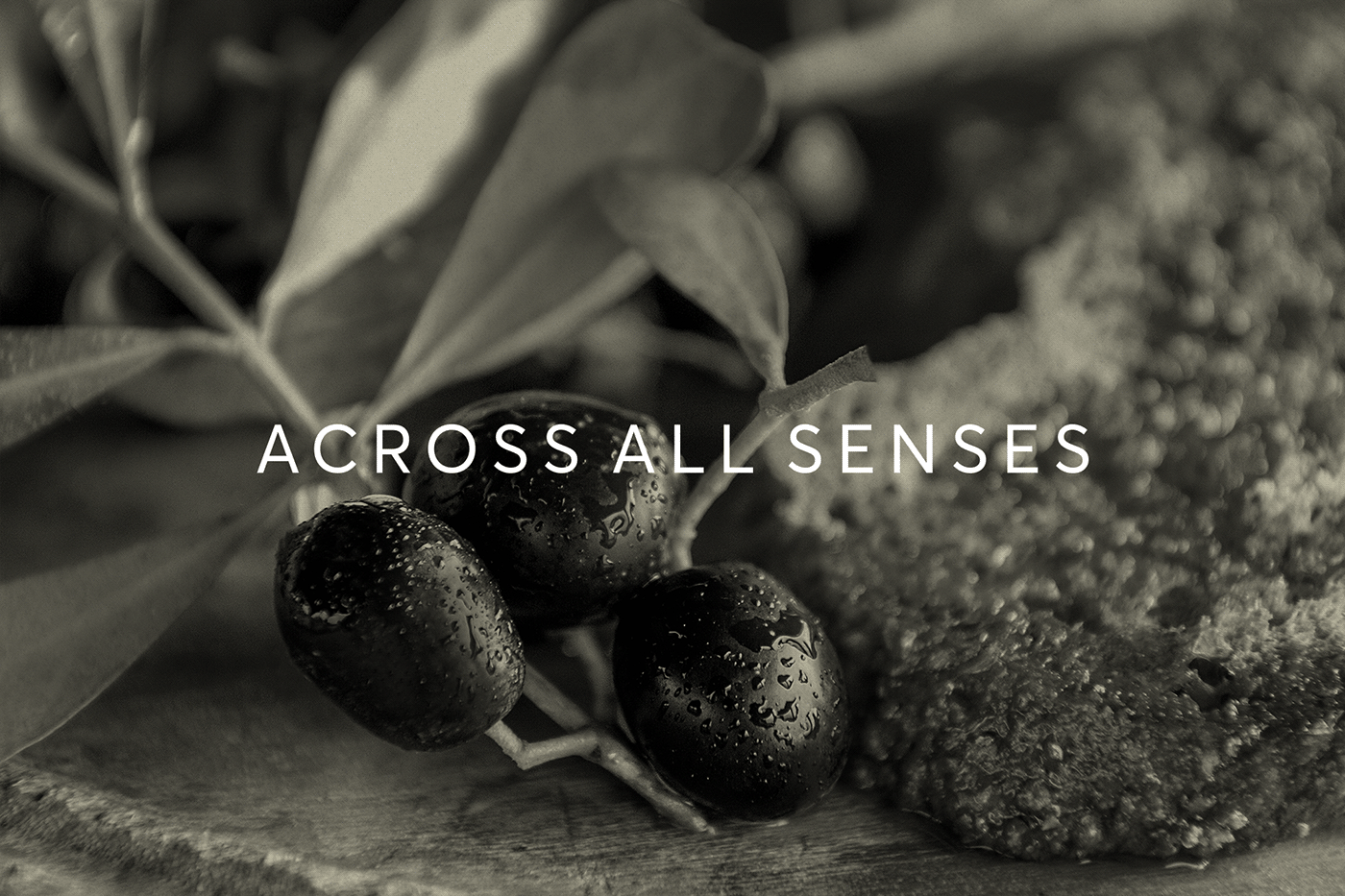
An extensive branding project, with naming, slogan, logotype, corporate ID, packaging, numerous applications and photo shooting art direction for an Estate in Tuscany (Italy) that cultivates and trades Extra Virgin Olive Oil.
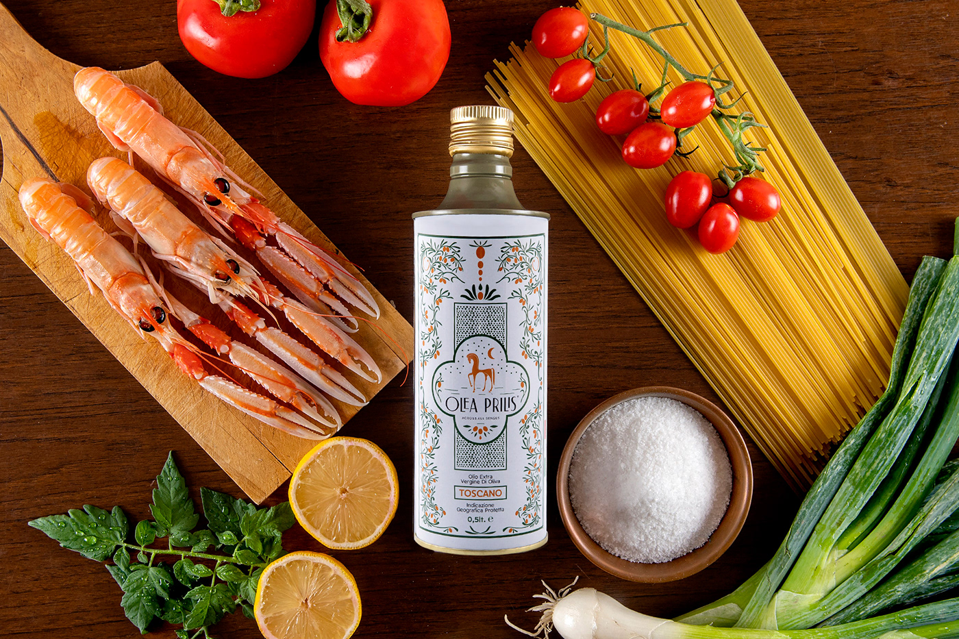
During the naming process we combined the ancient roman name of the – dried now – lake, where the olive trees emerge, with olive’s scientific name. We supported this name with a slogan that communicates the product ‘’across all senses’’.
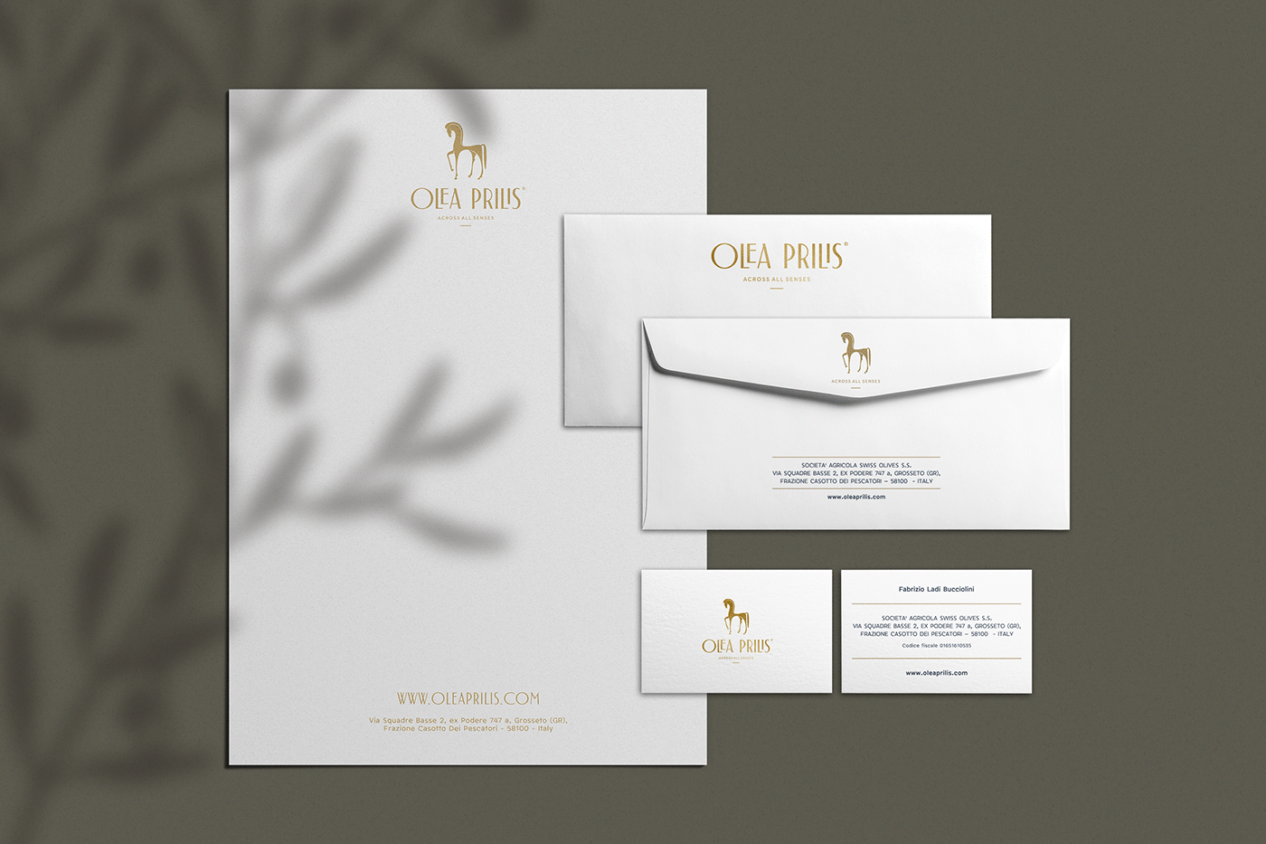
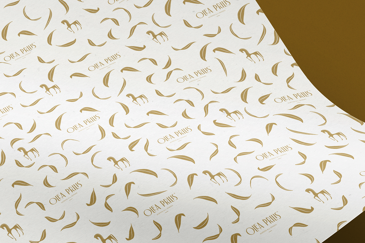
Regarding logotype, we were inspired by an Etruscan horse statuette, found at the area of the estate, which is still famous for its horsemen. Today, this ancient symbol is getting flesh and bones through “Breto”, the white proud horse of the farm.
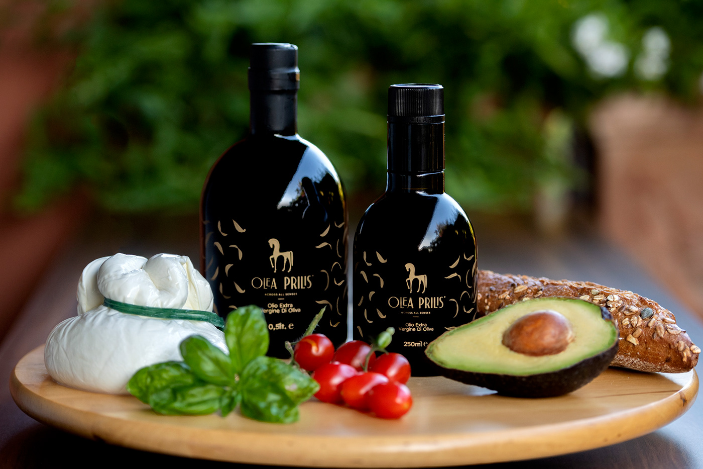
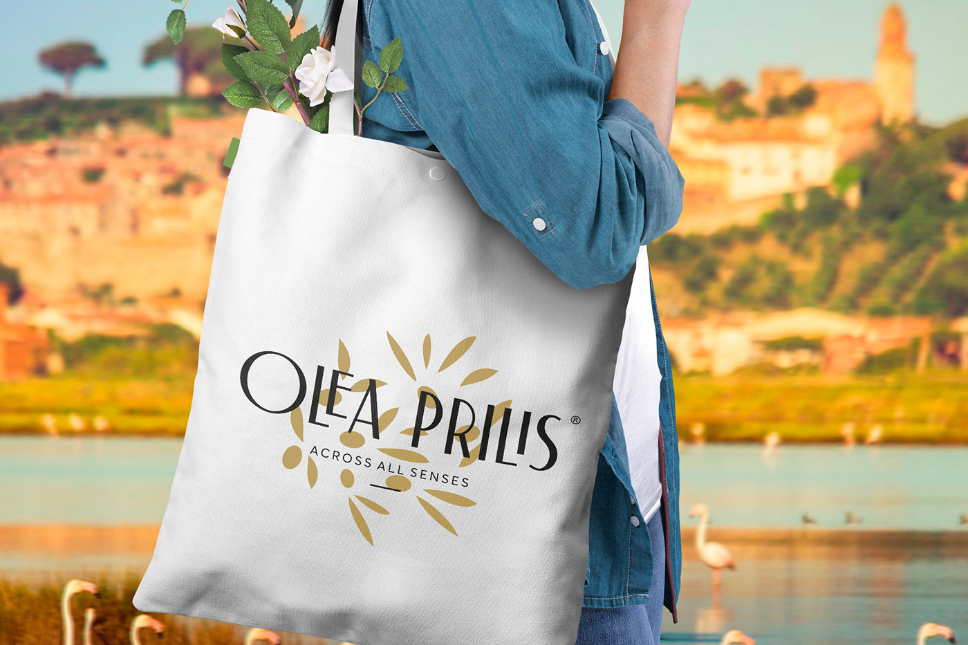
We based the corporate ID on minimal layouts and soft colors, which communicates sincere authenticity and natural innocence.
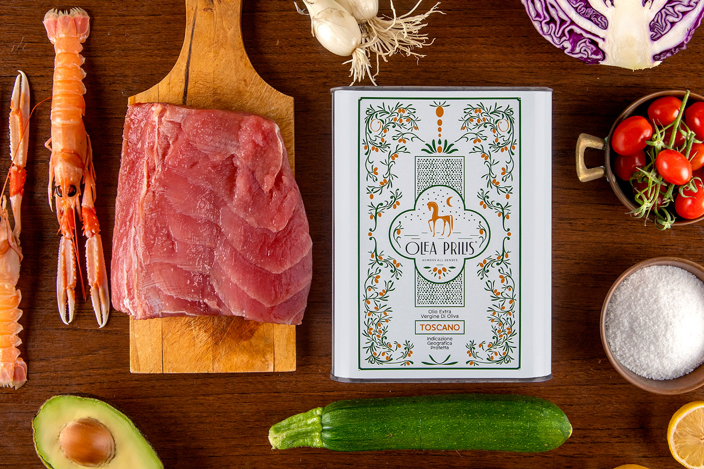
We developed the packaging with floral illustrations at the traditional color pallet of Tuscany, likewise the local traditional ceramics.
Photos by: http://www.jenniferlorenzini.com/
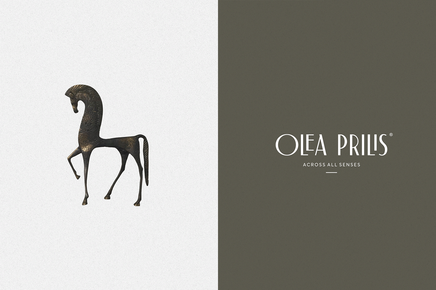
Etruscan horse statuette inspiration