
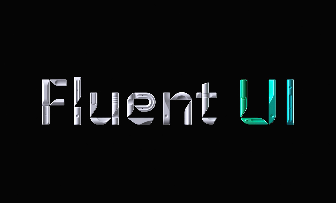
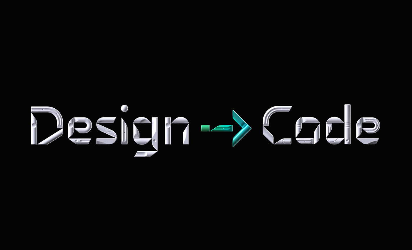
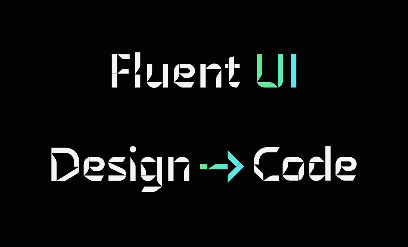
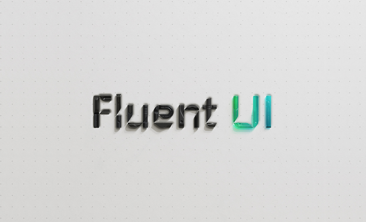
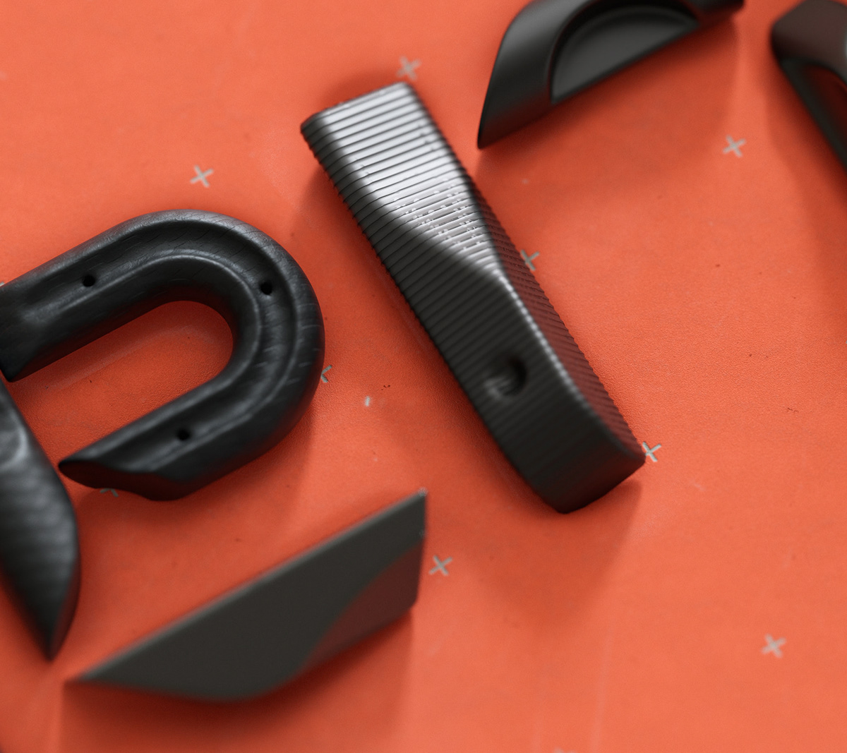
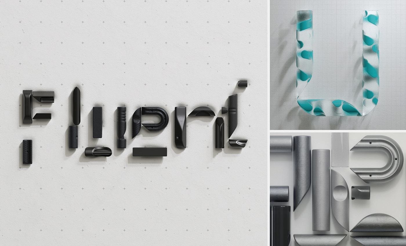
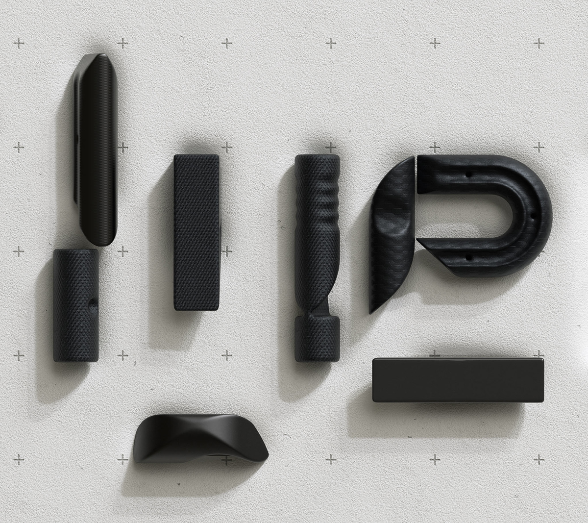
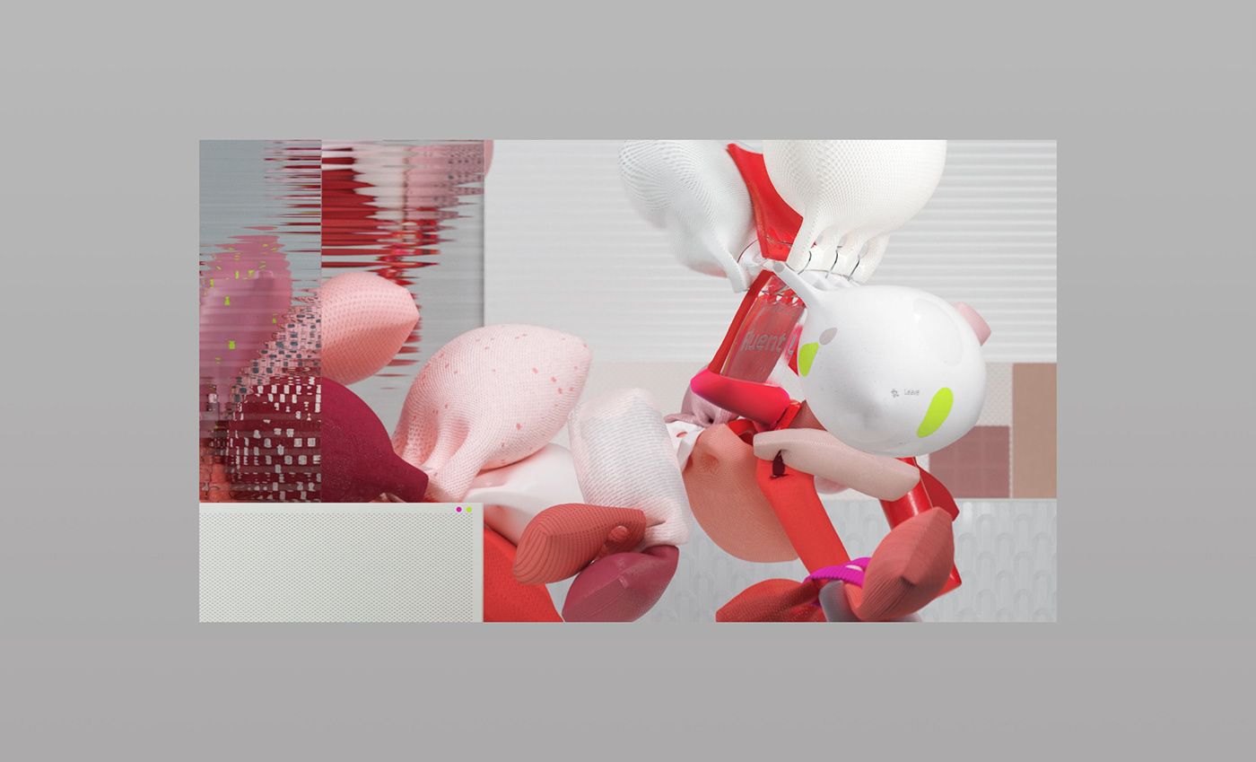
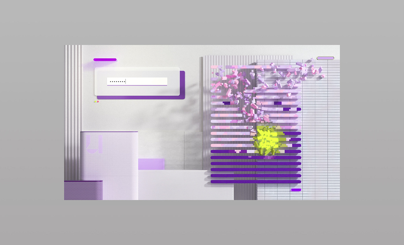
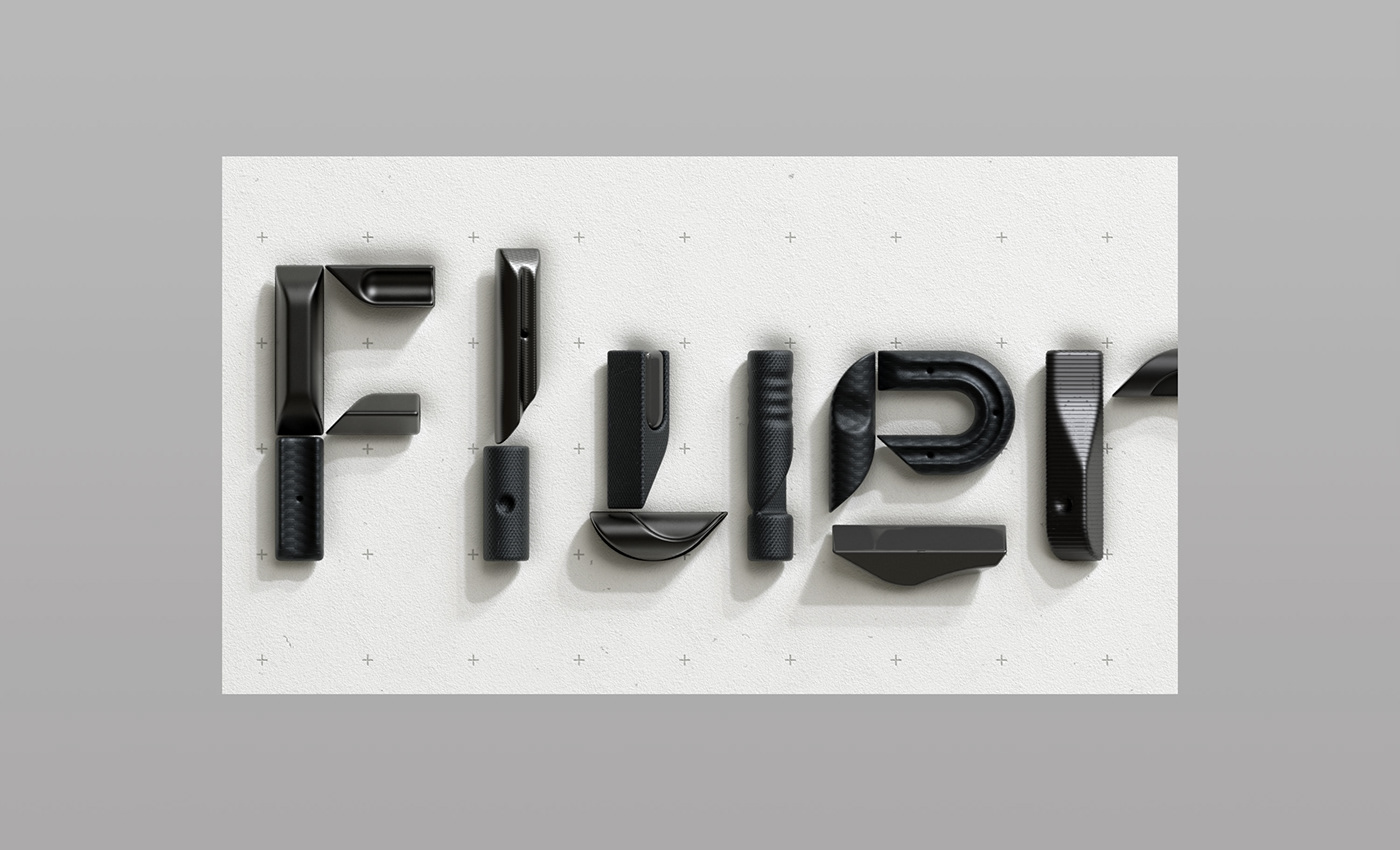
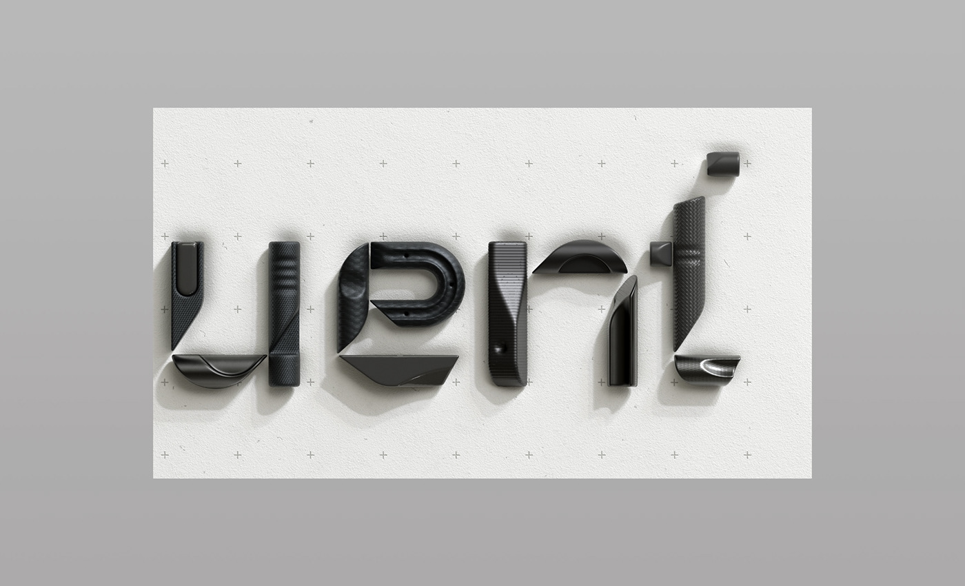

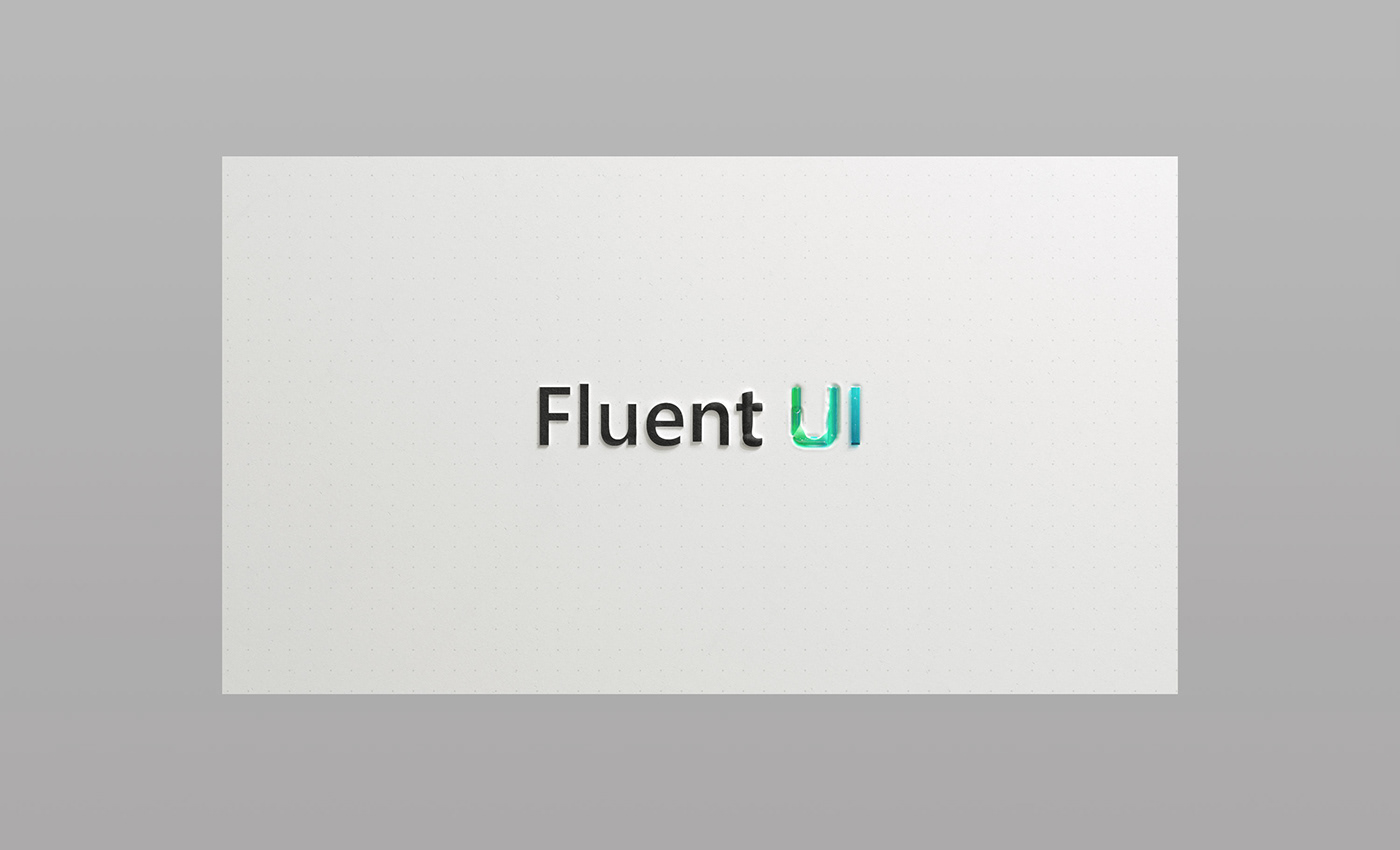
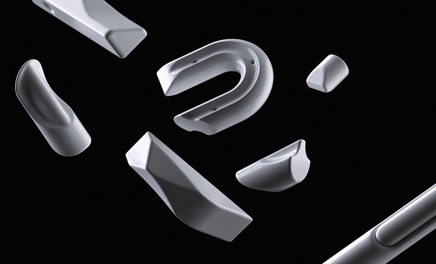
Microsoft approached us to create an alternative typographic take on their Fluent UI logotype which uses their brand typeface Segoe. The idea was that our more expressive version would transform to become Segoe in its rested state. We built and modelled type that took the proportions of Segoe and elevated it, making it technical, physical and transformative. This served as the opener for an animated film introducing Fluent UI at the Microsoft Build 2020 conference.
Fluent UI is a collection of UX frameworks — a cross-platform, open-source approach that enables people to contribute and improve on the design-to-code system.
Animation: Vincent Schwenk & Vitaly Grossmann
Typography: Sawdust
Sound design: Zelig Sound
Art direction: Nando Costa
Typography: Sawdust
Sound design: Zelig Sound
Art direction: Nando Costa


