Hypothetical Project
Nida Jewelry Identity Design
Nida is an India based jewelry manufacturer that designs premium jewelry for high-end consumers. They are specialized in diamond, platinum, sterling silver, and watches.
GOALS:
Create an identity for the brand which is clean and sophisticated, preserve the essence of luxury and craftsmanship.
Create an identity for the brand which is clean and sophisticated, preserve the essence of luxury and craftsmanship.
SOLUTION:
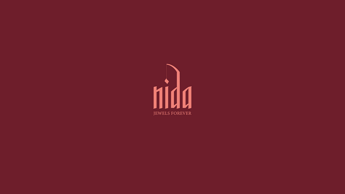
I created a new identity for the brand which is clean and has a sense of sophistication. It also has a graphical element for visual interest.
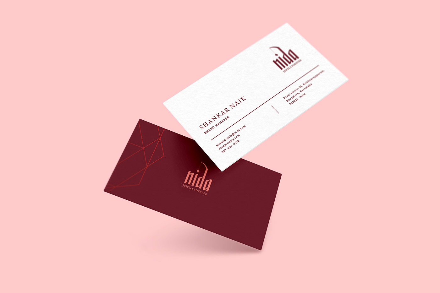
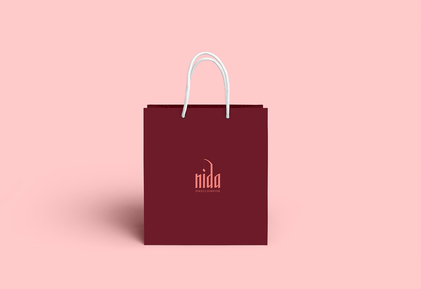
SCOPE OF WORK:
Identity Design
Identity Design
Office Collaterals


MOODBOARD:
After getting inspiration from the research, I curated a mood board to give me the visual reference and to narrow down my research further. The mood board helped me to visualize which direction I can go to and what could be the look and feel of the design in the end.


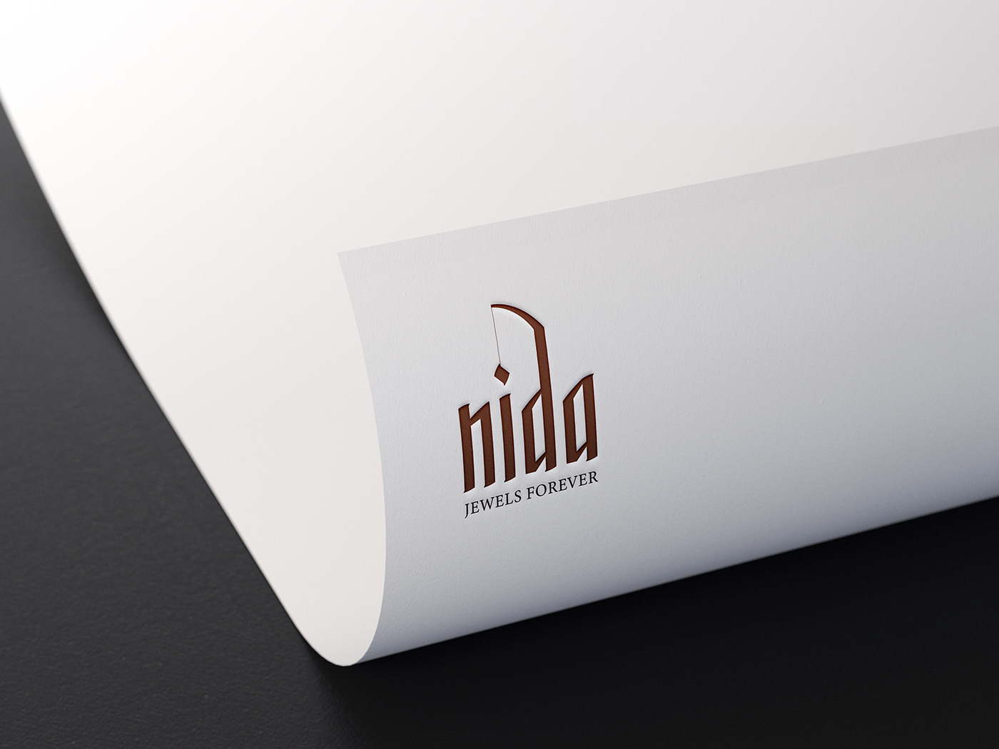
LOGO CONSTRUCTION:
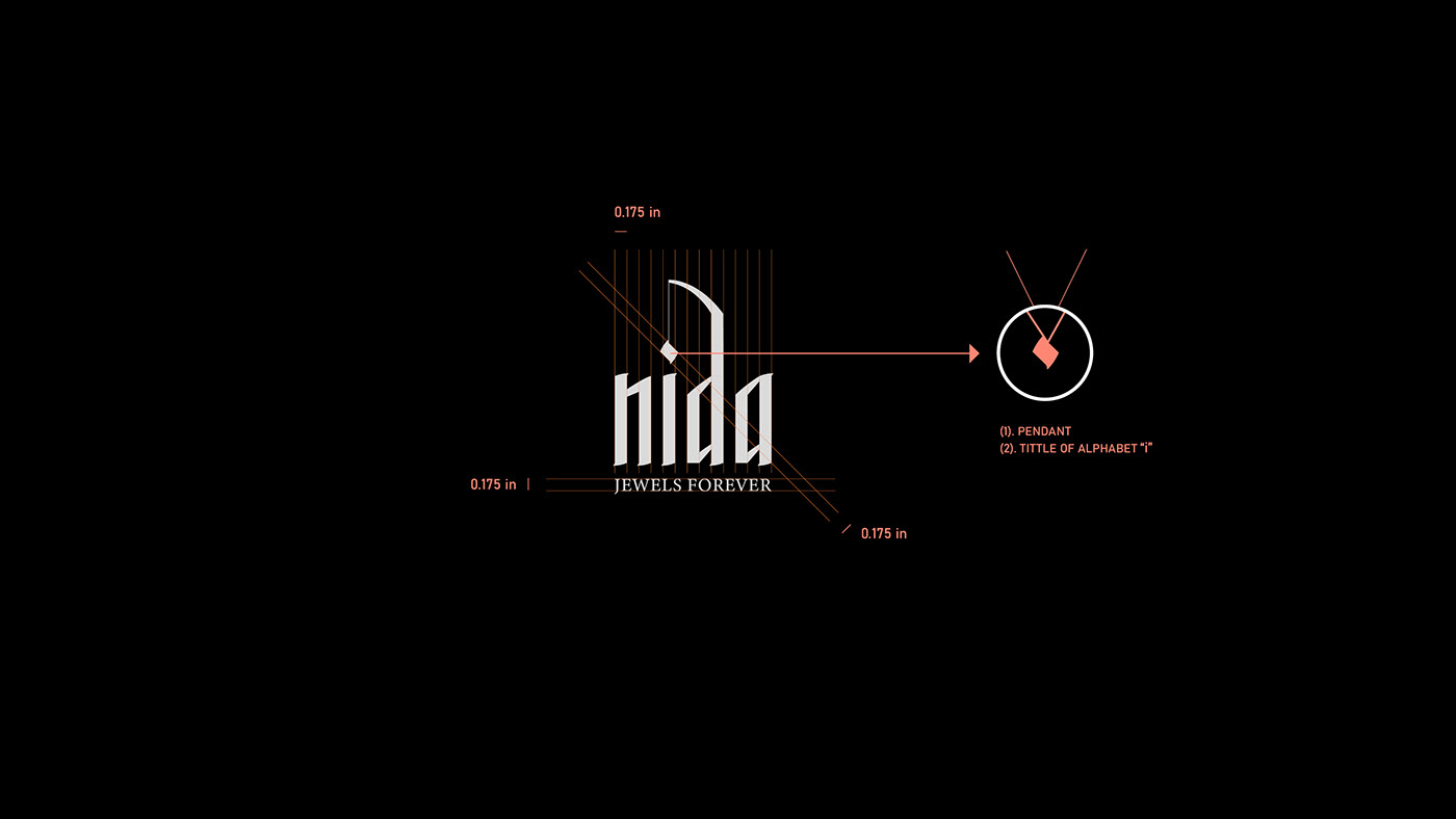
To communicate a sense of elegance, I crafted a wordmark which looks like a calligraphy font. I wanted to illustrate the superscript dot of the alphabet “i’ as a pendant (a jewel of women). I also made sure that the logo is legible in smaller sizes or on a big scale.

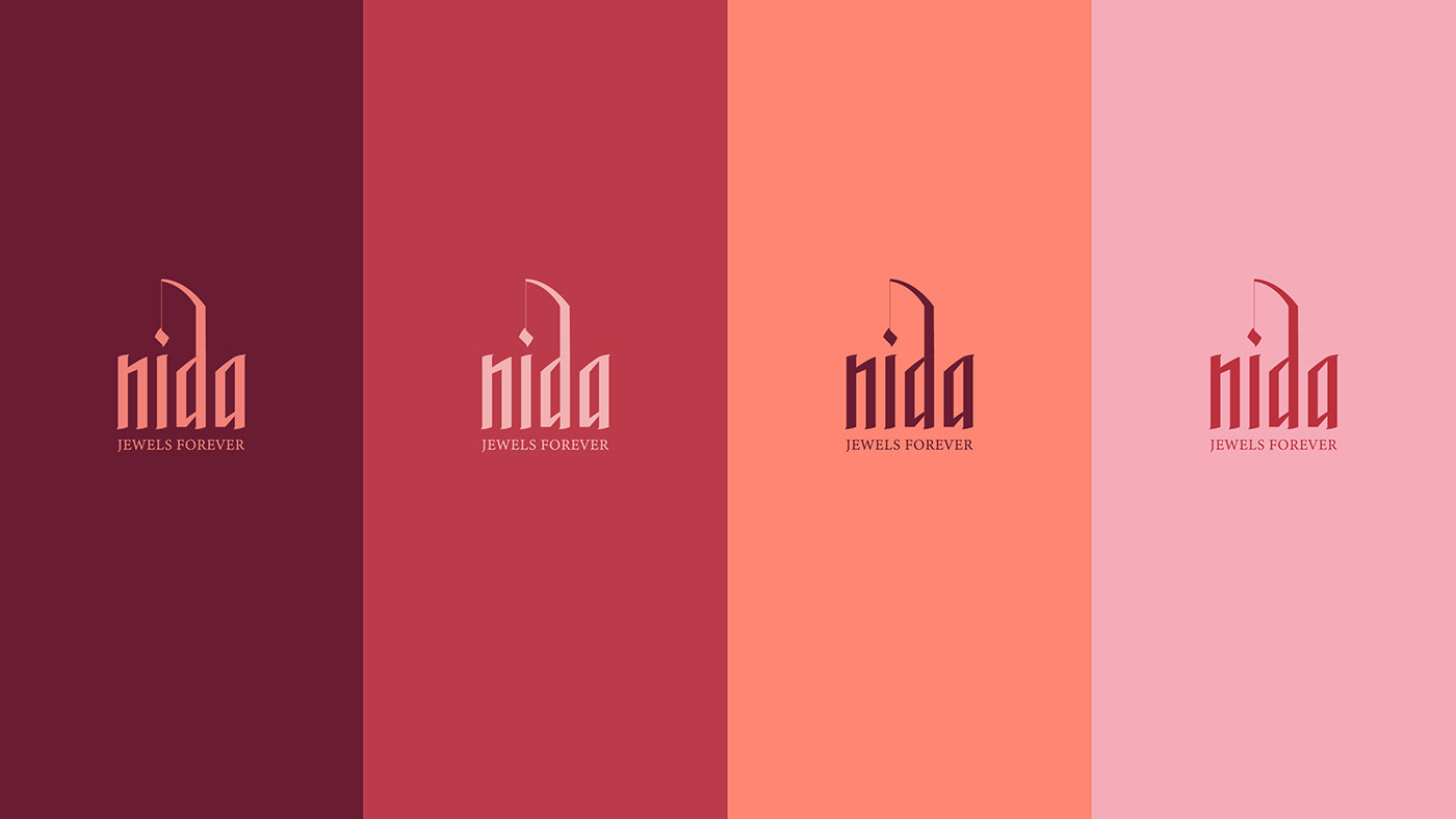
COLORS AND TYPEFACE:
I used a monochromatic color scheme of red which is taken from the color of rose to create a sense of passion and sophistication.
To convey a sense of elegance, I have chosen Minion Pro font as their primary font. Bahnschrift is chosen as a secondary font because of its clean nature. These fonts are legible to read in web and print forms.


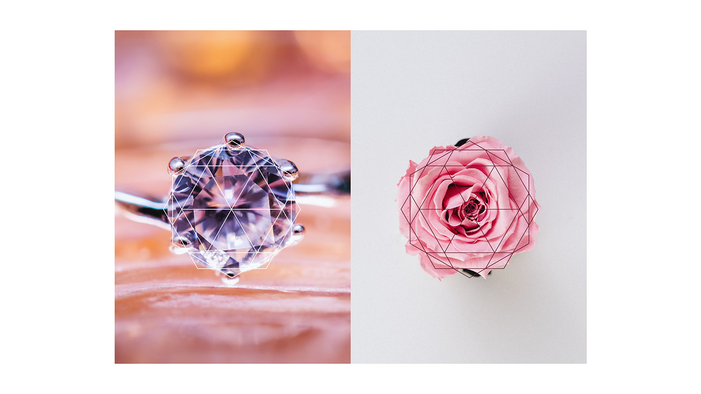
PATTERN DESIGN:
Inspired by the nature of Nida’s core business, I made a geometrical pattern as a part of the brand system. This pattern is inspired by the shape of the rose and diamond.