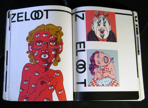
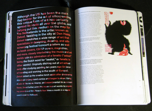
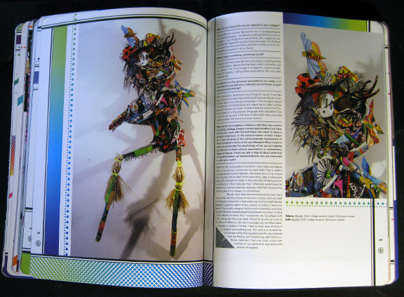
While at Beautiful/Decay my role, among others, was to design the quarterly art/design/grafitti/music/fashion publication.
The design of each issue of Beautiful/Decay shown here was a response to the particular theme of that issue, or in the case of Issue R, a themeless and thus neutral issue, an attempt to define the structure of things to come. After this system was established, it carried over into all subsequent issues as a way to keep things the same, yet different.
After this point, the issues feature many variations and plays on this structure through the use of typography, lettering, decorational illustrations and other theme specific decorational devices.
Issues S and U through W also feature custom typefaces, while Issue T uses existing type, just in a modified form.
Issue R


Issue S: The Darkness


Issue T: The Hyperspectrum


Issue U: Institutionalized


Issue V: The Grotesque


Issue W: Man Vs Machine


