


BRIØ is a brazilian management agency for sporting careers. Its services include legal, administrative and marketing consultancy for football athletes.

During the strategy process with the agency, we had the task of finding an emotional and memorable name in order to replace the older one, GMR Sports. A few rounds of naming later, one option seemed to have beaten all opponents: BRIO - a short and easy-to-say term which in Portuguese means strength and honor. The fact that the last two letters of the name could also mean 10 (a historically famous jersey number) wasn't bad either.
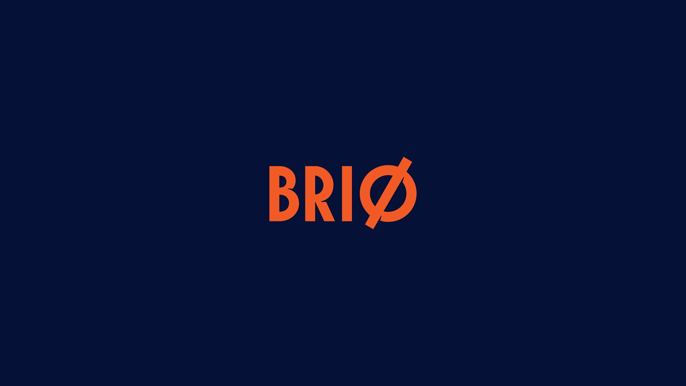

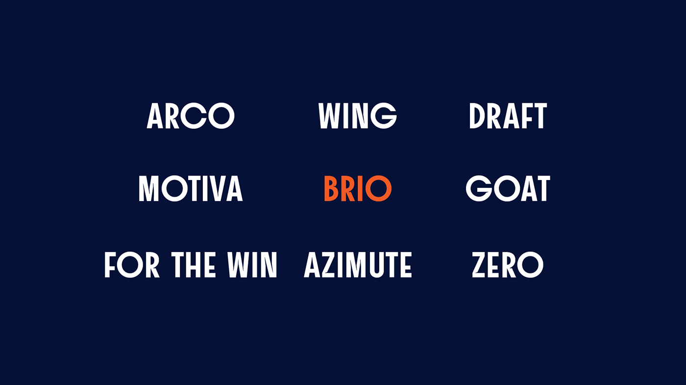
To build this brand visually, we took the forms of the pitch to create a bespoke typeface and a visual language as well. Squares, circles and half circles play together to construct this singular alphabet. The extreme proportions of the circular characters results in memorable shapes.

Custom font in use


We paired BRIØ Sans with Odisseia and Motiva Sans - both designed by Plau.


Credits
Creative Director: Rodrigo Saiani
Project Lead: Carlos Mignot
Project Lead: Carlos Mignot
Strategy & Graphic Design: Rodrigo Saiani, Carlos Mignot,
Ana Laura Ferraz, Gabriel Menezes, Aline Caruso, Valter Costa
Type Design: Carlos Mignot
Ana Laura Ferraz, Gabriel Menezes, Aline Caruso, Valter Costa
Type Design: Carlos Mignot
Type Production: Rodrigo Saiani


