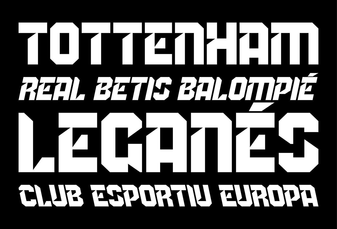
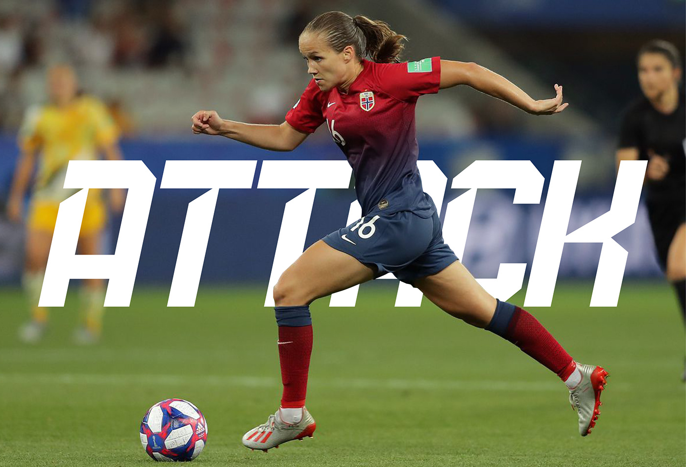
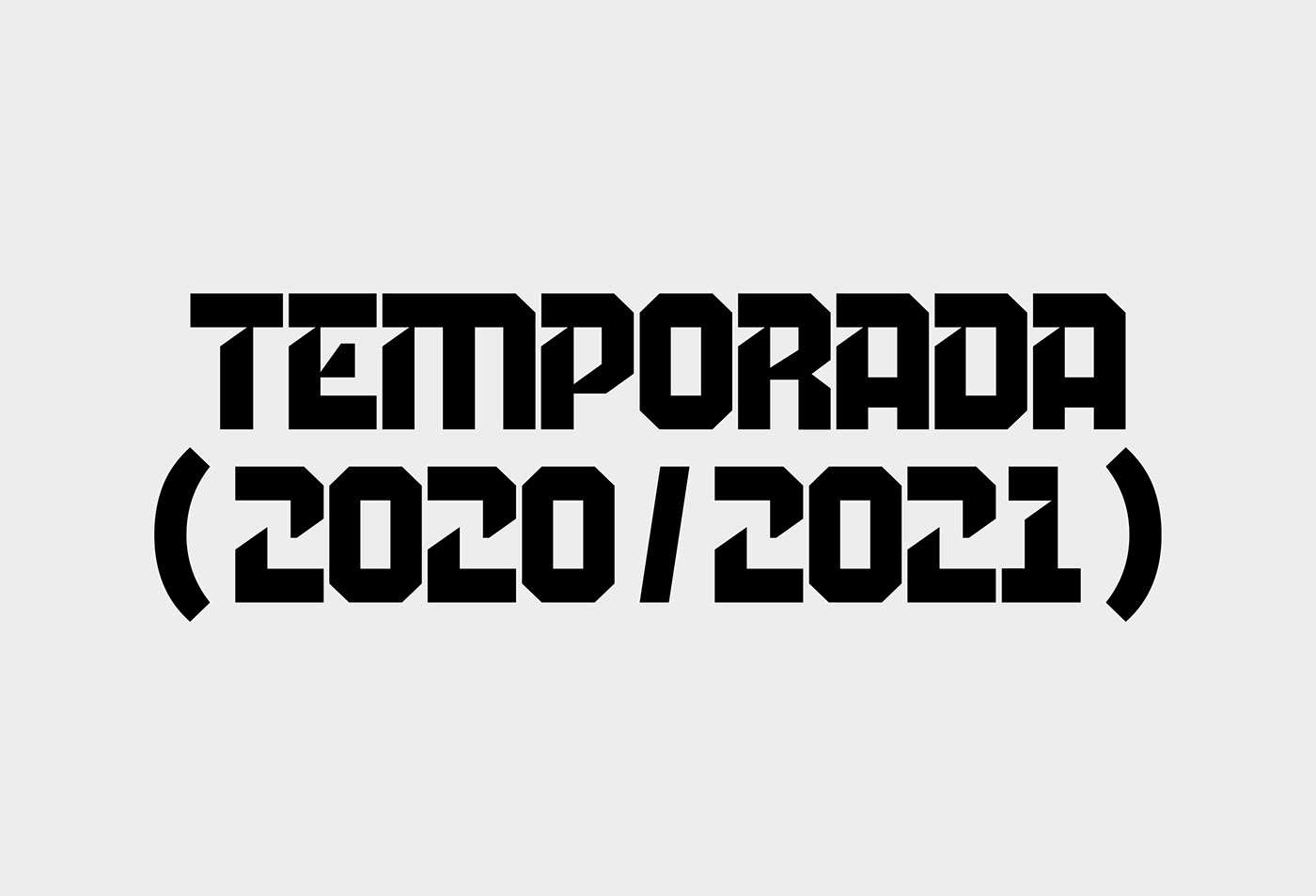
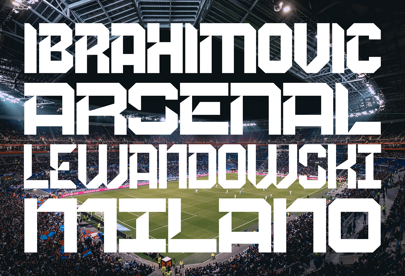
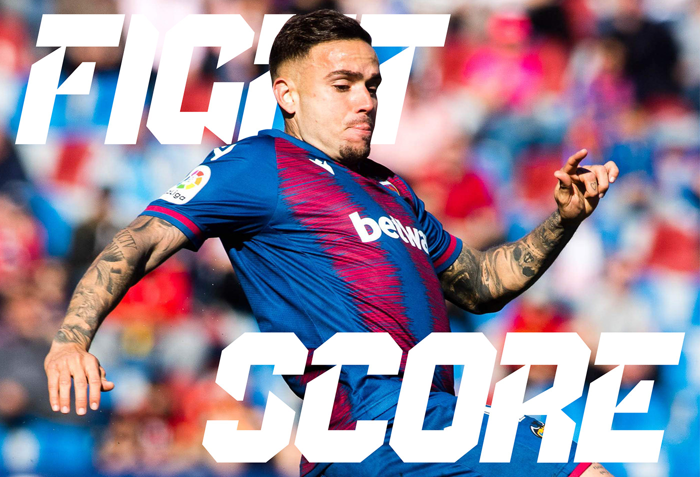
Display typographic family specially designed to be part of RHINOB's identity.
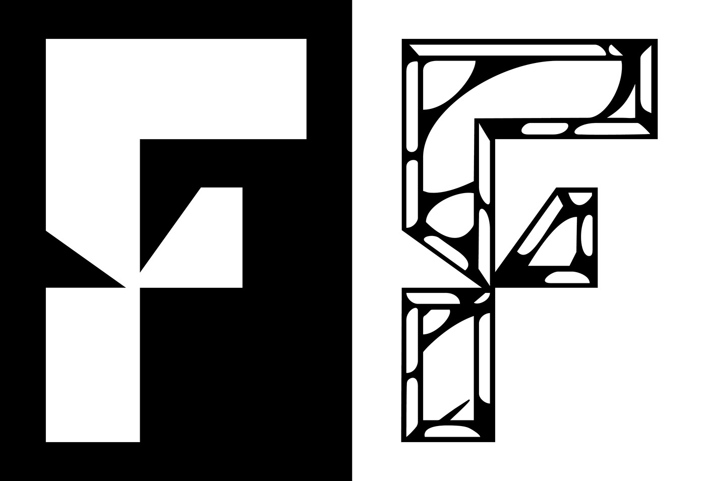
This uppercase typeface comes with a regular and light weight, and a wide style (including the obliques) and has an assertive and athletic aesthetic which is inspired on the shapes of the trade logo. Chamfered corners, sharp and fake stencil shapes besides some bites, all together give a rough feeling when used. Each style includes variations of some letters and the regular font has layers options (chrome, mirror) in order to be placed if a more strinking design wants to be used in special ocasions.
Client: Rhinob
Studio: Durana–Durana
Art Direction: Àxel Durana
Type Design: Gerard Sierra