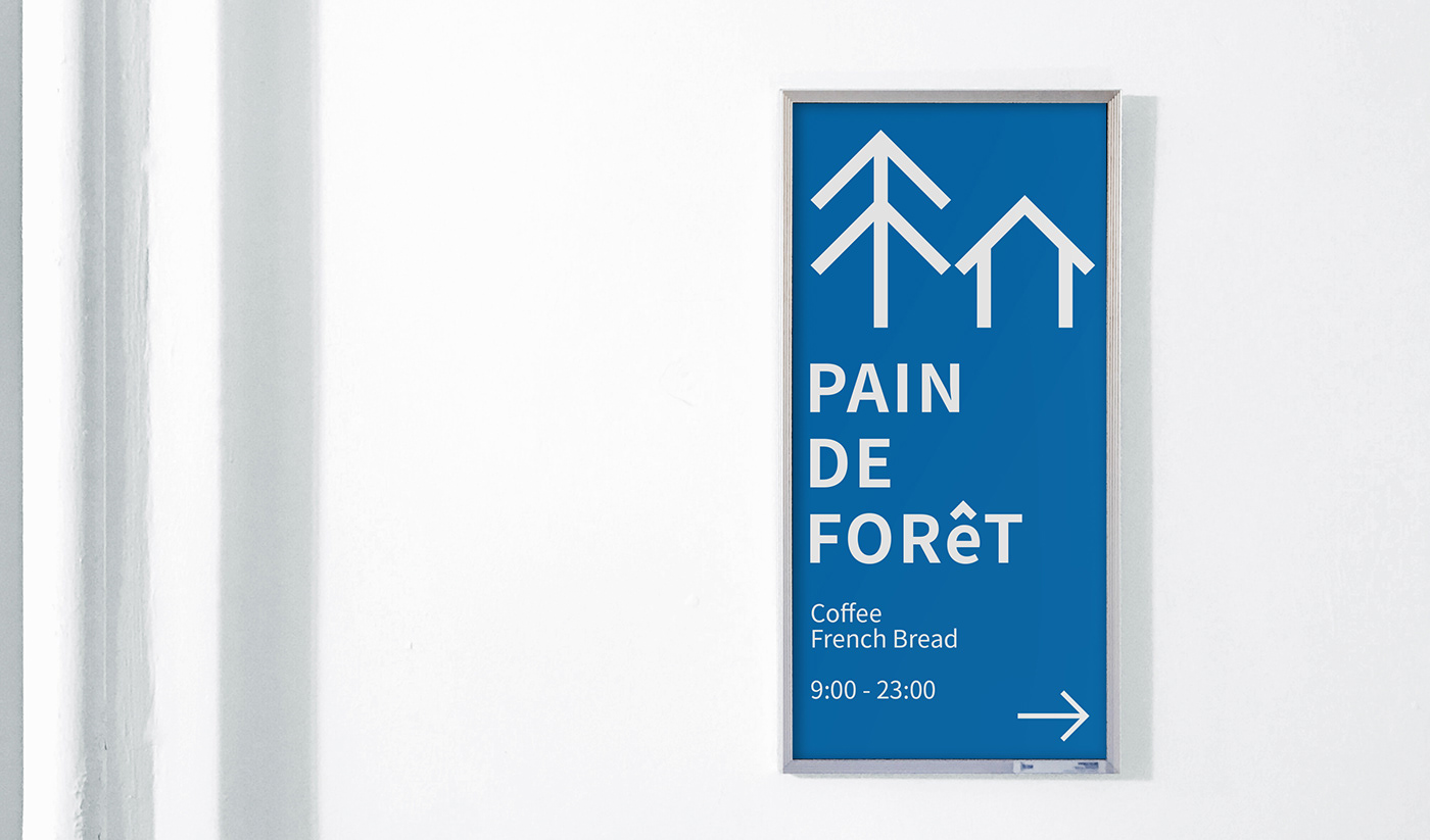
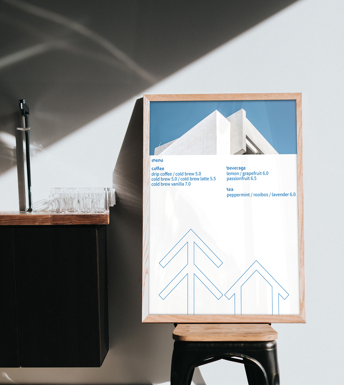
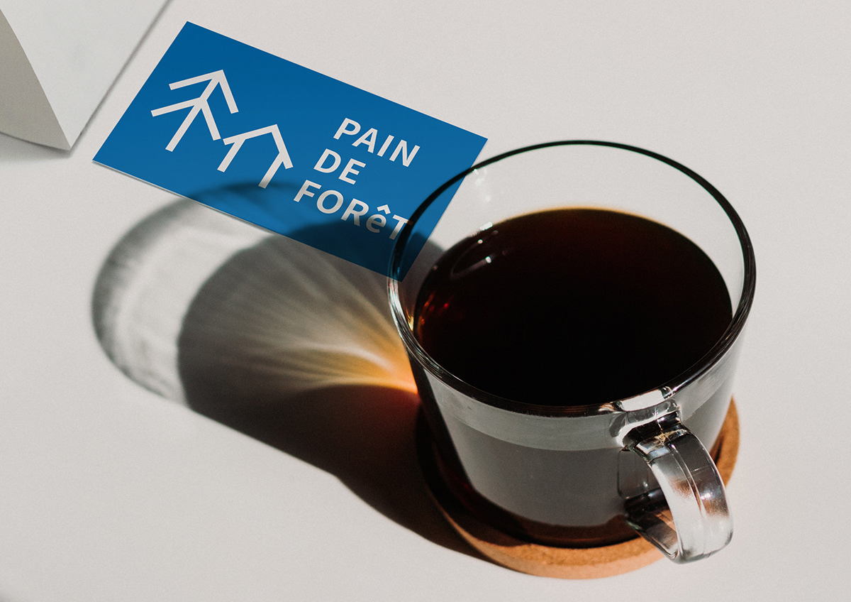
PAIN DE FORêT
숲속의 빵집을 의미하는 PAIN DE FORêT는 빌딩이라는 나무가 가득한 도시 숲 속에서 고소한 향이 가득한, 여유를 주는 공간을 컨셉으로 건강한 프랑스 빵과 향긋한 커피를 즐길 수 있는 가상의 베이커리 카페입니다. 숲속의 빵집 그대로를 보여줌과 동시에 단순화하여 모던한 로고를 디자인하였습니다. Ê를 소문자로 표기하여 포인트를 주었고 심볼과 같은 상승 형태로 통일성을 주었습니다. 프랑스의 상징이며 모던한 색상인 파란색과 흰색을 메인컬러로 사용합니다.
PAIN DE FORêT (a bakery in the forest) is a virtual bakery cafe where you can enjoy healthy French bread and fragrant coffee, and its main concept is a space for relaxation in a busy life in the city. The logo is simplified by displaying a bakery in the forest in itself. The logo is also highlighted with the illustration of Ê with a lower case, and the use of the similar pattern with the symbol enhances consistency. It is notable that the main colors of blue and white are symbols for France and modernity.